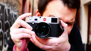
In this episode, I'm joined by Justin Mott, an independent photojournalist, documentary photographer, and filmmaker based in Vietnam, who also runs his own YouTube channel of photography critiques and advice. We go through a set of reader-submitted street photos, talking about color palettes, reflections, and the courage it takes to approach strangers, and Justin closes by turning the critique on himself, walking through one of his own New York Times assignment photos from Myanmar.
A Street Photography Critique with Justin Mott
In this episode, I'm joined by Justin Mott, an independent photojournalist, documentary photographer, and filmmaker based in Vietnam, who also runs his own YouTube channel of photography critiques and advice. We go through a set of reader-submitted street photos, talking about color palettes, reflections, and the courage it takes to approach strangers, and Justin closes by turning the critique on himself, walking through one of his own New York Times assignment photos from Myanmar.
Introduction
Hello everyone, welcome back to the channel. Today I'm here with Justin, an independent photojournalist, documentary photographer, and filmmaker based in Vietnam. Hello, thank you for joining me today.
Thank you for having me, excited to be here.
Apart from being a photographer, you also have a YouTube channel where you do critiques similar to this, right?
I do. I do a lot of behind the scenes and photography advice, and some venting. I just started a whole series where I pull up some celebrities who are into photography and critique their work, give my opinion on it. I only started it yesterday, my first episode was on Jeff Bridges' work. I'm enjoying it, and I've been doing YouTube for a while now. I'll leave it in the description for anyone who wants to check it out.
I'd like to ask you, during this session, to critique the photos I'm going to show you as if they were your own, or as if you had them from one of your clients. Just give us your honest opinion.
Yeah, seriously, all right, let's take a look at the first one.
@shorty.shots
If this was mine, I'd be surprised, because I very rarely shoot vertical, I shoot horizontal. So I'd be thinking, what are you doing, is there a particular reason for that. If you come from formal photography training, you have some good and some bad. There are certain things you've never been able to get out of your mind, things your professor said, or an influential teacher said, whether that was through school or a workshop. One of my mentors, the famous conflict photographer Gary Knight, from VII, told me once, you don't see the world with your eyes on top of each other, they're side by side, right, you don't see things like that. That made an impression on me as a young photographer. I looked up to that kind of work, but I still feel you can shoot vertical and make it interesting, it just doesn't work well for my style. I also shoot with a 35mm.
But the first thing that comes to my mind when I look at this photograph is that the color palette is quite interesting. There are even little subtle things you might miss at first glance. I like to look at a photo a little longer, because I appreciate when a photographer plays a little game of Where's Waldo with the viewer. Look at the color palette here, on the awning, the blue and the white, and then you've got the same tones again, and they've even put a little of that palette on this woman here, just a little bit of blue on her. It's almost like this was styled for a commercial shoot, like a lemonade ad. This could be a great one, maybe with a little more ice, some coasters on the table, or getting rid of the knife and fork, it might look even nicer. But even just that little blue in her skirt, and the rest of it, a photographer was smart to recognize this. A lot of people would say you got lucky, but I always say it's a smart photographer who actually puts something like this out there. They recognized it as a good shot, and it is, because even the little pop of red in the fingernail, the one color that's not in the palette, just pops right there. I dig it, I like it. Overall, I think it's a really cool find, a street photography shot, but not in that traditional way where you're expected to do moody black and white or an obvious juxtaposition. It doesn't fall into any kind of cliche, and I always respect that. I think a lot of photographers, when they go out and shoot street, end up mimicking other photographers' cliche shots, and I look at so much of that, I get bored with it. This is playful, and it works well in color, and the colors are used well. Overall, I think it's a really cool shot.
Is there anything you would improve, if you had been there, if you could?
It's tricky. I think sometimes I like it when a photographer gives the viewer a little more respect, lets them look around a bit more. But I think the red in her fingernails might have popped more if it had been on the table, that could have been interesting, because right now you barely see it, it's stuck in the shadow. If that bright red fingernail had been resting on the table, or backdropped by the white napkin, it would have popped out a bit more. Or, I'm a moment person, I don't love that he's just on the phone. If they were holding hands or something like that, that could have worked too, though I don't think it needs it. I would have liked the red in a different position, color wise, because this photo is really all about the color palette, there's not a lot else going on. So from that standpoint, I would have loved it if it was on the table, because the red would pop next to the blue, as the one out of place element in the whole shot. But it's really cool, I like it. Good job to the photographer for recognizing it and having the confidence to submit it, because they knew it was probably a pretty good shot. And it is.
All right, moving on to the next one.
Photo 2
First of all, I'll probably be a little harsher on this picture, because I feel like the previous shot was a cleaner, more refined version of this one. This photographer is relying a lot on the red and white color palette, and while it does exist there, this is an example of having those colors in the shot, but that still isn't enough. If you want to make a nice picture, you need good composition and good light, and you need those elements to come together, and I don't feel like they do here. She gets a bit lost behind the ambulance in the composition. I don't love the slow shutter, maybe around a twentieth of a second, so she's a little blurry, and I don't think that adds anything. In the background, your eye goes to the brightest spot of a picture, a lot of people know that, so it goes to the guy in the background there. Again, I feel like the idea was nice, that you recognized the color palette, maybe you were patient and waited for it, but that's not enough on its own. It's the same when you're doing these sort of old-and-new juxtapositions, they're a little cliche, and if it is cliche, I'm not going to like it personally anyway. But if it's a little cliche and you execute it well, with good lighting, composition, and a nice moment, then maybe I'll be more forgiving. Here, I don't feel like any of those things really come together.
If I was going to say how I'd improve this, I don't know, I don't really gravitate towards shots like this. I'm not going to say, oh, these are some interesting colors, red and white, so I'll wait for some red and white to come through, that's not enough for me in a photograph. I look for emotion, I look for moments. My background is as a photojournalist, so that's what I'm looking for, stories, a collection of images that tell a story, or even a single image that tells one. I don't get a story out of this, I don't get a moment out of it, and even the light and composition didn't really come together.
Was that too harsh?
No, not at all. Thank you, let's move on to the next one.
@sankardeep_hakraborty
This is more my speed, as far as light and drama. The composition is excellent here, with that low angle looking up, so all your subjects pop against the sky, really nice. Of course, I'm such a sucker for dramatic light and dramatics, and for those sunbursts. The fact that you've got the sun beaming through the clouds, the city in the background, the people in the foreground, there are a couple of different layers there, it's nice. The base of it is nice.
If I'm going to be tough and think about how you'd improve it, I'd like something else happening in the shot. I don't know if they were playing a sport, if there was any sport being played there. I don't know if you could have gotten an even better layer in the foreground, I've shot through someone's leg before, someone filling up the foreground a bit, the outline of a person, or if they were playing cricket, football, baseball, anything, that would have added a bit more. But the dramatics, the city in the background, that back layer, really nice. As you move forward into the foreground though, it doesn't do a lot for me, other than that they're just silhouettes. I think it's a pretty good shot, it could be an exceptional shot if you had a great moment in the foreground.
All right, thank you, moving on to the next one.
@ma_slav
This is cool, this is something, this photographer, whether they set this person up on purpose or it just happened naturally, it's awesome. It just feels like this futuristic superhero sort of moment.
It's a Terminator, right?
Yeah, a Terminator, or something like that. I think that's pretty wild. It doesn't fall into one of the street photography cliches, it's got its own thing going. The reflection is really nice, interesting.
If I were to do anything to improve it, I'd probably crop out the logo in the corner, because your eye goes there second, and I don't love that, it's a bright little spot with words on it. I'd rather crop that out in camera than in post, but I wouldn't mind if someone did it in post either. Or even a tighter crop, more on this woman's face, she's almost like the Emperor, or the Emperor mixed with the Terminator, with that long hair. The other red in the shot, the tail lights of the cars, that subtle yellow, it's cool. For these kinds of shots, shooting on public transport, I've done a lot of these, as an assignment, or as a street photographer just carrying my camera with me everywhere. It's smart, whether they got lucky or not, though I don't think they got lucky, I think they actually saw this and got it. I think it's rather clever, rather patient, and well executed. A cool picture overall.
Do you like to use reflections in your work?
Yeah, I do quite a bit. I probably use it too much in my commercial work. A lot of the commercial work I shoot, I also run another business, my visuals company, we do a lot of video production and commercial shoots, hotels, property development, that kind of thing. Often we're shooting spaces that aren't open yet, so we have to be very creative and work around that, like, okay, this lobby isn't built yet, but this part is, so we have to shoot through a lot of mirrors and glass in the foreground. I use it in general just to try to make the mundane more interesting, but I definitely took that from my editorial work, using it creatively in my street photography and in my New York Times assignments, where I'd have to put together a fifteen picture slideshow and I'd be running out of ideas, so I'd use reflections there, and then I carried that into my commercial work quite a bit. So yeah, I use reflections all the time. I try not to be too repetitive with it, I try to make it interesting, and I try to make it make sense. Like here, this image with the reflection, it makes sense, it's perfect, because you've combined these two elements. I think this is a really cool shot, I'd like it cropped in quite a bit, I think it would be even more powerful, but it's very well done by the photographer, really cool. That's why you keep your camera on you, that's why you travel around with it, you never know when things like this are going to pop up, and you don't go out and plan a shot like this typically, it just happens from having your camera on you, looking, being aware, and being ready. Very well done.
All right, moving on to the next one.
@joligs2.0
This looks kind of funny. When I look at a photo, I look at two things, first, whether it made me feel something. If it did, that's a good job, and I'll forgive a lot of other things, like composition. I don't love the composition, don't love the light here, but it's funny, it looks like this walking area with a lot of drinking going on, and this guy, I don't know what he's doing, I don't know if he can or can't walk, or if he just happens to be chilling on the ground having a beer. It's not as funny if he can't walk, it's more funny if he's just decided to plop down and have a beer.
As for the composition, I like it a little cleaner, or if it's messy, I want it messy with purpose, and I don't feel like this has that. He's got that guy sort of growing out of his shoulder to the right. The light is pretty flat throughout, though there's a mood to it because it's a dusk shot, with all the neon lights in the background. But there's all that negative space up to the left and off to the right. I think to pull off this shot, you might have needed to get even lower, maybe with a longer lens, looking up, so the man pops against the sky, or is framed by the neon lights in a more interesting way.
I don't love this one, there are a lot of little things with the composition, people cut off on the right, half a body on the left. I try to work around those things, or I just don't take the picture, sometimes I take the bad picture but don't show it. I try not to do that, every time I take a bad picture I look at it and think, why did I take that, don't take it again. So yeah, I don't love this one nearly as much as some of the others. I don't know what the photographer is trying to achieve, what they're trying to say. Maybe it's just someone who popped down for a beer and is enjoying the street scene, but it's hard for me to know, because I can't really see what's happening in front of them.
All right, thank you. Let's take a look at the next one.
@xonalog
For me, nine times out of ten, I'm not going to like a picture of someone looking right at the camera, unless it's meant to be a portrait, unless that was really the purpose. This doesn't necessarily look like it was meant to be a portrait. I'm always going to look at things from that perspective, as a documentary photographer, as a photojournalist, my job was always to work around that. If they noticed me, I'd look away, that's a good trick. When you're photographing people and they notice you, a lot of times people just freeze. Photographers are scared, they're shy, and I understand that, I was shy too when I first started, but I couldn't stay that way, because it was my job. I understand it's tough for the average person, someone who isn't a pro or even an amateur, they don't have to put themselves through that. If you're shy, you can indulge that, but I couldn't, I had to be able to get the shot. So if I liked a guy, if I liked what was happening, I'd probably look away, I do a lot of little tricks like that, I pretend to look one way and shoot another, or I circle back. If I recognize someone and I'm interested in them, I'll approach slowly, try not to make eye contact, or look in a different direction from where I'm shooting, so I might be shooting him but looking off at his baskets, or behind him, so he thinks it's a little mind game. People think you're shooting where you're looking, so if I look just to your left while shooting you, you'll start looking to the left too, and that's how you get those shots.
As for the interesting part of the composition, again, I don't like the guy growing out of his back there. I think he could make for a cool portrait. But I'm a professional, so if I liked this guy and found him interesting, I'd go strike up a conversation with him, and figure out a cool way to get a portrait, with his hat and those glasses, maybe through those baskets, whatever he's selling there, looks like old news clips. Or maybe using that chair in the background, I'd love a portrait of him sitting in a chair in the back of his van, with that hat, looking off to the side, using the light coming in from the back. That's how I see a scene like this, whether it's a portrait, a street shot, or nothing at all. Like we were talking about with the Terminator earlier, I make these calculations, this is what I'm going to do and how I'm going to do it, and then I commit to it.
When I teach, I see a lot of photographers who are afraid to approach people for portraits, afraid to approach people in general, and I get that, but I'll tell you, nine times out of ten, people usually say yes, if you have good intentions, if you smile, if you're nice to them, or strike up a conversation first. And if you're looking for a more candid shot, you just need to be more creative in how you approach people. So that's how I'd see this picture, I could see it as a portrait, with that empty van and those chairs in the background, a wide-angle portrait of him in the van, with that hat and those funky glasses, and even that little red marker, those little subtle details, the red marker and the red nails, I like those little details. I think it had potential, but I could see a little bit of a shy photographer here, this looks to me like the classic case of the photographer getting caught and not taking a nice picture because of it. I understand that fear in a lot of photographers, but to get better, you have to work through it. Every time I didn't approach someone, I hated myself for it afterward, and I can't think of many times, if ever, that I regretted approaching someone, even when they said no. People have said no to me, but it happens very rarely, and it's no big deal, they say no, and you move on.
That's actually great advice, thank you. Let's take a look at this one, a little more grainy.
@damian.m.x
This has a cool mood to it. I don't mind all that empty space, that negative space, I think it works well. I like the film grain, I like the look of the person on the bike, I don't know if that's the beach or where they're at, this empty concrete, but it's interesting. I like the bicycle, looks like the guy has a little hat, an outline of glasses, it's very artistic, it's different, it has something to it. I like it, I don't necessarily absolutely love it, but I like it. I'm tough, I'm telling you, I look at pictures all the time, and I critique my own work in a tough way too, so I think it's a nice picture overall, interesting, intriguing. The ground is interesting, I don't know what they did there, it looks like it was either shot on film, or added in post-production with a lot of grain. There's also a bit of a slow shutter, obviously, because you can see tracks of light in the background, off to the top left, some sort of movement, I can't tell if the lights were moving or if the camera moved a little, but it was a slow shutter.
Do you think the edit is what makes this shot? If I showed you this picture in color, unedited, straight out of the camera, do you think the style being used here is what makes it work?
That's a great point, it's interesting to bring that up, and you might be onto something there. I think it might add a little to it, just because the ground has this weird look, like a different planet almost. It's hard to tell without seeing it without any processing. Sometimes if I don't analyze it too much, I just look at it quickly, and it's interesting to me, intriguing. It's not a total love for me, but it's interesting.
Let's take a look at this one.
@jul_captures
This is sort of playing with that street photography juxtaposition move, though I can't really call it a cliche, it's more something we can all relate to, more of a classic than a cliche, I think. And it's executed well here, as far as the content goes. It's interesting, the cross, adding a religious element to someone who's not naked, she's in a bikini, but her skin is exposed to the sun. I think the moody light is really interesting, the fact that the cross is in shadow and she's in the light, I think it's smart of the photographer to recognize that, to capture that interesting light. It looks like it could be midday, so the light is quite harsh, and a lot of people think they can't shoot in harsh light, but I always try to find things within the shadows at midday, when you get that really harsh light and contrast, you try to make use of it. If it's exposed well, they did a good job making use of it, they found a subject the light was hitting, and a subject the light wasn't hitting but still made use of, the shadow. It might be a graveyard, I think it is.
I don't remember the city where this was taken, but the photographer mentioned that people go there to sunbathe, or spend leisure time in the graveyard, like a park. That's interesting, though I think the scene could have shown some of the other graves, or more people laid out, it looks like a place with a lot of potential if people do this often. A lot of cemeteries have these rows of headstones, but here the cross really sticks out, though it could also have been a memorial or a statue. The fact that it's a cemetery makes it even more interesting. You do see a bit of it in the background if you look closer, the other headstones, but I think it gets a little lost. I would have liked the photographer to get a bit closer, I understand that gets into creepy territory, photographing a woman in her bikini, but at the same time she's in a bikini at a graveyard, I guess it depends what country you're in and the rules there. But I think there's potential there.
Sometimes I say I'd love for a photographer to get closer, to get a more interesting shot, and people say, well, I was nervous, but people do it, you know. I always think about that, it's the same with access, people say, oh, I couldn't get access, but someone else did, so if someone else can, you can too. If you want to be really good, that's how a lot of photographers get there, it's not that they're always the most talented, it's that they put themselves in position, and they take that extra step for access. Sometimes that means getting access to something tough, for me it meant going undercover to photograph the rhino horn trade, getting access to black market mafia guys, that's its own thing, I'm not saying everyone has to do that. Sometimes it's just about talking yourself into it, or talking your way into it, like the guy in that picture a couple of shots ago, getting a portrait of him in his van, that's an extreme version of the same thing. It's that last twenty five percent, talking your way, or talking yourself, into getting closer, or talking the subject into a nice portrait, or if you're doing a documentary, talking your way into access to the story. I think that's the part a lot of amateurs, or even pros who don't go to that next level, leave out. They think it's talent, but it's not, a lot of the best photographers aren't necessarily the most talented, they just push themselves more to get that kind of access.
But it's a nice picture, it's interesting, it makes you laugh. It's one of those scenes where I think, I would have loved to work that. Maybe the photographer did, it's not fair to assume otherwise, sometimes we're just not the best editors of our own work. I'd love to see them work this scene a bit more, I would have tried every angle, gone up a little higher, tried to get closer, worked through the shadows, tried to block out some of those extra bright spots in the background as best I could. But maybe it did work, maybe they tried and this was the best of it, I don't know, that's just armchair quarterbacking on my part.
It looks a little tight, like it was shot with maybe a 70mm lens or something?
Yeah, it gives it this kind of compressed feel, especially with a subject like this, when you shoot with a telephoto lens. It's an interesting photo, though I don't use a telephoto lens on purpose in my own photography, because it forces me into good habits. I use a fixed 35mm for just about everything. My first year as a photographer, covering assignments for the New York Times, I shot everything with a 35. That was hard, I wasn't doing spot news, even though it was for the Times, I was covering stories, so I had a bit more time with my subjects, more time to let the story come to me and to learn about it. If I was doing spot news, natural disasters, events, sporting events, that kind of thing, maybe I'd need a longer lens. But the way that suits my style best is to use a fixed lens, it makes me move more, it makes me a little more creative with my compositions. I have a 24 to 70 and a 70 to 200, but they make me stay still and zoom, and not think or move as much. So I always encourage my students who want to do long form work, more street photography, and want to be more thoughtful in their photography, to work with a fixed lens, whether that's a 35, or something wider like a 28 or a 21, or tighter like a 50, whatever suits you. But 35 works well for me.
Moving on to the next one.
@weekendatowens
This is cool, this has a nice mood to it, it looks like a shot from the 70s maybe, because the car looks like it's from the 70s, but that guy's an interesting character, his tattoos, his chain, his muscle shirt, the color of his shoes, the way it matches the red in the car. I think a lot of the people submitting have a great eye for color, your audience really does, I see some great color combinations in there, great color palettes. This guy is so interesting, and that car is so interesting, but he could be even more interesting, I'd like to see a little more of what's going on. I don't even know what he's doing there, is he rolling something, is he about to light a cigarette, what is he up to. I'd like to see his expression more. I don't know if this was a friend of his, or if he was a little scared of this guy and just took this quickly, wanting to move on, but this is the kind of situation I would work, because I can see he's got a very interesting steering wheel in there, potential for reflections through those interesting windows, potential for a really cool portrait, or just working it more, him hanging out. The blown out sky in the background, top right, bothers me a little, so I'd like to be a bit closer, but the composition, I'd say about seventy five percent of this photo is really nice, I like the way the wheels and rims look, the lines in the car lead to him. I would have liked to see him in the car, using the side light from outside to light him in a much moodier, more interesting way, so you'd see the tattoos, the chain, the expression, and stuff like that. Whether it's a portrait, if you wanted to do a portrait of him, or if you're just doing street photography and didn't want to approach him, I totally get that too, I would still want to work it a little more and see what else I could get. But if you're just passing by and this is what you captured, I think it's still pretty good for that, I like it. What do you think?
I think it's probably the same question as with one of those shots before, about the tones and the style, whether this looks like it was shot on film. It gives this feeling, I like the shot as soon as I see it, because it evokes something, it might be an old shot, might have been taken many years ago. I don't know if I'd like the composition and the elements the same way if this had a different finishing approach, I don't know if this would work in black and white, I think the color is what makes the shot. But my first thought is that I like the shot overall, for the combination of things, the finishing approach, the grain, the film look, and the character, which all add to this old-time feel.
I think you bring up a good point, and it's something I see a lot when people submit to me. I think people sometimes rely too much on that. If you shot it on film, with the purpose of using that film for a reason, fine. But if you're adding a film look afterward to try to make up for a bad picture, which I'm not saying this photographer did, I'm just saying, since you brought it up, it's a good point, I think people do that too much. It's the same with black and white, they have a photo they think is just okay, and they turn it black and white and think it's suddenly going to become an excellent photo, but it doesn't really work that way. I think you should get the photo right in camera, adding these little filters, whether gimmicky or not, that's a different debate, or the kind of film, doesn't make a bad photo good, and it doesn't make a good photo great. It just adds something a little to it, but it can't make up for bad composition and bad light. Again, I'm not saying that about this photo, because I kind of dig it on its own. We don't know the circumstances, we don't know the neighborhood, we don't know if this was shot on film and the photographer just wanted to spend one frame on this moment and walk on, or if this was a friend of his or hers. But as a standalone shot, I'd rather like it than not, though there are a few things that make me think twice.
All right, I agree, I just wanted to bring up that film thing, because I see a lot of people do it.
Yeah, it can be a good tool, but it can also be a bad habit to rely on, I see too many young or new photographers do it.
Martin's photo
An interesting little moment, nice, three layers there, you've got the woman on the phone, beautiful light. Out of all of them, light-wise, this is one I really like, the light coming through the clouds, that's what I gravitate towards the most. This light is pretty nice too, that early morning or late afternoon light, casting a shadow on the side with her and her phone. She looks like an interesting person. You've got that layer in between, with the posters of a girl who looks like another version of her, I like that little triangulation. But as far as an overall moment goes, when you're trying to take these shots to the next level, you've got the light, you've got the composition, and then you want a really interesting moment. Someone just looking at and talking into the phone isn't a wonderful moment for me, it's just okay, it doesn't excite me much, it doesn't make me feel a lot. But as far as the light and composition go, I think it's pretty good in that regard.
Let's take a look at this one.
@sacks
This shot is cool for me. I like the light, the shadows, the composition, it all comes together, though it doesn't have a great moment. But this could be the kind of shot I like whenever I see fashion or editorial fashion photography, that's the style I like. If this were an ad for that coat, something cold and gray, I think it would be cool, it's a nice street photography shot, but it could also work as a great ad. Actually, I was thinking about doing something on Brooklyn Beckham, David Beckham's son, who's a photographer, and did a shoot for Burberry. This is what I would rather see for a Burberry ad, something like this, pulled back a little, the light hitting the coat. From an editorial fashion perspective, this could work really well, even if the photographer was probably just doing street photography.
The light hits the coat well, hits the subject well, she's got a little turn to her, she looks very fashionable, with the light on the side of her face, the sunglasses, the shadow of the street lights. The background is very clean and crisp, the way she pops out of it, it's a cool shot, I dig it, very well executed. The photographer waited for the subject to walk between the shadow of the lamp post and the shadow of the traffic lights, and nailed it perfectly. That's the reward of waiting and being patient, not just settling for any old subject. This is an interesting subject, that's how you elevate your shots, you wait for an interesting subject, find that background, and hopefully get a good expression. She's got a little look back, she's not on her phone, she's looking across her body, it has a very fashionable feel to it, I dig it.
I think you've got a point with the fashion angle, because this is how they show the coat in the environment, how people are actually going to wear it.
Yeah, I think this might be the best type of advertisement.
@robbinthehood
This shot is interesting. From a personal standpoint, as an animal person, I hate to see animals in bad conditions like this. My background is as a journalist, but more recently I've been doing a lot of wildlife photojournalism, so it's always tough for me to see animals being used for amusement, or sold to be eaten. That aside, as a picture, the contrast between the snake and her shoes, and the low angle the photographer took, was quite clever and smart. It's a nice moment with the snake.
I would have liked to see the snake's tongue, or something like that, a little more patience for that moment. In a situation like this, even though I don't use a particularly fast camera, whatever camera I'm using, I shoot with a Leica M10D, I'd crank the frame rate up, on that camera it's about three frames a second, not great, but I'd shoot as much as I could to try to catch the tongue of the snake. I'm assuming the snake is still alive, since it looks like she's about to pet it. The expression of the kid in the background is where the shot could have been, I'd like to see a bit more of a moment there. I do like the moment of the hand, though for that to really work, you need a connection, either the snake biting the person, or licking them with its tongue, or something like that. The fluffy crocs she's wearing are interesting, and the low angle is a smart choice by the photographer, it takes it from good to great. I would love to see some sort of expression or moment in there.
Let's take a look at this one.
@stefankurzeja
This one is tough. People looking at stuff, that's a hard subject. I've had to do this in my own work, when I'm doing travel stories, sometimes my shot list from an editor will say, get a shot of this gallery. Photographing art as a photographer is tough, because you end up shooting people looking at other things, or the art itself, and you think, why not just post a picture of the artwork? So it's a tough assignment, and it's not something I'd choose to do on my own in street photography, people just looking at stuff tends to be a little boring.
The colors are kind of interesting, the two people are framed okay, but the other guy on the left has lines coming out of his head, those little things bother me, even now with my own head growing out of things in this framing, though I'll blame you for that composition. I don't like that kind of thing, it bugs me. The subject matter is just a little boring here, people looking at stuff, people walking by. For this to work, it needs exceptional light, a nice moment, or a nice color contrast, ideally all of those things, and this doesn't really have many of them, so it's not a wonderful one for me. I don't know how to make this particular shot better, honestly I just wouldn't have photographed this, that's my advice there.
All right, thank you. Let's take a look at this one.
Justin's own photo
Oh, I didn't know you did stuff like this.
Oh my god, I have to be tough on myself. Well, this is a smart move. I like this, wow, this photographer is just amazingly talented, there's really nothing they can improve on, I don't see it. Okay, a little context for this picture, this was taken on an assignment for the New York Times, I was doing a story about Myanmar, maybe around 2010, Myanmar, or as some people know it, Burma. You couldn't really go in as a photographer without a ton of paperwork, they were cracking down on that kind of thing, so I had to pretend I was part of a tour group. I actually hired a guy who was in on the whole thing too, so I signed up through the tour group, but they sent me a separate guide who took me everywhere, acted as a fixer and translator, and we went and shot my story, which was a general travel story about Myanmar, but touching on the darker side of it. I wanted that dark mood about Myanmar, in the shadows, that's why this shot worked well for me and for the story.
As far as how I'd improve this, I wish I didn't have that little bit of car in the bottom right, composition wise I could lose that. I would have loved the subject to be framed perfectly around that blue door, but I waited there a long time, took a lot of shots, and got the shot I wanted. I'm going to be tough on myself here, since I've been tough on you guys, I should be tough on myself too. I would have loved a more interesting subject in the background, rather than just the color, though I do like the triangulation of red, the red on him, the red walkway under the blue, and the red sign. I wish the foreground was a little cleaner. I did get a shot of someone with an umbrella in the rain at night, selling street food, and I liked that one a little better. But you chose this one, because you're mean, no, I'm just kidding. I think it worked well for the overall mood of the story and what I was trying to capture. I believe the New York Times chose this one too, for their slideshow, one of the images they used. It was very mood heavy, as a standalone picture. It's still in my portfolio, I still like it, I think I have it as part of a series. But looking at it now, ten or twelve years later, I think I'd want to be a little more patient as a photographer, and try to get someone around that blue door, and frame out that car in the bottom right. So yeah, I can definitely improve, hopefully I have since then.
Closing
Okay, so thank you, Justin, for joining me today, it was a very nice conversation.
Thank you for having me, it was a lot of fun doing this. And thank you to everyone who submitted, I really appreciate that. We're not trying to be harsh, I'm trying to give advice, and I'm just as harsh on myself. I applaud everyone for submitting their photos, I think it's great, as a community, what you do, putting your photos out there to be vulnerable, that's hard. I never want to discourage anyone from taking photos, I just want to encourage people to take better photos and constantly improve, and that's what we should all be trying to do, at every level, in all of our photography.
Perfect, thank you, and maybe see you in the future.
Hope so, thank you, have a nice day.