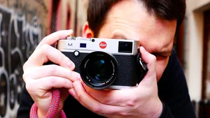
PROFESSIONAL Photographer CRITIQUES Your Photos - ft. Alex Kilbee
Today we critique your photos with Alex Kilbee (@The Photographic Eye). Check out The Photographic Eye: https://www.youtube.com/c/ThePhotographicEye
Today We Critique Your Photos, with Alex Kilbee
Introduction
Hello, fellow photographers! Thanks for coming back to my channel. Today I'm here with Alex Kilbee, who has an amazing YouTube channel called The Photographic Eye. You've probably come across it already. Alex has been a professional photographer for more than thirty years, and today we're critiquing your photos. Thank you to everyone who submitted one. If you'd like to submit a photo for a future critique, check the links in the description.
Alright, let's get into it. The idea is to rate or critique the photos I'm about to show as if they were your own, or as if a client had brought them to you.
I should let you say hello to your viewers first, since they might not know who I am. I'm Alex, from The Photographic Eye, and I've been a fan of this channel for a long time.
So let's start with this first photo. Can you give me your thoughts?
@stefanoannovazzilodi — the three women
Yes, as you mentioned, I'm happy to offer feedback on images. In this photograph, with the three faces, I think there's quite a lot going on, which is good, because there's at least some direction running through the image. But two things are really distracting for me. One is a sign that looks like it belongs to a bar, on the right side above the lady's face. Because the image is black and white, it really stands out. The other is the lady in the bottom left corner, who's looking straight into the camera with an odd expression. Because she's the only one making direct eye contact, once you notice her face, it's very hard to look away from it, so you're not drawn back to what should be the focus: the lady in the middle. Her expression feels like the real subject of the image to me. It would be nicer if the lady in the bottom left corner were looking almost like a mirror image of the lady on the right. That's the kind of thing I mean.
How do you feel about that kind of situation, where you have lots of competing areas of lightness in an image?
Yes, I find it a little distracting. I think the highest contrast in the picture is in the middle, with the middle lady, and your eyes probably move next to the girl on the right. What I don't particularly like is the sign over her head, because it's contrasting and it draws my eyes too. Then I look at what the girl on the right is looking at, which is the lady on the left, and she's looking at us as well. Other than that, I agree with what you said.
Alright, photo number two. Give me your opinion on this one.
Martin's photo — the man with a coffee and a cigarette
I feel there's a difference between snapshots and photographs, and this one leans toward the snapshot category. It's a picture of a man having a coffee and a smoke. He's an interesting looking character, but I think there's more opportunity here than what we're seeing. If you know him, then I'd say you want a bit more focus on him specifically. What stands out for me is that nothing here feels like it's been particularly worked on, it feels like simply taking a picture. There's nothing wrong with that, we've all taken photographs like this, similar to the kind I took myself when I was starting out. As you become a bit more confident and self assured about trying things, in this case I'd have looked at the street behind him, with that Škoda and the blue van rushing past, and thought about finding a place where the man could sit, lean, or do something a little more casual, a little more posed, though "posed" isn't always the right word for street photography. Put him in an environment where he's juxtaposed against something, maybe his leather jacket and all the ink against something soft and feminine in the background, or something quite posh, just some kind of contrast. There's a subject here worth working with, and something could be done with it. I also think black and white would work nicely with leather jackets, they tend to look great in black and white. But as it stands, it feels like you're not quite sure what to take a picture of beyond just photographing the man.
I think this is a fairly ordinary photo for me. Even though it's probably been processed, the background is really distracting. I don't mind the trees so much, but the cars, especially the moving car behind him, bother me. Like you said, something plainer in the background might have made the shot work better. He's an interesting character, but maybe a different depth of field, something more blurred, would help. Though I don't think you can fix everything with that.
That's true, the shallow depth of field thing can sometimes feel like a crutch. As you were talking, I noticed there's a doorway just behind the man's right shoulder, past the white van, with something red near it. If you'd placed him in that doorway, with the same kind of attitude he's got here, I think that would be a stronger image. One thing I do like is that you're quite happy to crop right into his head, which suggests to me you haven't been taking photos for very long. I don't mind that at all, sometimes it works, and here the tight cropping around the forehead gives us the feeling of being close to him. I like that.
That also reminds me, I wanted to ask you more about this. You actually run your own course, with one to one sessions critiquing people's portfolios and images. Can you tell me more about that?
Yes. One of the great things I benefited from as a student was getting good, helpful feedback on my images. So I run a course that teaches people how to see photographs, the kind of thing we've been doing while looking at these images today, and also gives more in depth, one to one feedback, really helping photographers find their own voice. There's no point in me telling people to take pictures the way I do, because I don't want photographers to become like me, I want them to become the best version of themselves. I'll put a link to the course in the description, and there's also a ten percent discount code, valid until the end of May, I believe. So if you'd like feedback on your own images, or want to learn more about how to see photographs the way we've been doing today, click the link and check it out.
Thank you very much for that. Moving on, next shot, what do you think about this one?
@gokhanarer — the hand on the railing
This reminds me of a Matt Stuart picture. These kinds of shots are humorous, and I think they live and die on how funny the picture actually is. I like the hand coming over the railing, that's a moment well seen by the photographer. It's one of those instants you need to be aware of, and it just happens, and it's great.
I'd only tweak the crop slightly. If you took off maybe the bottom tenth of the picture, that would help, because there are two handrails here: the main one, which works perfectly, and then one underneath it that's ever so slightly distracting. But that's really the only thing I'd change. This is about the moment and the humor of the photo, rather than any technical wizardry.
We mentioned snapshots earlier, and this is very much a grab shot, but unlike the picture of the man, there's a bit more to it. Someone's been aware of what's going on here. It feels like it could be Eastern Europe, Istanbul, somewhere like that. I quite like it, it's fun, it brings a smile to your face. I like how this image passes the test of whether you'd hang it on the wall. I probably would, though I think it really shines as part of a sequence, alongside more images like it. My only worry is that if this locks you into one particular style, you might end up only shooting this kind of thing, and it wouldn't fit into a broader portfolio. That said, look at someone like Matt Stuart: his work can seem to pigeonhole him into one style of juxtaposition, but when you look closer, there's still a lot of diversity in what he creates within that style.
@sifonkubik — the busy street in Korea
This shot's from Korea. This one's a bit more complex, and I'm immediately reminded of Alex Webb, these colors, these layers. I don't hesitate to use the phrase extreme cropping either, these unusual crops, similar to what I mentioned about the man's head in the earlier picture. I like what the photographer is doing here, pulling us into the environment. But that approach needs a very delicate touch, and what I find with images like this is that when they're visually busy, as this one is, with subject matter (two or three people here) and all the street signage on top of it, the eye starts going everywhere. There's a Far East feel to it that kind of works, but it makes things harder, because the eye doesn't have anywhere to linger. There's a man with a cup that looks a bit like a duck, which is amusing in itself, but I don't think it's enough to carry the picture on its own. I think the photographer has the right idea and is going in the right direction, but I'd like to see more of what they can get out of this kind of setup.
Would there be something you'd add to the picture to make it work?
I'd actually take stuff away. I feel there's too much going on here. I don't mind the layers of people, but I keep coming back to the signage in the background. We mentioned a shallower depth of field earlier, and it might work here too, just to separate the people out a bit more. Or you could embrace the chaos and go full on with it. There's a photographer who did some pictures in Hong Kong, in the Far East, where the closeness and the busyness of the crowd is really accentuated, and that's the kind of thing I'd like to see here too: either make it deliberately very busy, so it becomes intentional, or pare it right down. Right now it's stuck in the middle ground and doesn't quite work. But I like the composition ideas the photographer is playing with, which is why I'd like to see more from them.
I think a blurry background might actually be difficult here, because with this kind of street photography you're usually using zone focus, so everything stays in focus and you're ready to shoot fast. I don't think you'd really have time to focus in a situation like that.
That's true, unless you're deliberately setting your hyperfocal distance. That could be a solution here, making the infinity a touch more out of focus. If you're shooting something like a 28 millimeter lens, that kind of thing.
Alright, moving on. What do you think about this?
Martin's photo — the motorbike
Here we have another idea of a snapshot. Just to be clear, I don't use that word in a derogatory way throughout this. I use it to distinguish between images where you see something interesting, take the picture, and don't think about it much further, and images where more thought has gone into the composition. This one falls into the snapshot category for me. I do appreciate that the photographer was looking at things and trying to see beyond what most people would just call a pretty picture.
Something you could try here, to elevate it a bit beyond a snapshot: next time you're in this kind of environment, see what happens if you pan with the motorbike. Right now it feels like you've just let the motorbike come into a frame while standing still, so there's probably a whole sequence of you taking pictures of motorcyclists passing by. Next time, try panning with them, so you get that sense of streaking motion, and see how that changes the mood of the photograph. There are some lovely colors here too, the blues and the reds, and I think they'd work really nicely and help elevate the picture from just standing by the side of the road taking pictures. Give it a try and see what happens.
What I don't like about this one is the background. If those two motorcycles weren't there, I think it would probably work better. Also, this is really an accident: how often do you get two people blinking at exactly the same time? If the baby had been more visible, so it was clear both adults were driving with their eyes closed while the baby was the only one looking, it would probably have made for a funny picture. Unfortunately, not quite this one.
Alright, this next one is getting more into… I wouldn't say obstructions, but maybe abstraction?
Yes, abstraction might be the right word. I think it's more about seeing beyond the obvious. That connects with the course I mentioned earlier, learning to see these kinds of opportunities. Once you know some of the language and concepts we use in photography, you become more capable of employing them in your own photos. I think that's what we've seen in some of today's images: the visual language available to the photographer is still somewhat basic, because they're new to photography. But the more you build up that vocabulary, the same way a young child starts speaking in very simple terms and only gradually builds a wider vocabulary, the more you're able to create images like this one.
@nikos_konidaris — reflections in the rain
I like this picture. At first you're not quite sure what's going on, and the more you look at it, and bear in mind I'm only seeing it through a screen here so I don't get the full quality of the image, the more it reveals itself as a reflection: layers of reflection. There's a man with an umbrella causing a reflection on a window, and through that you can see a car reflected too. There are a lot of interesting layers going on. I'd actually like to see this one in color.
Doesn't it work mostly because of the contrast, though?
You could get that same contrast with color too, a very punchy, contrasty look, if you have the right colors. It depends. I've seen a lot of that recently, photographers doing very inky, deep blacks in their color work, combined with punchy, saturated primary colors. I quite like that approach. What tends to happen is that photographers get into black and white as a thing, they play with it, and I've taken pictures similar to this one in black and white myself, but I sometimes feel they lack the impact they'd have with that kind of punchy color. It's a taste thing, really. I think I'm just coming out of winter and craving some brightness. Even so, I like this image a lot. It's an interesting picture, and clearly the photographer has done this on purpose. This isn't an accident.
Alright, moving on. We have another photographer who's also done something on purpose. What do you think of this one?
Martin's photo — the portrait by the river
We've talked a bit about shallow depth of field, and in this case I think it's been used properly. This is an interesting photograph, of a man with a lot of character in his face, and by using that shallow depth of field, we're drawn straight to his face.
I don't often talk about things like exposure, but I think it's worth mentioning here. I'm not too worried about the burnt out sky in the background, since that's often a problem, especially with lower end cameras. What matters is that his face isn't too dark. It doesn't need to be as bright as my face is right now, but I want to see him. I want to see the man. His face needs to stick out. Right now, if you squint your eyes, all that white boarding on the other side of the river is where your eye goes, because your eye is drawn to the brighter parts of the image.
This is a good example of something useful for everyone: when you're going through your images afterward, squint at them like this and see where the bright parts are that aren't meant to be there, for lack of a better word. The more you practice that, the more it becomes second nature, so that next time you're out and you see a subject like this, a gruff looking man with a wonderful expression, you'll instinctively know that the white boarding in the background is too much, and you'll squat down a little to bring the edge of it out of frame. I want to see his face.
Apart from those two bright spots near his hand, maybe a traffic light or something, which are barely visible anyway, my problem is that I don't see much purpose here beyond: I was walking, I saw this character, and I took his picture. He's looking out of frame, looking a bit grumpy, and for me he's not quite an interesting enough character to carry a standalone portrait on his own. If he'd been more extravagant somehow, that would justify him being the only thing in the frame. As it is, he just feels like a fairly ordinary subject to build the whole picture around.
I see where you're coming from, and this man isn't anything especially remarkable, no. But I'd counter that a lot of standout street photography, throughout its history, isn't necessarily about extravagant characters. We talked earlier about context, about reading the backgrounds to these stories, and it's worth bearing in mind, which is why proper one to one sessions are so useful: you get to see someone's photography as a body of work, not just as individual images. This man, I don't want to say he's homeless, but he's clearly had a hard life. It could be interesting if this photographer built a series around people who aren't glamorous, who aren't amazing to look at, but who are genuinely the characters of the street in a given environment. If you're just starting out in photography, I think this is a good starting point. We don't all leap straight into perfect images, we have to build up to it. There's enough here, enough of a stylistic seed, to push forward with.
Alright, let's talk about this next picture.
@koko.analog — the man and his pigeons
Here we have a man, and it looks like there might be a pigeon or a seagull with him. My first question is: what is this actually a picture of? Is it a picture of street life, or is it specifically a picture of the man with his pigeons? If it's meant to be about the man and his pigeons, I'd like that to be clearer, something that shows he's essentially performing with them, like a street performer, so it's obvious to the viewer what the point of the photograph is.
I think you get there by watching the scene: you're walking along, you spot this interesting character with some pigeons, maybe they fly off and come back, and that's when it becomes worth watching what the person actually does. I think the reason the photographer felt this was a good shot is the timing, the wings of the pigeon coming in to land. But that's something a lot of photographers fall into: they find one element in the image that they think is better than it actually is. It's not that the timing isn't good, it's that they think the timing alone is enough to carry the whole photograph.
If this had been taken on holiday, snapped quickly on a phone, and this looks like it could be Southeast Asia somewhere, then I'd look at it and think, there's a story here, and I'd want to tell it. It's simply an interesting moment. But as a photograph, as an action shot in its own right, it's missing something. If you had the chance to revisit this scene, or this person, think about what's actually important, and how you can convey how interesting this man wrangling pigeons really is, not necessarily through a posed image, but by spending time watching him. If you don't talk to him, just be present, so he becomes less aware of you, and then compose something differently. If you really want the pigeons flying into his hands, get down low, get on your knees, and shoot upward, so the pigeons are up in the sky and coming down toward you. Try things like that.
@debranidas — running through the storm
Let's take a look at this one. What do you see?
I see a lot of influence from Fan Ho. We've had a lot of Southeast Asia pictures today, and this rainstorm, this cloudburst, is another one of these very contrasty shots. I think this girl has run across the street, and the photographer has managed to capture it. I often talk, with street photography, about finding a setting that works and then waiting for the elements to come together, a bit like the decisive moment. You've got wonderful light here, the sun coming down the street, lit up by this downpour, and the contrast is great.
I just don't think you've made quite as good a use of it as you possibly could. If you'd stepped back a little, giving yourself more space, think about how this would look with the girl who's running two steps further back, mid stride, just as her foot touches down, and then the next stride, and the next, right in the middle of the frame. There's a puddle in the street too, with a bright reflection in it that would balance nicely against the brightness of the street and the darkness of the side street. It's so close to being a really nice, well timed photo. I think if you'd come back a bit further, you'd also have caught her shadow, which would have helped too.
Technically, it's a good idea, and I think you're on the right path with it. I just think, next time, a bit more care in setting it up would help. This is lovely, and I think it was especially difficult because you don't have much time to set a scene in heavy rain like this, so I'd guess this was a quick, instinctive shot rather than someone standing and waiting. That comes down to observation.
I'm going to make a bit of a judgment call here: I'd guess the photographer who took this lives in this area, because the way it's exposed suggests they've done this before. This isn't a case of just leaving the camera on auto and it happening to work out. This feels like a conscious choice, which suggests to me they've seen this kind of scene before, and if you've seen it before, you know that people caught in these downpours will hop, skip, and jump across the road, especially the kids. My guess is you'd need to set your camera up specifically for this kind of light in advance. Otherwise, the only way you'd get a shot like this would be by pure accident, discovered afterward in post processing, maybe going through some presets and finding that it works well in a high contrast black and white. If you were just passing through as a tourist, you wouldn't be prepared for an exposure like this. That's why I'm fairly certain this person is either a local, or has spent a lot of time photographing this kind of scene. They've clearly had practice working out an exposure like that.
@spkossoff — looking up
Alright, what do you think about this one?
This is getting into Martin Parr territory, a kind of documentary style. I think you've got something interesting here, everyone looking at something. I'm not sure exactly where it is, maybe America, and I could definitely see this working as part of a series. Whoever took this, if you're not familiar with Martin Parr's work, that's P-A-R-R, go and look at it, because he does a lot of this kind of thing.
We talked about isolating a subject with the pigeon photographer earlier, and with this kind of photograph, you've got the right idea and the right eye: you're photographing the people who are photographing things. I like that the little boy isn't as engaged as everyone else. Maybe this is somewhere like Yosemite, and there's some kind of spectacle going on, but this kid doesn't seem particularly keen on it.
The viewpoint might not be quite right here. We talked about setting a scene earlier: if this is somewhere like Yosemite, or a theme park, somewhere these kinds of things happen on a fairly regular basis, it's worth spending time watching what people actually do. Do they behave the same way each time? People taking pictures of things is a very common, repetitive behavior, so think about how you could set yourself up so that behavior looks more interesting when it happens, and you'd end up with a stronger image.
Now that I mention somewhere like Yosemite, everyone here is looking upward, which suggests there's some kind of statue, maybe of a president. But the way they're photographed, sitting down like that, it feels as though they've been waiting for something to happen and have just looked up. That's a fairly static kind of composition, though there's more going on here than that.
@f4cundo — reflections and jazz
Alright, what do you think about this one?
This has that kind of moody, 1950s New York jazz club feel to it. I know this style isn't to everyone's taste, but I quite like this treatment: reflections, colors, and shapes that suggest, well, a fork of some kind. You mentioned earlier the test of which pictures would go on the wall. I'd put this one on the wall. Honestly, I wouldn't put any of the others we've seen today up on my walls, but this one I'd consider, and the reason is that it isn't a picture of anything specific, and that actually works in its favor.
From a technical standpoint, it's quite interesting. I like the treatment of the colors, there's a slight base to them, so the blacks aren't solid black, they're lifted a little. I think the tone curve has been pulled in a bit, so there's no solid black at the bottom, which I quite like, it's reminiscent of that film base fog look.
We often talk about seeing images in the context of a series, and I'd like to see this photographer's wider portfolio, to know whether this treatment is a one off or something they do regularly, because I really do like it. It feels like some kind of reflection, maybe off a window, with a neon light in there somewhere. I don't think it's a puddle, since the figures appear to be standing upright. But whatever it actually is, I like it, and that's the point, I don't want to pick it apart and work out exactly how they did it.
I think this is something for new photographers to understand: sometimes the technical side of things isn't as important as people assume. I'd be curious, personally, to know how this was made, but that's just my own curiosity. This photograph is a good example of how technical concerns can recede into the background in service of an artistic impression, and that's worth bearing in mind. Mastering your technique matters, but don't sacrifice emotion just to make an image technically perfect.
Martin's photo — Kyoto
Alright, I'm going to show you this one. What do you think?
This is interesting, this kind of avant-garde cropping on the right side too, and I'm pleased to see it. The theme of today feels like a lot of these images have good ideas at their core, but need a bit more development, and this one is another example. I think you've got the right idea, playing around with the cropping and composition, that's a good step in the right direction, seeing beyond the obvious, which always helps. But I don't think you've gone far enough with it.
To start with, your viewpoint seems a bit stretched: you're not quite at adult height, and not quite at the child's level either, more somewhere around the upper chest. I think it might work better at the child's level. If you crop it that way, playing with the idea of a headless adult looming down toward the child's eye line, and then looking up, since children see the world from a very different perspective than we do, chopping off the parent's head that way might be more interesting.
Next time you want to play with a composition idea like this, rather than staying so central and front on, try going lower, or to the side, and try some wide angle if you can. This feels like it was shot on a fairly standard lens. A wide angle can exaggerate these kinds of ideas and make them feel even more otherworldly. Give that a try. I do applaud the fact that you were willing to take a chance here. This particular one hasn't quite worked, but you're heading in the right direction. So, what was the idea behind this?
Well, I can tell you, since it's my photo. You chop the head off, and let another head rise up from the child, so the original idea was that only the hat would be visible. I think there was some inspiration from someone more famous who did something similar, though they were also wearing the same dress, which I found kind of funny. This was shot with a 50 millimeter lens. I also don't like the background, I think something simpler would have made the subjects stand out more, since throwing them into an unfamiliar environment is a bit like photographing skyscrapers, everyone does that. But yes, next time, wide angle. And maybe, since the smaller figure has her shoulders and chest visible, if it were cropped so the older figure was missing exactly what the smaller one shows, just a hat, perhaps, it might make more sense.
I wonder if you're overthinking this one a little.
I think this is a genuinely useful discussion for people to hear, because it's a good example of having an idea in your mind that works well as a starting point. I've seen a picture where the adult's head was cropped off and the youngster's was kept, both wearing the same clothes, that sort of idea. What's happened here is that you've become married to the idea that it has to look exactly this way, rather than treating it as a starting point and asking, okay, I've got there, what else could I try with this, could I move things around, could I change my perspective? That's really what I mean by not sticking too rigidly to the original idea. The reason I don't think it fully works is that it isn't your idea: you're trying to copy someone else's idea in their voice, rather than taking it as inspiration and then running with it in your own voice. Does that make sense to you?
I think a lot of photographers, myself included, fall into that trap of copying. I remember two young models who came into my studio, who'd been photographed by a photographer I really admired. I showed them his picture and asked how they'd posed for it, because I was curious, and we recreated it, right down to the lighting. But that photograph never felt right. It wasn't that it was someone else's idea exactly, it just wasn't me. I'd never have arrived at that on my own. It was interesting to try it and push it a bit further, but it never quite sat well. It felt wrong.
Yeah, now that you say that, I see what you mean.
If you take things as inspiration and pass them through your own filters, you get a lot more mileage out of it than if you try to copy something outright. We mentioned Matt Stuart earlier: if you go around only looking for Matt Stuart pictures, you'll end up disappointed, because that's all you'll be looking for, and you'll miss the pictures that actually work for you.
Exactly.
Martin's photo — Prague
What do you think about this one? This picture is the same, it's the same Pikachu that everyone who's ever taken a photo of a street performer ends up taking. It cost me about one euro to pose him, but there you go.
Then, very well. I get it. I lived in Edinburgh for a long time, which is a great source of street performers, and they're interesting subjects in themselves. But I mentioned earlier that often people photograph something interesting and expect the interesting subject alone to carry the photograph. They lean on the idea: look, this is an interesting thing, so I don't have to make a good picture of it, because the thing itself is interesting. That's the case here: you've got this guy performing, doing his thing, and you go, oh, that's fine. But I'd like to see something different. We've all seen street performers, we've all seen this kind of shot before. Show us something different. Try photographing it like you'd photograph a landscape, I've mentioned this many times, just try to mix it up rather than going for the obvious and assuming that's enough.
Alright, if I should say something positive about this…
No, you don't get to say anything positive about this one.
All right, all right, thank you. I'm interested though. I think if you're a person who's into street portraits and maybe a bit shy, this kind of subject will do whatever you want for one euro, so you can practice. Then, when you see an interesting character and stop them on the street, you'll have built a bit more confidence for a subject like that. That's what I have to say.
I can see where you're coming from. I wouldn't personally stop strangers on the street and ask to take their picture, I'm a bit reserved that way, though I don't mind taking pictures on the street generally. But I see what you mean, if you're a certain kind of person, it could help you build confidence a bit.
Alright, I've got the last one, a special one for you. I'm curious what you'll make of this.
Alex's photo — the studio composite
I already know what I'm going to say: composite. Sorry to say it, but that's clearly a composite.
To be clear, this is your own photo?
Yes, this is mine. I took this in my studio. Back when I ran a portrait studio, a young girl came in with her dog. She was quite young, but extremely serious. We were taking pictures of her and her dog, and it wasn't quite working out, so I thought we'd try something a bit bolder. The dog was actually quite attentive, so for this one I set up a sort of cut-price Rembrandt lighting, Tesco value Rembrandt lighting, if you like, just a big octabox coming in from about three quarters to the side, nothing too elaborate. Because I already knew I was going to composite it, I kept the background dark on purpose.
Looking back at it now, they loved it, and ultimately they bought the print, so it was good fun. But there are things I'd do differently today. Looking at it on screen now, there's no real separation between the subjects and the background, because all the light is coming from the front, roughly forty five degrees down onto both the girl and the dog, with nothing lighting them from behind. So they're both a bit hemmed in, and the dog especially starts to disappear into the dark background. I'll hold my hand up and say that's laziness on my part.
If memory serves, this was a difficult shoot. It's a decent picture, nothing wrong with it exactly, a nice picture overall, but it was a real struggle with the session. Posing a dog is hard, and this dog in particular was impossible to work with. For anyone watching who wants to photograph dogs: set your lighting up first, get everything ready, then position the dog, and get the owner to stand somewhere just out of frame so the dog looks toward them. In my studio there was a door just behind and to my left, so I'd have owners stand there and call the dog. With the young girl, I had her kneel in the same spot, in the same light, looking off to the side, and I'd ask her about something she felt really proud of, which gives the photo a bit of a story. But yes, I think the separation is what's missing here. Looking at it now, it's not quite as polished as the finished, delivered image, there's some shadow detail that's slightly lost.
Was the composition, with all that empty space, your intention from the start, or did you add it in Photoshop afterward?
No, that was there from the start. If you look through a lot of my dog photography, and my people photography generally, my subjects are often looking into quite a lot of negative space. If you cropped this square, for instance, I think it would lose some of that feeling. It's a matter of taste, but this kind of open composition feels very natural to me.
The reason they're looking to the left is really down to how the studio was set up: the lighting was on the left hand side. Looking to the left rather than the right, which can feel a bit more centered and conventional, makes the dog the star of the show in a way, since he's the most contrasting subject in the scene. We also read photos left to right, so the dark shape is the first thing you notice, or maybe you're drawn first to the girl's eyes and then to the dark shape of the dog. Looking at it now, I think it needs a bit more separation and depth. The more I look at it, it reminds me of one of those slightly awful, overly posed wedding photos, hand on this, arm around that. I think I'd handle it differently today, again, that's the laziness I mentioned creeping in.
That said, I do like the shot, I like the idea. It's a nice picture, and I think a lot of people would agree. It's also worth saying: this is one light, just one light in the studio. You don't need a ton of lights and equipment to get nice lighting on people. You just need a bit of understanding of how light works.
Closing
Thank you very much for joining me. Definitely go and visit Alex's channel, The Photographic Eye, and as he mentioned, the link for his course will be in the description. If you liked what you saw, make sure to check it out. Thank you very much, Alex, I hope to see you again next time.
Thank you, it's been a pleasure.
And thank you all for watching and being here. Thank you to everyone who submitted their photos. If you'd like to submit your own photo for a critique, check out the links in the description.