Welcome to this edition of Project Interviews. Today, we talk with curator Everett Helm about Composition. We'd love to read your comments below about these insights and ideas behind his work.
What changes when someone else selects the photographs?
Everett Helm makes those decisions for Composition, the visual art platform he started while studying design. Photographers send him their work, and he chooses which images to show and how to arrange them. Sometimes he works with a finished project; other times, he brings together photographs from different parts of someone’s practice. His role involves finding connections and deciding where a viewer should begin.
The photographs he chooses are not always his personal favorites.
Helm also considers which images people are likely to respond to on social media. He usually starts a carousel with the photograph he expects to draw the most attention, then chooses a second image that could also work as an opening. These decisions bring his own taste together with what he has learned from sharing work online. Selecting photographs means thinking about both the work and the audience who will encounter it.
He explains how he builds sequences, why he recommends seeking an opinion from someone trusted, and where social media feedback can become misleading. The conversation also considers the difference between an image that catches attention and a project that stays in someone’s memory.
The Platform
Composition
Composition and Compositionally Inclined are connected platforms founded by Everett Helm. Composition began as a collection of visual references during his graphic design studies and developed into a platform sharing photography, contemporary art and culture, with a particular focus on emerging artists.
On Instagram, @composition presents selected photographs and projects with accompanying context. Compositionally Inclined, its Substack publication, offers longer essays on creative practice, visual research and editing, alongside project features and monthly selections of work from its community. (Instagram, Compositionally Inclined)
Before we get into your work as a curator, can you tell me how your interest in photography and visual culture developed, and what led you to create Composition?
It all started when I was in college. I'm from Tennessee, which in some ways is not very culturally relevant. Growing up, I was really into rap music and fashion, mostly based on what I saw on Instagram. I wanted to go into the arts in some capacity, but I wanted it to be something relatively commercially viable. So I went with design. I'd had a clothing brand in high school, so it made sense. We had to take all these foundation classes, and one of them was called Intro to Contemporary Art.
That's where I started learning about all of these really interesting artists, like Walter De Maria, who made the Earth Room in New York, which is just dirt in an apartment in SoHo. Then there were people like James Turrell and Andres Serrano, and I thought, I've never seen any of this. Why is that? A big part of it was that I owed all of my knowledge of art, visual mediums and culture to Instagram. I felt that there wasn't really anyone showcasing that kind of work to a younger audience. That's where I thought it would be cool to share that stuff online.
At the same time, I wanted to learn how Instagram worked. I knew that the only way I would be able to do anything creatively was to understand how these algorithms work. So I used it to showcase a lot of what I was learning about and what I thought was cool. Over time, it slowly evolved into what it is now: a very photography-heavy visual art platform that mostly showcases emerging artists, which has been really, really cool.
What were you looking for when you first started collecting and organizing visual references?
Generally, just the things I was really drawn to. I couldn't pin down exactly how I would articulate it. A big part of that was because I was nineteen or twenty when I started, so I hadn't yet developed the ability to articulate what I was visually attracted to. But I had always been interested in art as a whole. When I saw all these really cool contemporary artists, I would have a very positive visual reaction. It's hard to describe. It was a feeling of, okay, that is really strong, that speaks to me. Then I would just post it and give it a little bit of context. That was how it started.
As Composition has developed, it has become a much more interesting process. A lot of what I'm visually interested in now is not necessarily the work I like the most. It's actually the work I think will perform well on social media. That creates an interesting curatorial perspective, because I'm not always showcasing the best work or my favorite work. I'm showcasing work I think people will enjoy and have some kind of reaction to, while still keeping curation at the forefront of my approach.
So how do you recognize work like that? What makes you stop looking?
A lot of the time, it's work that I can look at and say, okay, this will resonate with my audience. That's based on so many different factors. With photography, for example, it might be a frame that I think is super crazy, something out there that people don't see very often. If there's also a nice sequence of other images from that project or series, I just know that it will do well. That's usually what makes me stop when I'm researching. I think, okay, I'll go with this. Then I work on the sequencing and try to present it in a way that I think will perform really well.
Is it a matter of a single strong image, a series, or a combination?
I would say it's a combination. But what I typically look for is something that I know will make a really strong first image. If the rest of the images in the series are also compelling, that obviously helps me build out my thesis for presenting it as a body of work. For the most part, though, it only takes one or maybe two really strong images from a series. Then I can build the rest around them and make it look cohesive and interesting to the audience.
What makes a photograph or visual image work on social media? Do you have to shock or surprise people, or do you have to aim for something new?
That's a huge part of it. Something new is always going to be something people want to see, and that's obviously very hard to pin down, because so much has already been done. As for shock, it's usually not in a very visceral way. It's more that the image is a little bit jarring.
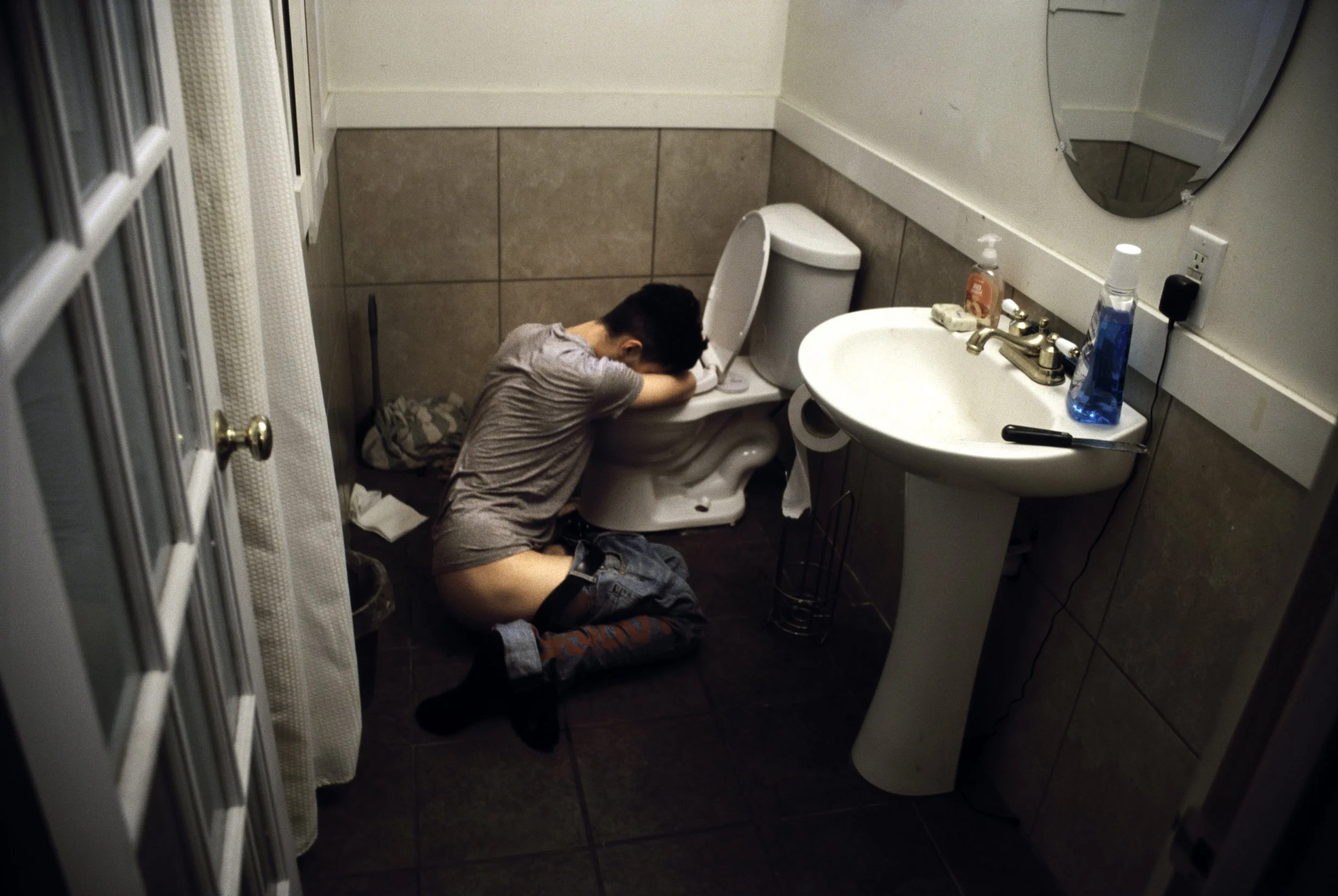
For example, I made a post for one of our members, Grady [Editor’s note: Grady Rajagopalan, whose series The American New Wave was featured on Composition]. In the series he submitted, one of the pictures showed a guy leaning over a toilet with his pants down. It looked like he had been out partying, was drunk and was throwing up. I was on a call with him while I was making the post, and I told him, "This is going to go nuclear, because this is going to be the cover shot." Then we posted it, and I watched all these new followers come to him from the post. I think it's at around two hundred thousand views, and that was just last week. A bunch of other pages also reposted it, which was cool, because it led to more people seeing the work and following him. That's just one example of something where I knew it was going to work.
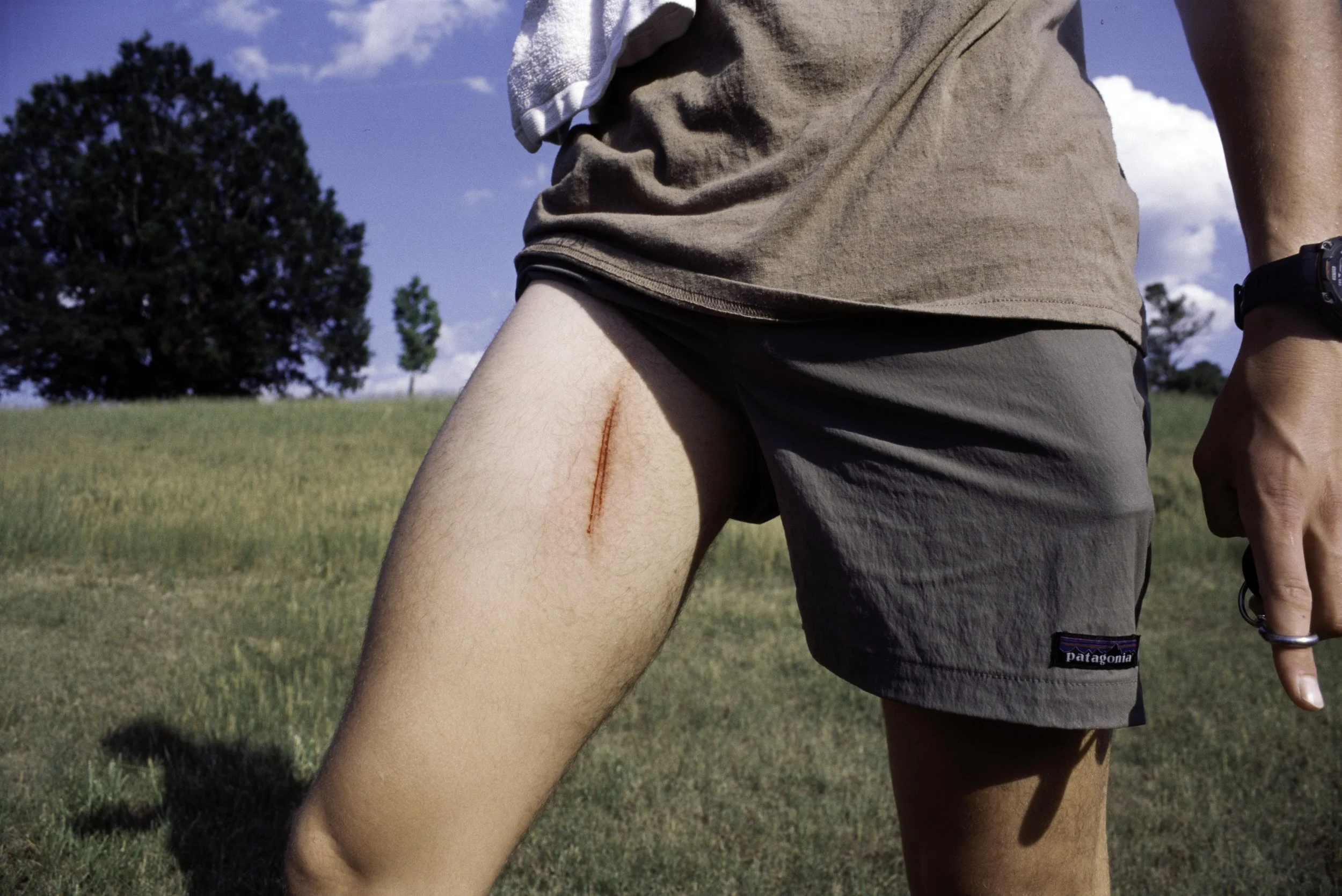
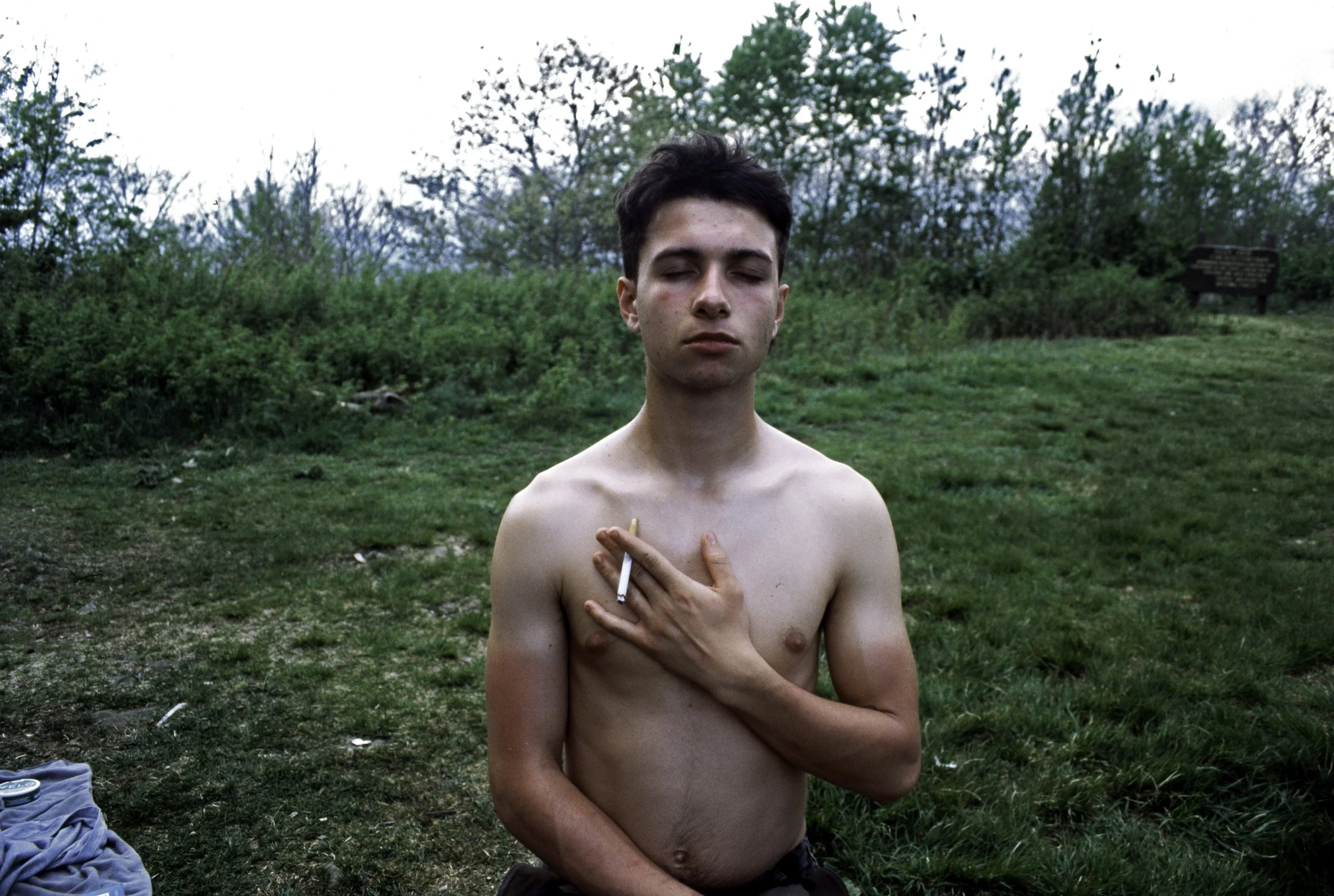
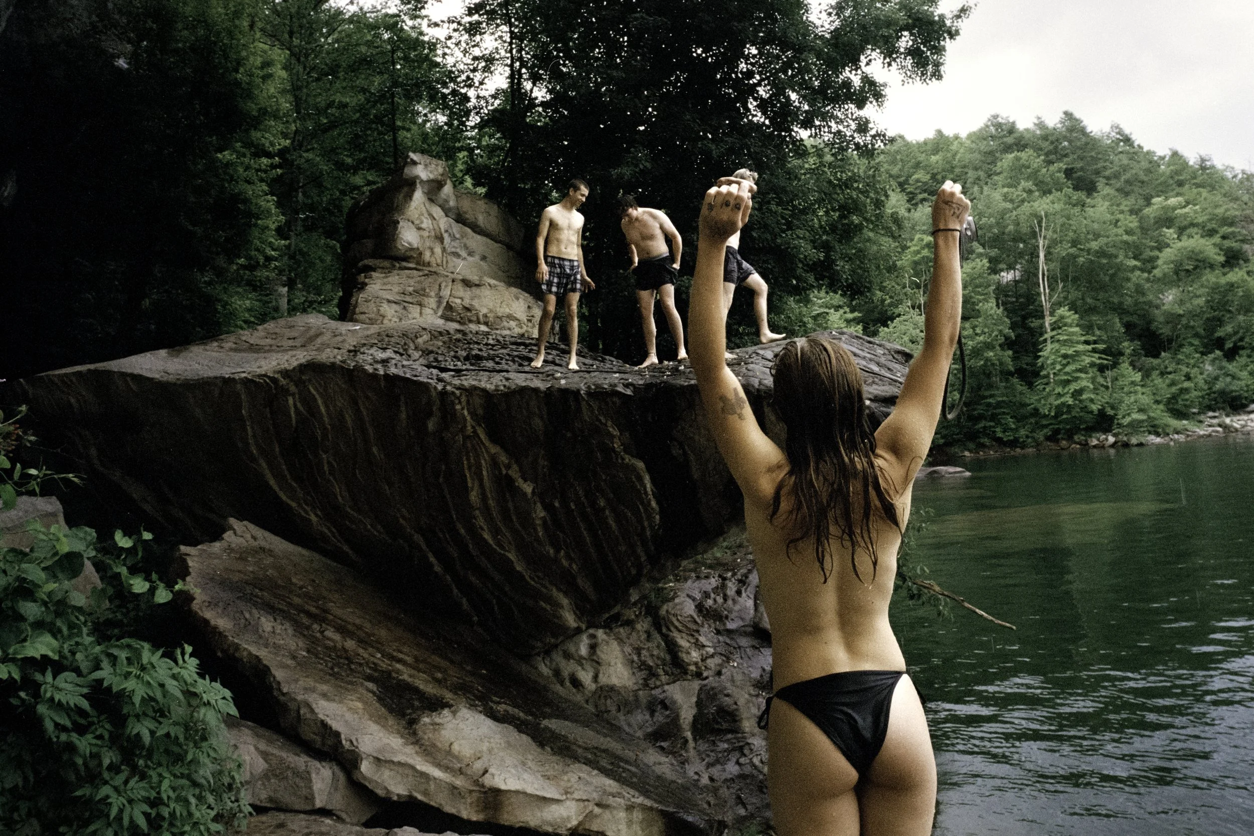
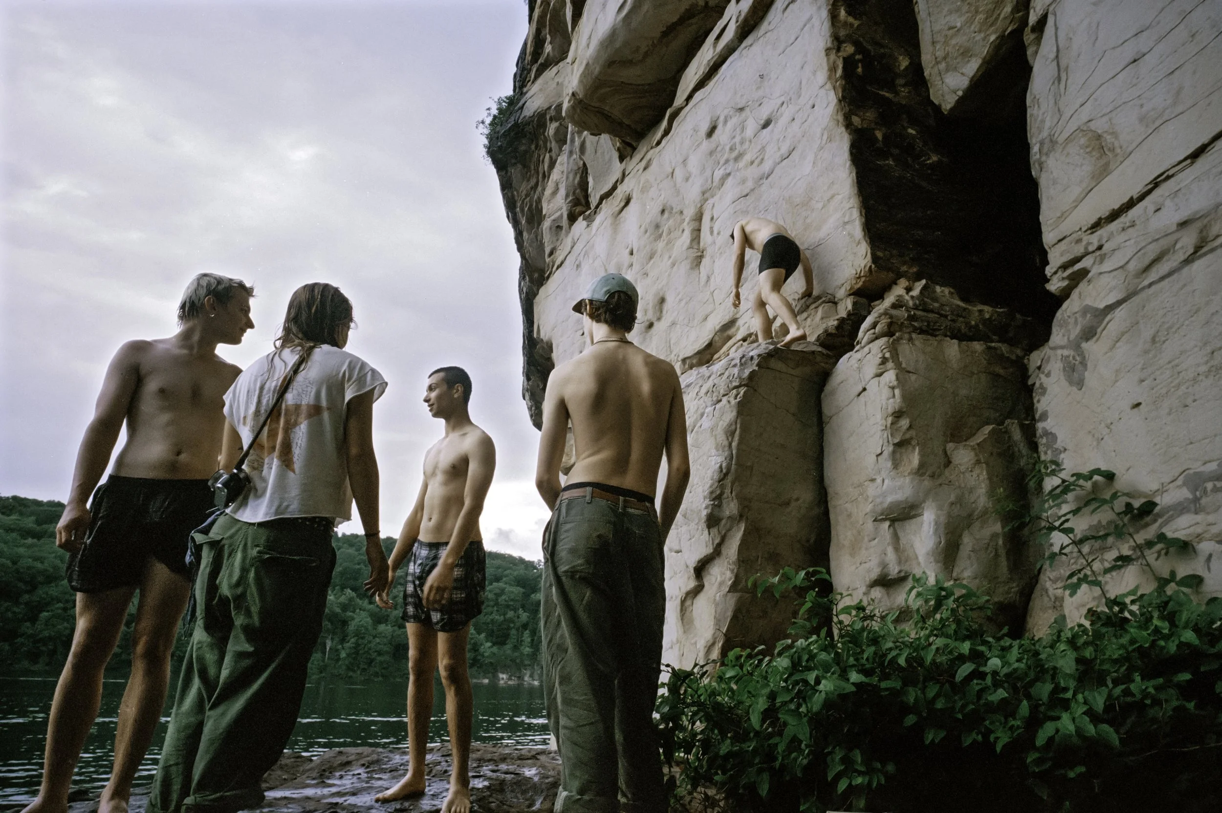
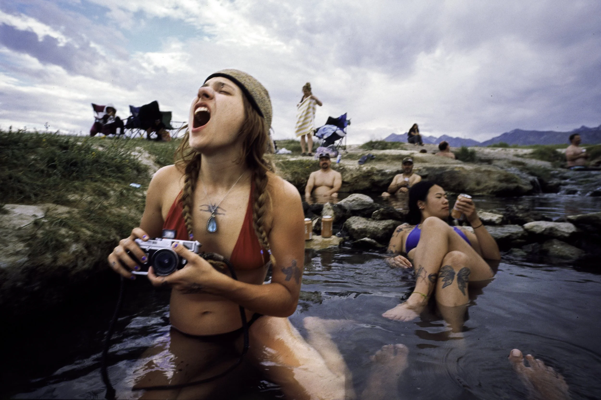
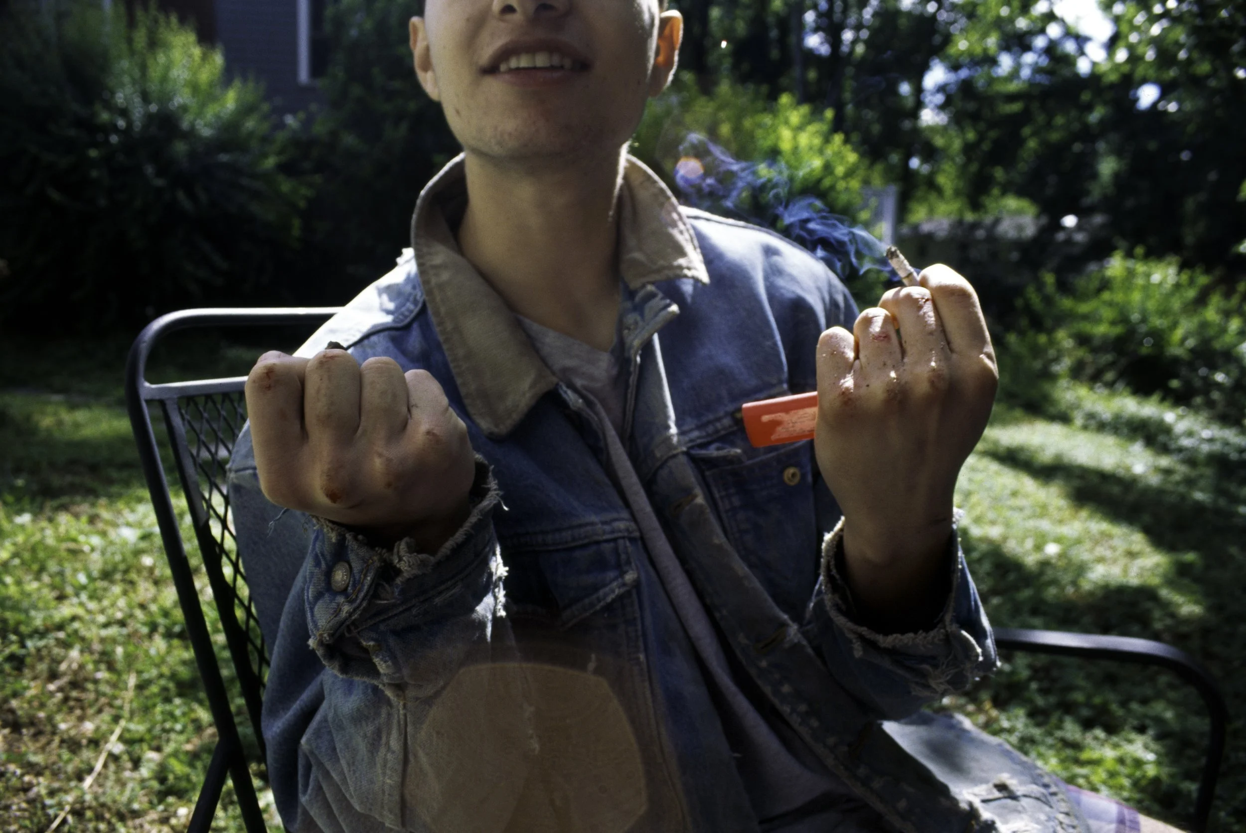
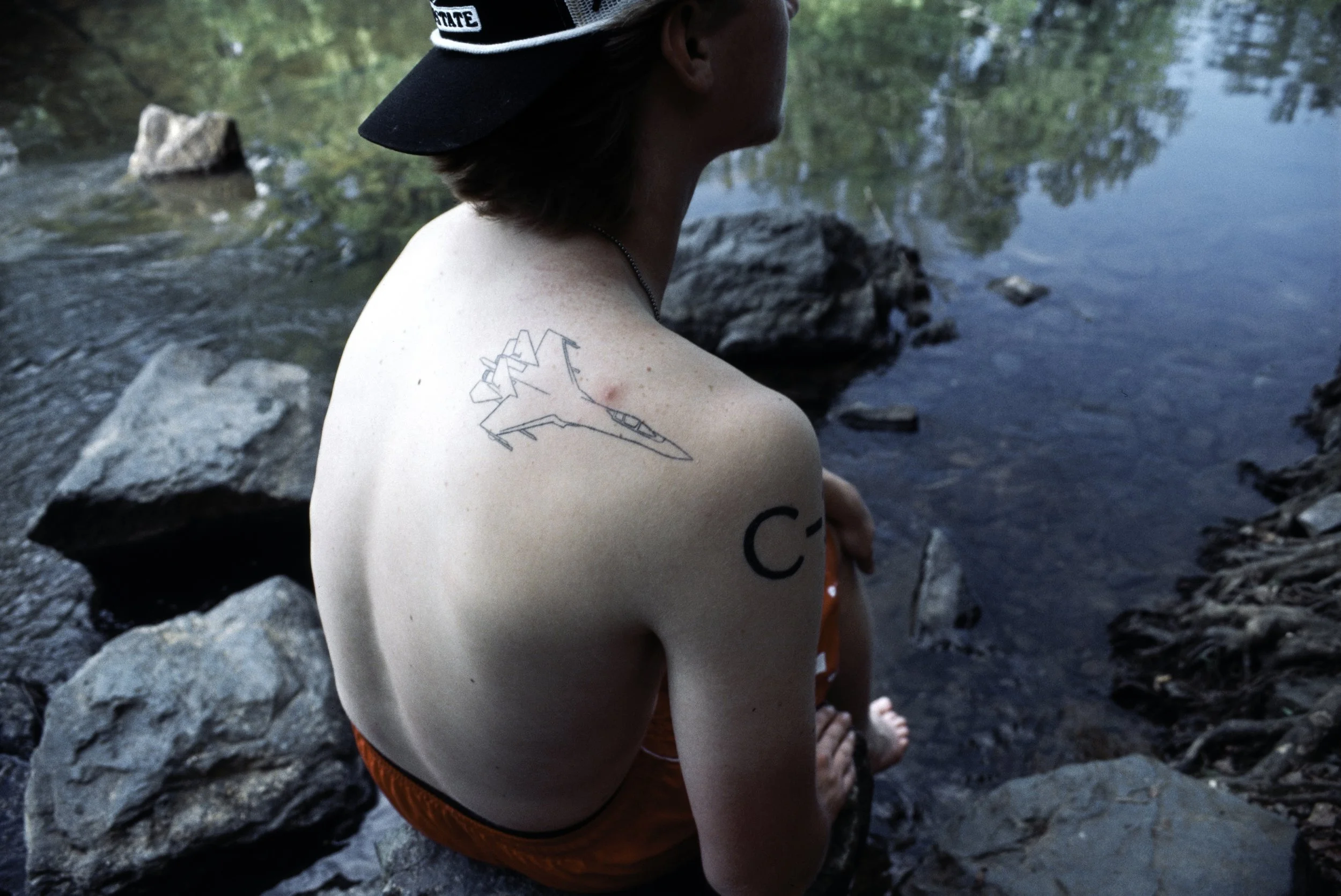
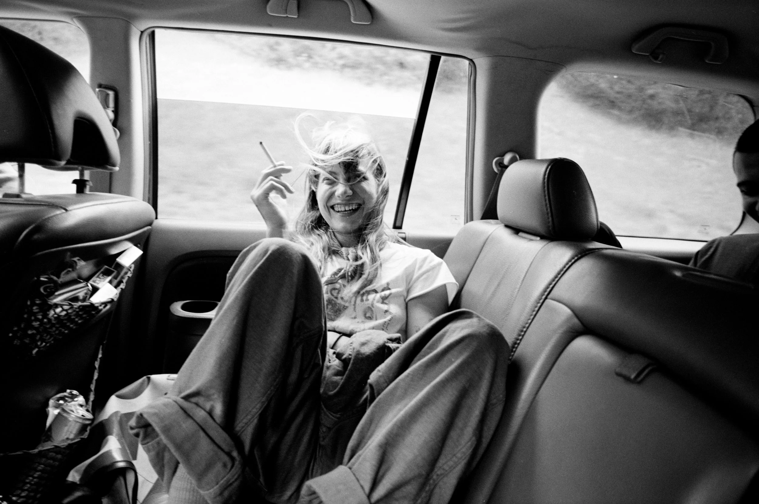
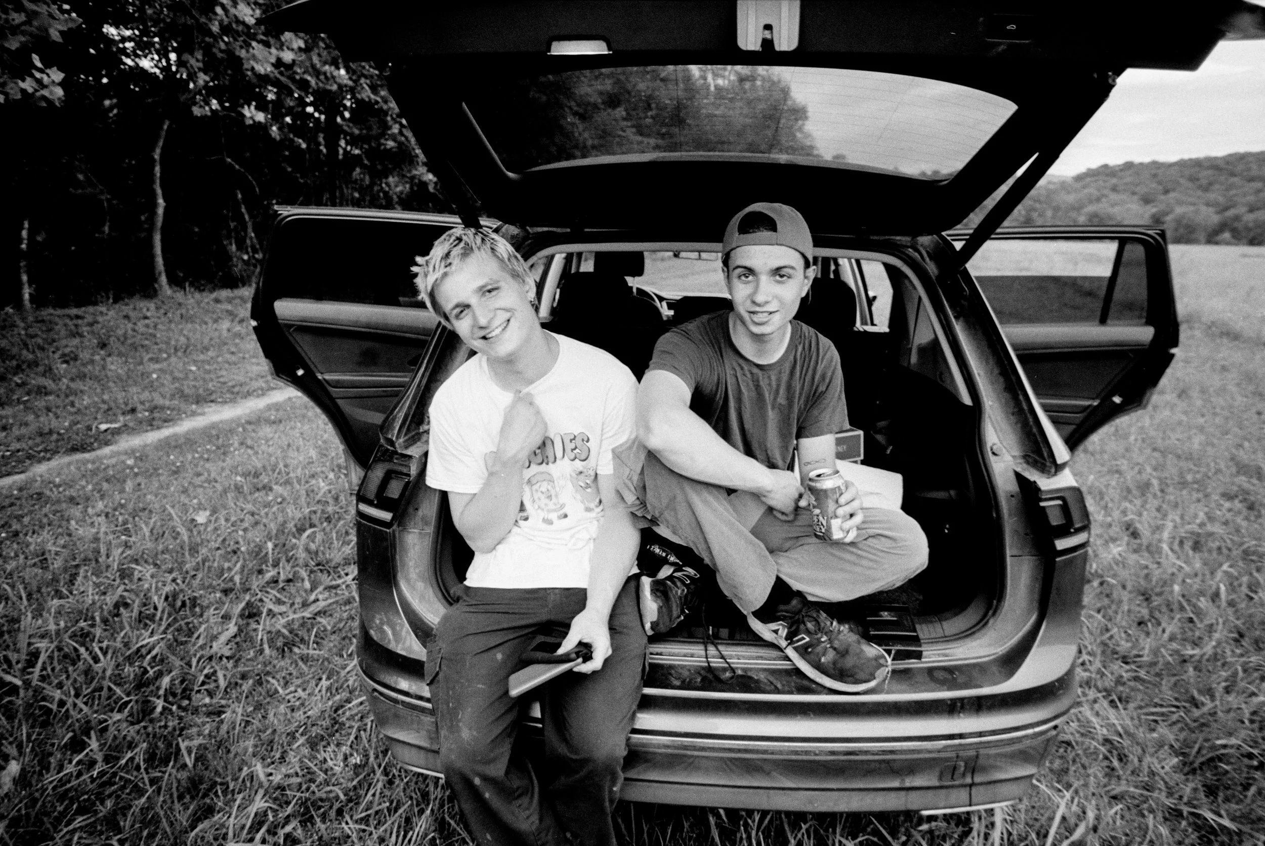
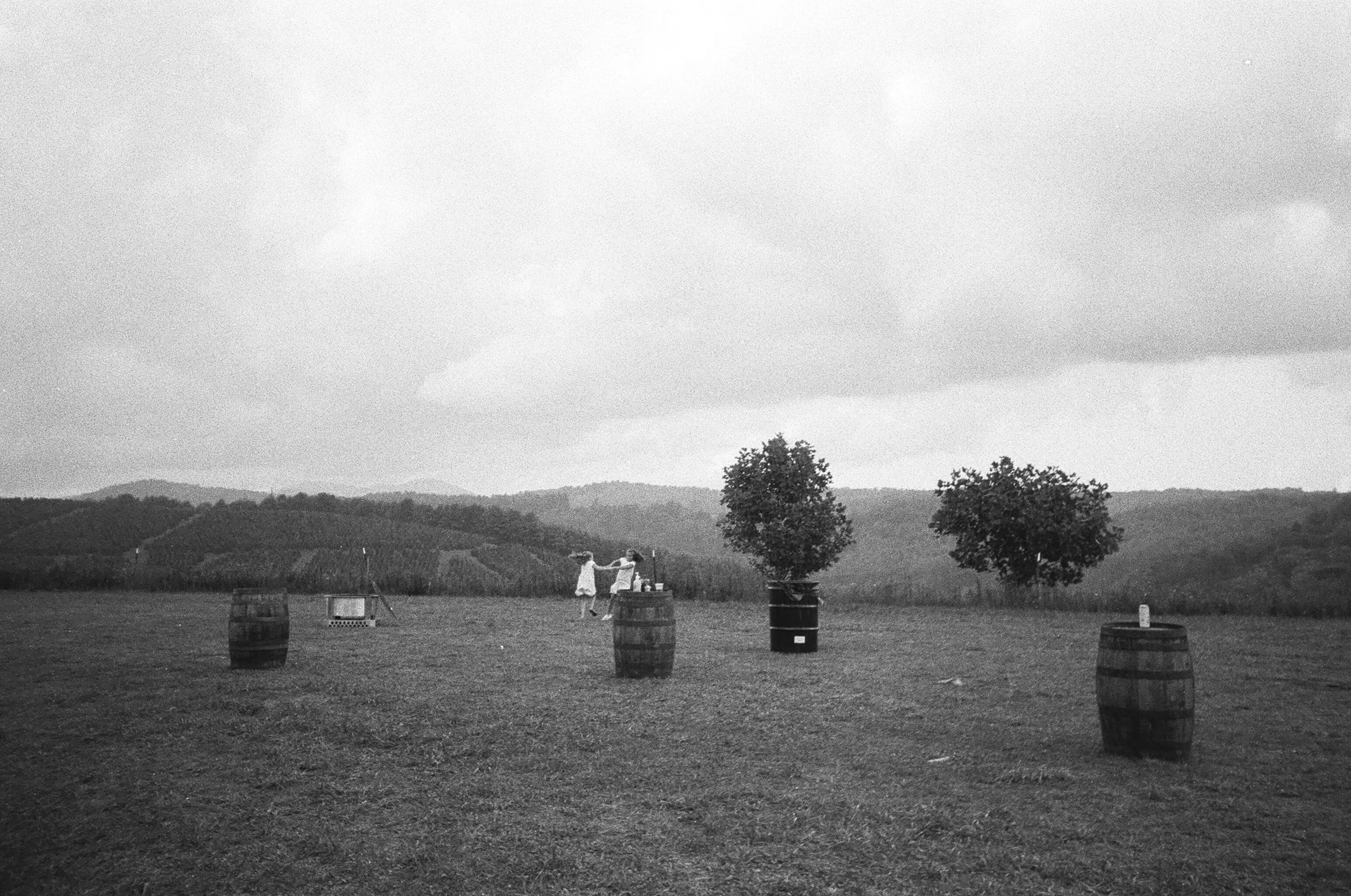
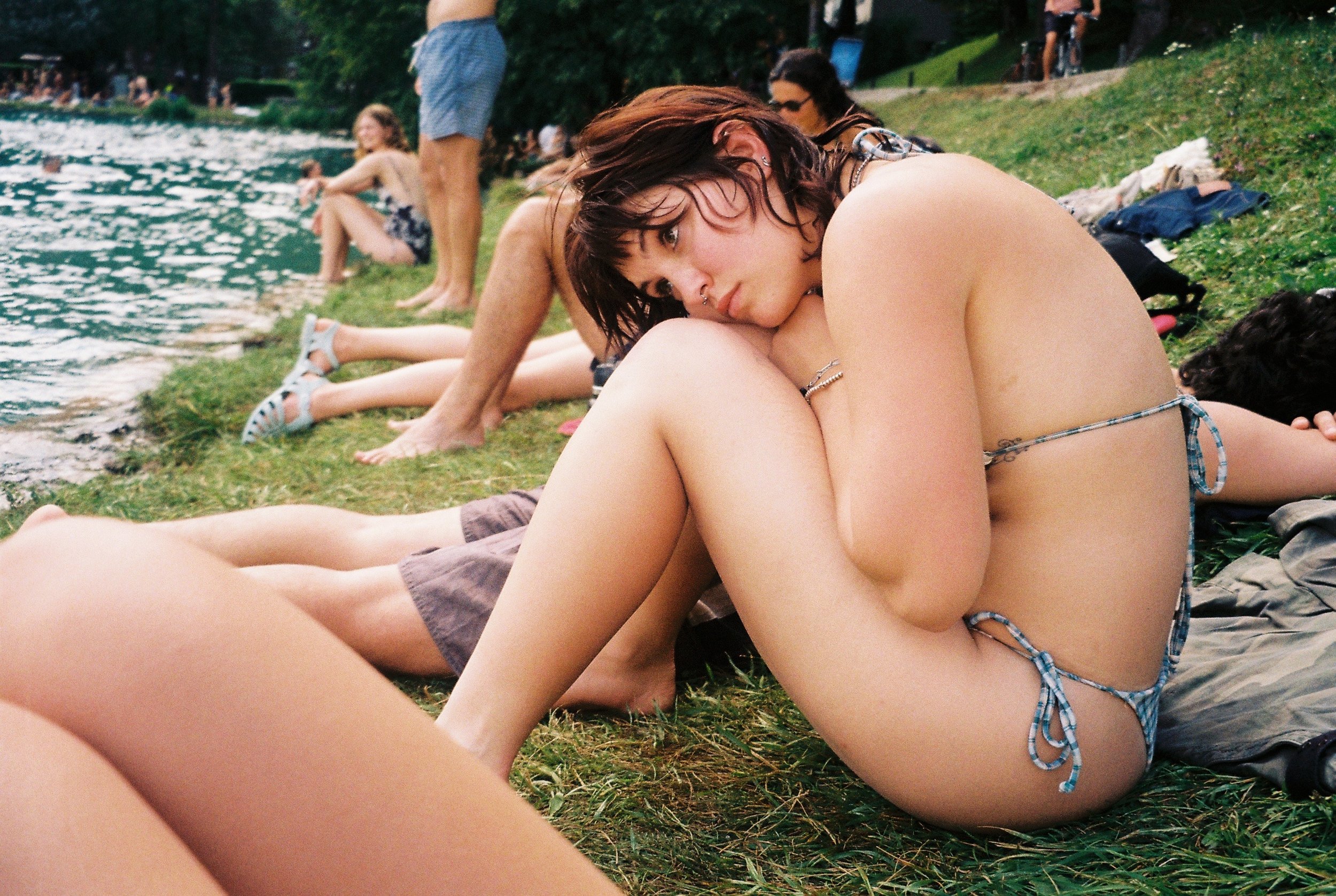
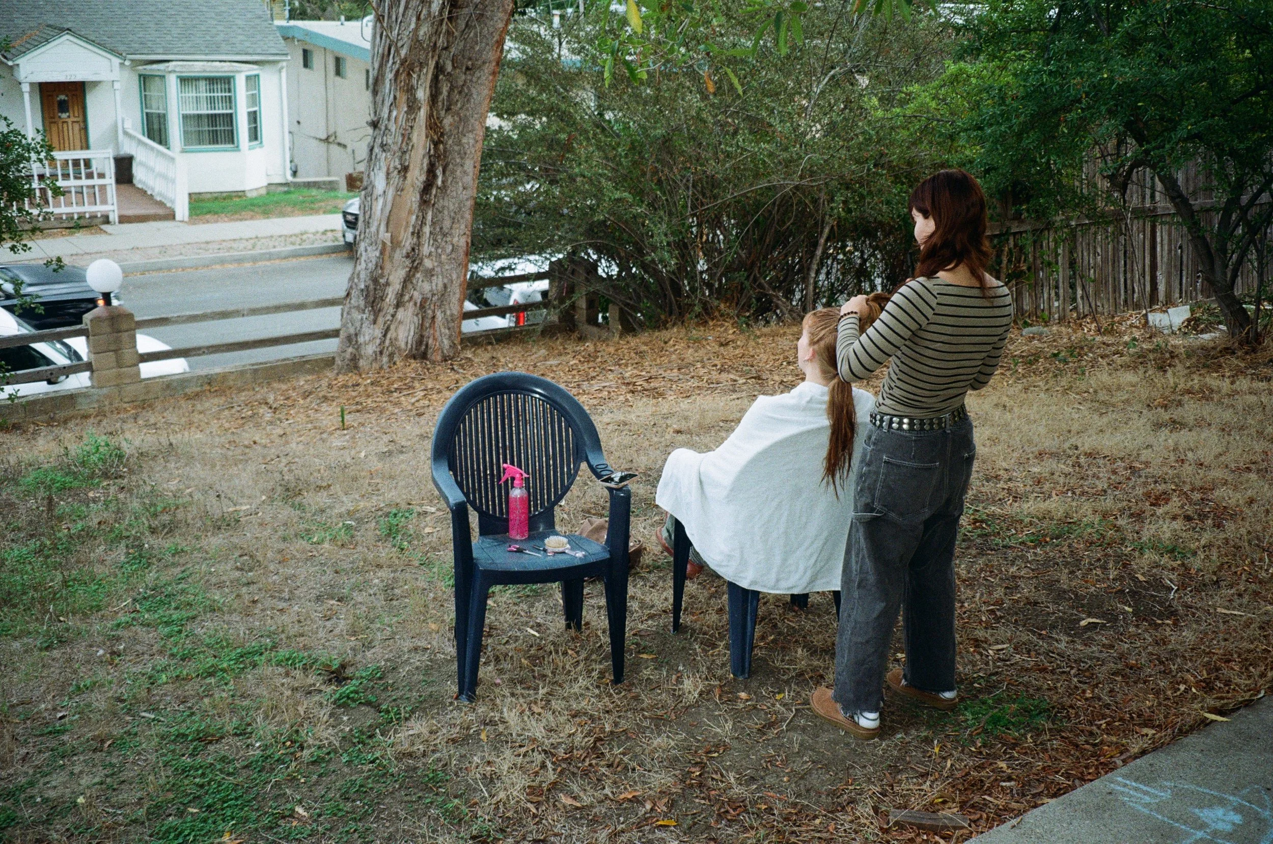
With other projects, I don't always have that. Often, it can just be an overall vibe. Right now, for example, I find that a lot of people are responding well to the Americana aesthetic. It's that coming-of-age look, similar to Justine Kurland's Girl Pictures. That kind of visual aesthetic is performing really well, and people seem drawn to it. I think that's partly because, especially with digital and social media and the way it all works, there's a kind of longing to be outside in nature.
It speaks to me because I'm from Tennessee, with its mountains, hills and open landscapes. I went to school there, and I feel a connection to it, because now I live in Miami, where there isn't a lot of that. Sure, if you go into the Everglades, you can get some of it, but there aren't many hills, and there isn't that vast nature. I think it's not only me. As I've grown up and moved out of Tennessee, a lot of other people in my age group have probably also moved to big cities, where that kind of landscape is less common. So when you see something that perfectly captures that feeling and that nostalgia, it reads well. It's definitely a recurring theme I've noticed. When I see a project that fits that visual aesthetic, I know it can be something people really enjoy seeing.
Do you think AI has had an impact on that? Maybe people are more interested in something that other people made?
I could definitely see that. I think that aesthetic is a very raw form of it. It's kids just having fun in a field or wherever, and it's captured on film. It's something a robot would never make, and even someone prompting a robot would probably not be inclined to make it. So it reads as very raw, which feels very much in contrast to the current landscape we're all in, where people are concerned about AI and often want to reject it. I think that is definitely a factor.
On those social media platforms, what's more important, the visuals or the story?
The visuals. I know that's probably not the best answer. I think people would want it to be the story and the concept and all these other things. But at the end of the day, it comes down to whether you present it in the best way.
Here's a quick example. When I get submissions, photographers will sometimes send darkroom prints with the borders still on them, and I always crop the borders out. It's not because I don't think they're cool. I think they add a very cool texture, and they look very pretty. But I know that because of how Instagram works, any space that isn't the actual image is going to decrease the possible performance of that image or that series. That's a very nuanced example of visuals versus story. The frames and the borders might tell the story better, and I definitely agree with that. But I also know that when it comes to performing on social media, the visual nature of the actual image is going to be the most important thing.
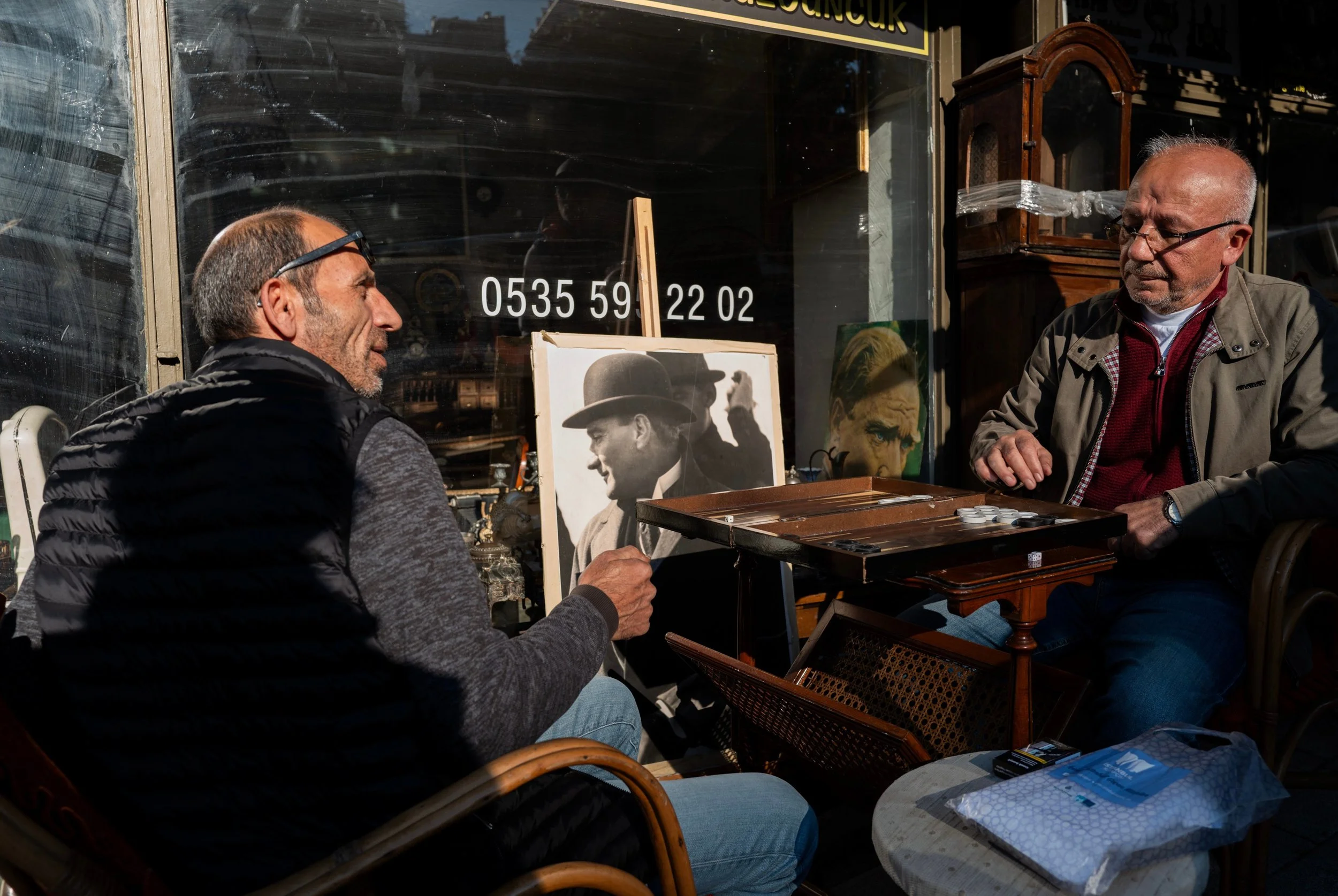
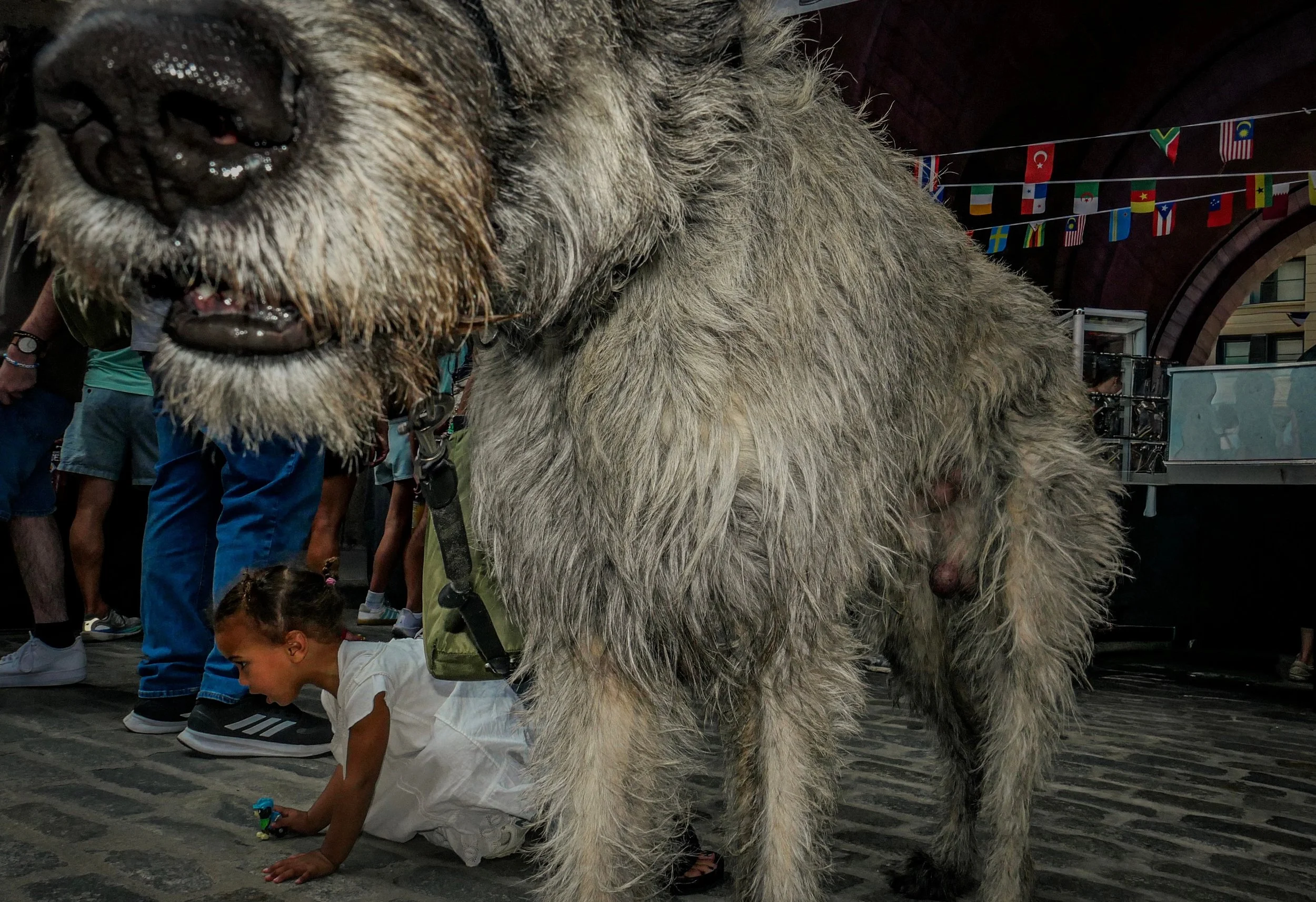
Do you also see a difference between color images and black and white ones? Is the audience more interested in one or the other?
For sure. Unfortunately, black and white imagery is just not as stimulating. People aren't going to have as strong an initial response to it as they would to a color image, especially a striking color image. A lot of the time, when people submit black and white work to me, I'll go back to them and ask, "Do you have some color work that we could include here?" That's just me keeping the audience in mind and wanting to put my best foot forward, for both the artist and myself, by presenting the work in the way that will lead to the best results.
Do you see a difference among the platforms you use? Does something that works on Instagram not work as well on Twitter, Substack or the other platforms where you post your content? Are there trends specific to each platform?
Yes, there are a ton of nuances in how all the different algorithms work. On Instagram, for example, I've found that the more pictures there are in a carousel, the better it performs. My theory is that Instagram wants people to stay on the platform for as long as possible. So if you give them twenty images in a carousel, that will keep the viewer on the platform longer than if there were only five or ten.
On TikTok, it's actually kind of the opposite. When you post a slideshow carousel, it looks at the data on how many slides the average viewer got through. What I found on TikTok was that anytime I posted more than five images, it always performed worse than when I posted five. So a photo series that might have twenty slides on Instagram might only get five on TikTok, because I'm trying to keep retention up. That's a small example of how, even though I would obviously like to show more of the work, getting that work in front of more people on a platform like TikTok means keeping it trimmed. That way, there's a higher likelihood that viewers will swipe through everything, and with five images, they're much more likely to.
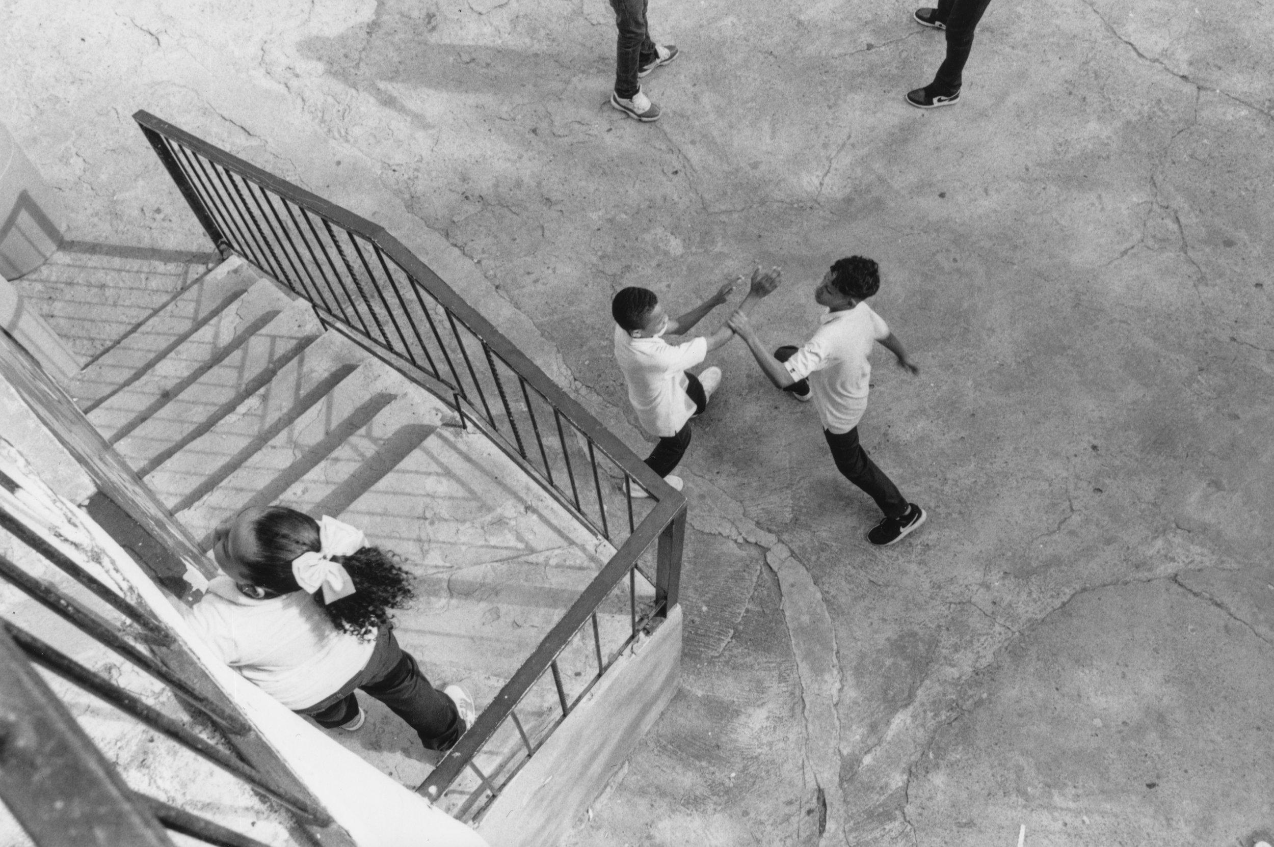
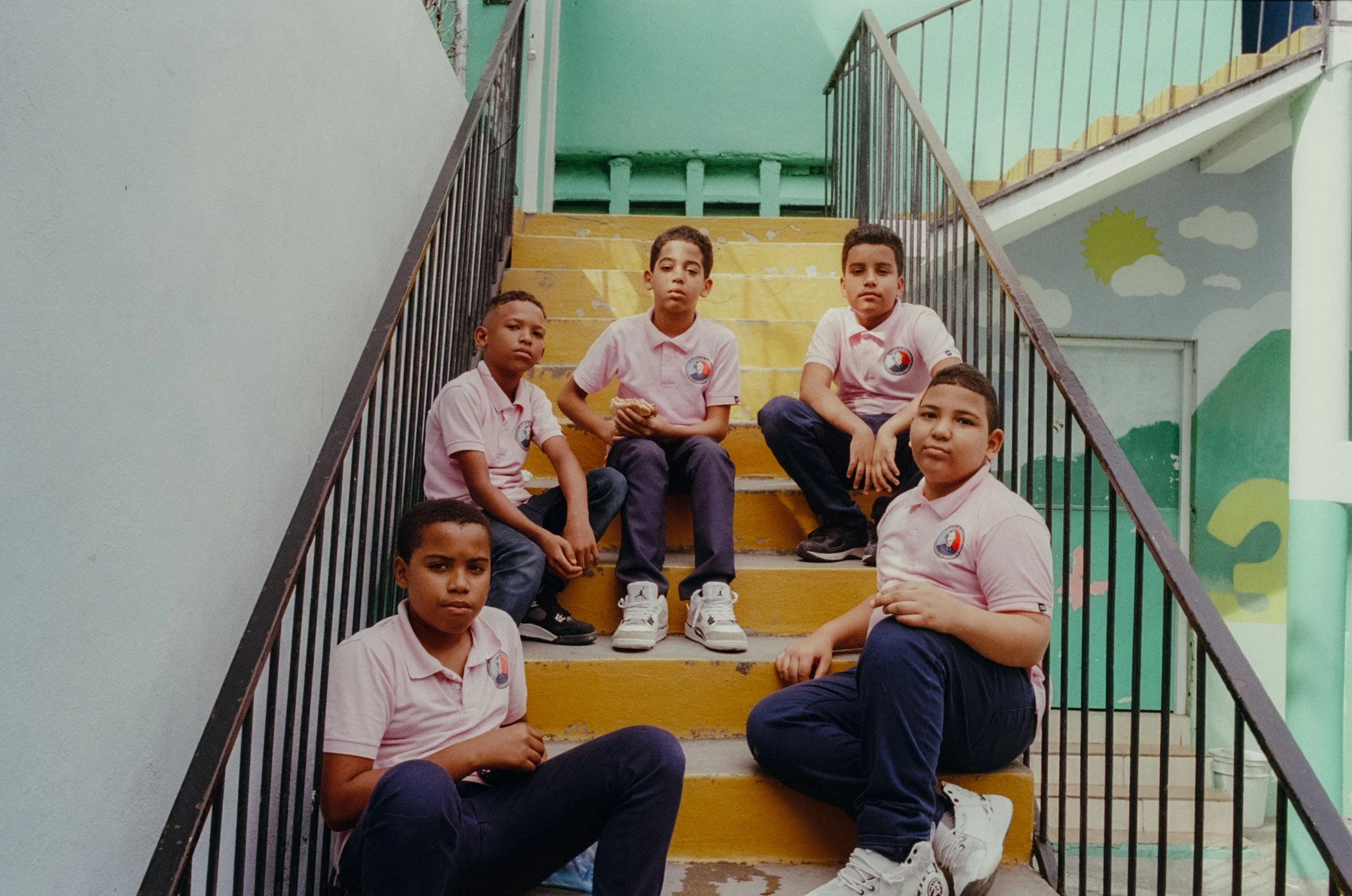
What is the best platform for photographers to present their photographs?
Instagram. I would be hesitant to say there will ever be a better platform than Instagram.
I see a lot of photographers on Substack, especially when I scroll the feed, and they're really talented artists. I think Substack is a great platform for discovering new artists and photographers. They have a really good way of showcasing work, and I think that's partly because of who's on Substack. Not everyone is on it the way everyone is on Instagram. On Substack, it's a little more intentional and a little more thoughtful, so the people presenting content there tend to be more artistically inclined.
But with the sheer number of people on Instagram, I can't imagine a better opportunity for photographers specifically. You've got two billion people on a photo app. That seems pretty crazy to me. I actually wrote about this in an article I put out last week about the algorithm. I see a lot of people complaining about it, and I understand why. It can be a very frustrating thing. But at the end of the day, you have an application that started as a photo app, with two billion people on it. Just think of it as two billion people hanging out in a gallery where they could possibly see your work. I don't see a world in which there's ever a bigger platform than that.
When it comes to getting traction and getting your work in front of new people, Substack can be great. Threads is great as well. Twitter, or X, is not the best. But overall, I think it's always going to be Instagram. I've found that myself, too, because I've been posting on all of these platforms for years now. I think photography, and images in general, especially in the carousel format, are presented best that way, and Instagram is kind of the king there.
What I like about Instagram is that followers actually matter. On a lot of other platforms, followers don't seem to matter as much, especially on TikTok. Instagram seems to have a really good balance. It will show your work to new people who don't follow you, but it will also show it to your followers. TikTok doesn't really show your work to your followers, so gaining a follower doesn't mean much, because you don't know if they'll ever see your work again.
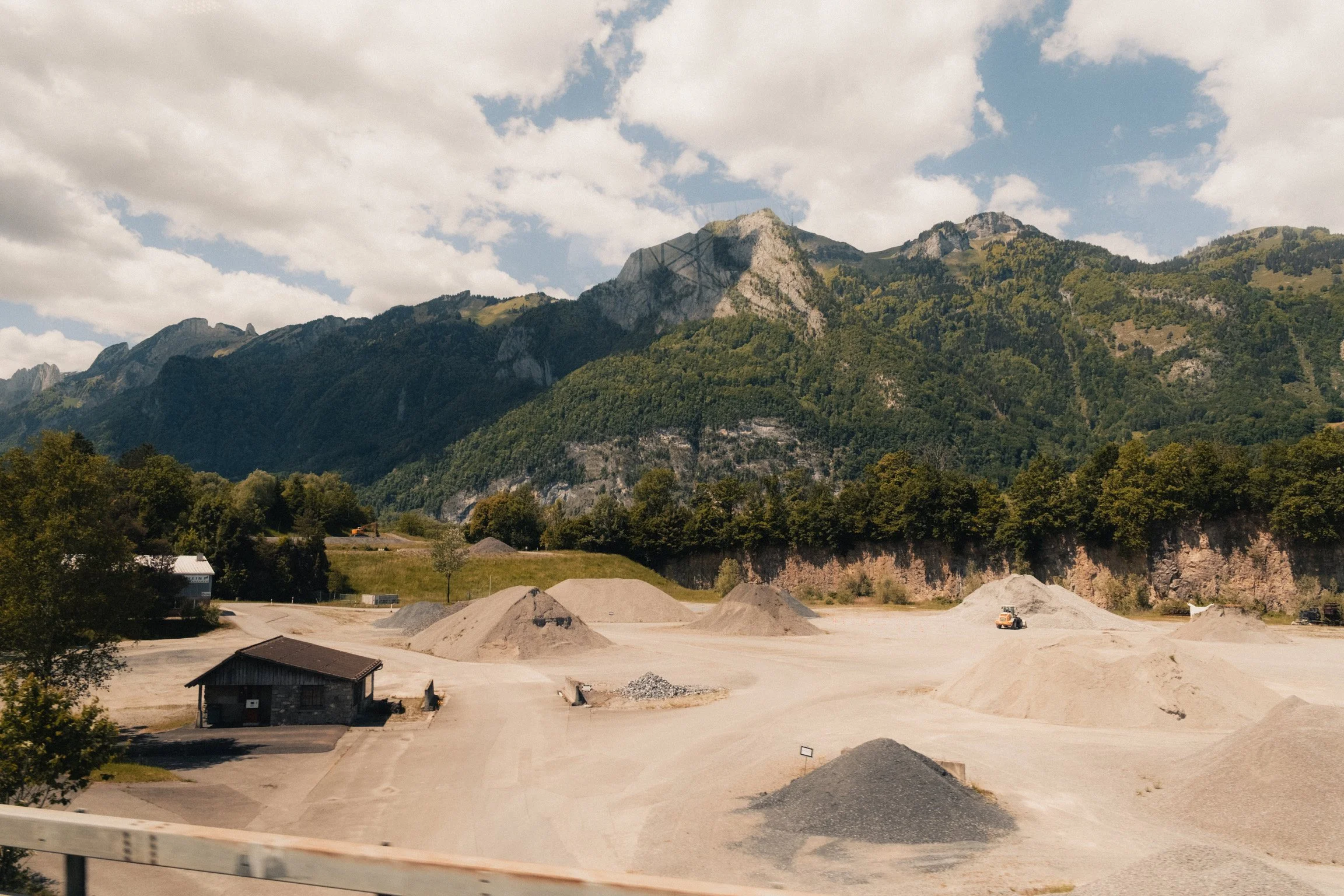
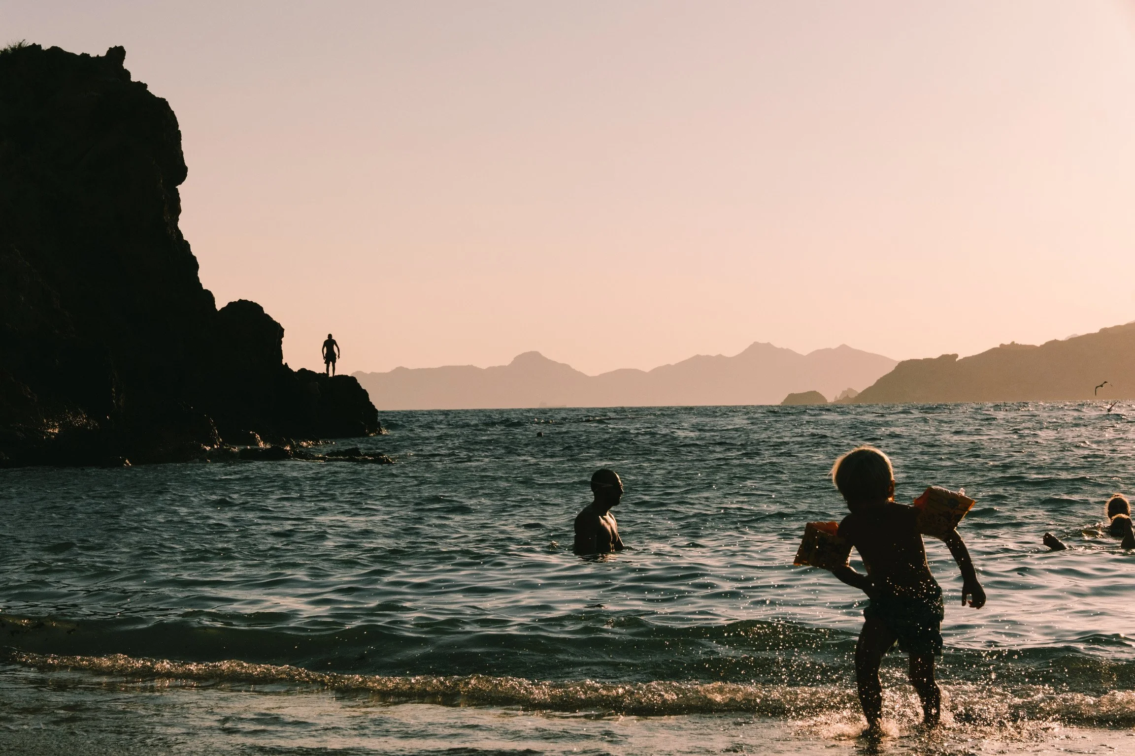
You said you can recognize when something will perform well on Instagram. What do you recognize when you see that something will not perform? What's missing? Is it a sense of "I've seen this a million times before," or is it the quality of the work?
I actually don't think that something being familiar will hurt it. If anything, that's kind of better, because the algorithms have data showing that a similar visual style performs well with a certain audience, so they show it to that audience.
In terms of what's missing, the obvious one is quality. If a work just isn't compositionally well done, that can be a factor. Beyond that, it might simply not be very interesting, at least visually. That can always keep it from performing well. It's hard to define, though, because what I might not find interesting, other people might. Taste is subjective, of course, and art is subjective.
From your experience, has it ever happened that you posted something and were surprised that it didn't perform, or that it performed better than you expected?
That happens every day. Sometimes I think, this is it. This is going to go viral. I'm going to make this guy famous. Other times, it's not like that at all. I can predict it a little bit. I'd say I have a sixty or seventy percent success rate at predicting whether something will perform decently. But I'm always surprised. Sometimes I'll post something and think, this might get thirty thousand views, and I'll be happy with that. Then it gets two hundred thousand. Other times, I'll think, this is going to go nuclear, everyone's going to love it, and then it just doesn't. It's hard, because you do get better at predicting. I'm better at it than I once was. But there's still no science to it. It's all an educated guess.
Do you think this influences the art itself, with people optimizing for these platforms? Maybe they take more vertical images because they want to use the whole space of the post. How do you see that? Do you ever look at something and think, this was shot for Instagram?
I think it's a balance. In that article, I wrote about keeping the platforms in mind, and I used an analogy. If you're a painter doing a gallery show, you're going to make sure that the canvas is level, that there aren't scuffs all over the wall, that the lighting is good and that the artist statement is positioned well next to the work, not written on a Post-it note you stuck up there. I think that's the best way to describe social media platforms. The way you present the work is a big part of it.
If you walked into a gallery and it looked like whoever hung the work just threw it up there and said, "Go look at it," it wouldn't be as compelling. But if it's presented well, it's more compelling. That doesn't change whether the piece in that gallery is well-made art, but it does change how people perceive it. That's how I like to think about the algorithm as well.
But it is a balance. If you're making photography, an Instagram Reel that's just a slideshow isn't necessarily going to be the best way to present it. A carousel on Instagram is probably the best way. But if you also wanted to make a Reel, maybe you could talk about the background or history of the project, what led you to make it, or share some behind-the-scenes material. That could also be interesting. So you have to keep the platforms in mind. And yes, there are certain artists who purely optimize for the algorithm, and their work isn't that amazing. They'll gain followers, and maybe they'll even become very successful artists one day.
At the same time, I think the actual craft and technical ability of the artist is the most important thing. That's about eighty percent of it, and the other twenty percent is presentation. I always tell people that if you're a street photographer, for example, and you live somewhere with people on the street, you have practically infinite content. You can go out and take thirty shots a day, choose the five to ten that are most compelling, put a little story behind them and post them as an Instagram carousel. You can do that every day. I think that's a much better approach than taking thirty shots, picking the one good one and posting it on Instagram with a bunch of hashtags.
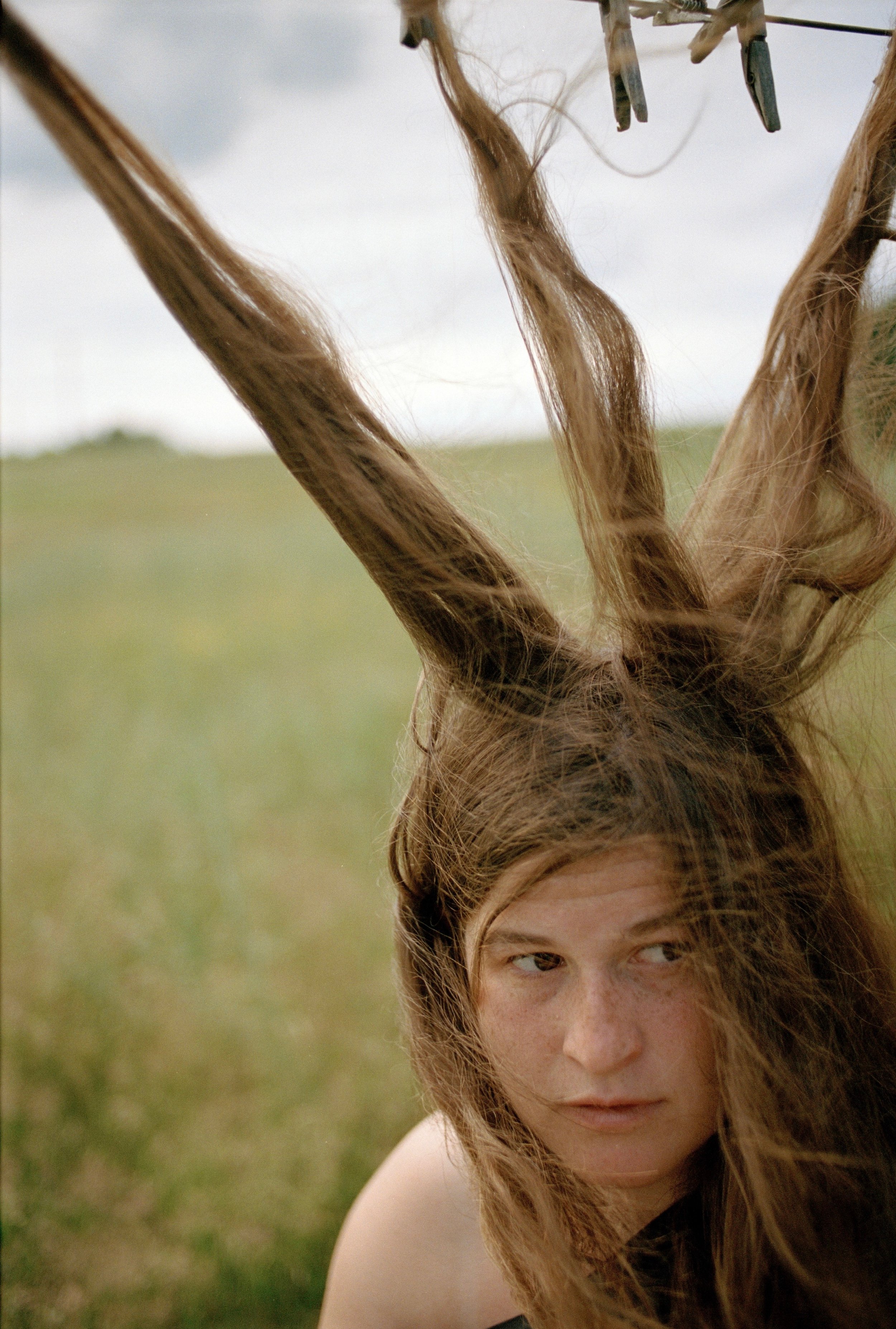
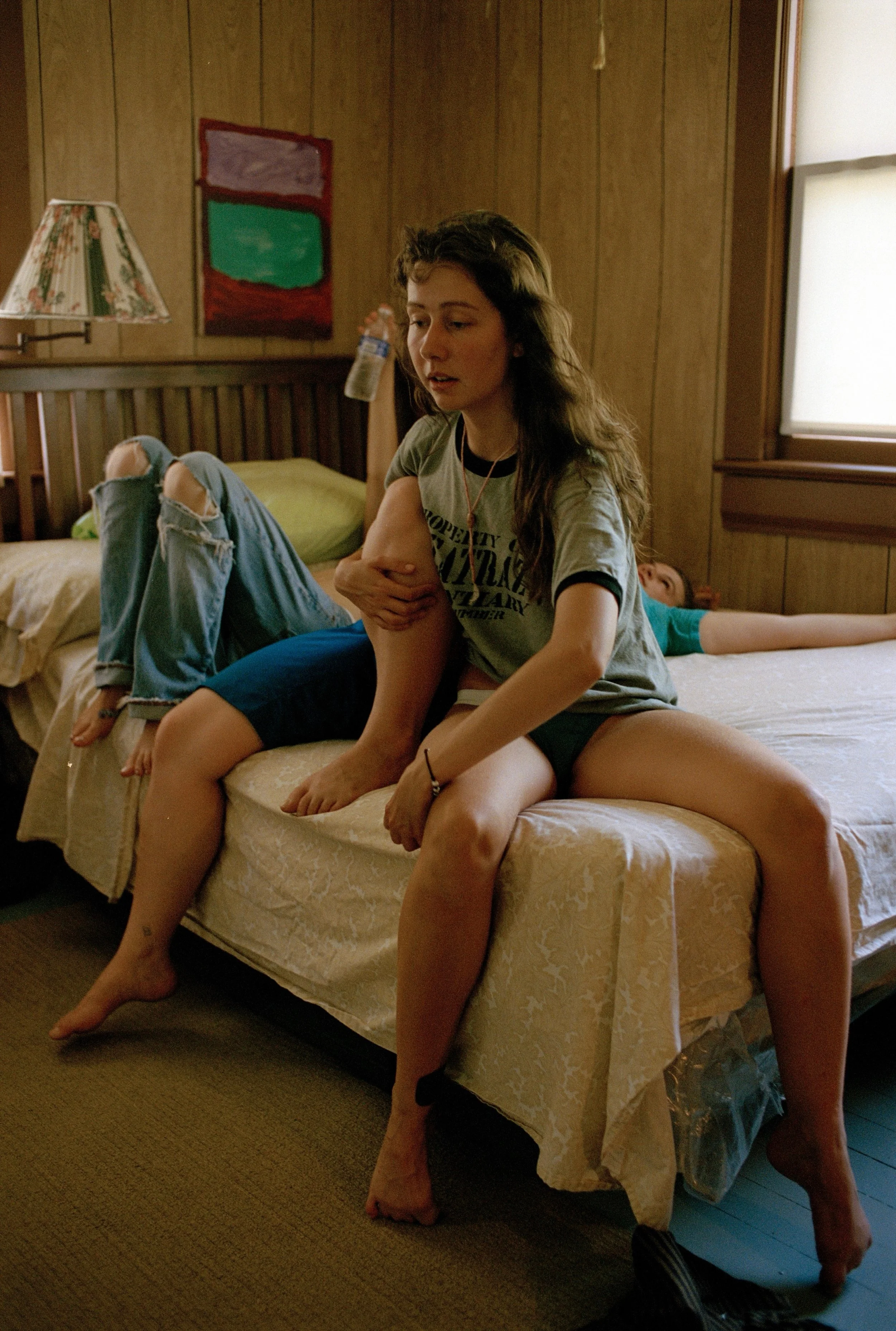
I've been thinking lately that some photographs make an immediate impression, while others become more interesting the longer we look at them, or even over time. What do you think separates a photograph that rewards repeated viewing from one that simply makes a strong first impression?
That's tough, because I'm not someone who comes back to things often unless I'm referencing them in some way. I think that's probably the biggest difference between something I just look at and maybe post, and something I'll bring up in conversation. Maybe I'm talking with an artist, a photographer or someone at a brand, and I use it as a reference to make a point. The artists and photographers whose projects I find myself referencing are the ones I'd say are the most referenceable.
Unfortunately, when I'm referencing things, it's usually a certain style and whoever pioneered it. Justine Kurland is a great example. I'm thinking of that visual style and the whole of Girl Pictures, the way she photographed the girls playing around in the fall, in the mountains. That visual aesthetic is what I'll reference before I mention other photographers who replicate the style or have a similar look. But that's just because it's the most widely known. So I think that's what gets me to come back to something in a way I otherwise wouldn't. The challenge is that it isn't really based on the work itself. It's based more on its cultural relevance.
Where do you see the difference between someone copying a work and someone referencing it or being inspired by it? In photography, there are people who defined their own style, say Martin Parr or Saul Leiter. Then someone posts images like theirs, and very often you'll see comments like, "Wow, this is such a Leiter." When you come across something like that, do you sometimes think, this is really good inspiration, and other times, this is just a copy of their work?
I think it has to do with how much it's iterated upon. On Instagram, I see kids all the time who just flip their canvas around and it looks like a Basquiat painting. And it looks exactly like a Basquiat painting. There's no difference. It's not that they took a little inspiration from Basquiat and I can see it. It looks like a carbon copy. I think that's the biggest difference.
Obviously, with art, you're going to use references and take inspiration from people who have done it before. I think that's great. I think you should, and it's smart to do so, especially if you want your work to be received well. If someone sees your work and it makes them feel the same way Martin Parr's images made them feel, then you're doing something right. But when it looks literally like Martin Parr took it, with nothing to differentiate it and no iteration, when it's the same thing, that's where it starts to feel derivative. It doesn't feel like an expansion, or like your own style or twist on it.
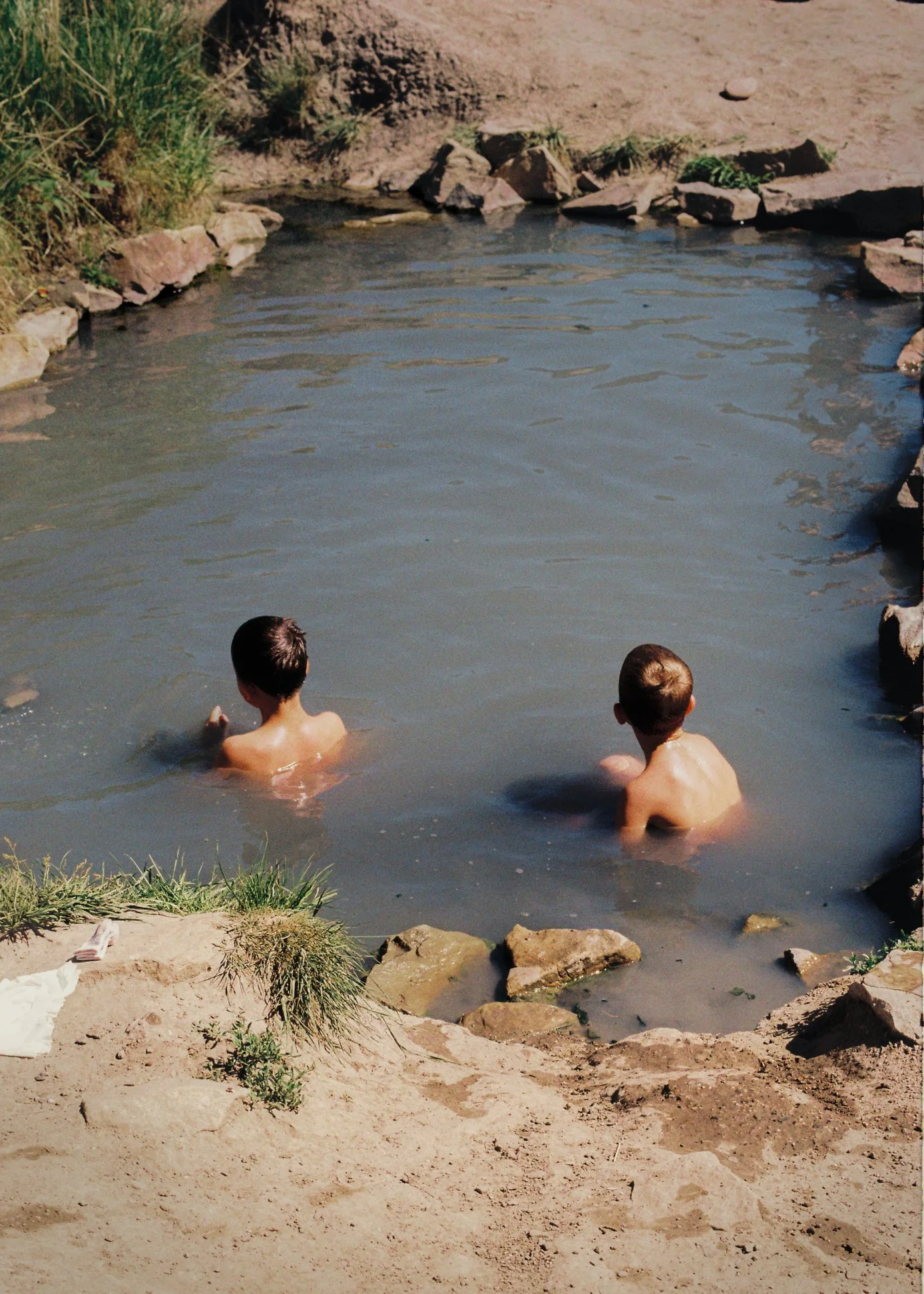
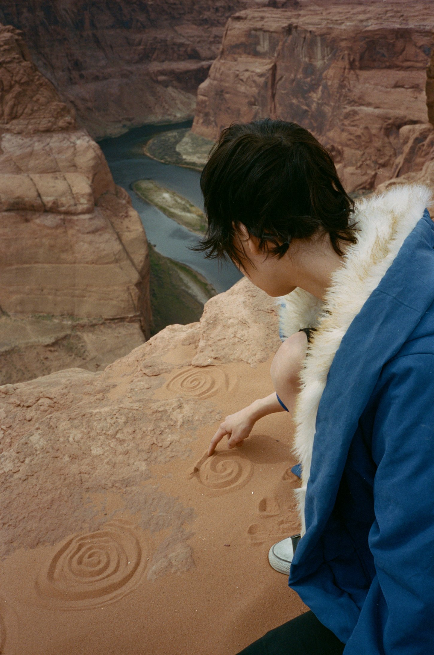
When photographers submit their work, do you sometimes find several strong individual photographs but struggle to understand what connects them? What tells you that you're looking at a meaningful body of work rather than simply a collection of good images?
I don't actually have a strong preference. One thing I've been able to do as Composition has grown is look at someone and say, this person doesn't necessarily have a super cohesive project with a really interesting concept, one they worked on for years and that I know will be well received if I present it. Instead, I can look at their overall body of work, see that there are some good shots there, and try to piece a story together myself.
So I do see that, but I don't think it makes the work worse in any way, or less cohesive. There's something to be said for looking at someone's overall body of work, taking bits and pieces from it and creating something that presents well. That can stand next to a project that's super thought out and carefully curated, one someone spent years on. Yes, obviously a project that's consistent in its concept and has expanded and evolved over ten years will usually be received better than a selection from someone's overall body of work. But I don't think that necessarily makes it better.
I like the idea of showcasing people's work and showing their evolution, and stringing together a little visual consistency so it becomes a nice portfolio piece for the artist, in case they ever want to present it to people beyond Instagram.
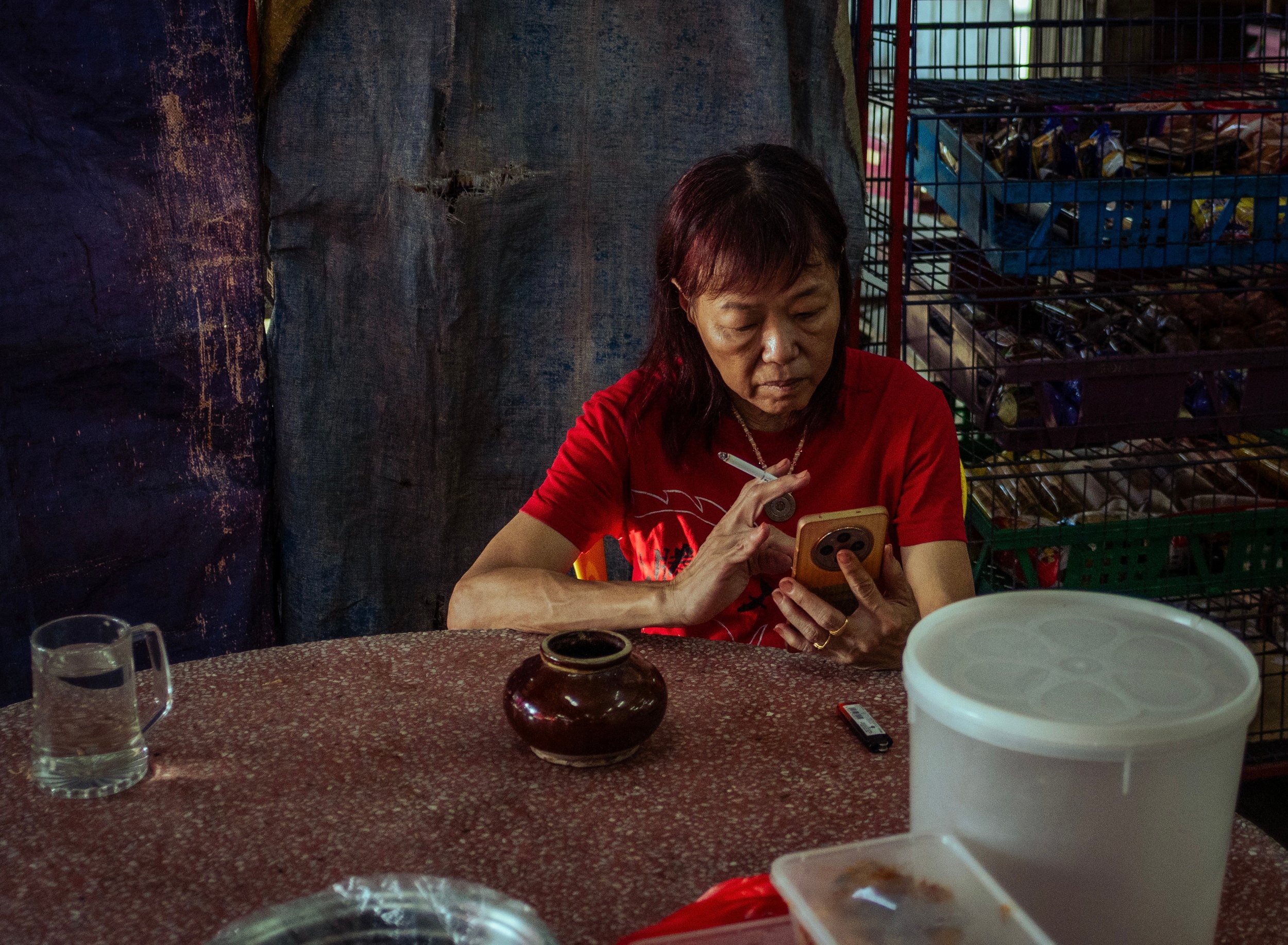
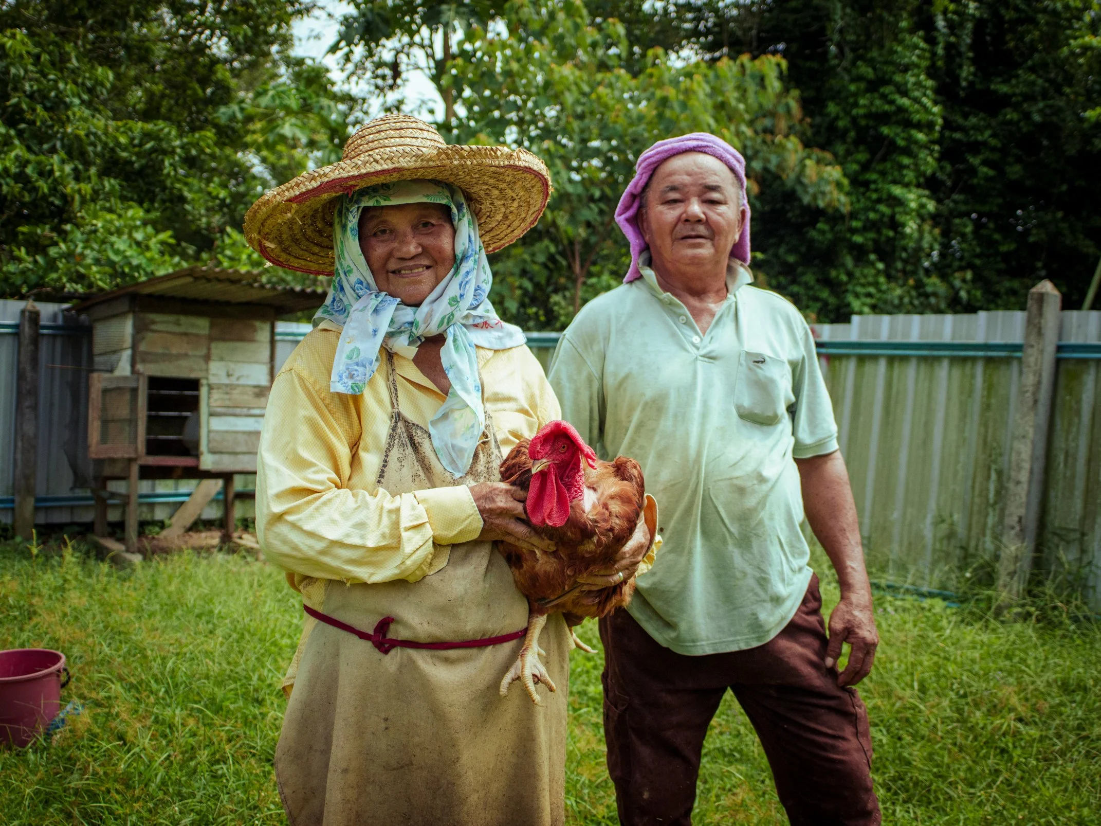
In your article "You're Too Close to Your Own Work," if I remember correctly, you discuss how difficult it can be to recognize what needs to be removed from something you've created. When you look at another photographer's work, what can you recognize that the photographer might struggle to see?
I think it's really difficult, as an artist, to look at your own work through a third-party lens. Because I've done it so much at this point, I can see what's working and what isn't, based on intuition. In the article, I recommend that people send their work to a third party and have them take a look and say what's working best and what isn't.
That's also a big part of what I do with submissions. People submit a ton of work, and I pick what I think is the best and the best way to present it. I can serve as that third-party editor for a lot of the artists and photographers in the community, which is really cool and really exciting. I really enjoy that part of it.
It's also something I would recommend everyone do. Always get a second opinion, but from someone you trust. That's the crucial part. It has to be someone with good taste and some level of understanding of art, of the landscape and of what they might feel drawn to. I wouldn't necessarily ask my dad to look over my work, because he doesn't know anything about art. But I have plenty of friends whose second opinion I would ask for. I don't produce a lot of work myself, but when I write an article, for example, I send it to friends who are good writers and whose opinion I respect. I ask them what's working and what's not, and then I take that input and make the piece cohesive.
Is social media a good place for that kind of feedback? Or can it give you the wrong ideas? You publish a bunch of work, some of it gets liked and some of it doesn't, and then people might start optimizing for what gets liked. How can you use it usefully as a third eye?
I think social media is a good place for that, because the engagement metrics will tell you what people are drawn to. At the same time, social media can also be the worst place for it. There have been times when I've posted or written something and people have vehemently disagreed with my opinion. But that doesn't mean my opinion is wrong. It's not the be-all and end-all.
I do think it's a nice gut check, or a touch point. If you post a bunch of work and one post does much better than the others, look at why that is. But if one post does a lot better than the others because everyone hates it, steer in the other direction. You have to make sure you're taking in the right data and feedback in order to properly iterate on your practice.
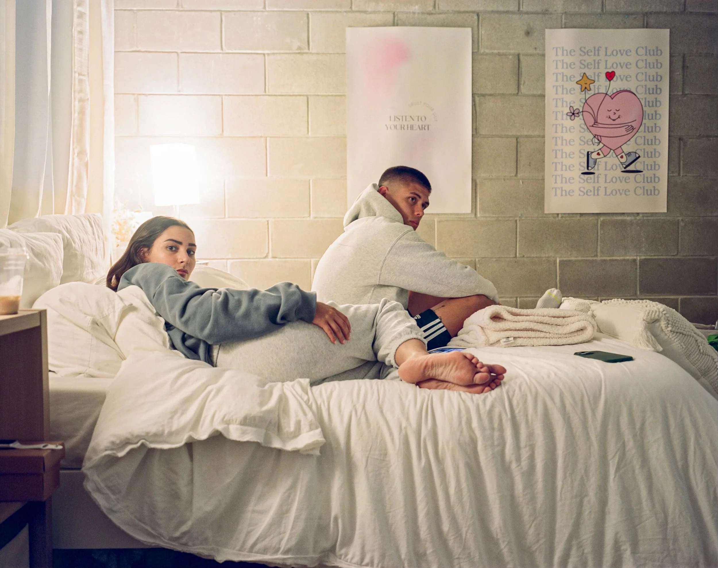
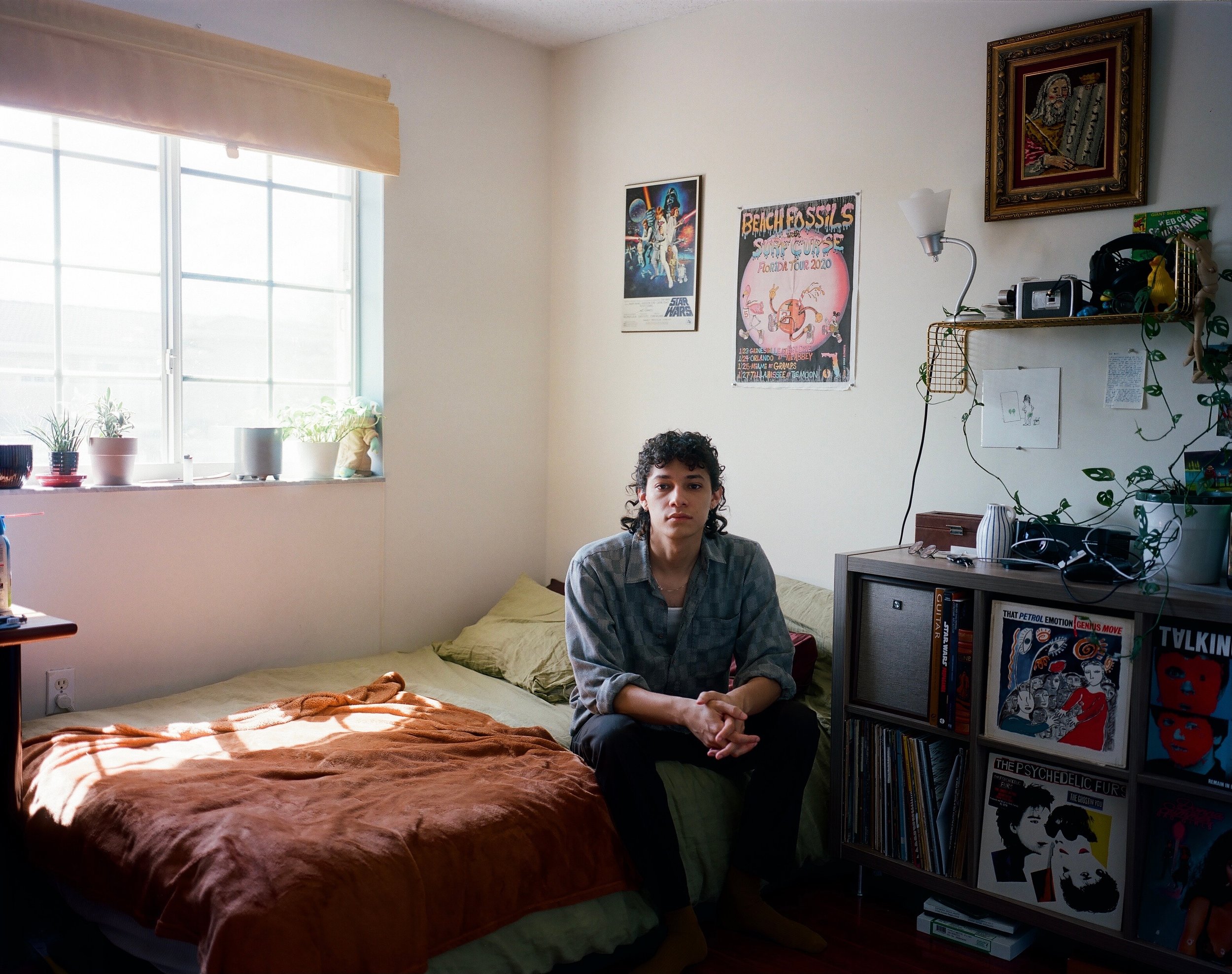
Speaking of removing photographs, have you ever suggested removing a photo that its creator considered essential?
With photographers, I find that it's actually less of an issue. Photographers seem a little more trusting of my editorial decisions. With fine artists, though, it can be harder. If I had to come up with a theory as to why, I think it's because when you make a painting, you spend a lot of time with it. You build all of this emotional connection to it and all of these feelings from the time you spent making it. So if someone like me cuts it, and it happens to be the work you spent the most time on, that's a more intense feeling.
With photographers, I think producing an image doesn't necessarily require as much time spent with the work as painting or sculpting, for example. So it's easier for photographers to say, "Yeah, you don't have to include that one if you don't want to." Every now and then, someone will ask why I didn't include a certain image. But at the end of the day, I think people trust my opinion and my taste, and they trust that I'm going to present their work in the best way possible, based on all the data I've collected over years of doing this.
Because your role is curating, have you ever looked at other social media accounts and thought, this could be really good, but the sequencing or the presentation is what makes it not work?
A big part of Composition, something I've tried my hardest to keep core to what I present, is resolution. I went to school for design, and I'm looking at screens and seeing all kinds of different work. If I see a picture that's low quality or low resolution, it just doesn't hit the same for me as something in full HD.
Unfortunately, when I was researching, I would often find something I thought would be really good to showcase, but I couldn't find a high-resolution image of it. So I wouldn't post it, even though I knew it would perform well. That's because I want the people who see the work to feel the same way I feel when I see it, and if something is low resolution, it just doesn't hit the same for me.
I see a lot of other curators and similar pages online showcase work from, say, the nineties or the 2000s. There just isn't a great high-resolution image of that work, so they post the low-res version anyway, and I think it makes the work less compelling.
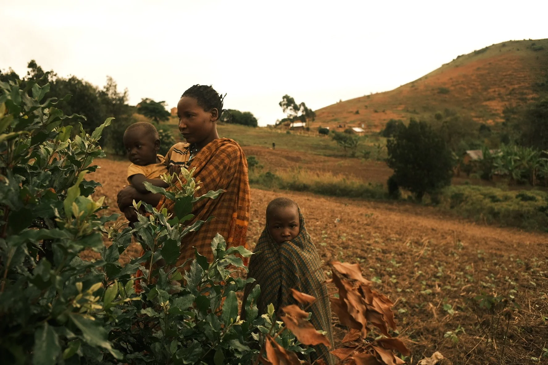
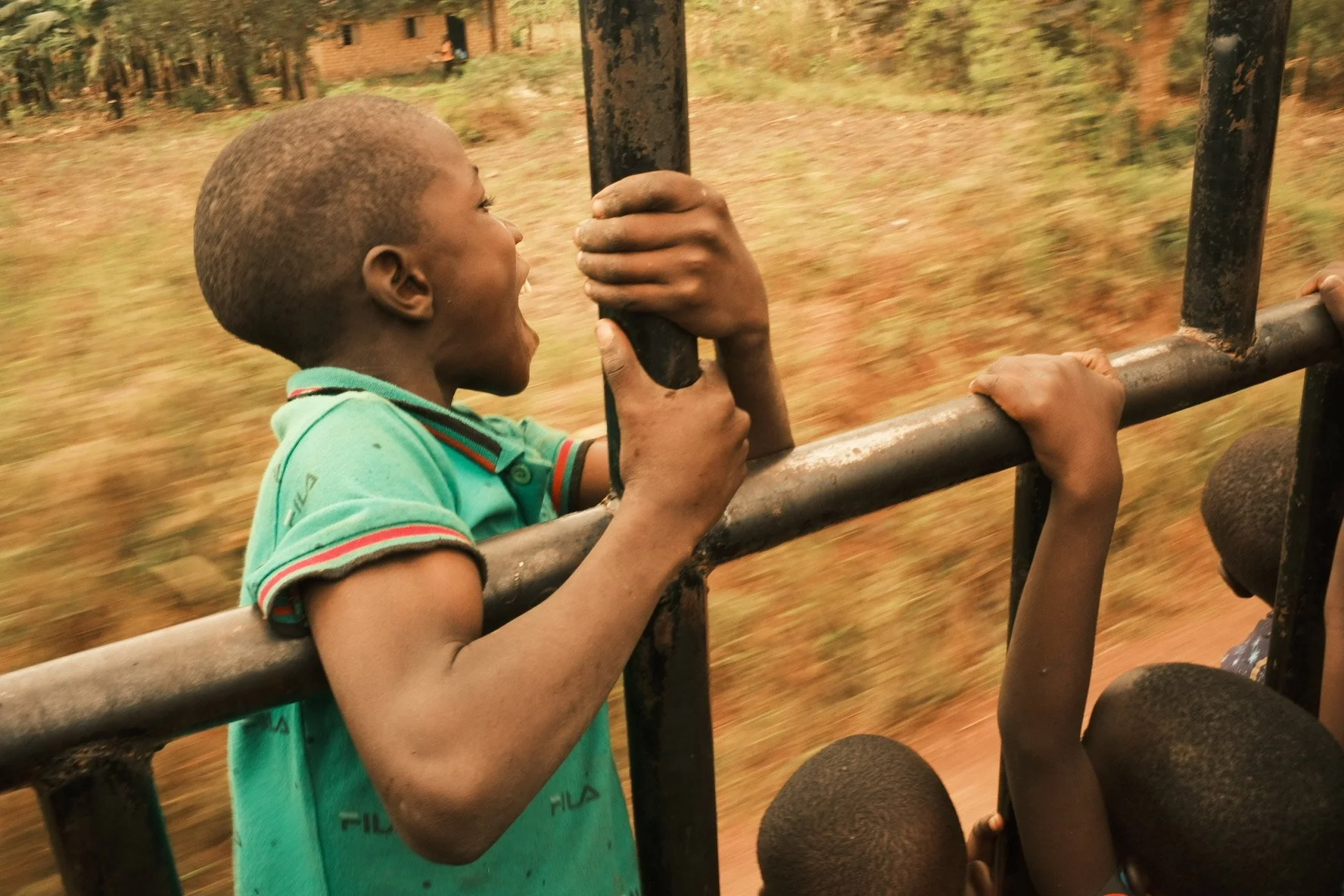
In terms of sequencing, has it ever happened that you posted something, it didn't work, and then you rearranged the order and it suddenly worked? Maybe because the stronger image was presented first, or because the story became more readable or recognizable for the viewer?
When you post a carousel on Instagram specifically, Instagram will sometimes show the second image first if people respond better to it. If someone sees a carousel and scrolls past it, Instagram may show it to them again with the second image first. I think that's a really cool way to A/B test what will be received well. So I always keep that in mind when I'm structuring a post. I usually choose the first image as the one I think will do best, and then I have a plan B as the second image, the one I think will do second best. Sometimes that second image is the one that shows up in people's feeds, and that leads to the post performing better.
I just got the Instagram update that lets me rearrange the order of images in a carousel after posting, and I've only used it two or three times so far. I haven't seen a post blow up because I switched the order. I think that's because I still see the first and second images as the ones I think will do best. If those don't work, the post probably isn't going to do great in general. Sometimes I'll switch to a different image if I think it would work better on the grid and draw more people in to click on it. But I've yet to have a situation where I posted something, it flopped, I switched the order and then it went viral.
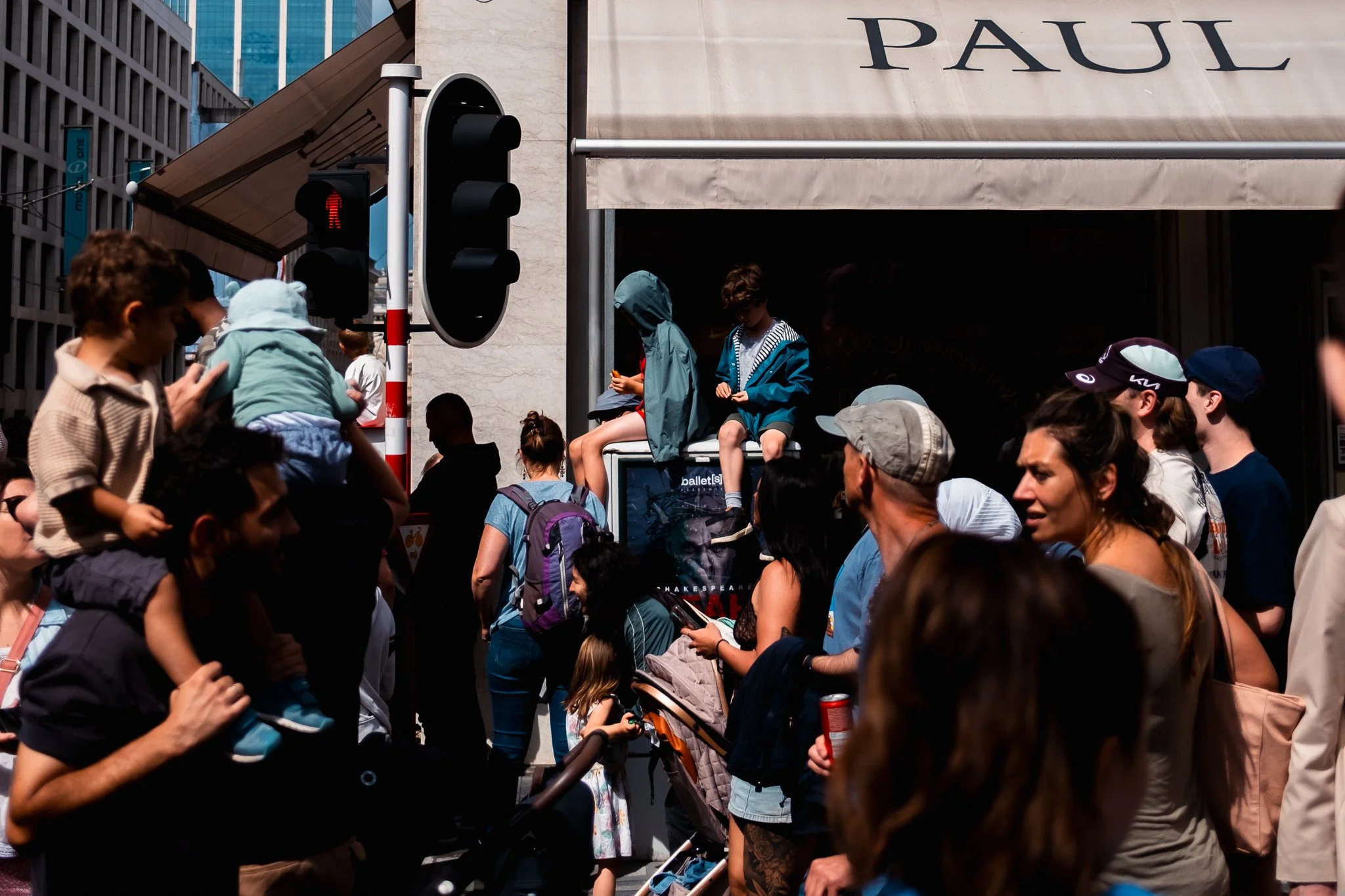
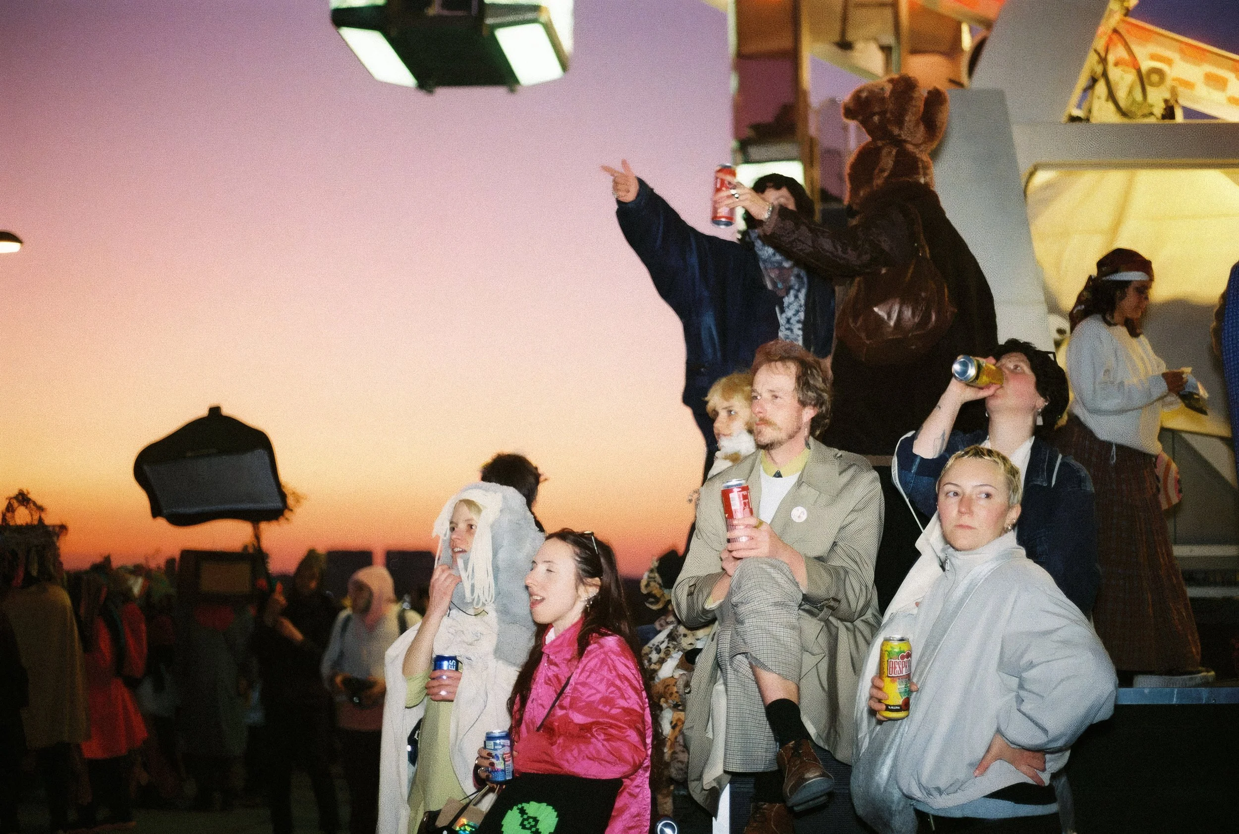
You said that the visuals are often more important on social media than the story. When you make a carousel that also depends on text, would you start with just images, mix in the text, or put the text further into the carousel, knowing that the second image might be shown first to someone seeing the post for the first or second time? Does this matter in how you arrange a carousel?
Typically, no. There have been a handful of carousels I've made for articles I've written where I used a pull quote. But when I'm featuring an artist, the text is usually all in the caption. The way I think about it is that someone will swipe through, and if they're visually interested, they'll go read the caption and get more of the story. So I don't think the text needs to be at the forefront, because of the order in which the viewer experiences the post. They're going to see the images first, and if they're compelled by them, they'll read the caption. I don't think it works the other way around.
About composition: you've written about the formal elements that make a composition work. But some memorable photographs succeed precisely because they feel awkward, unbalanced or visually chaotic. How do you recognize when breaking a compositional principle makes an image stronger?
I think the biggest thing I would say is this. If you're an emerging artist, if you've been practicing for, let's say, less than five years, and you're not yet recognized as a master of your craft, I would just stick to what works. If you're Martin Parr, you can play around with whatever you want, because you've built that reputation and that trust with your audience. They know you know what you're doing, so you have the freedom to make decisions that go beyond what would typically be considered the basics or the principles.
That's what I'd say in general. Obviously, someone could pick up a camera for the first time, take a picture that's all messy, and people might receive it really well. But more often than not, sticking to the principles of what makes a good image is going to be the best way to go. Beyond that, if you want to break from those principles, I feel you'll have a better chance of getting away with it if you have that reputation and trust with your audience.
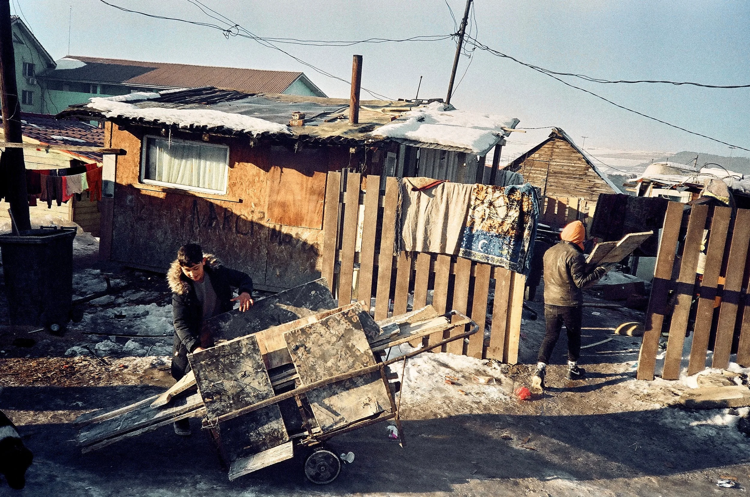
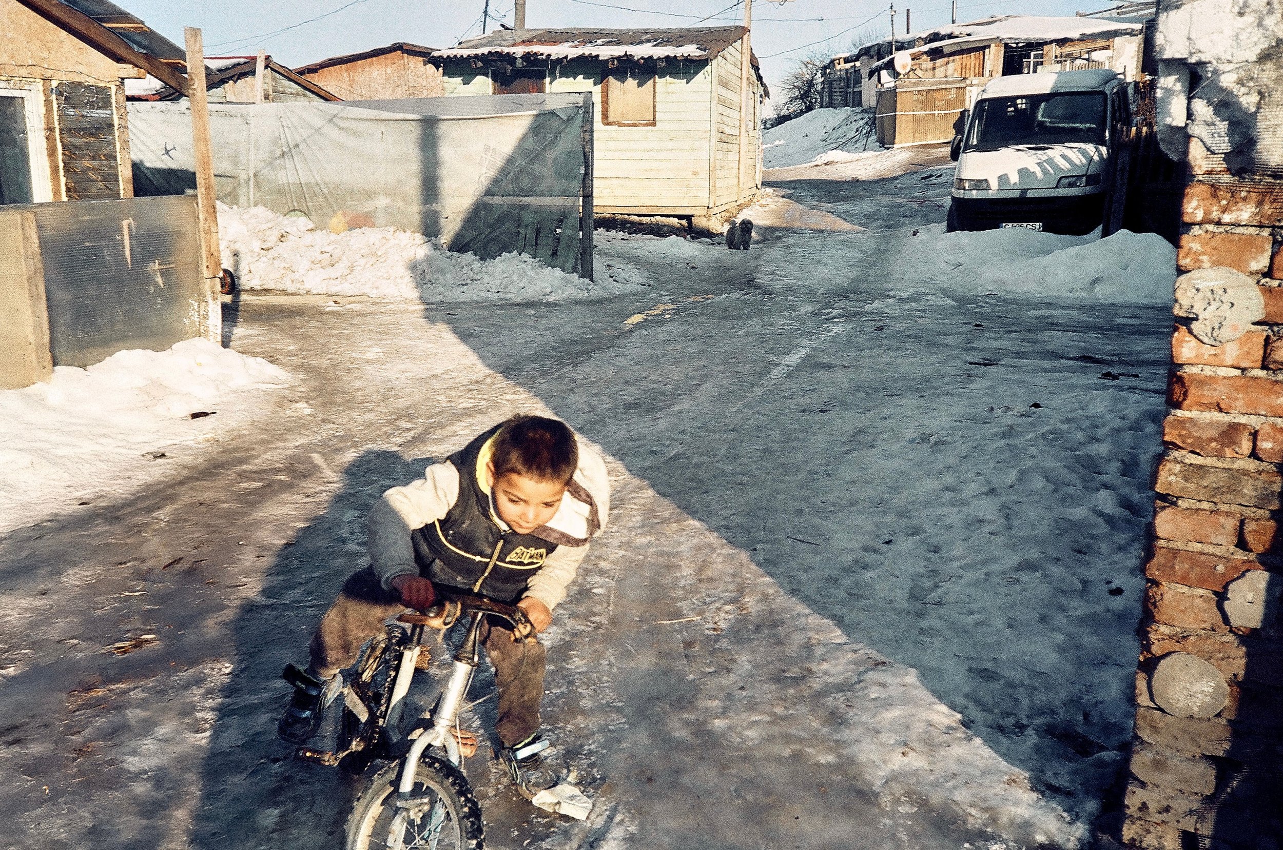
When you spend so many years curating photography and other visual arts, you inevitably develop personal preferences. How do you prevent those preferences from limiting the kinds of work you're willing to consider?
Honestly, I lean into my preferences more often than not. The reason is that I think my style, what I choose to present and the decisions I make are what have led to the success of Composition. I think that's what brings it together in a way that's a little more cohesive than some other photographic or artistic outlets, where there doesn't seem to be a through line connecting everything. I often include work that falls a bit outside of that, but it's still work I'm visually drawn to. I think that's actually what people appreciate more than me being particularly neutral.
The idea of curatorial integrity is something I've started to explore as I've had more conversations with artists and photographers. Until I started taking the Substack relatively seriously, I didn't have many conversations with these people. It does seem that curatorial integrity is important to artists and photographers. But as someone who considers himself more of an editor and curator than a maker or producer, I think having a preference is what leads to the most interesting end result. I'm presenting other people's work, but at the end of the day, I still want Composition to have a brand and a voice of its own. If I'm completely neutral and only showcase what's generally considered good, there won't be that point of view, and there won't be people who trust me and keep coming back.
Through Compositionally Inclined, you've moved beyond simply sharing photographs to writing about creative thinking, research and editing. Has putting your curatorial decisions into words changed how you look at photography and other visual arts?
Yes. I think the biggest through line I've seen, which is what I wrote about in the article "You're Too Close to Your Own Work," is the similarity between curation and editing, meaning editing from a writing point of view. I didn't even know what an editor was until I started writing. My friends told me I was way too verbose, and I thought, okay. Then I sent my writing to someone I trusted, and they said, "This doesn't make a lot of sense." I said, "Okay, show me how to make it make sense."
That's an editing decision, and I think it's the same muscle as curation. I'm not only the presenter and the platform for the work I show. Especially with all the submissions I get, my role has now become that of an editor, which I think is cool. It's nice to be able to do that. In some ways, that role doesn't really exist. Obviously, the role of a curator exists for a gallery exhibition, and there are editors at magazines. But blending those worlds has been particularly interesting, because I don't know if that really exists in this space.
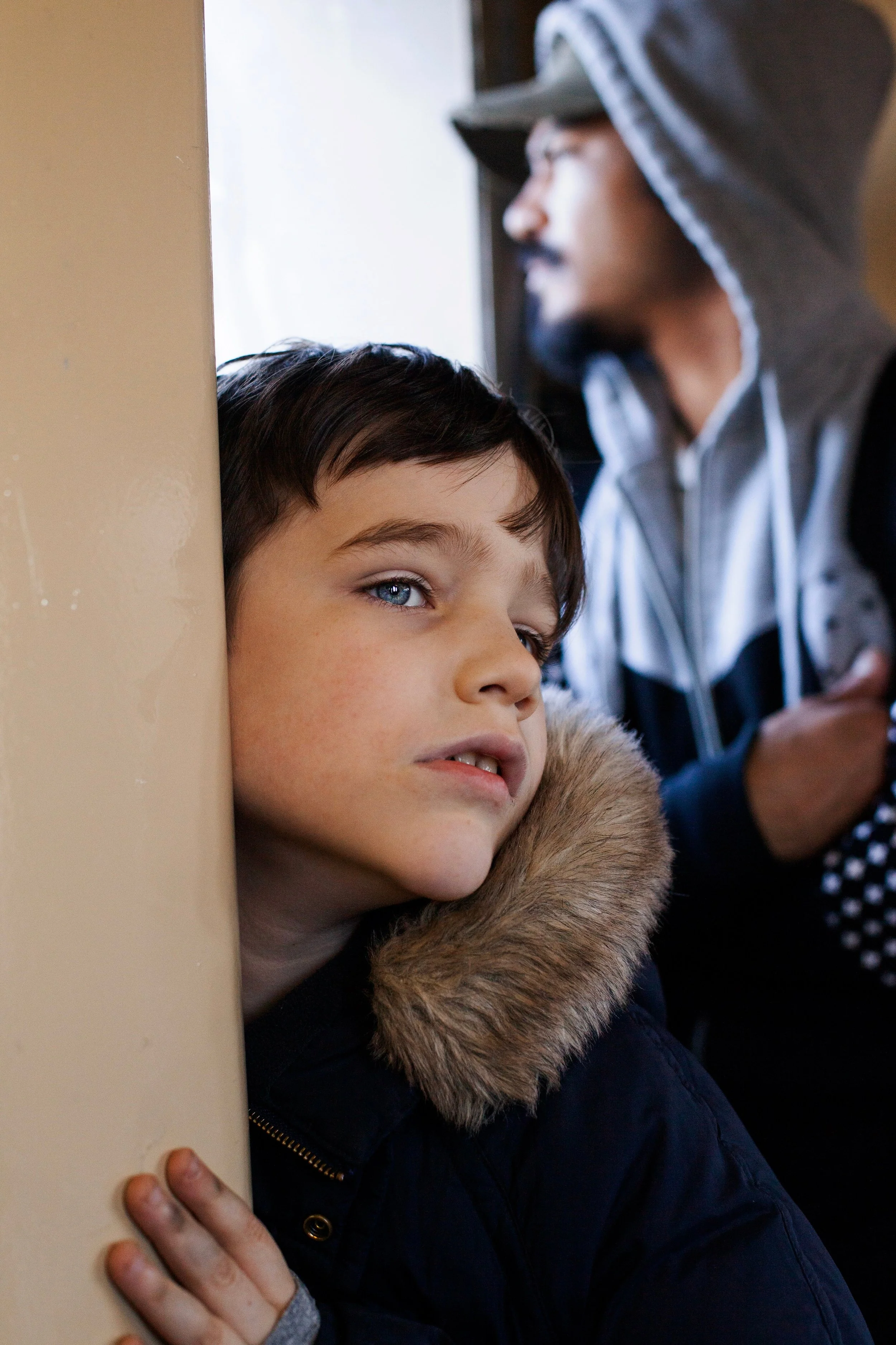
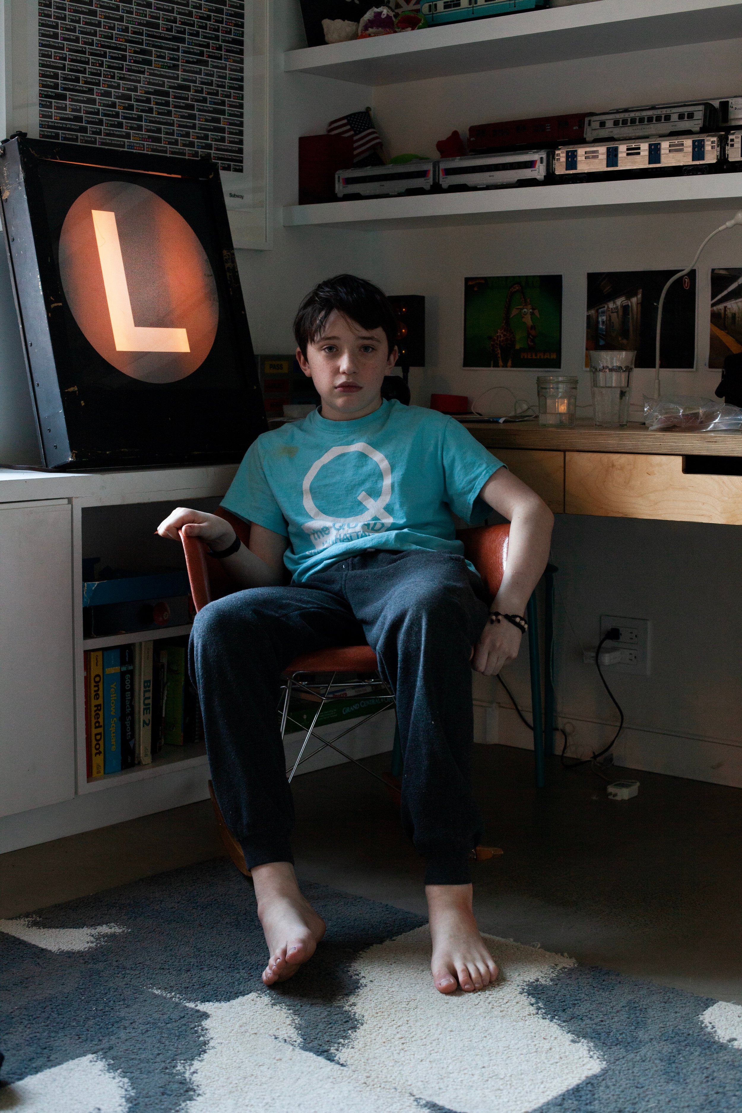
After years of discovering, selecting and sharing visual projects, what have you learned about why some photographs stay with you long after you've seen them, while others quickly disappear from memory?
I think that's where the story kicks in. In terms of performance on a social platform, the visuals are more important. But having a really strong story and concept behind the work is actually what sticks. That's what I tend to lean on when I reference people, projects or artists. I'm able to point back to a concept that is particularly strong, not just the visuals.
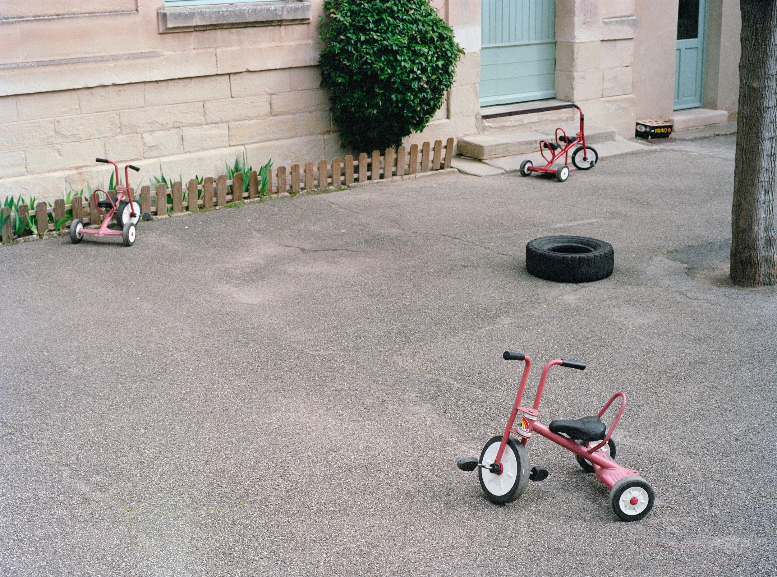
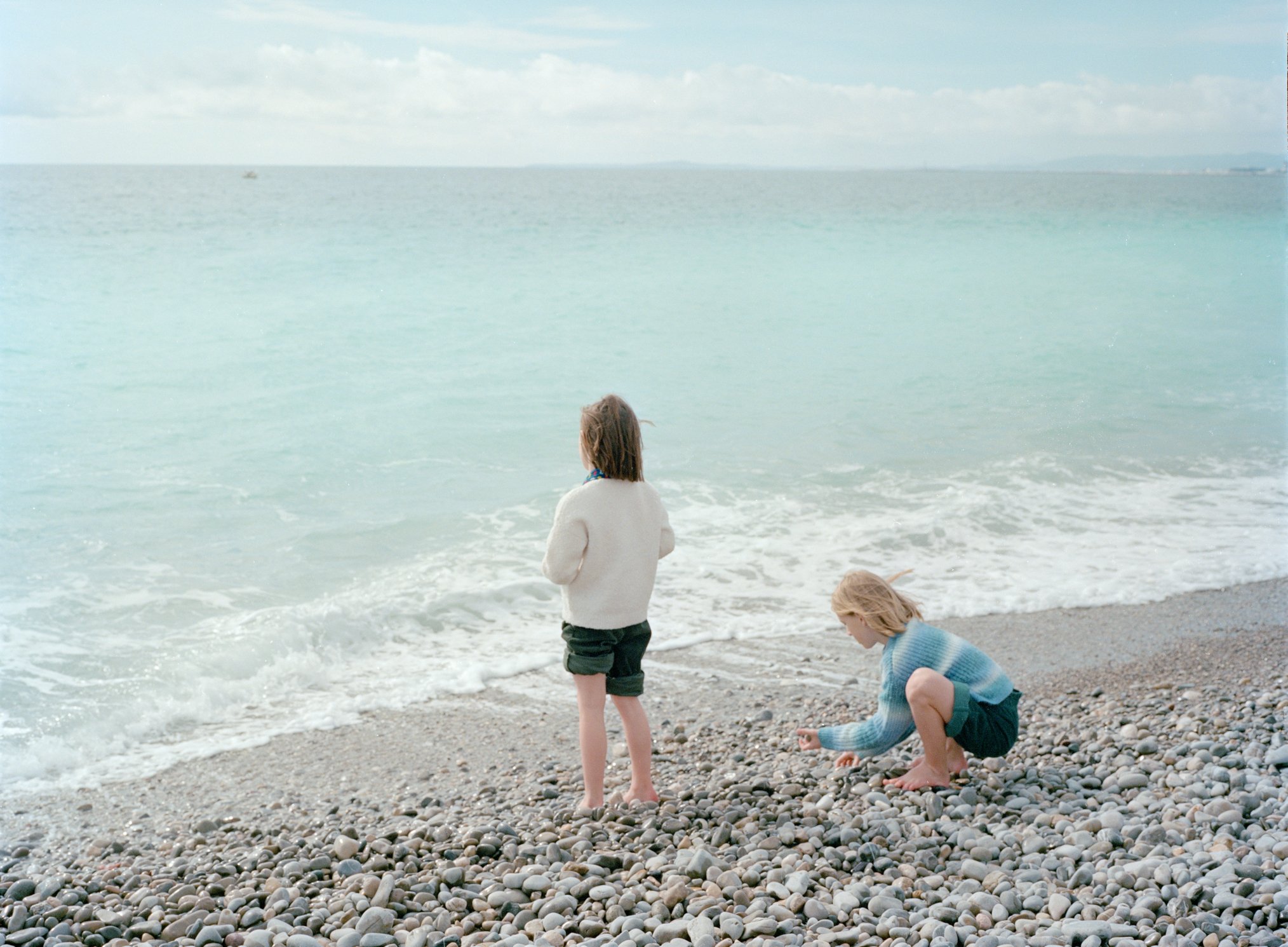
My final question is for someone who is just starting to post their work on social media. After looking at thousands of photographs, what do you think makes a photograph genuinely good, regardless of how well it performs on social media, and what makes it good for social media?
That's a hard question. Your work could be the best thing in the world, but if no one sees it, what's the point? That's my point of view. Obviously, there's the argument of making art for art's sake, and I totally understand that. But a big part of why I started posting on Composition was that I knew one day I was going to make something, and I wanted people to see it. I didn't want to post Instagram Reels all the time. So I thought, let me present other people's work, and eventually I'll present my own. I never ended up doing that, and Composition became the thing itself, which is a very interesting evolution.
As for the separation between what makes something good and what makes something perform on social media, I think the people who will have the best careers, at least in the digital world and the footprint we currently exist in, are the people who can blend the two. That means making something that is very good, visually compelling and well put together compositionally, while also making something people respond well to on social media. I see balancing those two as a bit of a balancing act.
That's been my perspective. A lot of people go all in on social media and try to fully optimize for it, and then the art takes a hit. Other people go purely for the art and the craft, and then the presentation doesn't put their best foot forward. I think Composition is a great example of blending those two worlds. I'm not going to go super hard into making Instagram Reels and doing voiceovers and all of that. But I'm also going to keep in mind the platform we're on, present the work with its best foot forward and hopefully get it out to people so they can see more of it.
I think that's the core philosophy of Composition: building a bridge between those two worlds. That's really difficult for artists, and I understand that. I try to help where I can by giving artists a platform and a bit of a shortcut to get their work in front of more people, without them having to post a trillion times to get there.
More photography books and interviews?
We'd love to read your comments below, sharing your thoughts and insights on this conversation. Looking forward to welcoming you back for our next interview. See you then!
Lauren Shaw found connections between her body and nature. In March 2020, she brought an extracted tooth home from the dentist, amazed that it had come from her own body. She spent several days photographing it. Photography Book Spotlight