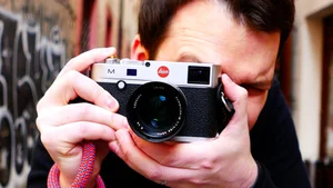
Alex on Streets CRITIQUES Your Photos
Today we critique your photos with Alex Muñoz ( @Alex On Streets )
You can submit your photos for the About Photography challenge here :
https://www.reddit.com/r/aboutphotographyblog/
Find out more information:
http://aboutphotography.blog/submit
Check out Alex's youtube channel!






3 Things That Can Make or Break Your Photos: A Critique with Alex Muñoz
In this episode, Fukuoka based street photographer Alex Muñoz joins me to critique a new batch of reader submitted photos from the AboutPhotography subreddit. We talk through lighting, composition, and subject, the three things Alex keeps coming back to, and along the way get into color theory, photographing children abroad, and even critique two of our own photos.
Introduction
Hello everyone, welcome back to the channel. Today I invited Alex to critique your photos. Alex runs his own YouTube channel, Alex on Streets, which you should definitely check out if you don't know it already. If you'd like to submit your photos for a future critique, check the link in the description and submit your photo to the AboutPhotography subreddit. Thank you for watching, and let's jump right into it.
Hello everyone, welcome back to the channel. Today I'm here with a famous photographer from Japan, Alex Muñoz.
Hello, thank you. Nice to meet you. I'm good, maybe I'm famous in Fukuoka, at least.
So today we're going to look at photographs people submitted to the AboutPhotography subreddit for this challenge. Let's take a look at this one.
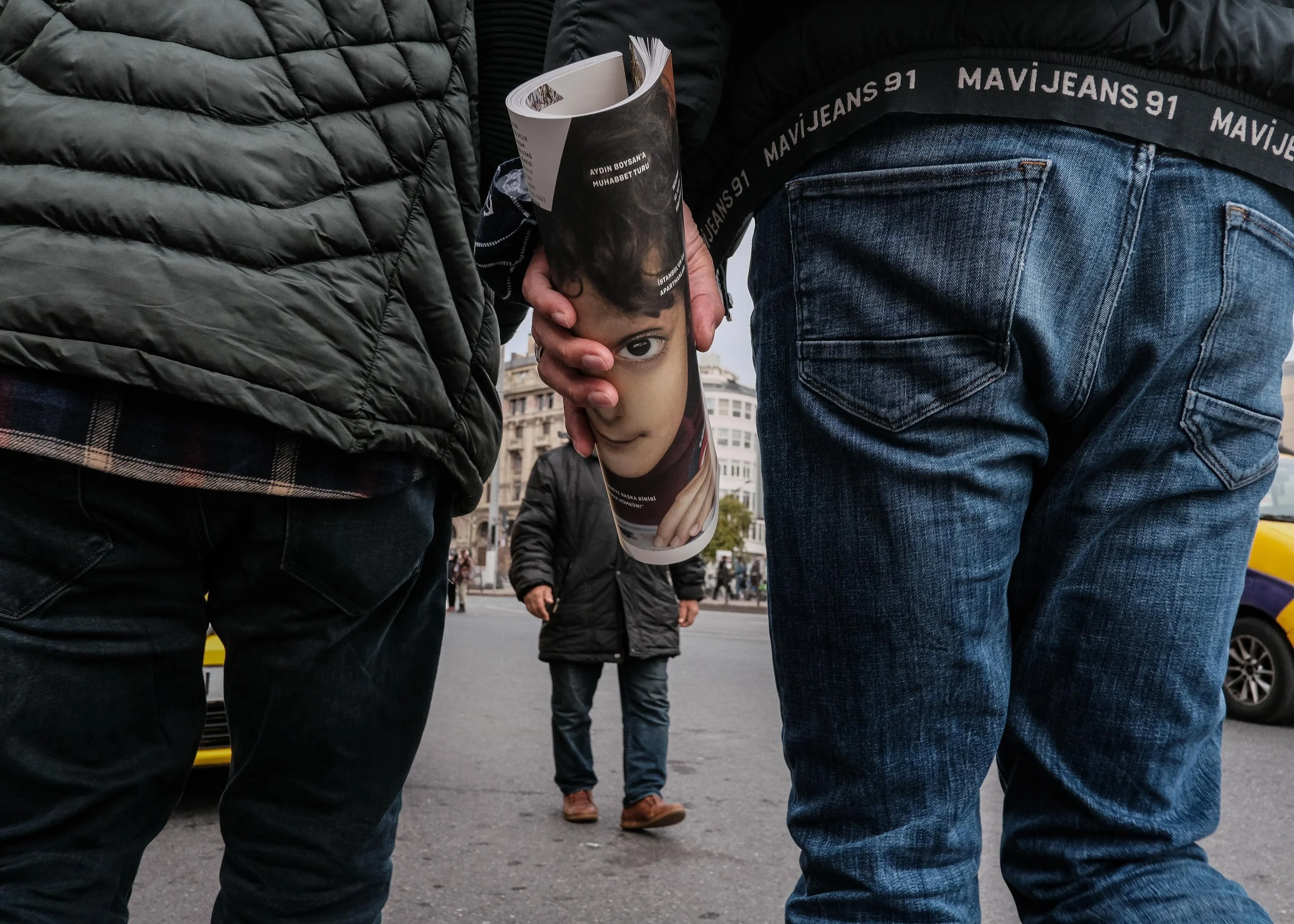
@emirssevim
This is already an amazing photo to start with. Did you do this on purpose, showing a great photo right away?
Obviously it's a great photo, I think it's amazing. What makes a good photo? I think a lot of people know the three things: lighting, composition, and subject. I don't think the backsides here are particularly interesting to look at, I don't especially enjoy looking at that, but the subject, this piece of paper covering the face of the guy walking in the middle, and the two guys on the left and right, they act almost like a door, like a hinge in a room. It has that effect. It's amazing, it almost makes me wonder if he had to arrange the position of the subjects at all, but it doesn't look like there's any trickery going on.
What I also noticed is a really nice small detail: the car behind or in front of the guy on the left is yellow, and so is the one on the right. That's great, because the only yellow in the whole photo is in the background, which helps the subjects in the foreground fade away a little in your perception of where the focus is. Since those foreground subjects aren't colorful or distracting, your eye goes to these two yellow cars, which lets you know you're on the street. Yellow is such a powerful street color, isn't it? This is a brilliant photo, one I'd be very proud of.
Alright, moving on, it's a great start. We continue with a similar theme.
Martin's photo
This is interesting. It's interesting that the subject is doing what they're doing, leaning over like that, there's a sense of curiosity to it. The subject themselves is just an ordinary looking person, nothing particularly interesting about their clothes, but they're doing something interesting, which is nice. I'd say the lighting is good, the subject matter is good, but I think I'd want that little chair on the right side cropped out a bit, it's just a small distraction. I suppose it proves there's more going on in the scene, more to this area, but I think it's unnecessary, so cropping out that sliver of chair would help. You can see the person's entire body, down to the ankles, it's not cropped oddly at the ankles or anything strange, so that's good. Everything works, it seems like a nice photo.
It's nice. If it were me, I probably would have stood more to the left rather than shooting it straight on.
Maybe with a bit more context, yeah, I feel like this is a somewhat flat photo.
It's a little flat. I wonder, because that chair is on the right side, that gives a hint there are things on the right side of the frame too, so the photographer could have stood more to the left, at an angle, and included the people sitting at the table with their chairs, or maybe people walking on the sidewalk on the right side, whatever's over there, and then had this person leaning over on the left side of the frame, with whatever else is happening on the right. As it is, it feels like a really safe photo, like: let me take advantage of this situation and grab this very safe shot.
So what do you think about this one?
@shorty.shots
This is nice, this is artistic. The lighting is nice, the subject matter is nice, the composition is nice, everything just makes sense with this photo. I do wonder a little about this black area at the bottom of the frame, whether it was added later. It could be that this was edited afterward to blend the subject into the bottom of the frame, it has that feeling.
I don't know if that's true, but it does look kind of like a shadow.
Yeah, it was probably more dodged or burned, to make it a deeper black. I feel like they definitely wanted this artistic style of deep, contrasted black, and that's cool, to have your own signature style. If this photographer has a body of work where this kind of blackness is consistent across many photos, and this isn't just a one off, then it makes sense, they've built a body of work around this jet black look, with these two or three colors, red, black, and white. The person's face has also been darkened, I feel. I also like how the sign is kind of similar, do you see it, that top right edge? It seems like the line is parallel to the shadow. I bet the photographer really wrestled with that decision, but I think it's very intentional, everything edited in this photo feels intentional, so I'd guess that bit in the top right was left on purpose, probably for exactly the reason you'd think.
Alright, what do you think about this one?
@blank_photographie
Oh, this is great, this is the kind of photo I really want to take when I go back home to the US. The background is jet black, shadow dark, with the highlights nicely protected. I'd like to see a little more of the background though, a bit more of where they actually are. But if this person has a whole body of work like this, with the background dropped to jet black across multiple photos, then that's cool. I like it.
The old guy on the left, the old guy on the right, very nice, and the lady in the middle: two men on either side and a lady in the middle, that's an interesting arrangement. There's something about older people, their skin is always so interesting, and they tend to dress nicely too. Especially here in Japan, older people dress well, so I always try to catch older people out on the street. I think it's a really cool composition, it's like the lady is emerging from his ear. To me this is a five out of five photo. This is great, all these photos so far are really good, I came in with basically zero expectations and I'm pleasantly surprised. This is cool.
Alright, moving on.
Photo 5
I think it's not an impressive photo. There's nothing really interesting to say about it. The lighting is okay, not great. It's a silhouette, but I don't find it very interesting. The subject is just a guy on his camera or phone, which isn't especially interesting either, and I don't know where this is or why the photo was taken, so it's hard for me to care about it, hard to relate to. There's nothing particularly relatable here. Maybe if there had been a different gesture from the subject, or more going on, it would help, but as it is, nothing stands out.
I do like the sky, I'll say that. The sky is nice, and if the lighting is good anywhere, it's in the sky. But the foreground, the silhouette and everything, I don't find that interesting. I could maybe see this working if the composition with the tower behind was a bit stronger, maybe as an ad for a travel magazine or something, a "visit this city" kind of image. If there were a couple in it, with this lighting, it could work as a romantic travel advertisement. But as it stands, I'd say try again.
Moving on.
@inframeswetrust
I like the subjects, this is nice, this is relatable to me, especially as a father, and probably to you too, right? Father and son. This is beautiful. I wonder if these people got this photo by chance, I bet they'd love it. This father would love to have this photo of himself.
I think the photo is actually called Fatherhood.
Oh, that's cool.
Yeah, I was just talking with the photographer yesterday, and he said he pre-focused on that spot and waited, then fired away.
That makes sense, and he caught a lot of expressions, but to catch this calm expression on a ride like this is really interesting. It's not usually the kind of situation where a son would lay his head down on his father like that, unless he were really scared, but he doesn't look scared, he looks happy and relaxed. The father looks really nurturing. I love this, just the father and son subject alone would be enough, but then the lighting is great too, the colors are great, and the editing is simple, not overdone, classy.
I don't mind that there could be a bit more crop, since it's maybe less distracting this way. I respect it, because the focus should be on these chains, these leading lines running down to the subject, this beautiful sky, the yellow and soft green pastel colors. I love this photo. This might be my favorite so far.
Wow, alright, moving on.
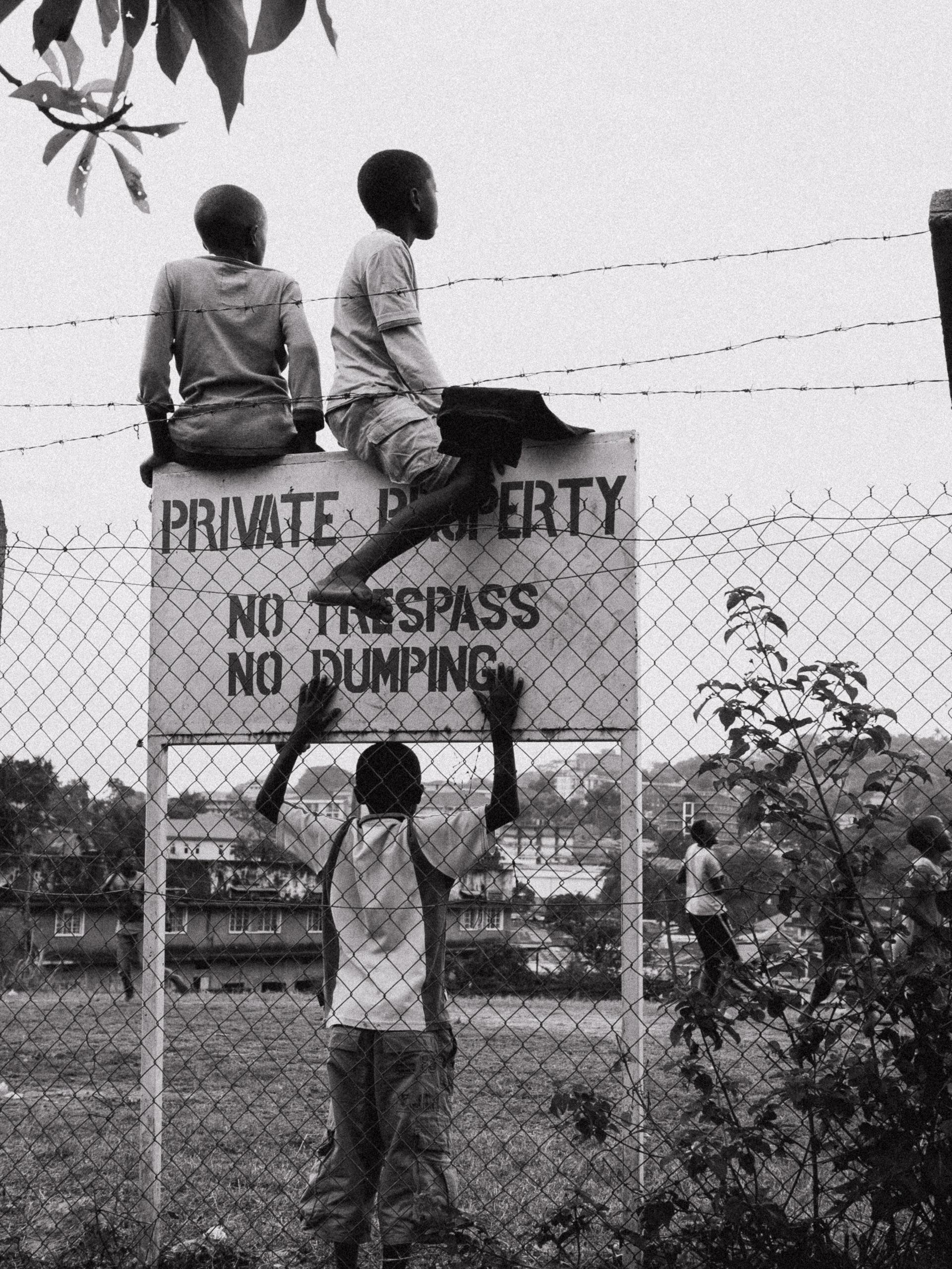
@Ekideken
This is very filmic, if it wasn't shot on film, it looks like it. The subjects are really nice, one, two, three, four, five, six boys. They're obviously looking off at something happening in the distance, so I think the subjects are solid. I do wish one of the boys had been looking toward the camera. There's one boy on the left who's kind of looking our way, but I wish one of the three in front had been looking toward us, so we had a face to connect with, since we don't really get any faces here, and that sometimes bothers me, just seeing everyone's backs. I wish we had one face looking in our direction, while every other subject stayed looking where they're looking.
Sometimes, when this kind of situation happens, where everyone's looking in one direction, I'll try to get someone to look at me, I'll snap my fingers, stomp my feet, make some kind of sound, so I get that eye contact if I want it. I think that's what's missing here, a little eye contact or a face. But I still think it's cool, it's nice. It feels like a fairly safe photo though, one I'd take and share, but it wouldn't be my best work.
When I first saw this picture, it had this vibe like a "private property, no trespassing" sign, with someone trespassing anyway. Then I noticed people in the background, probably playing football or something, and realized they hadn't trespassed, they'd just arrived to watch a match. Looking closely, you can tell they got there from the other side, not from the photographer's side, which is my read on how this happened: they were playing something like football on private property, and these boys sat down to watch. So it's not quite as strong a photograph as it could have been under different circumstances, not that the photographer could have influenced that, just my take.
Alright, moving on.
Photo 8
This is awesome, this is cool, it's almost hard to believe, is this background even real? I wonder how long the photographer had to wait for this perfect situation. The lighting is good, the subject matter is of course interesting, but compositionally it's not that interesting, it's just a flat photo. I think it's a good photo, but it's missing that one extra element of a more interesting composition. It's the kind of flat photo you look at for two seconds and think, oh cool, nice match, I wonder how long that took, and then you keep scrolling, or turn the page.
Moving on.
@faltintas
Let me take a moment to look at this, maybe I'm missing something. The situation, this person pushing trees in a shopping cart in the middle of the road, I just never see that, not in Japan, not in the US. It's probably difficult to move those trees without a car.
Maybe this is a situation where the person was just parking on the other side of the street, maybe there's a garden shop nearby or something.
If the situation is that he was moving them home, for maybe half an hour, then in that case I'd probably follow him to get more shots, in contrast with other interesting subjects along the way.
Exactly, the main subject alone isn't quite enough for this situation, there needs to be more. When you see it for the first time, it makes you smile a little, but for a truly great photo, it would probably need something to pair it with.
Alright, moving on.
@dommetysk
Cool structure, cool lighting, but that's about it, the subject is far off in the distance. This is a very safe photo, like the photographer stepped into this building for the first time and was struck by the lighting, inside or outside, and thought, wow, cool, nice lighting here, never been here before, let me take a photo. It's kind of like a memo photo, one I might take myself, but it wouldn't be the shot of this location, it would be the one that tells me, okay, I'm warming up here, let me take a better photo, or let me just grab this now and come back another time to get something better using the architecture, the light and shadow in this situation.
Would you want more subjects, or bigger ones?
Bigger, yeah. You can have just one subject, but it needs to be bigger. This is more urban landscape or architectural photography, and that's cool, but as a street photographer who works at arm's length from people, it's not really my genre to comment on too much. I think this could work well on the wall of a restaurant inside that building.
Right, right, so many restaurants or buildings like to document their own history, or take on their own thing that way.
@kool_peter
Another zebra pattern here, okay, let me see what's going on. We've got the zebra with its stripes, the shadow with its lines, a little gutter on the right with more lines and shadows, but the top right of the frame, it seems like there's a restaurant or shop that's closed for the day, and that part of the frame feels unnecessary. Still, I see what the photographer is going for, with the zebra, the lines, the shadow on the ground, the gutter, and everything else, it's a really cool concept, it just needs to go one step further.
Does it need that lady in the zebra dress from the previous photo to walk in?
Yeah, that's exactly what this photo needs, her walking in on the right side of the frame, right in that beam of light, in the main area where the light falls, roughly center or right of center, instead of where that stroller or wooden pedestal currently is. You'd want a lady, or someone, leaning against that pole with another striped pattern on them, or maybe a cat sitting in the zebra's eyeline, staring back at it. It's a cool concept, but it feels a little dead, a little lifeless, which is its own kind of emotion, I suppose.
@chetanclicks
Alright, artistic, very cool, this looks beautiful. This is nice, it's a very artistic photo. This is the kind of thing I really want to shoot more of, I want to be more artistic, and this is the kind of photo I'm genuinely jealous this person was able to capture. I can't really critique it based on my own style of street photography, since this isn't my genre, but it's something I want to do more of. I love it.
I love the electrical towers, I love that the guy is standing next to them in the frame, almost like he's a tower himself. I like how the flowers lead down toward him, the colors are so nice, and there's so much texture in the water with the bubbles. It reminds me a bit of Starry Night, the way everything seems to wrap around, and that's because it's a reflection, it's a flipped photo.
Is that also like a fish in there?
I was wondering the same thing, whether that's a dead fish or a plastic bag or something.
I think it might be a plastic bag.
Yeah, I kind of wish that trash wasn't there, though honestly you can't really control that. I actually kind of like it, it makes the photo a little less perfect, and I think that's appreciated sometimes, we don't always need these amazingly perfect photos. Or maybe it's a fish stuck in a plastic bag, which would be even worse, that's really saying something.
That's really saying something. Alright, moving on.
@ma.druga
The lighting is amazing, the subject matter is amazing. I wish the boy on the left's feet were more in frame, unfortunately they got cropped a little, but that's okay, don't worry about it. The lighting is amazing, the subject matter is amazing, the timing is amazing. This isn't a safe photo, this took skill, this took a bit of bravery on the photographer's part, more than one photo usually does.
Yeah, you never know, there could be older guys around who'd say, hey, don't take photos of the kids.
Right, if this person is a traveler and doesn't live here, there's a bit of bravery involved in photographing kids, since you never know how a given society reacts to strangers photographing children. South America is usually more relaxed about that, isn't it?
It is, yeah.
In Asia it's not as relaxed. Compared to the US too, I think it's really frowned upon there to photograph children candidly without permission, you can get in serious trouble with parents. In Japan I don't photograph kids very often, unless it's a situation like this. If this were in Japan, if these kids were Japanese, I'd absolutely take this photo anyway, even risking getting in trouble, or worse, for it. I love this, it's cool. I love the boy on the right, smiling, like, where'd the ball go, he just hit it, that's cool. The boy on the left looks like he's getting ready to play the ball too, they're kind of fighting over it, like birds.
Yeah, they're all black, like crows.
Right, this is a photo to be proud of. If I'm being nitpicky, I'd love to see the same exposure on the face of the boy on the right as the one on the left, so we could read his expression too, but otherwise, beautiful photo.
Alright, moving on.
@erdem___yildiz
I like this, the lighting is nice, the subject in the bottom right is nice, the composition is nice. The highlights are a little blown, but I like that sometimes, it adds character to a strongly lit scene like this. I think it's amazing. I like the leading lines along the tops of the roofs, and you can see the sky, so there's a lot of context here, from ground level, to the mid level with the buildings, up to the cross with Jesus lit only on the top half, not the bottom. You get this very dynamic lighting, and the sky has clouds too, so it's unmistakably that particular kind of scene. The person's got a bike and a cool hat, there's not much more to say, though I do wish we could see a bit more, maybe if it were a wider shot, more of the bike, more of the ground. I don't know what lens this was shot with, maybe a 35 or 28, but I wonder how it would look at 24 or 21.
What I find funny about this approach to the scene is that the cross is really what makes the shot. You get the same feeling as when you walk into a church, everything positioned above you, looking down, so you feel small, almost overwhelmed by it. The photographer was probably shooting from a bit lower, from the ground looking up, which gives that same feeling you get entering a church. If it had been shot from a regular eye level, it probably wouldn't have had the same impact on me.
Exactly, that's a really good point. If you shoot from closer to eye level, you lose that. The only thing I wish were different is if the guy were facing toward the camera, toward the photographer, toward us, so we'd get less of a sense of him walking away and more of him coming forward. Just a preference though.
Alright, next photo.
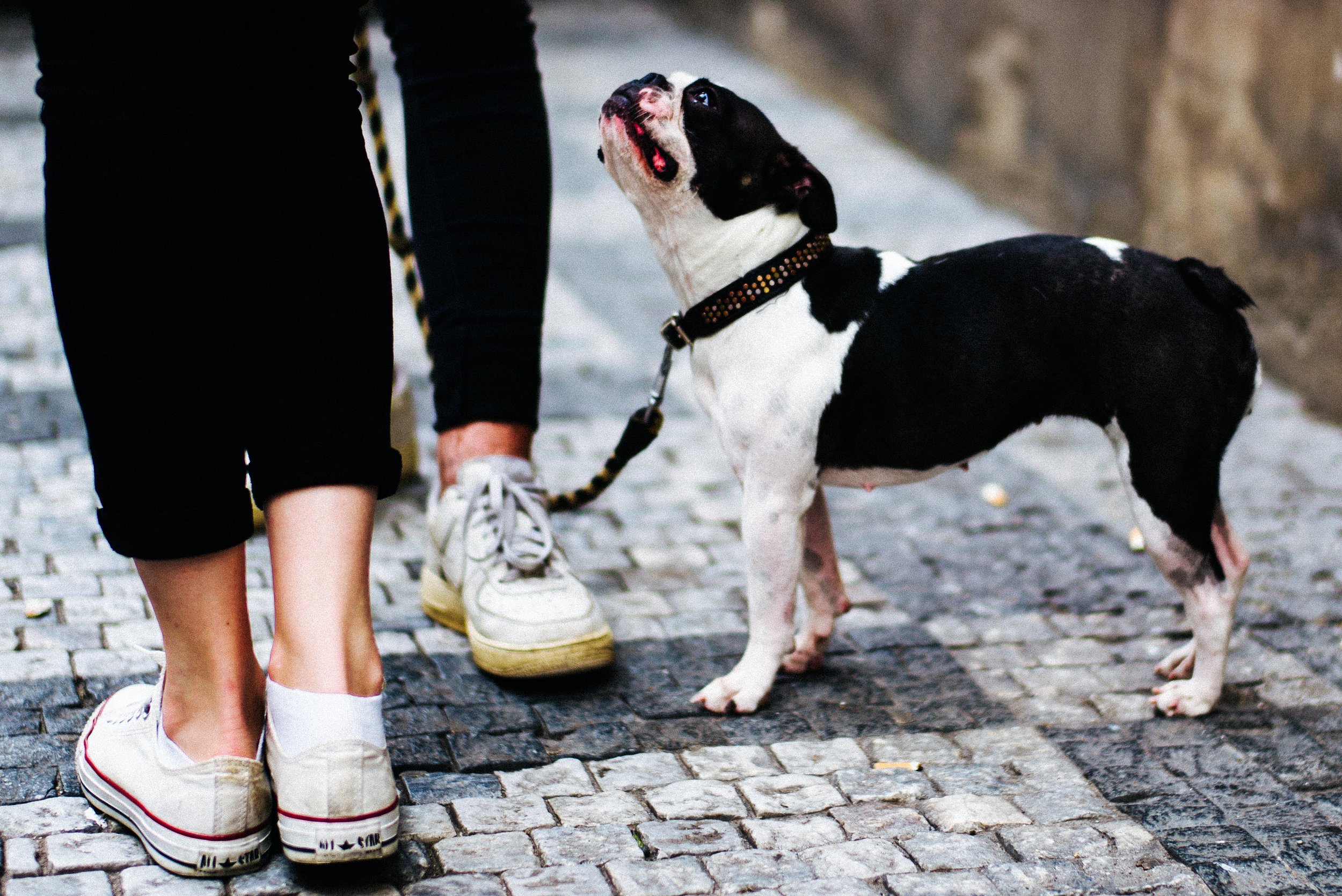
Photo 15
Interesting, interesting colors. The colors are nice, the lighting's okay, and the subject matter is just okay, but the lighting and colors are nice. If it were my own dog, or something like that, I'd feel something about it, but I don't feel anything about this particular dog. What is it that makes a dog picture work? I love dogs, I think everyone loves dogs, it's probably part of our shared history with them, we grew up alongside them. So I do take photos like this myself, a guy on a motorcycle with his dog, and that's cool, I'm not blown away by it, but I like it. I just don't think the composition is very interesting, it's a safe photo, there could be more to it.
A lot of dog photos, when they work, either have a stronger juxtaposition, think of Elliott Erwitt's dog photos, next to their owners' legs, or the dog is doing something with a human role, like this one, a dog riding a motorcycle isn't usually what dogs do in their free time. This one's just a dog walking, nothing particularly interesting about it.
What do you think about this one?
@gettons
This is a nice portrait, I like it. I wonder about the lighting on the subject, if he'd been sitting on the right side instead, the lighting might have been stronger, since the sun seems to be coming from the left, and the right side of the frame has stronger light. If he'd sat on the other side of the bench, the lighting on his face and hair would probably have been better. But that's not usually what people do when they're traveling, they tend to sit so the sun isn't in their face.
Right, so it might have been hard to get that here.
It does seem like this was posed, in my opinion, like, let me take your photo, and it would have been nicer to pose him on the other side. I think he's got a little smile, which probably means he's feeling a bit shy about having his photo taken. If that's the case, I'd have analyzed the lighting first and said, hey, sit over here in the light. The left side of the frame is also busier, with these chairs and this arcade console or video game machine, while the right side is quieter and has the better light, so it would have been more balanced too.
You're right, but I think the lighting and the colors make it feel like it could have been taken in the eighties or something, it has that feel.
Yeah, even those machines and the chairs feel that way, leather chairs and everything, the colors are nice, it looks like it was shot on film.
It seems like it, though maybe the shadows were also edited a little afterward.
Alright, moving on.
Martin's photo
A little closer to home, this is Japan. Unfortunately this isn't a very interesting photo, it's the kind I could literally step outside my door and take any time I want, and that's just not interesting. Whoever took it, Japanese or not, it doesn't matter, but it feels like a photo taken purely because someone's in Japan and thinking, look how Japanese this scene is, look at this arcade machine, the gacha machine, look at all the writing and the colors. The colors are interesting, since the cone on the left matches the machine, so color wise, it's nice, but the lighting is nothing special, and the subject and composition don't offer much. It feels like a very safe photo, one anyone could take, with no real skill involved. This is the kind of photo I used to take constantly for about two years when I first got to Japan. I've been photographing here for about seven years now, but for those first couple of years I'd have taken this kind of photo every week, every month, just warming up, getting acclimated to my surroundings, getting over the novelty of it. Now I take photos with more purpose, and this one doesn't have quite enough purpose, unfortunately.
I have to say your guess was spot on, this is actually my photo, from a holiday I spent in Japan. Even so, you're right that anyone could take a photo like this: you're a tourist in Tokyo, you see someone dressed in a suit, clearly coming from a corporate job, standing in front of a vending machine where you can gamble to win a sushi keychain. It felt like the most Japanese thing I'd ever seen, completely unreal to me. And he seemed kind of annoyed because it wasn't working out the way he wanted, it was some kind of claw machine you had to actually win. I remember thinking, why does this man want a sushi keychain so badly, when you could probably buy the same one for about five hundred yen at a shop across the street?
That was probably my own fascination talking, people's obsession with arcades in Japan. I've taken a lot of photos inside arcades myself, and eventually I got kicked out, I went in and photographed so much that the staff learned my face, like, oh, it's that guy again, watching us. So there's apparently an Alex in Fukuoka now who's known for this. Eventually I stopped taking photos in arcades altogether, years ago, partly because I also wanted to actually play the games, and I didn't want to get banned from that too, since the staff already knew who I was.
This is something I actually picked up from a previous conversation I had with Alex Kilbee, which you should go watch after this if you haven't already. He said something that really made me think: people expect to photograph an interesting subject, or a subject they think is interesting, and then expect that alone to produce an interesting photo.
For me this was such an interesting scene. As someone experienced photographing people trying to win prizes on claw machines and in arcades generally, what would you do in this kind of situation to capture it in a more interesting way?
I can tell you right away. That smaller machine on the right is also clear, translucent plastic, so I'd position myself over by the red mat and shoot through that smaller machine to frame the guy's face and the claw together, getting a bit of foreground separation from the toys inside. It also seems like the light, maybe the sun, is coming from the left side of the frame, so you'd probably get his face lit nicely, with the electronic lights and bulbs lighting the right side of his face, and the sun lighting the left side. I think that could work well.
The question is how strong that would actually look, because the plastic on those smaller machines on the right is quite thick, and I've tried shooting through similar plastic before, sometimes it's too thick for the photo to come out clean. But the plastic on the machine this guy is using looks thinner, easier to shoot through. That's something I'd test first, I'd look through the plastic before even raising the camera, just to check how thick it is and whether the shot would come out well enough, this is something you learn after shooting a scene like this hundreds of times.
That's interesting.
Don't take it too personally, I was taking photos just like this myself for a long time.
Alright, moving on to the last picture.
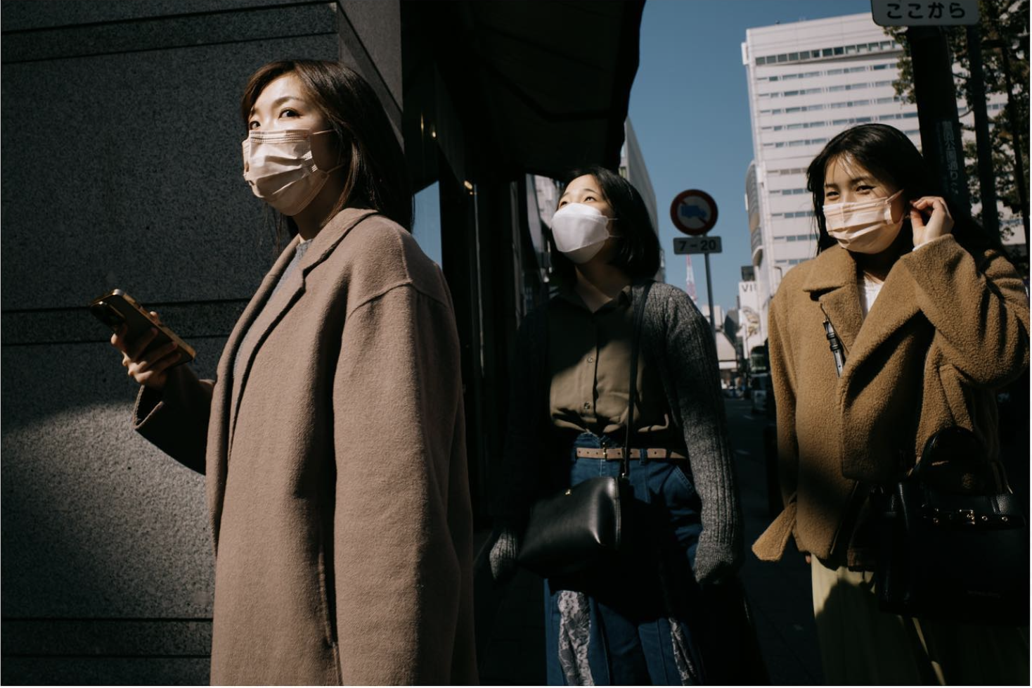
Alex's photo — @alex.on.streets
This one's mine, this is my photo, I'm going to critique my own photo here. A lot of people liked this one, not that it matters, but I got thousands of likes and a lot of comments on it. I'm going to be really brutal with my own photo though.
I liked it, and I posted it, because the colors worked: the girl has blue jeans that match the blue sky behind her, and she's looking up into the light, which is great timing. The lady on the left is looking down toward me as I took the photo, so I've got her eye contact, from a strange, low angle perspective, which I liked, and she's well lit. Then there's the girl on the right, who looks almost shy, but happily embarrassed, from what I could tell, about me taking her photo. So it read as a curious, friendly kind of reaction, which is why I took it. I like that there are three girls, giving it a composition, you can see the city in the background, and there's a sense of action, since they're crossing the corner, doing something. She's holding her phone but not looking down at it, thank god, that would have ruined the photo, I wouldn't have posted it if she'd been looking down at her phone, that would have just been trash.
Now let me rip it apart a bit. I'm honestly a little tired of this, and I know people will have different opinions, but they're wearing masks, which is unfortunately just how things are here in Japan right now. If you don't like photos of people wearing masks, I wouldn't recommend visiting Japan for the next couple of years, masks aren't disappearing here anytime soon. Mask culture in Japan wasn't as rare elsewhere even before Covid.
Right, even before Covid, people were wearing masks.
Exactly, I think people need to understand that mask culture in Japan has always existed. If you'd gone to Shibuya Crossing before the pandemic, the busiest pedestrian crossing in Japan, the famous one everyone knows, back in 2019 I'd say maybe twenty to thirty percent of people were already wearing masks, easily. Now, in the middle of the day at Shibuya Crossing, it's more like ninety nine percent, though people take them off more at night, which is part of why I'm glad winter's over and we're heading into spring, since I can shoot more at night now without freezing, and photograph people without masks a bit more. But I do sort of dislike this photo because of the masks, I've photographed so many people wearing them, I'm honestly a bit sick of it. A big part of why I'm going back to the US for a while is wanting a psychological break from masks and the whole Covid situation here. Not that I'm anti-mask, to be clear, I'm not some "Covid is fake" kind of person either, I'm pretty middle of the road politically on prevention and vaccines and all that, and honestly my opinion shifts day to day depending on how I'm feeling, but aesthetically, I don't love that they're wearing masks here.
Another thing: I wish there were more happening than just them walking. They are doing something, walking around the corner, and the girl on the right is holding her hair, a bit shy about being photographed, and the girl in the middle is looking up, but otherwise they're just doing what any person in Japan does on any given day. There's nothing especially unique about the situation. So I don't love this photo for that reason, even though I like it for all the other reasons I mentioned.
So what do you think, tear it apart, tell me. Before you said that, I don't really mind the masks. There's actually a Cartier-Bresson photo of a man in China, from around the 1950s, wearing a face mask, so it's not exactly a new invention from the last two years.
Right, and especially in Japan, you could have taken this same photo ten years ago and it might have looked just like this.
I'm wondering, if the girl on the right had the same head position as the girl in the middle, they'd both be looking up, and the girl on the left, who's leading them, looks quite strict, so it almost feels like some kind of group, not religious exactly, but with her looking up like that, light hitting her face, almost like she's being enlightened, and if the others matched that pose, it would look like some kind of group with a stern leader.
I think that's probably her mother.
Yeah, I think so too. For me, the smiling girl gives it away a little, since the one on the left seems candid, the middle one seems unaware, and the one on the right seems to have noticed me and reacted, since that's clearly not how she normally walks.
Right, she wouldn't normally walk like that. Other than that, I like the colors, and I like that there are three of them, three always looks better than two or four. There's maybe Tokyo Tower in the background.
Actually, that's Fukuoka Tower.
One of them, there are a few towers like that around, but yes. The lighting is also interesting, the way the sun comes through, I like how the faces are lit, aside from what I mentioned about the girl on the right. And by the way, I didn't stake out this spot for the shot, I wasn't waiting here for the right subject to come along. This was just me walking by, a quick snap. I could tell the lighting was going to be interesting, so as I approached I slowed down as the subjects were coming toward the light. I didn't want to get there before they did and just stand around waiting, that would have ruined it. So often what I do, when I notice a nice lighting situation ahead of me, is slow down or speed up to try to catch the right timing, and this was the only photo I took, I didn't shoot rapid fire. I shot this on my Ricoh GR3, twenty eight millimeter, and it was the only frame, no refocusing, just, timing's right, got it, walked away. I was really satisfied with that.
Closing
Alright, thank you, Alex, for joining me today.
Thank you, this was fun, an interesting conversation.
It was fun. I think a majority of the photos were really quite good, especially a lot of the ones at the beginning, the first four were really nice, and then especially that artistic one, the one from India with the flowers and everything, that was fantastic. So thank you, and if you liked what you saw, make sure to check out Alex's YouTube channel, Alex on Streets, on Instagram and YouTube as well. Thank you everyone for watching, I hope you enjoyed this critique. If you'd like to join a future critique, make sure to submit your photo to the AboutPhotography subreddit, you can find all the links in the description. Also, if you liked this critique, you should watch the video where I talk with Alex Kilbee from The Photographic Eye and we critique your photos. Thank you for watching, and see you next time.