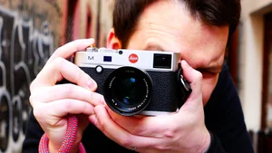
Professional Street Photographer Critiques Your Photos: A Conversation with Samuel Lintaro
In this episode, professional street photographer Samuel Lintaro joins me to critique a new set of reader-submitted photos, judging each one as if it were his own. Along the way he shares his own approach to street photography, including how he reads light, gesture, and timing before a shot even happens.
Today we critique your photos with Samuel Lintaro ( @SamuelStreetlife ) Check out Samuel's YouTube channel: https://www.youtube.com/c/SamuelLStreetlife
Website: https://www.lintaro.de/
Instagram: https://www.instagram.com/lin.taro/
Professional Street Photographer Critiques Your Photos: A Conversation with Samuel Lintaro
In this episode, professional street photographer Samuel Lintaro joins me to critique a new set of reader-submitted photos, judging each one as if it were his own. Along the way he shares his own approach to street photography, including how he reads light, gesture, and timing before a shot even happens.
Introduction
"Hello everyone, thank you for joining us today. I am here with Samuel from Streetlife. Hello Samuel, thank you for joining me today."
Thank you for having me again.
"So the idea behind this is to explore how different photographers critique different photos, and what I would like to ask you to do is to critique these photos as if they were your own."
Oh, okay, let's jump right into it.
@pierre_pauwels
Okay, so, because I don't know who shot this, and as you said, I will treat it as my own image. I will be as honest and critical, and maybe sometimes as harsh as I can be, but I also want everyone to know that this critique, well, you know I do one myself on my channel, you can only go so far. You need to know more about the photographer, the intention behind it, so everything will be just my subjective opinion of what I'm seeing.
"Of course, let's look at it as a standalone street photo."
Yeah, which is better than knowing who shot it, all the background information isn't so important if you only look at the image. So if I would have shot this, maybe I would be happy about the colors, the things going on in terms of the colors, the blue on the ceiling, it's kind of a busy place. There are rarely instances where I am happy with a photo of someone from behind, it's kind of cliché, we see people with hats a lot on the street, and I personally try not to shoot too many photos that look familiar to me. For me, I wouldn't necessarily keep this one, to be honest, there might be a better moment in this scene that you can find, maybe if you wait for this person to come back out of the store, you can see them from the front. I don't know, there's not much else going on, the story for me is: someone enters the store, the end. I think for me to be engaged as a viewer I need a little bit more, maybe a bit of mystery, something that piques my interest. So my first initial impression would be, oh, a lot of colors going on, but that's basically all.
"Also, I wanted to tell you that we don't usually do themes, but this round was just color photography."
Oh, okay, that's good to know, because I got that from seeing this for the first time, that the photographer definitely looked at the colors. Beyond that, I'm not so sure what else the photographer wants to show me. I kind of like the symmetry, if it was cropped on the right side, if the person was in the middle, it's kind of symmetry, not quite the golden ratio, but also not quite in the middle, it feels a little uncomfortable, not super symmetric. I agree, it would look a little cleaner, more balanced, cropped maybe to a one-to-one ratio, because now I'm starting to ask myself why we need to see so much from the right side, is it about the person or about the store? It's a little unclear.
@rosetta_lynn_photography_
"All right, moving on."
Strawberry Head, I think that's the title of this photo.
"Oh, okay."
Feels a little like a hip shot to me, looks very wide, could be shot on a phone, looks like 28mm, of course the person has an interesting outfit, everyone will take a photo of her. I'm sure we don't really know where they're heading, the eyes look at something, maybe there's something going on that we don't see. The background doesn't really tell me more about what I'm seeing, can't really tell if there's an event going on, a parade, maybe some kind of festival, but there are little hints of that in the background, because other people aren't dressed unordinary, but I get the sense that something's going on, and this person didn't just decide today she's going to be a strawberry and go outside like that. So there must be something going on I want to see more of, and yeah, it feels like a hip shot, and I think there's more to be explored here. You can follow these two people, if you're not clear what's going on, you can always ask, "what's going on here, do I miss something?" and then try to get that information from people, so you can explore this further, go to the event, maybe find other people who are dressed interestingly, and try to do some interesting juxtapositions. As it is right now, it feels like a hip shot, and then the photographer probably moved on their way, it's not enough.
"If you meet interesting subjects like this, would you personally follow them?"
Yeah, not in a creepy way, of course, but I think it's good, if nothing else is going on, and let's say you live in a boring city and things like this never happen, no one is dressing differently, then you have to take all the chances you get. So yeah, I would definitely follow these two and see what else is going on, where they are going, and you will also get reactions from other people, which can be interesting.
Story time
And actually, a quick little story: today I was out in the city taking pictures, and there were lots of women who are about to get married, so they hang out with their girlfriends, and it's a tradition in Germany that before you marry, you make a fool out of yourself, or your friends make you do things that are a little embarrassing, dress really silly, or do silly stuff on the street, and it was full of people doing that today. Which was fun, and mostly they were all doing the same stuff, but there was a group dressed like they were looking like 60s or 70s outfits, white pants, very colorful, and I didn't think these were the same kind of people I'd already seen, so I just asked them what was going on today, and they were like, "oh, she's going to get married," and I was like, okay, I see. And then we all entered the same subway, and I just stood next to them and hung around with them, seeing all the other people in the subway also react to them. So I was able to take pictures of them in different situations, I didn't follow them, but we happened to be in the same subway. If I would just take a photo of them at the train station and leave, then I would only have an image like, "these are people dressed interestingly," and you move on to the next thing, it's a missed opportunity. Because if someone is dressed like this, they will not be surprised if you ask them what's going on, what are you doing, can I take a picture, if you want to do that.
@gettons
"All right, moving on."
Okay, yeah, so if I would have shot this, I would be pretty happy about it. I think I would crop the left side a little bit, but I wouldn't change much, it has nice colors, and you know, color was the theme. The shadow and the silhouette are interesting, I also like that we don't see the face, it makes it a little more mysterious, it's beautiful, I think we can crop this a little and it would stand out more. Although, if this were my image, I would have a hard time cropping it into a different aspect ratio, because I don't really like to do that, but I think it would look very good, maybe even without the house on the left side, trying to imagine how that would look, just the blue and the white chair and umbrella, I think it would look much stronger. Because we have some other colors on the right side, I think it wouldn't hurt to leave a little bit of the pinkish house on the left in the frame, but maybe crop it after the door. But because it's already framed very tightly, you would have to change the aspect ratio, which you can do if this is just a single image, but in a series, of course, you want consistency. It's a cool shot, I don't know what else to say.
"How do you feel when you see a portfolio where the shots are presented in different aspect ratios?"
If there's a need for it, if the project calls for it and it's obvious, then sure, I would have no issue with that, but if it doesn't make any sense, then to me it would just be a distraction, I would keep just one aspect ratio. I think it's easier if you want to make a book out of it and do something with your work, it's easier if they're all the same aspect ratio. If you just post it on Instagram or social media, then this would work better in a one-to-one ratio, or maybe even four by five, on a platform like Instagram, for example. So just crop out the left part a little, then you have a really cool graphic image with nice colors.
@sacks
Definitely strong colors in here, oversaturated because of it, the legs look a little unnatural, they look very vivid, but the closest ones don't look too oversaturated, or maybe the skin colour was like that. But it's hard, it looks clean on the right side, it's also kind of messy on the top left corner. I think I would crop the left side to the point where the left leg, which is now behind, is sticking out maybe half of it, so that we don't immediately know what we're looking at, and now it's really obvious, it's some woman's behind, and you can even see a little through the pants, it's too obvious, this is what I wanted to photograph, and it's a nice background, it's clean, but what else is the story here? If we crop more of it, and make it, if the photographer wanted to show the shapes in a more abstract way, like now everyone knows, oh, this is a human, this is someone walking, so the story is over. But if we crop the left leg, half of it, away, we have just a little bit of colour and lots of blue, and then it makes us think a little more about the image, and I think it will look a little more interesting. The framing feels just a little weird, we have so much dead space on the right side, negative space, it's not filled with anything, just one colour, one tone, and it's hard to get that honest street shot, it's something that is really effective, and the yellow pops out so much, yellow and blue, opposite colours, it works, our eyes are interested in what we're seeing. But is it necessary to put her on the left side, if we can see her almost fully, it's a little weird crop for me, so I'm not sure what the intention here is, other than to look at the colours, but I will probably make this even more abstract, or focus on a very small detail.
"Imagine if you're standing in front of a blue wall like this, and then you see a subject like this entering the scene, would you shoot it like this, or what would your first reaction be?"
If I see this wall, my first reaction would be, okay, this is something I can work with, let's see what is going to make this more interesting, and then, if someone comes by with a yellow dress or yellow clothes, that's jackpot, that's perfect. I don't know how this person looks, so I don't know if she'd be interesting enough to have her full body in the frame, but maybe in this case, because it looks like something that wants to be as abstract as possible, I would probably, if the clothing is interesting, and she has maybe a nice...
"What's it called in English, if you have shoelaces and you do this?"
High boots or something like that?
"No, I just mean what you do with the laces."
Oh yeah, it's called Schleife in German, I know how it's called in Czech too. But basically, I can see her having something like that at the front, and mainly ask her to stop and say, "this background works perfectly with your dress, can I take a close-up here of this detail?" I think in most cases, if people know they're not going to be photographed with their face, they are probably fine stopping and posing for you, and I think it's okay, even though it's not candid anymore, but it's just your vision. I would probably try to post someone against the background.
PermanentCoffeeBrk
"Moving on."
Okay, what I like here is the harsh shadows, and how much the sign sticks out, and how it creates this cross, which I know is just a street sign and another sign below, but because it's lit up in a way that makes it look like a cross, it's interesting to look at. And then the person beneath it, this little red accent colour, the rest is kind of blue and muted, it looks interesting. Not so happy with her gesture, I don't know what she's doing, is she drinking something or is she on the phone, I can't really tell.
"Yeah, she's drinking something."
Okay, yeah, I don't know what the story is, it looks interesting, and if I would see this on the street I would also stop and think, let's work this. But what she's doing here, you can't really see her face, it's not a clear gesture, something better would be, maybe if she would really take a big sip and you can see the bottle, no one does that really, but it would make this a little more interesting. Or if she would look into the light, that would actually look very cool, her body is facing the shadow side, she's basically looking in the direction where the sun rays are going, but if she would look over her shoulder into the light, because we have these shadows that create a line to the right side, if she would look in the opposite direction, you'd have this opposing dynamic, that often makes an image very interesting, if you have things looking in opposite directions out of the frame. It's a cool image, for me it's more like a visual note, I would say, if I'm taking a picture here, if this would be my picture, I would think, ah, it's not quite there yet, definitely, let's remember the time of this photograph, and come back again. I like the colours, I think if she had a different colour of her coat, like black, it wouldn't work. Unfortunately, I don't really like too many other things, I don't think her pose is interesting, and it doesn't really make me ask a question about what she's doing, maybe because it's not visible if she's drinking or calling someone. So unfortunately this is just a shot of a person standing on the street, and composition-wise it seems like there's a stick out of her head, so I don't know if I like that. Just by a quick glance, I like the colours, but unfortunately that's probably the only thing, otherwise I think it's just like a snapshot.
One thing I want to add here is this is a perfect example of treating the street as a stage, a theatre that is happening on the street. If you treat scenes on the street as your own personal theatre, where you can direct, and people are actors in your scene, this is what resembles that to me, the woman comes from one side and she stands there, they're kind of waiting for her role to be called, to act out her role. I don't remember who said it, but someone in street photography talks about directing people on the street, like saying, "why are you doing this, oh, you should have done that, because that's more dramatic," even though you can't really force people to do something, but sometimes it feels like that, because we don't have too much control, we can't really control what people are doing, but you can wish it into existence. And here I feel like you could exercise a little bit of that power, by just hoping, "please move to the left, or act out your role." So for me, she's just waiting for her role to do something, in that way you could say it's a behind-the-scenes shot.
@inframeswetrust
"All right, moving on."
Yeah, I get it, the colours, the shadows, are interesting, it's cool, it's the silhouette and the gesture again, it's a little bit, again, you don't see the faces, a little bit from the back, the person's facing away from us a little bit. The silhouette again isn't really a well-defined silhouette, almost like just a blob of shadow on the wall, this would look more interesting, I think, if the gesture were very clear, like imagine just the hand spreading out with the fingers, you would see that on the wall very clearly, something that, because you have the subject and then the silhouette, which is another subject, but it comes from the same subject, right, so that's kind of cool, if you have a copy of something, and the light gives you that. Again, this is almost like the previous shot, the lighting is almost the same, so again this is an actor waiting to be called to play out their role, so again this is for me a behind-the-scenes shot, it's not the action that I want to see yet. Maybe if the photographer moved a little more to the left, they'd have got something different, and I was just wondering if the light wouldn't be this hard light with a defined shadow, but more flat, without shadow at all, you would have this person blend with the wall, with just legs sticking out, because her coat is...
"Right, yeah, that might be a funny shot."
I think, yeah, like you said, if the shadow was more defined, more interesting, you already have everything you need here too, for a great shot, it has all the elements, but it's just missing that extra spiciness. Something special, because everyone can take this picture, but there's more, you can wait a little longer, maybe another person coming into the frame, it's hard to look at, because I know that this is a perfect background for a little bit more action, or something cool happening.
My photo
[Laughter] First I thought this guy in the middle just got slapped, but I'm sure that's not the story, he seems to be enjoying the sun. The gesture is nice, it's always good to have some hand gestures in the frame, it's a little random, I have to say, I don't know what the story is, this is a good distance, it's pretty close, don't know what's going on, it doesn't speak to me, the background is a little noisy as well, the hand fun with the statue, it's too random for me, but it has the elements again that can work for an impactful image, for me the content is still missing, it's not the right moment. The person in the middle, that's cool, that's a little unusual, that's good, I would be happy seeing this, the hand, another layer that is hard to get, but still it's not too interesting to me, it's a little too random, and it's hard, it's not bad to have randomness in your image, but what you want is to control the randomness. So this is like something you take real quick and think, "oh, that could have been better," but there's no chance going back, because the hand is already gone, and maybe I don't know these people, so maybe I don't want to go back and stand there. Sometimes those random elements are just happening so quick, you either stand there and take it or you don't. It feels a little like this could be a good warm-up shot, sounds a little bad, but it's something that works, you got the hand, great, you got someone doing something interesting, you have someone on the left doing some blocking, but then the background is a little noisy, and then you get the timing and everything, so this is probably the GS3, that's why it has dust spots on it.
@joshgun_suleymanov
Yeah, Joker, okay, I like the idea, I've seen something like that before, I don't remember from which photographer, but the concept is interesting enough to do something like this, the shirt, the face, you can work with that, the back on the left feels a little weird. I like images that are a little blurry, that show motion, it's not there yet, sorry, it's an interesting subject, and there's potential for motion blur, working with motion blur and having this face, that's great, the back and the rest, and composition, it also feels a little random, it's very noisy, maybe if you're in front of him and have some more leading lines towards the face, moving this guy, and create a motion blur that goes into the frame, that could work, or maybe spin the camera so that everything is spinning, the face in the middle, because it does work, but it takes a little practice, that could be an interesting effect. Yeah, it's again something that, if I would catch that, I would look at the back of my screen and think, "oh yeah, I kind of got something here," but when I'm later looking at it on the computer, I would think, "ah, maybe not yet, but close enough." I kind of like the shot, I mean, if this wasn't the Joker character, but anything else, this wouldn't work, but to have a Joker in the middle, and his face, which seems like the eyes are in focus.
"Oh yeah, I just noticed that."
And then the rest is kind of blurry, so I kind of feel like this fits the character of the Joker, everything around him being kind of messy, that's what I like about it, but the eyes are still focused on you, and it's a little scary.
"Yeah, I didn't see that."
Yeah, it's kind of like a scary shot, this is so cool, that the eyes are sharp, I didn't really see that, this is cool, look at this crop, this is so intense. And I like what's going on between the back and the face, this diagonal, horizontal lines, there seems to be like an upwards motion, and then a sideways motion going on, it's very chaotic, so kudos for getting the eyes sharp, a little bit, checked what I said, I was out of focus, or something, and it caught the face on the T-shirt, but now I'm starting to question if this is proper, if it's really motion blur caused by a slow shutter speed, or if there's something like a post-process thing, maybe it does kind of look like that when you zoom in, the arm on the inside is sharp, and next, on the left side of the face of the shirt, it's very clear, there's a clear line, and it's kind of strange, now that I see it up close, I hope it is not a Photoshop job, but something else, something different.
"Yeah, that gives you plus points."
@aris_sfakianos
This looks like Piccadilly Circus in London, I'm almost sure it is that spot, because I have shot this image at that spot, almost the same, because they have these super bright advertisements on the buildings. I don't love it, but I also don't dislike it. I like this silhouette, it isn't doing anything interesting, but you see the head is separate from the body, it's a person, I don't know if we need the... it doesn't even look like a silhouette of a person. Maybe more interesting silhouettes, like this, or you could only get one silhouette, and then have maybe half of it red and half of it white, it also kind of looks like the red part of the frame is like blood leaking out of the silhouette, like if someone just shot him in the head from the left side, but because the angles are almost like 90 degrees, it looks a little too clean.
@okan.ozcan
"All right, I like how we just moved on. Moving on."
This is too black, all right. Okay, yeah, so, beautiful light, check, waiting for a subject to enter the frame, check, are we done yet, is this the winning shot? Maybe. I like the silhouette, it's clear, so you see the movement of the arms, I don't know what the shadow on the ground is caused by, a rock or something. It looks like he's holding something, like he's holding a flower, or he bought flowers, but in a weird way, not holding it down at the bottom, he kind of blends in with that little element on the ground, which is okay, it looks a little off, that's the first thing I notice, trying to figure out what it is, maybe it takes a little away from the scene, but it is beautiful light, and I like the negative space, the shadow on the left side, that's almost going into complete darkness. But it's kind of a cliché shot, I'm sorry, it's the easiest thing to do in street photography, find beautiful light and wait for someone to enter the frame, you have your shot. I've done it a lot, I sometimes still do it, and the more time you spend, the more chances you have to get something more interesting in the frame. For me, if this is part of a series of silhouettes, this could fit. I think, personally, if I had control over this scene and could pick and choose my subjects, I'd probably love to see someone coming out of that door, maybe casting a long shadow on the wall, because the light looks very close to the wall. The obvious thing is to wait for someone to fill the middle of the frame, which looks empty without them, but if someone entered the frame from the right side, maybe entering the building, or looking out of that door, adding to these long shadows, I think that would be more interesting, or maybe a cat, or a bird, imagine a bird flying close to the sun, you don't see it, but it casts a big shadow on the wall, that would be amazing.
"But you have to have a lot of patience for that."
Definitely, nice slide, I even like the colours, but kind of like you said, a cliché shot, a good cliché shot. Also, don't feel sorry if you think you're taking cliché shots, I do it too, and it's good to have them, it's good to take them anyway, you never know, they might end up being a little better than these cliché shots, so don't stop doing that, but know that there's always potential for more, there's always more you can do.
@salman_almadoug
So, okay, I don't like it too much, it's another person from the back. This is something you can take by walking down the street, practicing your focusing, on your camera, I don't know if you use manual focusing, I will probably focus on that guy to check if my distances are correct, and take a quick shot, and see, oh, it's in focus, and this kind of looks like that to me, because I do it a lot when I walk down the street. Instead of practicing with people coming towards me, because I have to be on my game and get the shot, I practice by people who walk in front of me, because they tend to keep the same distance, and I can adjust and take my time, and then when everything is set up, I move on to focusing on people who walk towards me. So for me this feels like one of these shots, it's kind of messy, I mean, the subject on the left is in focus, but it takes so little space of the photograph overall, and then you don't really know what's going on, and he's not even standing out against the background, because he's blending with another man. I think maybe if the photographer thought, like, an interesting character with the hat, could have moved, taken the shot from the side, or stood in front of him, like this. It's just a person from behind, and the composition isn't something interesting, I kind of feel like this is a shot you take to sell this head, if there would be a logo on the head, then you could sell it to that brand, and they will probably be happy to post it, because it's only about this person's head, and because we don't know more about this person, that's the problem, we don't know what this is all about, and then we see all the other elements, and they don't add anything to that photo, it's just a person walking on the street, and this is not something out of the ordinary, we see this on the street.
"Do you know this photo from Matt Stuart, with a weasel or something hanging from the back of someone on the street?"
Yeah, like this weasel. I think the story is the guy had it on his shoulder, and then it fell down and was hanging on the line, with his road, the background was also out of focus, similar to this one, but because it was such a weird scene, it was okay, because he wanted us to focus on this unusual moment, so in that case it made sense. But here, the subject is not that interesting to carry, it looks cinematic, crop it to 16:9, do some orange-teal colour grading, and it could be part of, I don't know, a Batman movie.
@emirssevim
"All right, moving on, what do you think about this one?"
Yeah, super hard shot to get, it's very strong, it's not perfect, but I don't want to pretend that I could have done this better. First of all, you have to get four things right here, no, actually five, because first you have to figure out the potential, that's number one, and then you have one, two, three, four people in the frame, all in almost a perfect position. If you think, "I want to put four people in this frame," then good luck, and be patient. The guy on the left is probably someone who was buying something, maybe he's the owner of this store or market, but he is in a good position, quite dominant but not too much, and he's starting the frame, and the others, I think I even like it, if someone would be under the second, whatever that blue thing is, if there was a person underneath or behind that, maybe it would be a little too much, but it could also work. To me it looks right here. I really like the third one, on the right corner, because it kind of looks like a raincoat, a person looking up, so it really works. The guy on the far right, had you discovered, yeah, it's good, the movement of the position of the feet is good, the same goes for the guy under the white thing, so it works. And then also, having the fruits coming into the frame, and not being too dominant, but just filling the corner, then having the street, so you have these lines, this foreground element, and then the street, then the other side street, the pedestrian street, and then the storefront and another line. I could never do it better.
"So can we talk about the next image?"
There are things I wish would happen here, like maybe the guy on the left looking into the opposite direction, doing something more than just standing there, but he is in the right spot, and yeah, it's a great shot.
@shorty.shots
"Moving on."
I don't know, I will be honest, if I see this on Instagram I would keep swiping. It's a beautiful photograph, it's beautifully shot, portrait orientation, it works well, I like that we don't see the wheel of the bus, it's just this little edge, this half circle, the lines, we all know it's a bus without really seeing much of it. The reflection is too strong, we see the boy's expression, is he looking into the camera, I don't know, probably not, but we see his face, he's looking out, it is what it is. When I first saw the shot, I thought something like this, the distance, in the middle, I would rather see either a tighter crop, focusing on the boy, maybe looking out of the frame, or I would like to see more of the scene, to have him in some sort of interesting, he's on the bus, so maybe including more interesting characters, it doesn't look like it was possible here, but this distance kind of seems to be in the middle. There are many things that do work so well, the lines, and how the lines cross each other, it's very nicely framed, composition is very good, it's perfect. I think the subject is probably what I have a little difficulty with, it's a nice moment, if this were my son, I have a photo like this, of course I would be happy, and he also caught something that is very candid, it's a relatable moment. The fact that we don't really see what he's looking at, he's probably looking outside at some street, observing people, because he's so isolated, we only see him, we don't see other faces, it's a good street portrait without being a traditional portrait. I see many of these photos though, and this is a good one, of course. This is a kind of photo that maybe in twenty years or so will be much stronger, it will be, well, not timeless, that's not true, because it will feel maybe a little old in twenty years, but it is very human, so in twenty years we will still feel the connection, or relate to it on a human level. As a photograph, it doesn't really stand out in today's times, with Instagram and social media, street photography is so oversaturated nowadays, we see window shots a lot from buses, but I think this has a good chance of having a long lifespan.
@lin.taro
"Ah, this is a bad shot, this is probably photoshopped, I doubt this is real. What should I say, this is of course the best street photograph in the world, that's the end. I mean, it makes me question if the woman was part of the wall and the photographer just got the butterfly, or if this was the other way around."
I think I have an idea what happened. No, okay, so, a little fun fact here: obviously this is my image, this was actually one of the first street photographs I was proud of, spent almost two hours to get this. As you see, I saw an interesting background, and waited for a subject to enter the frame, I had ideas in mind, I was hoping for someone, I was trying to get the butterfly on top of someone's head, but most people were taller than the butterfly, and some people would point at something and I wanted to get the butterfly aligned to someone's finger, which I almost got but didn't quite, and it just never came back. I had someone photograph it, but it was kind of boring, and then she came, and it was perfect, I only did one shot and it kind of works. What I wanted to say is the fun fact is that I submitted this to Tony and Chelsea Northrup, the photographers' YouTube couple, they did a street photography critique show with the street photographer Jonathan Higbee, who commented on the submissions, and the theme was juxtapositions, which is basically his thing, he's the master of juxtapositions. So I submitted this photo like one minute before they started the live stream, thought it would be fun if he critiqued this image, and they picked this one, and he said that the position of the feet, it's not ideal, but of course if I would have waited for the legs to be spread out more, so we see a clear motion of walking, then it wouldn't fit with the butterfly again. I also think he didn't like the woman on the right, which, of course, it looks cleaner if you crop it, but obviously this is my image, and I think it's still okay to have the woman on the right, because, and this is important, if I would crop the ground away, and also the right side, and have only the background and the butterfly and the girl, it would almost look too unreal.
"Yeah, you can probably do that by zooming."
Maybe, but like everything, even the butterfly, and then it would just be a girl with the umbrella, it would almost look like a photo studio, a clean, staged look, and I think I used this crop for a video thumbnail. It is visually interesting, but it almost removes it from the street, and that's why I kind of like the woman on the right, because it reminds us, oh, this is an actual street scene.
"Maybe another person on the left would balance the woman on the right?"
Maybe, yeah.
"But then again, you said you waited two hours for this."
Yeah, maybe one and a half, until I got this one, and then I waited another thirty minutes. I have another one with a guy on a bike where the butterfly's on his head, and it also works, but it's not as interesting as this one, I think it's a lucky shot.
"Yeah, but I like it."
Yeah, I like it too, it's hard when you need so many elements to line up, but still a nice shot.
Closing
"All right, so thank you for joining me today, and thank you everyone who is watching. If you want to participate, check out the links in the description. Thank you, Samuel, for joining me today."
No problem, it was fun not being the host of a critique show, and being able to be a little more honest.