“Colour Is Language”: What Zak van Biljon’s Pink Alps Say That Green Never Could
Welcome to this edition of [book spotlight]. Today, we uncover the layers of 'Modernising Nature,' by Zak van Biljon (published by Kehrer Verlag). We'd love to read your comments below about these insights and ideas behind the artist's work.
Infrared turns the Alps into a new color vocabulary.
It takes a place everyone thinks they know and makes it strange again. In this interview, Zak van Biljon explains how he uses infrared to push nature past “pretty” and into meaning. You will learn what he is trying to say with pink mountains, and why green is not always the honest choice.
Pink is not the point, and it is not a trick.
Zak breaks down the real process behind Modernising Nature, from planning and light to what works and what fails. He also talks about taste: when the colour becomes too much, and how he keeps the picture clear. So even if you never shoot infrared, you will walk away with a sharper way to use colour on purpose. You will see landscape photography as a language, not just a view.
The Book
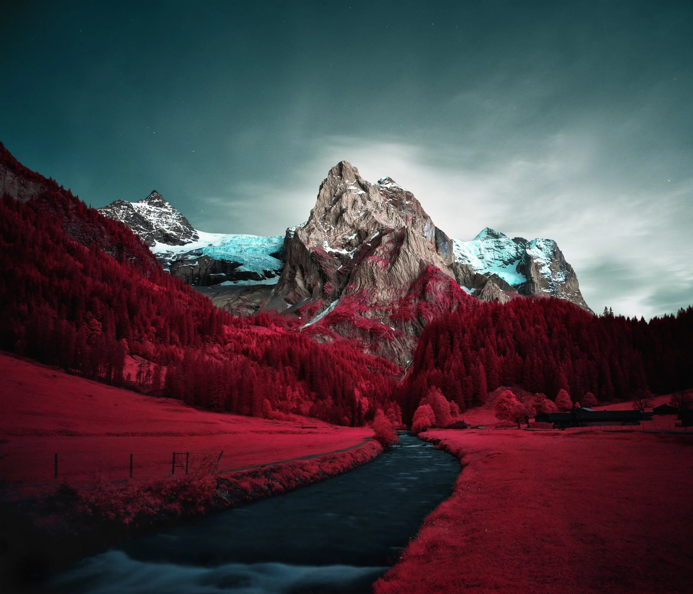
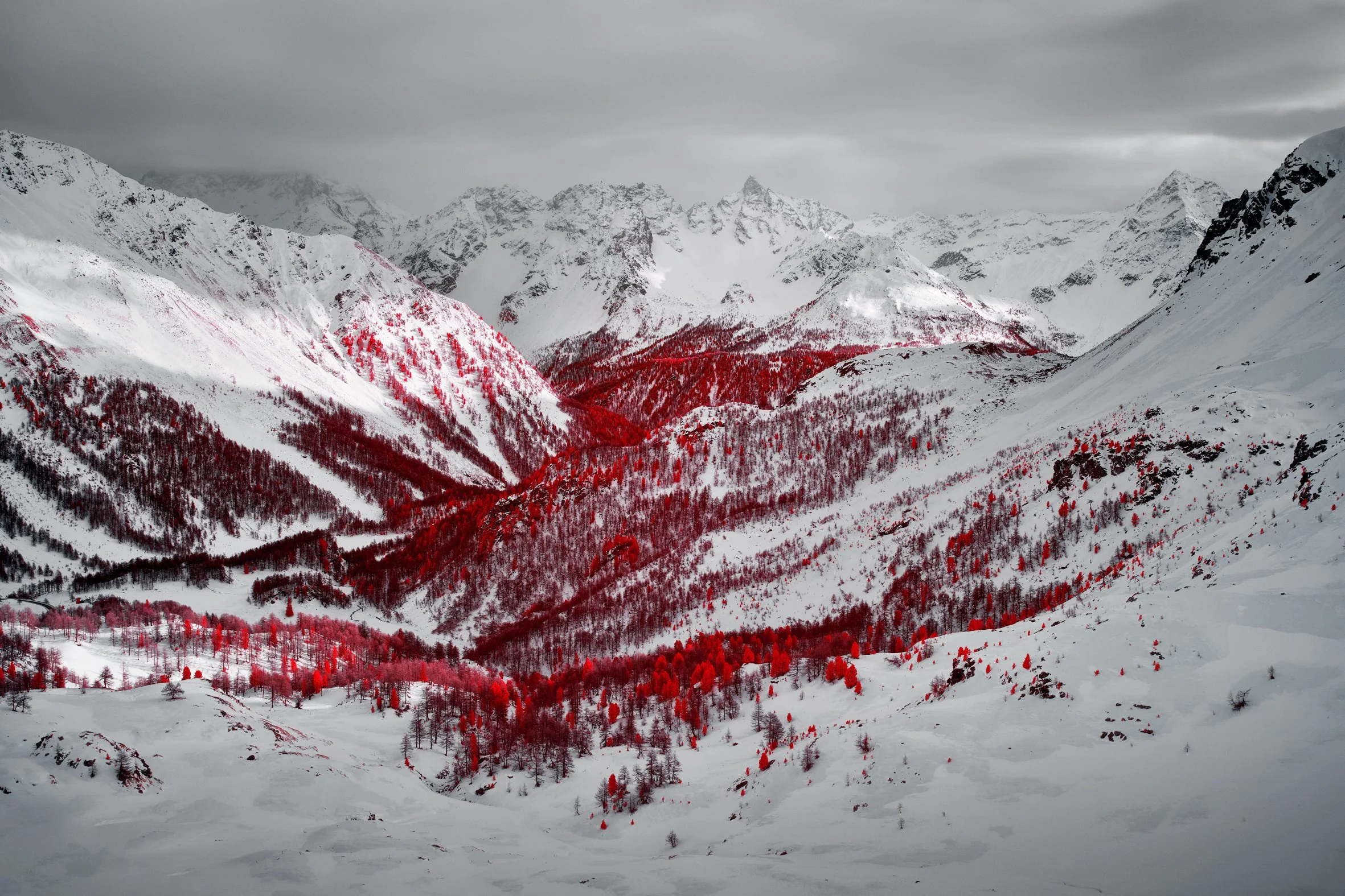
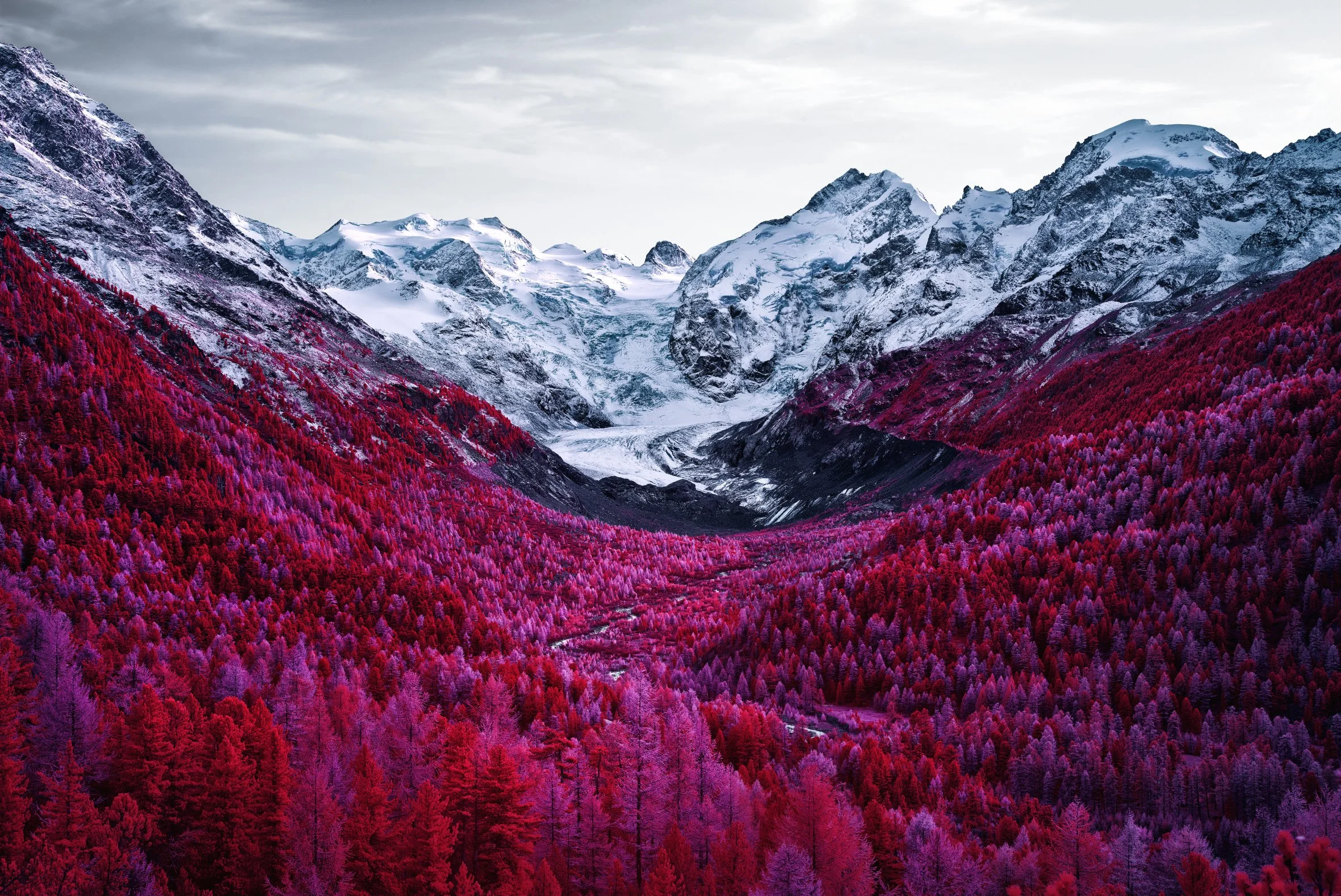
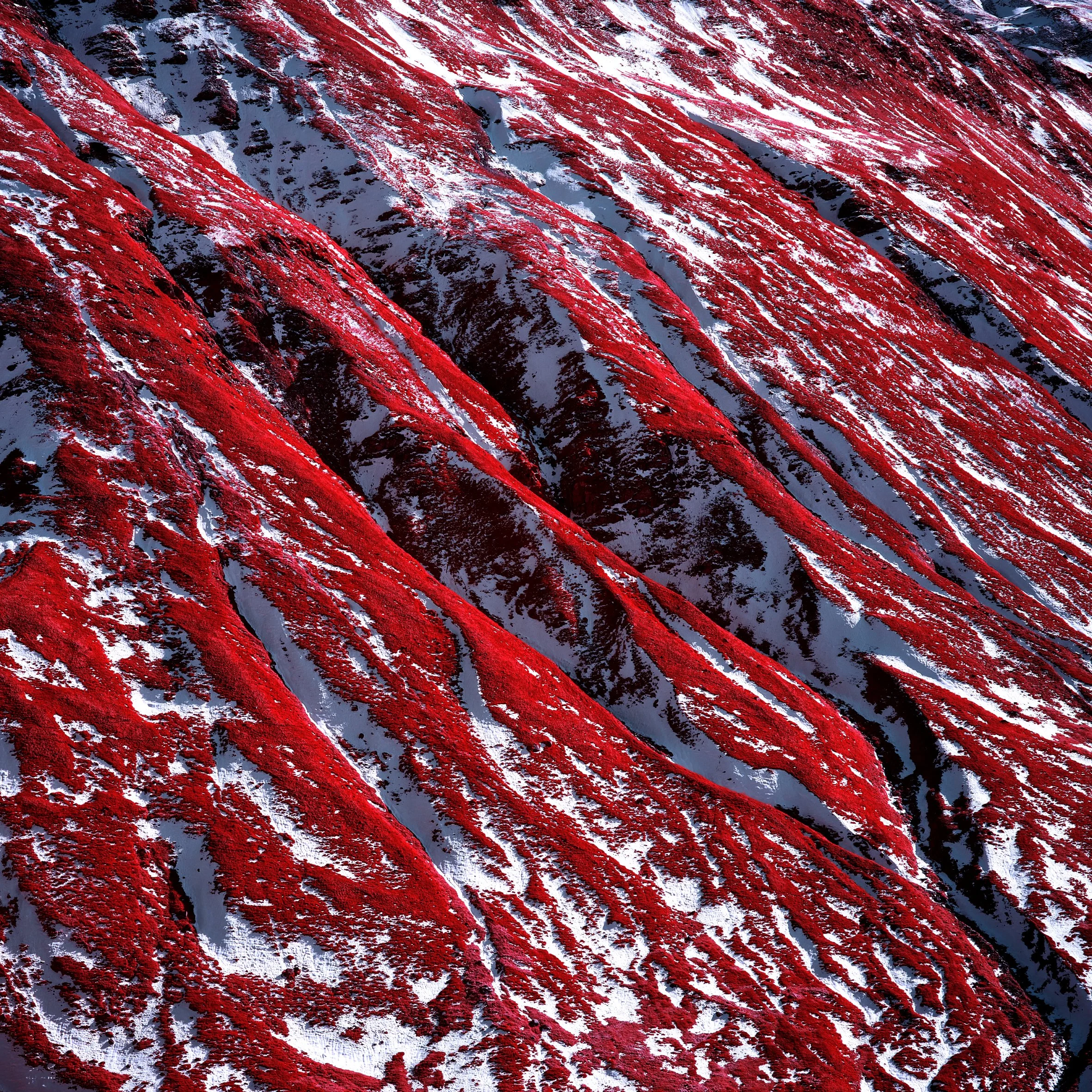
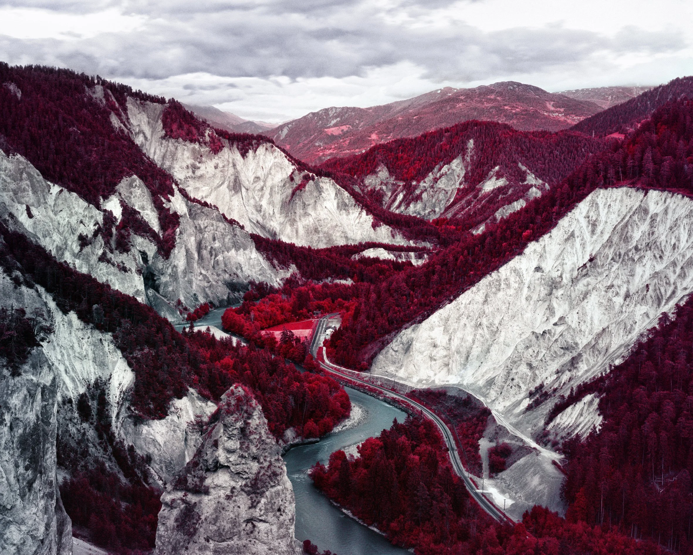
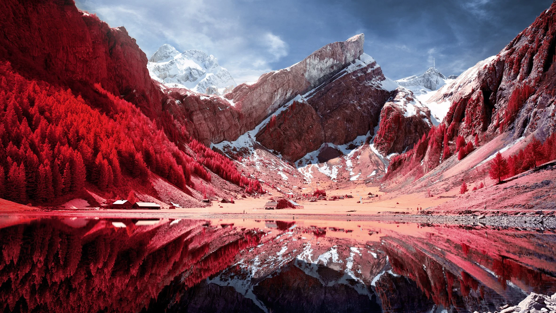
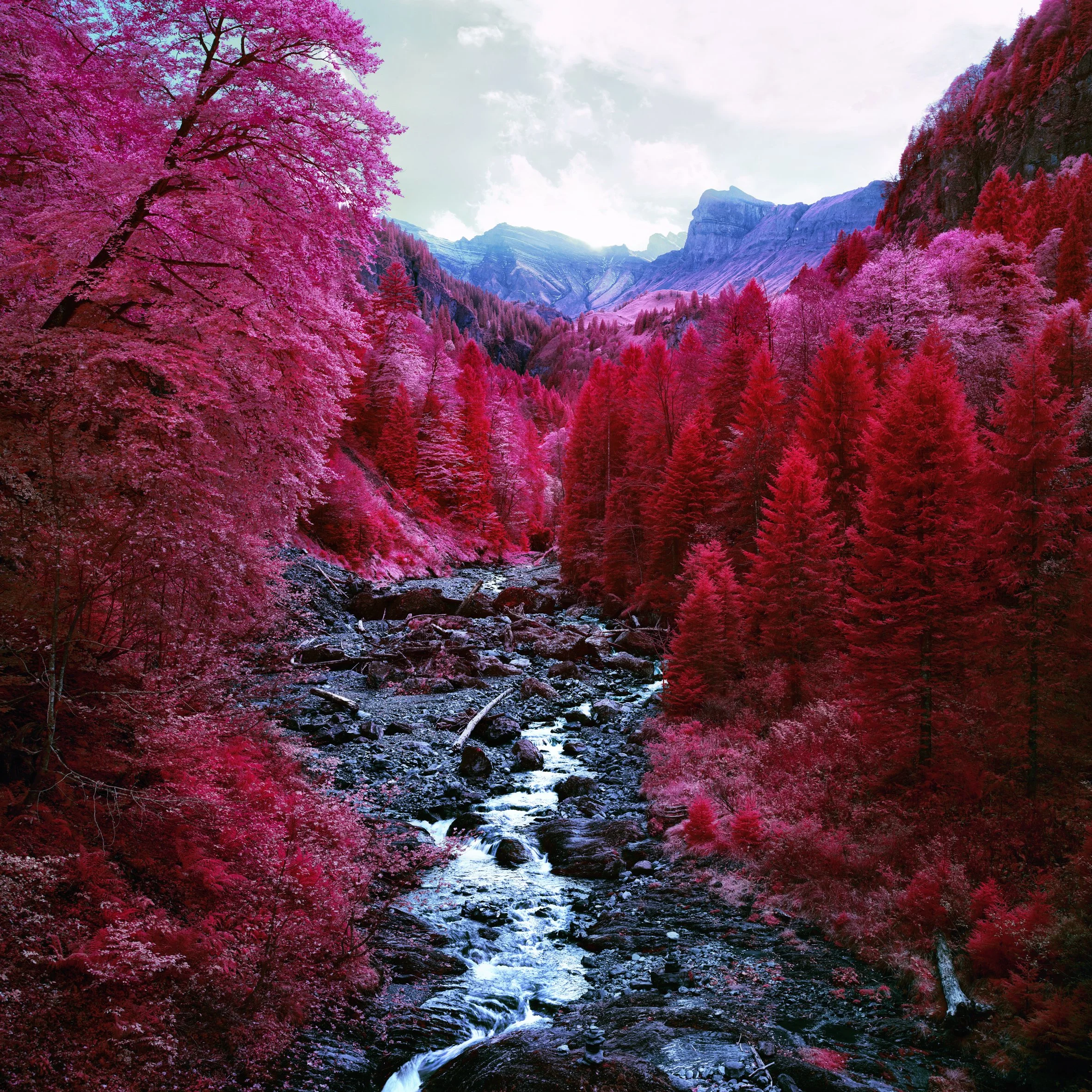
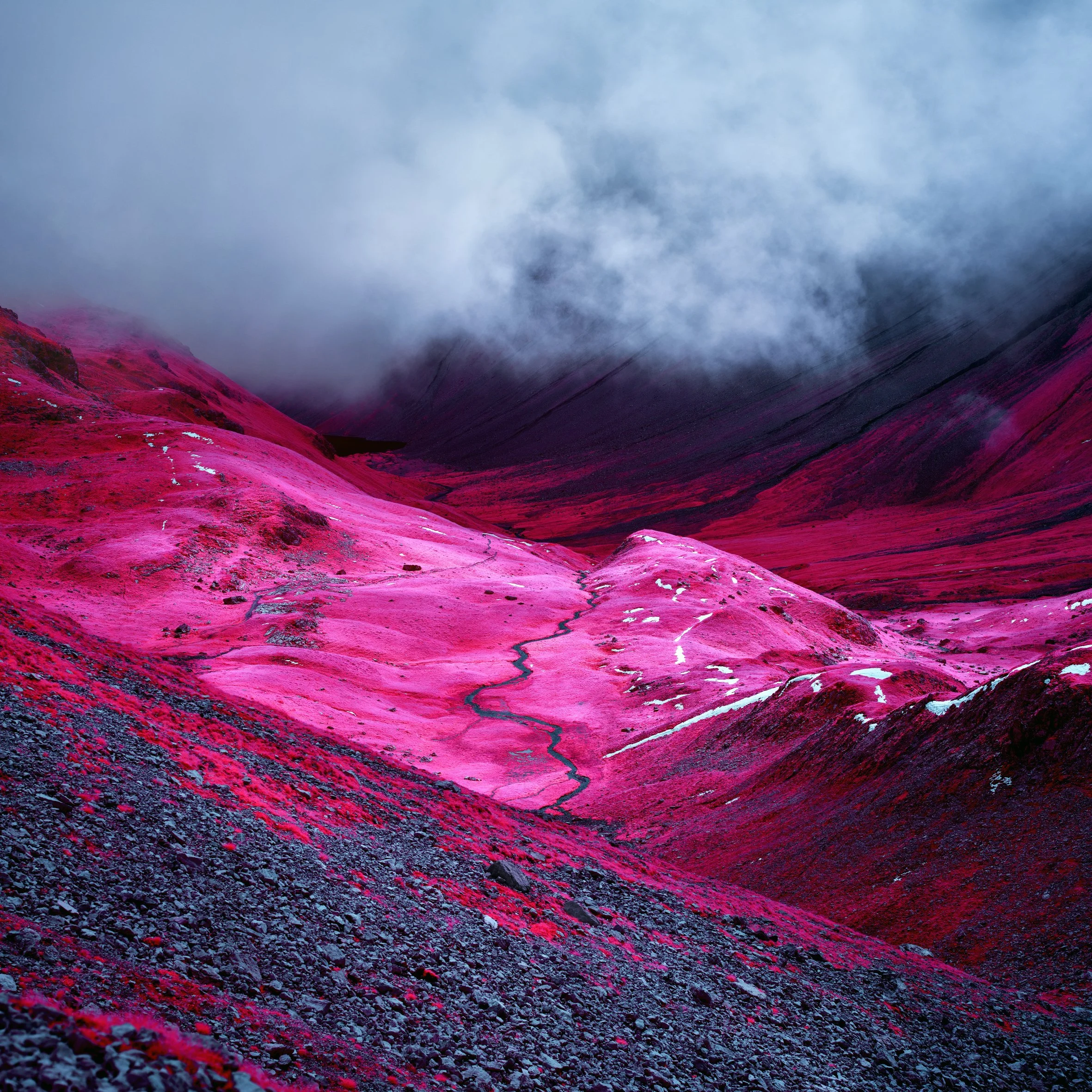
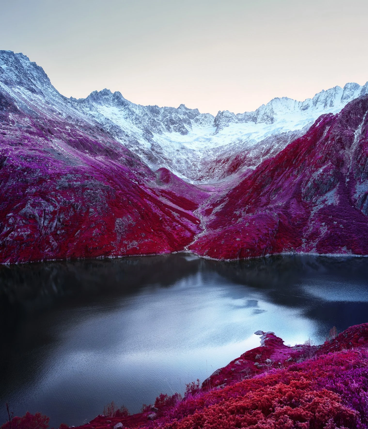
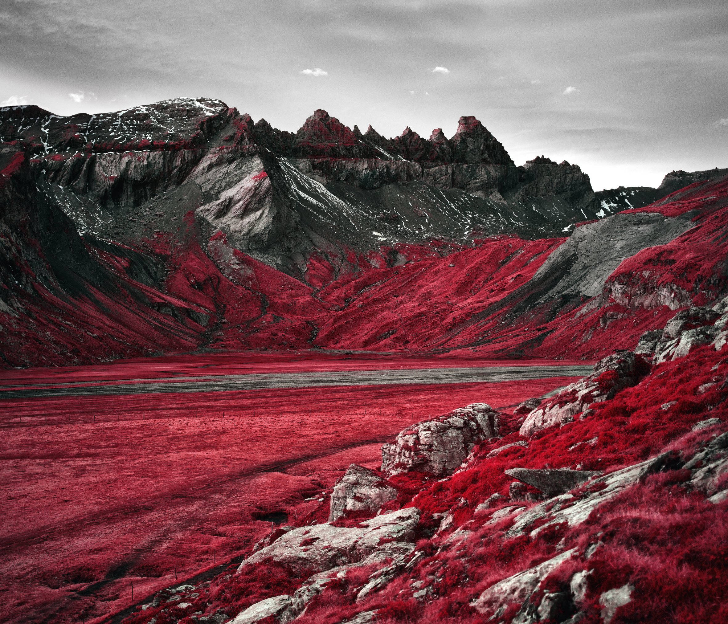
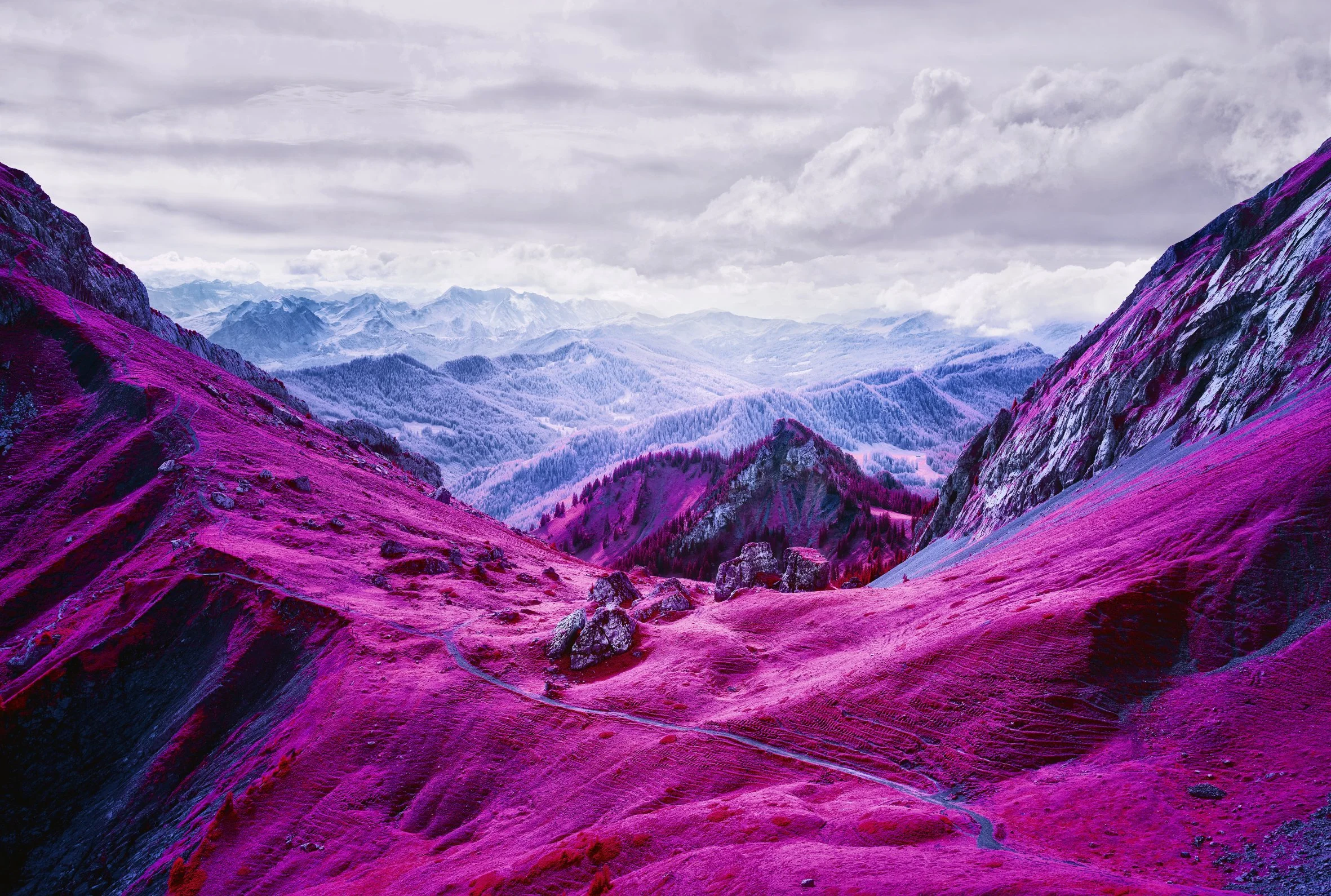
Modernising Nature by Zak van Biljon is a photobook that reimagines the Swiss Alps through near-infrared photography, a technique that records light just beyond what the human eye can see and translates it into vivid pinks, reds, and violets.
What can look like digital manipulation is actually a faithful rendering of a hidden spectrum, especially the infrared energy reflected by vegetation, which shifts familiar greens into an otherworldly palette and makes the landscape feel both beautiful and slightly unreal. (Kehrer Verlag, Amazon)
Project Start: What made you decide to use infrared photography to show the Swiss Alps instead of normal colours?
I started this project at a time when I was doing a lot of commercial work, and creatively it didn’t feel satisfying enough. I wanted to make something personal that I truly enjoyed. I’ve always loved spending long hours out in nature, so returning to the Swiss Alps felt like the right place to begin again.
At the same time, it was when Instagram really started to take over how people looked at landscapes. Everything became heavily filtered, and nature often turned into a backdrop, people posing to show they were there, rather than actually seeing or appreciating the place. I wanted to react to that. So instead of another “normal” alpine picture, I chose infrared because it creates these bright, wild, unreal colours that you can’t scroll past. It makes a familiar landscape feel strange again, and that’s the moment I’m interested in: getting people, especially younger city audiences, to stop, look, and hopefully think about nature in a deeper way.
You mentioned that Instagram turned nature into a backdrop where people just pose to show they were there. When you're out shooting in the Alps, do you still encounter this, and does it affect how you work or choose your locations?
Yes, I still encounter it, especially at the famous viewpoints and anywhere with easy access. You’ll see people arrive, take the “proof” photo, and leave again. It’s not a judgement, it’s just the rhythm of how places get consumed now.
That said, I do feel it’s declined a little compared to the early Instagram years. The algorithm has changed, and a lot of what’s being posted now isn’t as nature-focused as it used to be. And for me, it’s still a reminder to work in a slower, more intentional way to make images that bring the focus back to the landscape itself, not just the fact of being there.
Technical Choice: You use both film (Kodak Aerochrome) and modified digital cameras for this work. How do you choose which one to use for different locations?
I would always prefer to shoot on film if I could. The analogue look, especially with Aerochrome, just has a richer, more beautiful colour, and for me it’s actually simpler and more intuitive to work with. The main limitation is that the film is expired, and you can’t really buy it anymore. I still have a good stock, but I treat it as something special and I save it for the right moments.
So at the moment I shoot a lot more digitally because it’s the safer option: it’s reliable, practical, and it lets me work without worrying about wasting rare film. But if there’s a specific location I really love, and I know the light and conditions will work, that’s when I choose film because I want that particular place to have the best and most unique rendering.
Seeing Different: Your photos show "invisible energy reflected by vegetation." Can you explain what this energy is and why our eyes cannot see it?
Plants and trees reflect a lot of near-infrared because of their internal leaf structure. But the human eye only sees a small slice of the electromagnetic spectrum, roughly what we call visible light, and near-infrared sits just beyond the red end of that. So even though it’s there and it’s being reflected all the time, we can’t perceive it as colour.
Infrared film and modified digital cameras are sensitive to that wavelength. They record how strongly vegetation reflects it, and then that information gets translated into the bright, surreal tones you see in my images. So the work is essentially showing a real, physical layer of the landscape; it’s not a filter or fantasy, it’s just a part of light that’s normally invisible to us.
Colour as Language: On your website you say “colour is more than light, it's language." What message do the pink and red colours in your photos tell that green cannot?
Pink and red can communicate something that green often can’t, because green is the “default” language of nature for us. It’s familiar, calming, and we almost stop noticing it. When I shift that green into pink and red, it rewrites how we read the landscape; you can’t rely on the usual shortcut anymore, so you’re forced to look and think differently.
Those colours also have an alienating effect; they make the Alps feel slightly unreal, almost like another planet, but at the same time, they’re still very pleasing. That tension is important to me. The image feels strange, but it’s also warm and inviting, so people are drawn in rather than pushed away. It’s almost like an opposite palette, but it stays attractive and welcoming.
And colour is never universal. Different cultures read colour differently; for example, red can mean prosperity and celebration in many Asian cultures, while in the Western world, it might suggest warning, danger, or intensity. I like that the work can carry multiple meanings at once, depending on who’s looking at it.
Mountain Challenges: What is the hardest part about shooting infrared photos in the Alps (weather, equipment, finding the right light)?
For me, the biggest challenge isn’t even technical; it’s time. I still have a family, and that’s a major priority in my life, so getting the right window to go out and shoot is often the hardest part. And then when I do have time, the weather also has to cooperate.
In the Alps, everything is so weather-dependent. Lately, there’s been a lot of summer rain, and that can make it difficult to get the infrared look I want. And when it does snow, it’s beautiful, but the perfect snow conditions don’t last long. Often, the snow looks clean and fresh for only a day or two, and then it changes quickly. So the real challenge is aligning everything: family life, a free day, and that short, ideal weather window.
That's interesting about the snow only looking perfect for a day or two. Can you walk me through what happens to it after that? What changes make it less ideal for infrared photography?
The snow melts very quickly, especially in the last few years. It can snow, and then within a day or two, sometimes even the next day, it either rains or the temperature rises. So there’s only a short window where the snow still sits fresh on the branches and everything looks clean and quiet.
Once it starts melting, a few things happen: the snow falls off the branches, the ground becomes patchier, and you get more wet, heavy textures. Visually it can feel messier and less “pure,” especially in infrared where bright snow and strong contrast can quickly dominate the scene.
And I’m aware that this is also partly my idea of “perfect.” In a way it’s me judging nature, deciding what’s ideal and what isn’t, and that’s something I think about. Sometimes the messier stage can also be interesting, it’s just a different mood and a different kind of image.
Not Digital Filters: Many people think your images are edited with computer software. How do you explain that the colours are real infrared light, not manipulation?
I usually start by explaining that infrared light is real; it’s just outside the spectrum our eyes can see. So the camera is recording information that’s actually there in the landscape, just normally invisible to us.
Most people understand that part, but then they ask, “Why does it turn red or pink?” And that’s where I explain that the camera still works with colour channels of red, green, and blue, and in infrared photography those channels get mixed differently because the sensor or film is also capturing infrared. Especially with vegetation, which reflects a lot of infrared, that information ends up being translated into these pink and red tones.
It can get technical quite quickly, so I often compare it to something we accept without thinking: like why the sky looks blue, or why ice can look blue. It’s not that someone edited it; it’s just the way light behaves, and the way the camera interprets wavelengths our eyes don’t normally see.
Working Process: When you arrive at a mountain location, how do you know if the scene will work well in infrared? What do you look for?
When I arrive at a location, the first thing I look for is actually composition, whether I’m genuinely drawn to the scene. If the shape, lines, and layers aren’t strong, the infrared effect alone won’t save it.
Then I start reading the conditions: what the light is doing, where the shadows fall, and how the scene is structured. After that, I look closely at the vegetation, because infrared can easily turn plants into one big block of pink or red. So I’m looking for separation, different types of vegetation, different distances, and contrasts against rock, snow, or sky, so the image keeps detail and depth instead of becoming one flat colour.
And honestly, there’s always a bit of trust involved. You can do everything right, but mountains and infrared can still surprise you. So part of the process is experience, and part of it is hoping you don’t run into some unforeseen problem once you commit to the shot.
Urban Connection: You say you want to attract "neon city dwellers" with bright colours they recognise. Do you think this approach helps people care more about nature?
Yes, I think it helps, but not in a naïve “one photo saves the planet” way. For me, the bright colours are a bridge: they speak a visual language that city life and screens have trained us to notice, so they make people stop scrolling and actually look. And once they pause, the landscape can shift from being just a backdrop to something you engage with, and that’s where curiosity, reflection, and care can begin. That’s the intention, and I hope it works.
15-Year Journey: You started with black and white infrared in 2001 and now have this book. What is the biggest lesson you learned about infrared photography during this time?
The biggest lesson for me was to keep going, keep trying, keep experimenting, and stay with an idea until you’re really happy with it. With infrared, it’s never guaranteed you’ll get a strong image, even if everything looks perfect, so you have to accept that process and not give up too quickly.
And I’ve also learned that sometimes the most unexpected frames become your favourite images. That’s why the journey has been such a big lesson for me, to enjoy the adventure, the locations, and the experience of learning something new, not just chasing a “perfect” result.
You've spent 15 years with this technique and now have a published book with your work. Looking back at everything you've created, is there a moment or image in this collection that surprised you the most, where the result was completely different from what you expected but became something special?
Yes, there’s one evening that really surprised me. I wanted to photograph a valley, but I arrived a bit late. I still thought the colours might be interesting, but the sun was already gone, it was after hours, just after sunset. I almost didn’t take the picture, but I decided to shoot it anyway, just to see what would happen.
Later, when I looked at the result, I realised there was still a fair amount of infrared light in the landscape, even though you wouldn’t expect it. An image like my Wetterhorn photograph comes from that kind of moment, shot after the sun had set, when the remaining infrared light seems to gently “light” the scene. The shadows become very muted, almost disappearing, and the whole image turns softer and calmer.
To discover more about this intriguing body of work and how you can acquire your own copy, you can find and purchase the book here. (Kehrer Verlag, Amazon)
More photography books?


We'd love to read your comments below, sharing your thoughts and insights on the artist's work. Looking forward to welcoming you back for our next [book spotlight]. See you then!