How Complexity Theory Shaped the Visual Language of David Ricci’s Photographs
Welcome to this edition of [book spotlight]. Today, we uncover the layers of 'Hunter Gatherer,' (published by MW Editions) and 'EDGE,' by David Ricci (published by Fall Line Press). We'd love to read your comments below about these insights and ideas behind the artist's work.
Most photographers underestimate how complexity really works.
Many believe a busy frame is enough, but true complexity needs structure. David Ricci has spent decades learning how to hold a chaotic scene together. In this interview, he explains how small choices create order inside crowded environments. You will see what makes complex photographs strong.
Ricci did not rely on chance.
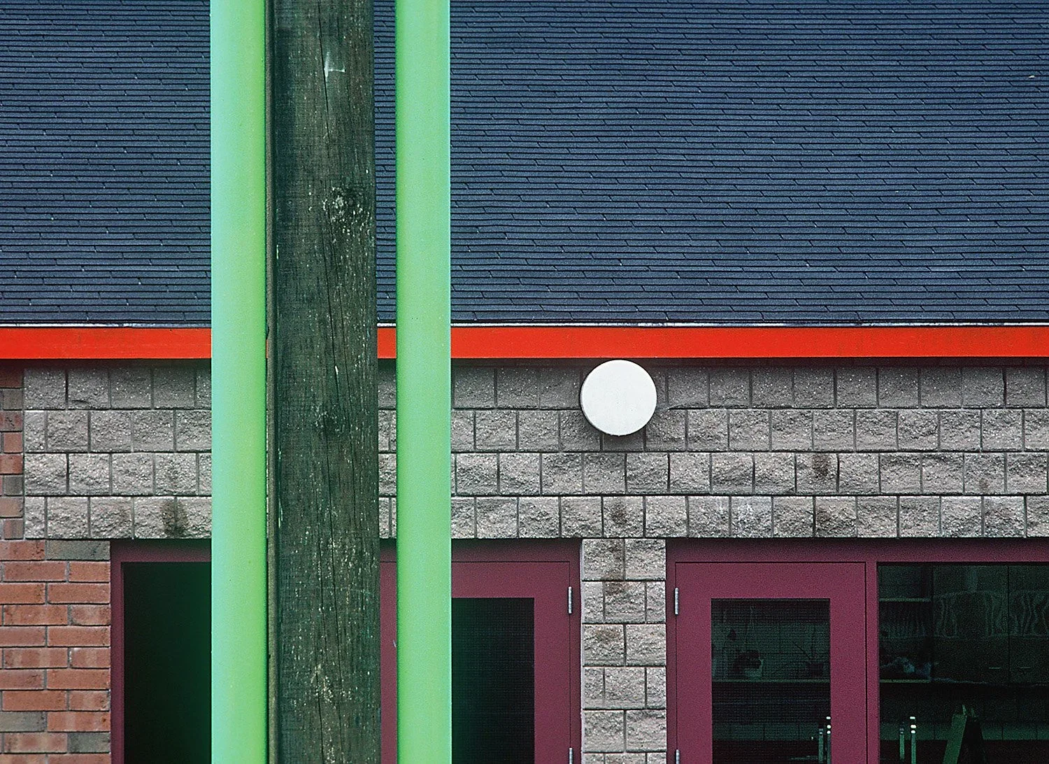
He used ideas from science, engineering, and repetition to guide his compositions. His book EDGE shows more than thirty years of working at the edge of chaos. These ideas can help any photographer see more inside the frame. This interview will walk you through his approach.
The Books
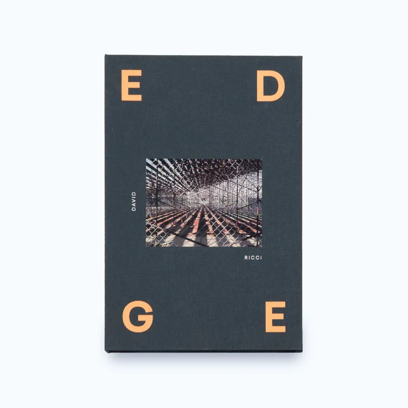
EDGE
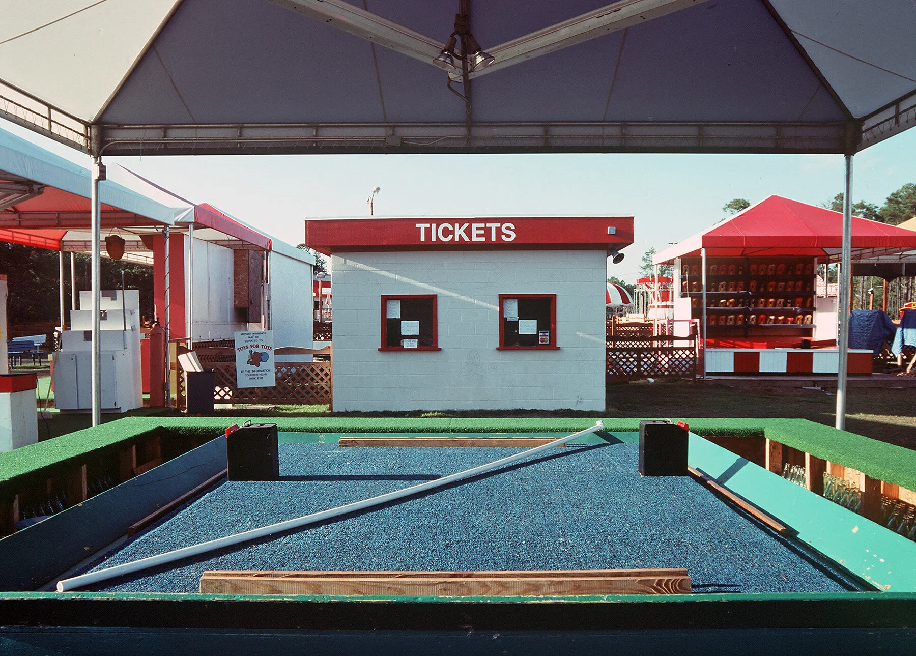
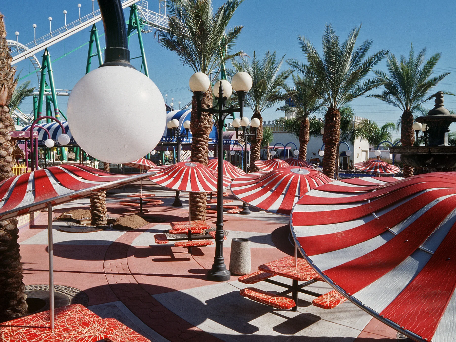
EDGE brings together more than thirty years of David Ricci’s work exploring visual complexity in everyday environments. The book presents amusement parks, scrap heaps, industrial sites, and working boats as dense, carefully balanced compositions that sit between order and chaos. It shows how Ricci’s approach turns ordinary scenes into structured, detailed photographs that reward slow looking. (Fall Line Press, Amazon)
Hunter Gatherer
Hunter Gatherer is Ricci’s long-term project documenting objects found in flea markets, resale shops, and antique fairs around the United States. The book transforms these displays into tightly composed images filled with symbols, cultural references, and unexpected connections. By photographing the items exactly as he found them, Ricci creates a visual record of American material culture and the stories hidden inside it. (MW Editions, Amazon)
How did you first get into photography and what drew you to it initially?
I’m completely self-taught. I actually studied biomedical engineering in college, and photography wasn’t something I had much exposure to growing up. I tried drawing as a kid, but I was never very good at it, so art didn’t feel like a natural path for me.
Everything changed during the last week of graduate school. I stumbled into a small photography show organised by the camera club at RPI in upstate New York. Walking through that exhibition, I remember feeling genuinely intrigued. It struck me as a way of making images without needing the kind of manual dexterity I lacked. Photography felt like drawing with light, and that idea opened something up for me.
About a year later, I bought my first Nikon 35mm camera, started teaching myself, read everything I could, and visited exhibitions. That was the beginning.
Was it a particular show or a particular photographer you liked?
After I started reading about photography and exploring it more seriously, a few photographers and a couple of key experiences shaped my direction. One of the most important moments was a visit to the Museum of Modern Art in New York. I went there intending to see their photography exhibitions, which included classic works by Edward Weston, Garry Winogrand, Robert Adams, and others.
But the real turning point happened when I wandered into the painting galleries. There was a massive Jackson Pollock piece on display, Blue Poles, and it completely captivated me. Up close, it was all texture, layers, and paint on canvas. From a distance, these bold structural elements suddenly emerged. The experience shifted dramatically depending on where I stood, and I found myself drawn in again and again.
I also remember being struck by the colour and pattern in paintings by Pierre Bonnard and some of the Impressionists. I spent far more time in front of those paintings than I expected, often more than with the photographs. It wasn’t that the paintings were necessarily better, but they absorbed me more deeply. They rewarded slow looking, and that stayed with me. I didn’t walk out wanting to become a painter, but I did start wondering how to make photographs that could hold a viewer’s attention in the same way, images that invite repeated viewing and continue to reveal new things.
The other major influence was discovering the world of new colour photography. There were exhibitions and a book by Sally Eauclaire that introduced me to William Eggleston, Stephen Shore, Joel Meyerowitz, and others. That book was a revelation, especially Stephen Shore’s work. His photographs seemed almost mundane at first glance, but when you spent time with them, you realised how carefully everything was composed. The relationships between objects, shapes, forms, and colours created this subtle but powerful structure beneath the surface.
I bought Shore’s Uncommon Places and studied it closely. He and Eggleston ended up becoming two of the biggest influences on my work.
Talking about composition, looking back at your 50-year career, when did you realise you wanted to push photography beyond conventional composition?
One of the early turning points came through the influence of new colour photography. Stephen Shore’s work, for example, contains a surprising amount of complexity, even though his colours tend to be quite muted and restrained. At the time, I was making photographs that were much more graphic, often architectural, with strong, bold colours.
I wanted to take what I admired in Shore and others, but use it as a springboard to create something that felt more dynamic in terms of colour. As I experimented with that approach, I gradually began adding more and more elements into the frame. Shore and many photographers of that era relied on recurring visual motifs, but I found myself wanting to push those ideas further.
For me, it became about amplifying repetition and interplay: repeated colours, shapes, patterns, and forms all interacting within the rectangle. That was the moment I realised I wanted to go beyond conventional composition and see how far I could stretch those visual relationships.
Can you tell me a little bit more about your book Edge? What is the Edge of Chaos concept and how did you discover it?
Because of my engineering background, I’ve always had an interest in science, mathematics, and physics, even after I stopped working in those fields professionally. While I was already focused on photography, I kept reading about these subjects, and that eventually led me to a book called Complexity by Mitchell Waldrop.
In that book, Waldrop describes a concept called the edge of chaos. He explains that when you keep adding more and more elements into a system, the system becomes increasingly complex. But at a certain point, it goes beyond complexity. Something new emerges, something that isn’t just the sum of the parts. It transforms into a different kind of order.
As I read that, I realised it echoed what I was trying to do in my own photographs. I kept pushing more elements into the frame, almost to see if the picture would fall apart. The idea of the edge of chaos became a metaphor for that process. I wasn’t going out looking for literal examples of chaos; it simply described the tension I was exploring in my compositions. That metaphor later became the title for a book dummy called Edge of Chaos. When the book was eventually published, we shortened it to Edge.
Edge brings together several portfolios made over more than 30 years, from the early 1980s through the 2000s. The earliest images include a few pieces created before I fully embraced the edge of chaos approach, but they hint at where I was heading, with strong geometric forms and bold structures.
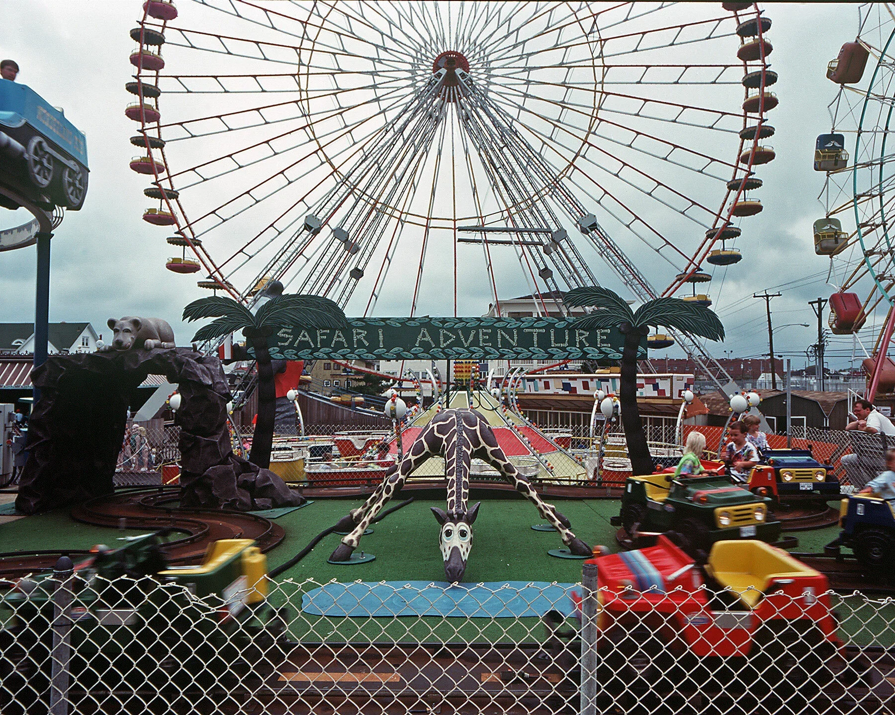
From there, the book moves into a project I made in amusement parks, mostly along the Jersey shore but also in South Carolina, Arizona, and other parts of the United States. I photographed them when they were nearly empty, often at the beginning of the season when things were being set up or at the end when they were being dismantled. That was during the 1990s.
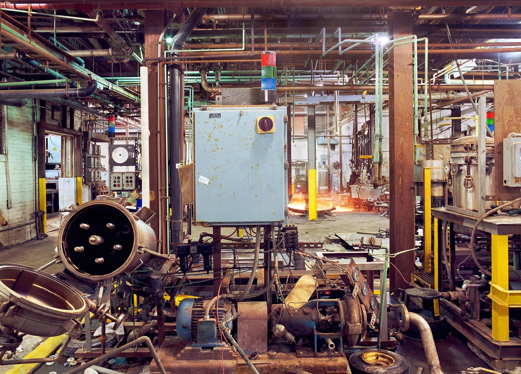
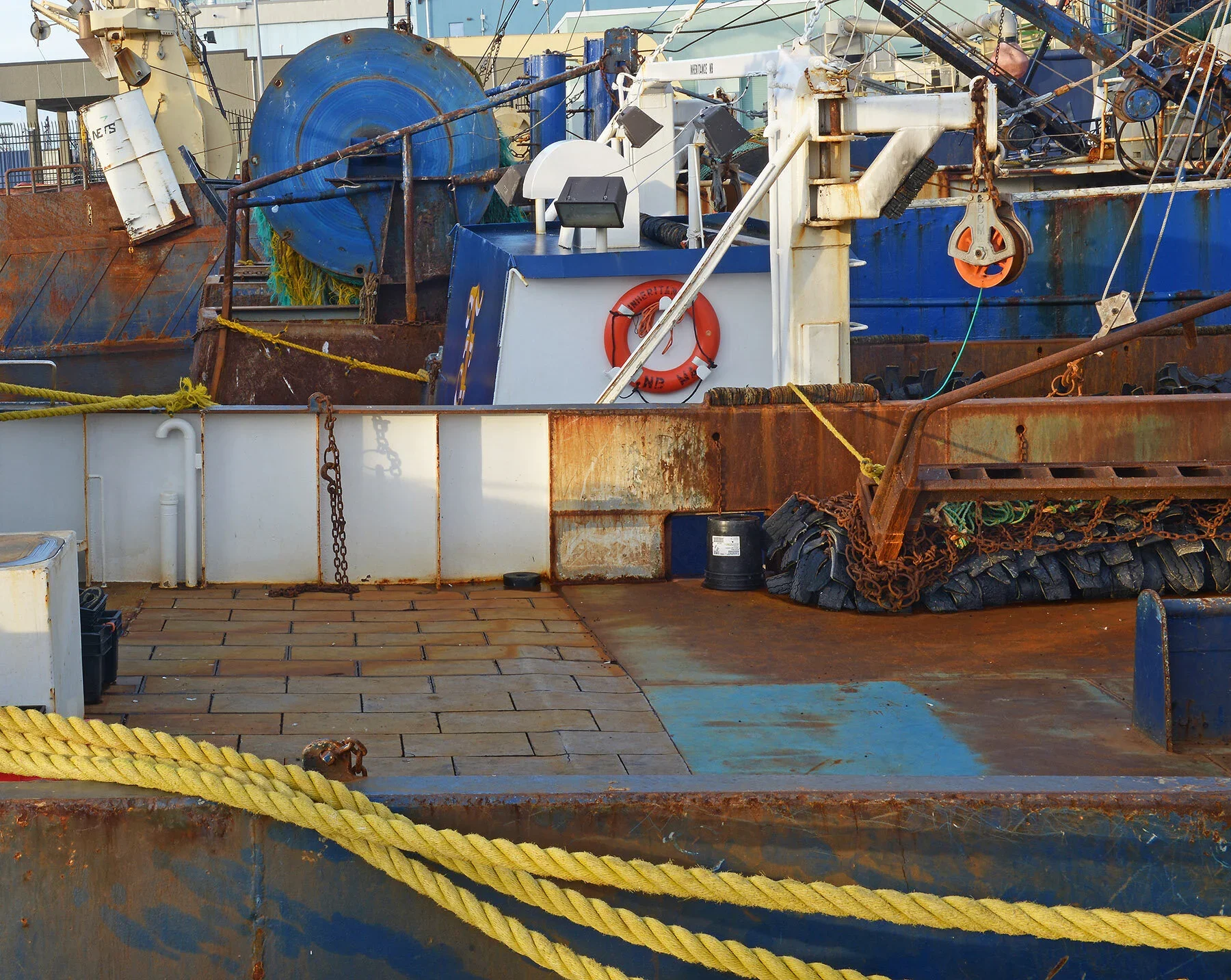
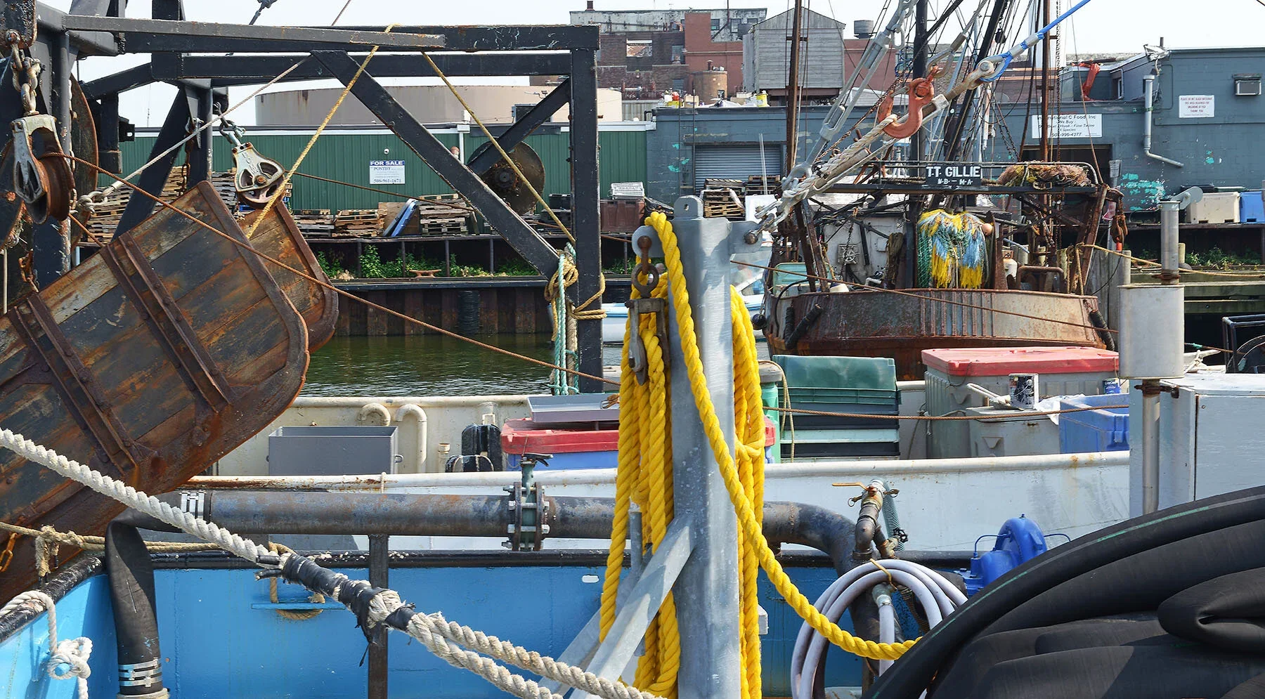
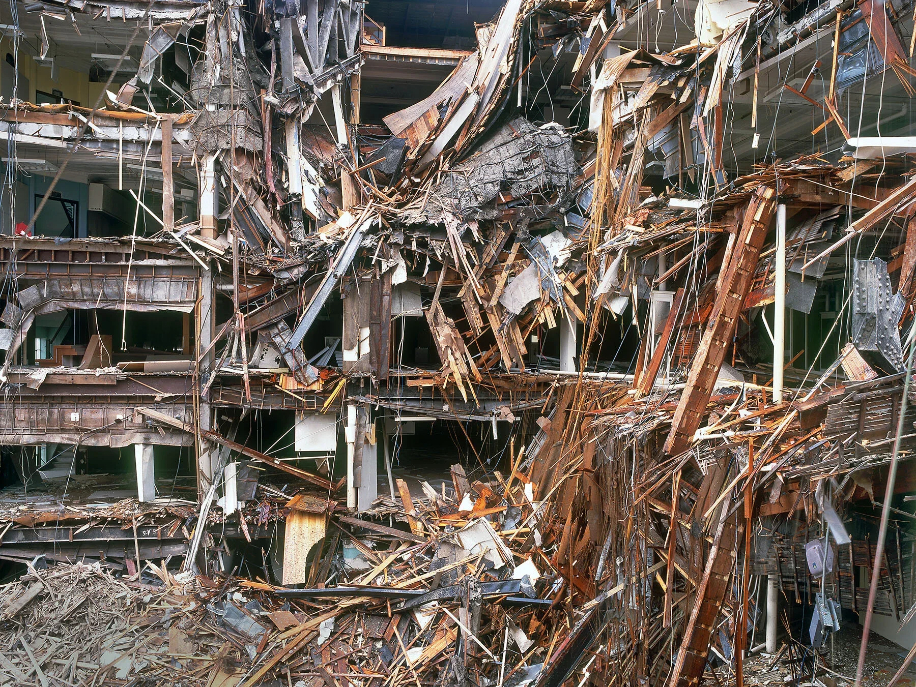
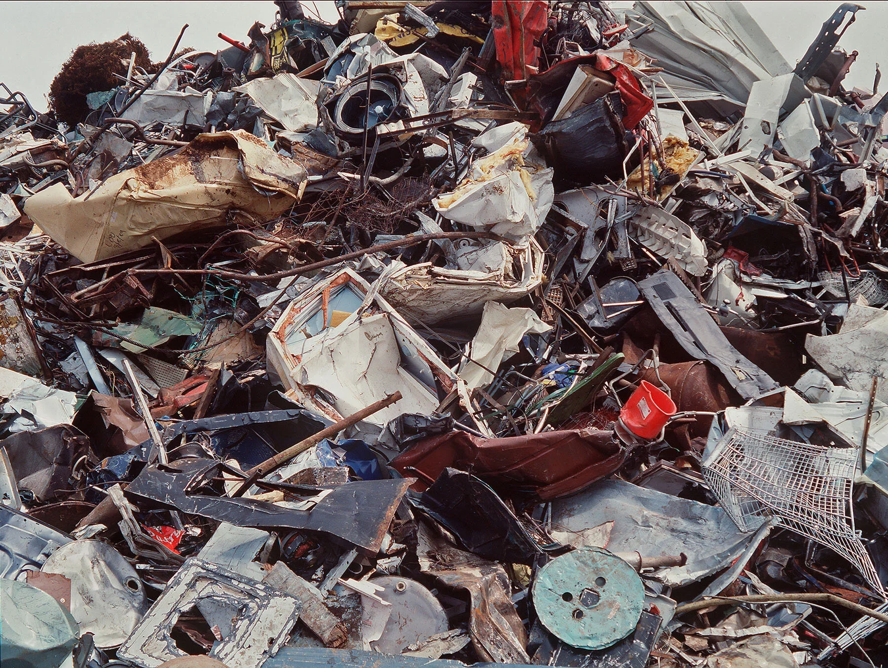
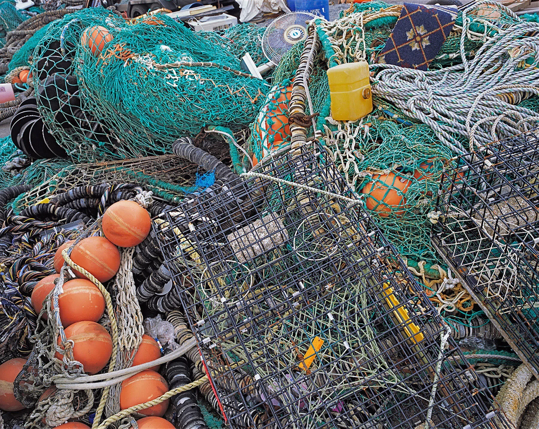
After that, I kept expanding the approach into other bodies of work: scrap metal heaps, building demolitions, industrial sites being taken apart, and a series on commercial fishing boats. In each of these projects, I was still working with that edge of chaos idea, seeing how far I could stretch the complexity within the frame.
But it was never only about composition. Many of these photographs have a strong human presence, even though there are no people in them. You see it in the ropes tied off on fishing boats, in the tools left behind, in the traces of labour and activity. The human element is there, just outside the frame.
So what does it feel like when a composition is about to collapse into complete chaos?
That feeling actually happens most of the time. When I’m working this way, it’s a constant struggle because the world rarely arranges itself into the kind of complexity I’m looking for. When I first started exploring this direction, I spent a couple of years making hundreds of photographs that I never showed anyone. They simply didn’t hold together. They fell apart visually, and in that sense they had gone past the edge.
But that process was essential. It taught me what didn’t work, and it helped me refine my eye. Even now, I very often find scenes that are close but not quite there. I’ll think, if only that object were a little to the left, or if only a certain colour appeared somewhere else in the frame. I never wanted to solve those issues in Photoshop, so I would take the picture, look at it later on the monitor, and decide whether it held up.
Every once in a while, though, everything clicks. I’ll be looking through the viewfinder, adjusting my position, and suddenly the pieces interlock like a jigsaw puzzle. The shapes connect, the colours balance, and the whole frame feels coherent. The yellows are where they need to be, the reds are distributed in a way that works, and the structure just makes sense. That’s when I know the composition isn’t collapsing into chaos but landing exactly where it needs to be.
Is that why you mentioned that you sometimes move an inch or two until the composition locks in? What are you actually seeing when you do that?
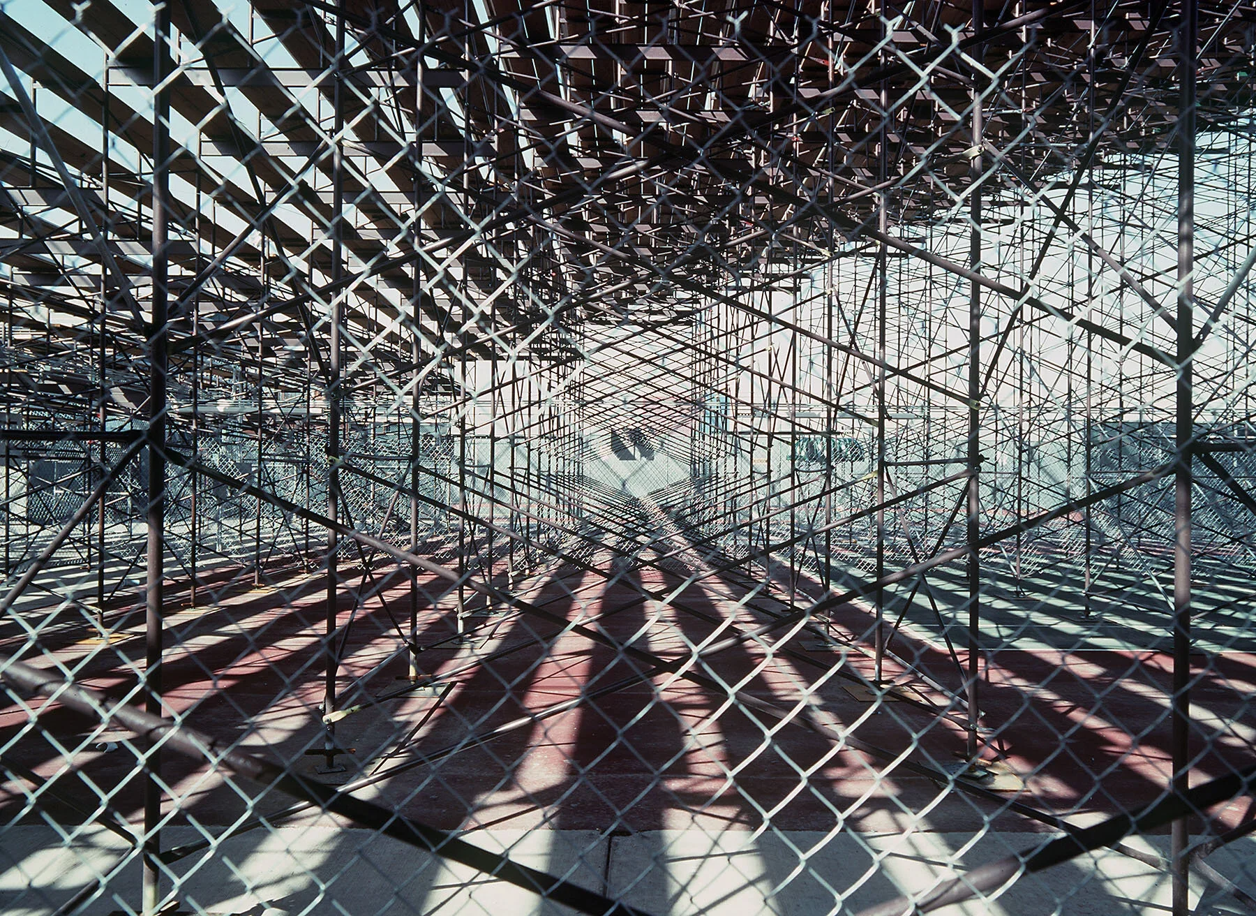
Absolutely. Small shifts can make a huge difference, especially in very complex photographs. There is an image in Edge that I made inside a silk mill that was being dismantled in Massachusetts. The machinery was being packed up to move down south, so the whole place was in this transitional state, full of shapes, colours, and overlapping forms.
In that kind of environment, even moving slightly to the left or right changes everything. A small background shape might suddenly get hidden behind a column, or a colour that balances the frame might disappear. When I reposition the camera, certain elements either come into view or get blocked, and that affects how all the parts fit together. The final position I settled on was the one where all those pieces aligned in a way that felt right. There are no page numbers in the book, but the photograph is titled Torpedo. I do not have the previous versions because the differences were incredibly subtle, and I did not keep every small variation. But I remember paying attention to details like a tiny yellow triangle in the frame. For me, that little shape mattered. I do not expect anyone else to notice it at that level, but it contributed to the relationship between the large grey rectangle in the centre and the structures around it.
What I like about that photograph is how the colours repeat and echo one another. There is a lot happening, and those small adjustments in position were what made it hold together instead of falling apart.
So how do you know when you are going too far and have crossed from the edge of chaos into pure chaos?
It’s always a judgement call. Even with an image like Torpedo, which I consider very strong, I’m sure some people look at it and think it is too much.
I can only rely on my own experience and intuition to decide whether a picture holds together or collapses. For me, it works. For someone else, maybe it does not.
You also described something that felt like engineered chaos. What is the difference between accidental complexity and engineered chaos in photography?
Engineered chaos is not a term I’ve really used, but I understand what you mean. Some photographers create chaos by breaking compositional rules in very deliberate ways, like placing a huge object in the foreground, using extreme contrast, or intentionally introducing motion blur. Those approaches introduce chaos into the photograph through technique.
What I’m doing is a little different. I’m very interested in randomness and chance, and I’m looking for scenes that already exist in the world. I’m not staging anything. But even though the scenes are found, the compositions are very intentional. This is not a matter of snapping away and hoping something works. All the images in Edge were made on a tripod and composed very carefully.
Can you describe what goes through your mind when you arrive at a scene and start deciding where to position yourself?
When I arrive somewhere, I almost always begin without the camera. Photographer friends of mine used to joke that I was a photographer who never carried a camera because I do so much mental editing first. I walk around, study the scene, and look for a few elements that might work. If something intrigues me, I circle it, view it from different angles, sometimes climb onto or into the structure if I can. Only if it still seems promising do I go back to the car, get the camera and tripod, and begin composing through the viewfinder.
Once I start working, it becomes a matter of small adjustments. I move the tripod an inch or two, shift closer or farther, change the camera angle, and try to see whether all the elements will interlock. Sometimes the light is wrong, and I have to come back later. One time in New Bedford, I found a scene on a commercial fishing boat that I thought would make a great complex composition, but the light was terrible. I decided to explore the other piers, have lunch, and return later when the sun had shifted.
When I came back, the tide had risen. The boats were tied three or four deep, and the whole orientation of the scene had changed. The foreground deck no longer aligned with the objects behind it, and the composition I had in mind was gone. That one didn’t work out, but that is typical. I returned to New Bedford probably 15 times over the years. Most scenes were close but not quite there, or they drifted past the edge into visual confusion.
That is the reality of working this way. You spend most of your time searching, adjusting, returning, and waiting for that moment when everything aligns just enough to hold together.
You also write that photography is the act of turning a three-dimensional world into a two-dimensional picture. With such complex scenes, do you pay special attention to foreground, middle ground, and background? How do you train your eye to see everything at once?
Yes, that is essentially what all photographers are doing. We are mapping three-dimensional space onto a flat surface. But with the kind of complexity I work with, it does become more challenging.
One thing that helped me early on came from Ansel Adams. When I first started learning photography, I bought his series of instructional books. Somewhere in there he described carrying a piece of black mat board with a small window cut out of it. I started doing that and kept the habit for years.
So when I said earlier that I often walk around without a camera, what I usually had with me was that mat board. I would hold it up and look through the cut-out window. That simple tool helped me concentrate on everything inside the rectangle, near and far. In the fishing boat example, for instance, I could judge how elements on the closest deck interacted with elements three or four boats back, or even across the water on the next pier.
For some reason, looking through that window rather than through a lens made it easier to see the entire frame as a unified space. I paid close attention to the edges of the rectangle and what was entering or leaving the frame. Over time, that trained my eye to make sure everything worked together.
Mapping a three-dimensional world onto a two-dimensional surface means that something half a mile away can be just as visually important as something ten feet from the camera, depending on how much space it occupies in the frame. That awareness became a core part of how I compose.
Why do you think most photographers avoid this level of visual complexity?
Well, first of all, I don’t always shoot this way either. It depends entirely on what you’re trying to achieve. Most photographs simply do not lend themselves to this kind of complexity. In many situations, the classic approach makes perfect sense: focus on one subject, eliminate anything unnecessary, move closer, simplify the frame. That is how I started too, and it is a very solid way of working.
I just happened to spend a couple of decades going down this other path, exploring compositions built around visual complexity and repeated motifs. It became something I wanted to investigate deeply, but it is definitely not the norm.
Another factor today is social media. On Instagram, people look at images for less than a second while scrolling. Photographs with a single, strong graphic element, bold colour, and immediate clarity work far better there. You cannot really absorb a complex image in that environment. It takes time, patience, and attention, which is not how most people consume photographs now.
I do not consider the edge of chaos images perfect photographs in the traditional sense. I cannot say every single element contributes equally, but most of them do, and together they hold the frame in a way that feels interesting to me.
When I was making this work and exhibiting it in galleries and museums, the prints were often large. Many were 20 by 24 inches, but some were as big as 48 by 60. That scale was always in the back of my mind when composing. Even though I wasn’t doing the math, I was imagining how big certain objects would appear in a four by five foot print, and how that scale would affect the viewer’s experience. The complexity becomes more readable in a large print, and that influenced how I approached the composition.
You have this concept of the Edge of Chaos, and then these sections on your website: elements, emergence, fusion. Are these stages of the Edge of Chaos, or something else?
The Edge of Chaos became a metaphor for my work. Because of my background in engineering and science, I’ve always been interested in complexity theory. As I looked back over the years, I began to see parallels between the evolution of my photographs and some of the ideas from complexity science.
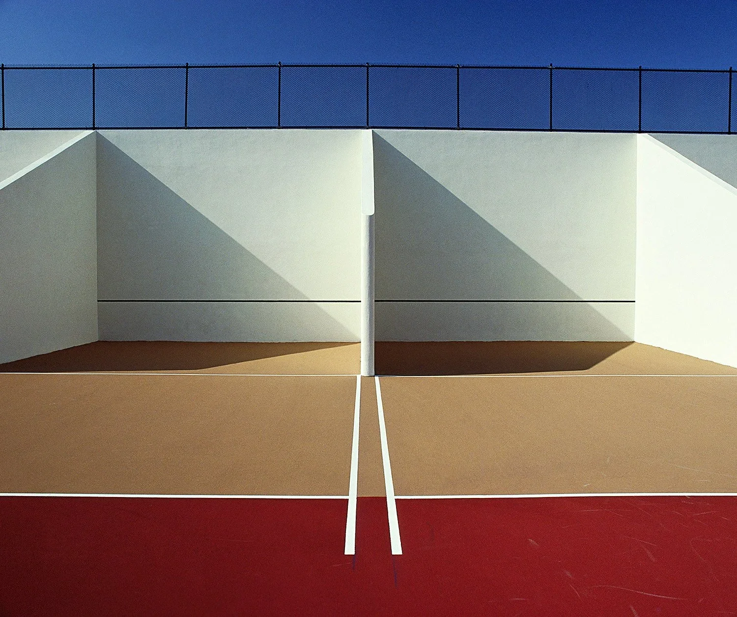
On my website, I grouped the work into different portfolios and gave them titles related to scientific concepts. The first gallery, Elements, contains my earliest photographs from Edge. Long before I got into the more maximalist compositions, these were almost minimalist images, made from simple geometric shapes and colours. The parallel in science would be elementary particles that form atoms and molecules.
When I was first putting Edge together, I actually made a book dummy called Edge of Chaos. The designer and I divided the work into the same categories you see on the site: elements, emergence, fission, fusion, strings, and entanglement. The final book dropped that structure, but the associations remained useful.
Emergence comes straight from complexity science. When you add enough elements to a system, something new appears. After the early architectural pieces, I moved on to photographing amusement parks and recreational sites when they were empty. That is where I began pushing more elements into the frame, building increasingly complex compositions while still keeping a geometric foundation. In my mind, something new was emerging from that shift.
Fission and fusion came later. Fission, in science, is the breaking apart of an atom, releasing energy. I related that to several bodies of work: demolition sites, buildings being torn down, industrial plants being dismantled, and even disaster areas after tornadoes. Those scenes were all about things coming apart, so in my mind, they became fission on a macro scale.
Fusion is the opposite. In science, it is the joining of particles. I explored that through a project on scrap metal heaps and recycling centres. Objects from many different lives end up pressed together in these piles. That became a visual analogy for fusion.
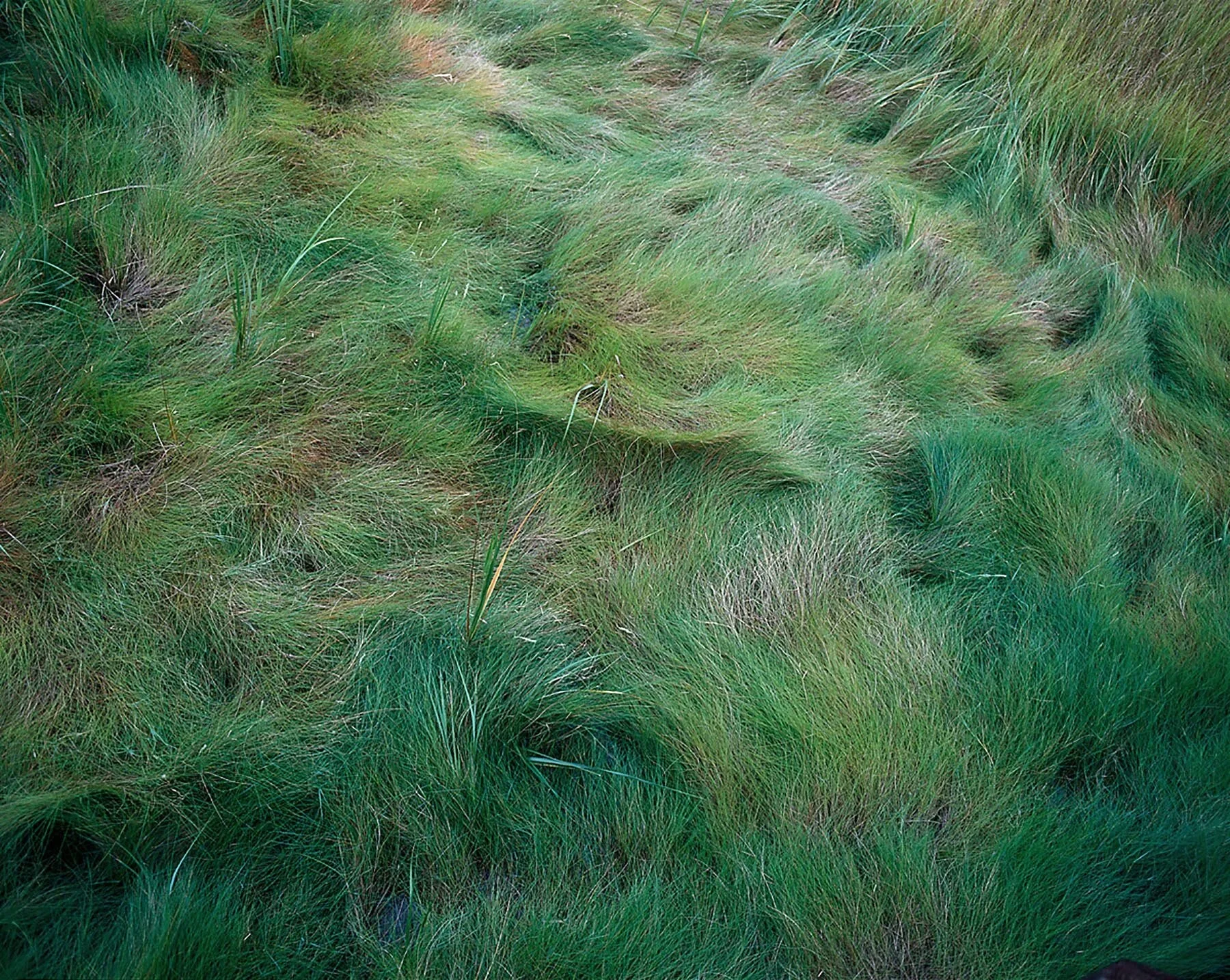
Strings was inspired by string theory, even though I admit I don’t really understand the science fully. But the idea that beneath particles like quarks and electrons there may be something even more fundamental resonated with me. I used it to frame a series of abstract nature photographs: thickets, brush, dense tangles of lines running throughout the rectangle. Many of them feel almost like Jackson Pollock paintings.
The last category is Entanglement. In physics, entanglement happens when particles influence each other because of their proximity. At the commercial fishing piers I photographed, there were nets, ropes, wires, and cables everywhere, often intertwined in complicated ways. That visual interconnectedness inspired the name.
All of these categories are metaphors. I’m not going out looking for literal examples of fusion or fission. They are simply structures that helped me organise and understand the different bodies of work, both on the website and in the book dummy.
So these are, rather than an evolution from one stage to another, more like folders you sorted your images into based on what is happening in the frame, right?
They relate to different bodies of work, and some categories include more than one project. After the amusement parks, for example, I spent years photographing scrap heaps, demolitions, and industrial sites. Some images dealt with things breaking apart; others dealt with things coming together. Because of my background in science, thinking in terms of fission and fusion was a natural way to group them. It helped me connect the visual characteristics to concepts I already understood.
How do you assess the impact of different mediums? An exhibition concept may not translate well to Instagram or a book.
Exactly. When I made most of the photographs in Edge during the 1990s and early 2000s, there was no Instagram, no social media. The final destination for an image was either a print on a wall or a print in a book. That was the context I was thinking about.
Later, as Photoshop and digital screens became part of the process, the way images were viewed changed again. And now we have social media, where people are looking at photographs on screens that are only a few inches across. The experience is completely different. Something that holds together beautifully as a large print can fall apart when reduced to the size of a phone screen. It is just the reality of how we look at images today.
If you had to summarise what makes a complex or chaotic photograph work, beyond just the feeling, what would it be?
For me, it comes down to an underlying organisation that might not be obvious at first glance. Even in the most complex images, there has to be a sense of structure, a way the visual elements relate to one another. I’m not talking about the content or meaning, but purely compositionally. It is about how objects, shapes, colours, forms, patterns, and rhythms are distributed across the rectangle.
That distribution has to make sense. It does not have to be symmetrical or traditional, but it needs internal balance. That organisation is what keeps the photograph from falling into pure chaos
When you take several versions of a scene, slightly left or right, how do you know which one has the best organisation?
A lot of it is intuitive. It is similar to being asked why you like a particular painting, sculpture, or film. You can only articulate it up to a point. There are certainly objective factors too, like in portraiture where you might reject a frame because the head is cut off or something distracting enters the edge.
But with complex photographs, the evaluation is more subtle. When you showed me that image of the roller coaster, for instance, you asked why I didn’t tilt the camera up to include the entire structure. The answer is that the frame reached a point where it balanced itself. As I moved the camera, things clicked into place. Tilting up may have broken that distribution, even if logically it seems like including more would make sense.
So the distribution would have become unbalanced?
Exactly. When I am on location, I move the camera around until the elements interlock in a way that feels coherent. Sometimes I cannot explain why a particular position is the one that works. I just know that when I settle on it, the shapes and colours integrate in a way that holds together. That feeling is what tells me I’ve found the right frame, even if I can’t fully articulate the mechanics behind it.
If you had to give one piece of advice to photographers about embracing visual complexity, what would it be?
I would say: experiment. Try it out. One of the great advantages of the digital world is that experimentation is essentially free. Even if you prefer shooting film, almost everyone has access to some kind of digital capture today, whether it’s a camera or even just an iPhone. Use that freedom.
When I was making the photographs in Edge, most of them were on medium format film. Every shutter click cost money in film and processing, so experimenting was more limited. Now you can take hundreds of photographs, delete what does not work, and keep going without worrying about the cost.
So my advice is to push beyond the usual rules and see what happens when you put more elements into the frame. You do not have to commit to a whole project, but play with it and see whether it leads somewhere interesting.
I never took a photography class, so I’m not even sure what all the rules are supposed to be. Being self-taught had its advantages and disadvantages, but one benefit was the freedom to follow my own instincts, study the work that interested me, and build my path from there.


To discover more about this intriguing body of work and how you can acquire your own copy, you can find and purchase the book here. (MW Editions, Fall Line Press, Hunter Gatherer on Amazon, EDGE on Amazon)
More photography books?


We'd love to read your comments below, sharing your thoughts and insights on the artist's work. Looking forward to welcoming you back for our next [book spotlight]. See you then!