From Static Photos to Living Images: How Sandra Cattaneo Adorno Uses Light, Movement, and Materials to Transform Perception
I used to think photos were fixed objects.
That once you take them, they stay the same forever. But in this work, the image shifts depending on where you stand. Light, surface, and movement all change what you see. So the photograph becomes something unstable.
This interview looks at a different way of presenting photography.
Sandra Cattaneo Adorno moves beyond prints on walls into projections, installations, and sound. Her exhibition reacts to the viewer and changes in real time. It creates an experience where seeing is not passive anymore.
And it questions what a photograph really is.
If you care about your own work, there is also something to take here.
You will start to notice how presentation, materials, and space affect meaning. And how small decisions can completely change how your images are seen.
You will realise that a photograph can behave like a living thing.
© Sandra Cattaneo Adorno, courtesy Robert Mann Gallery.
The Project - Fragments of Light
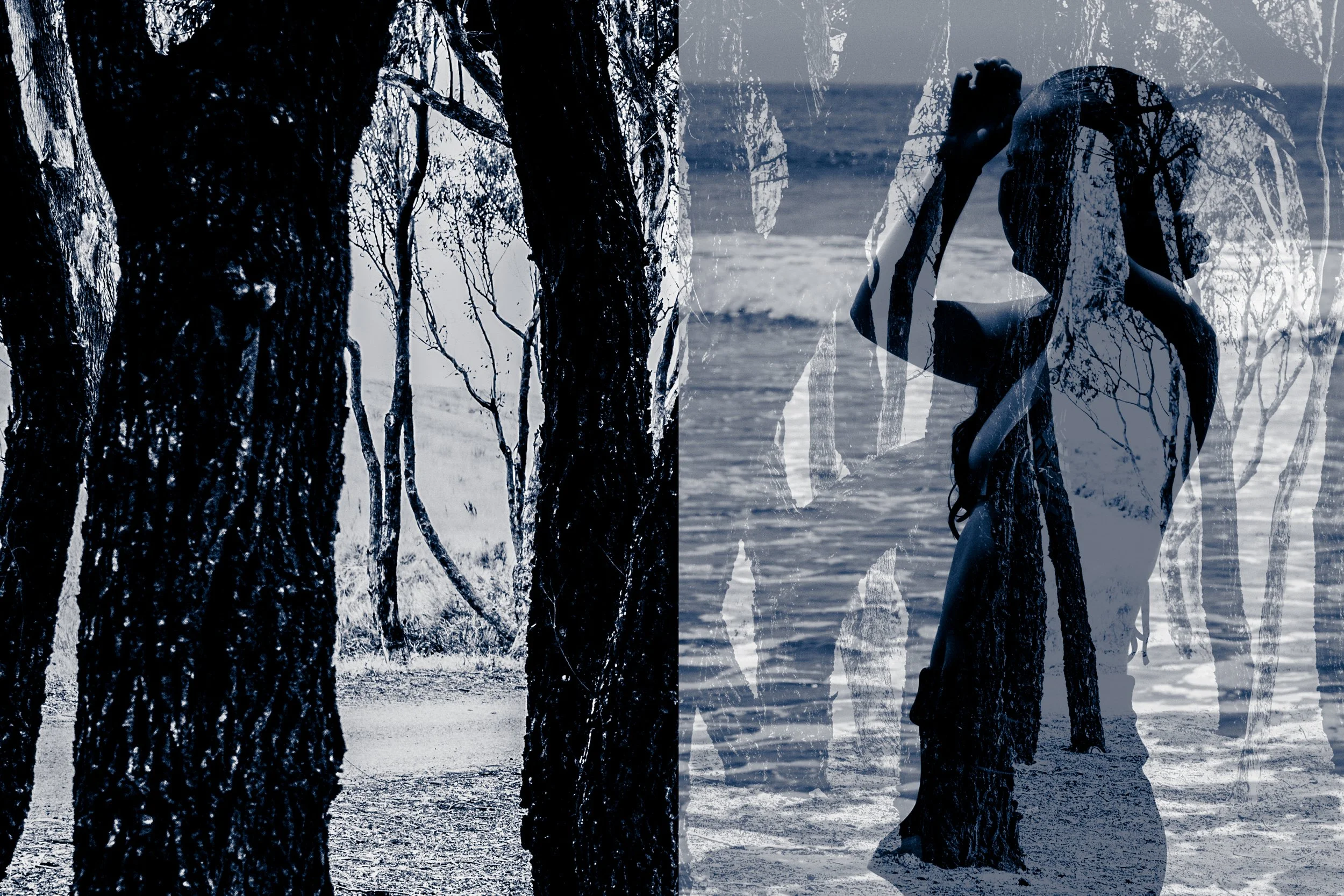
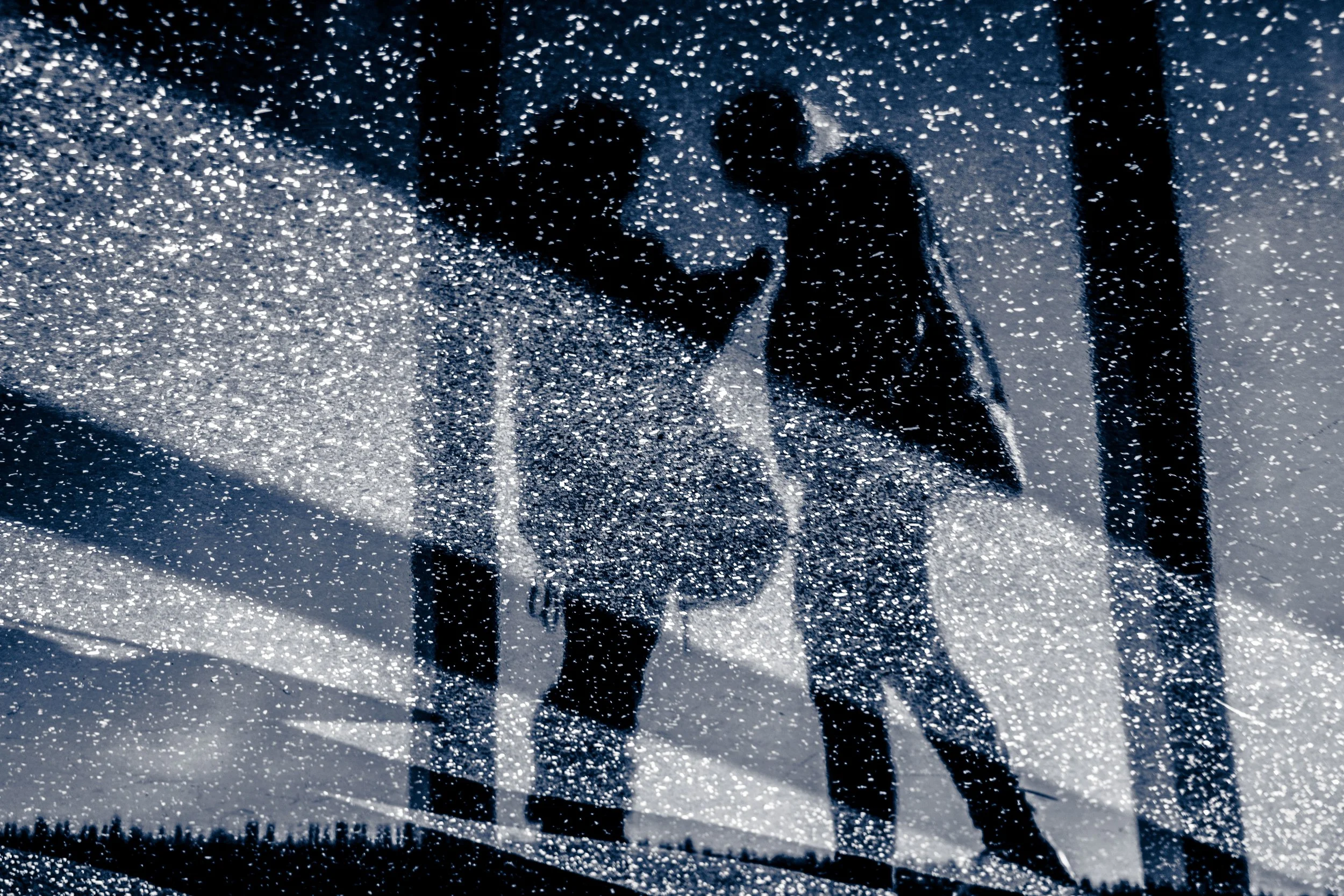
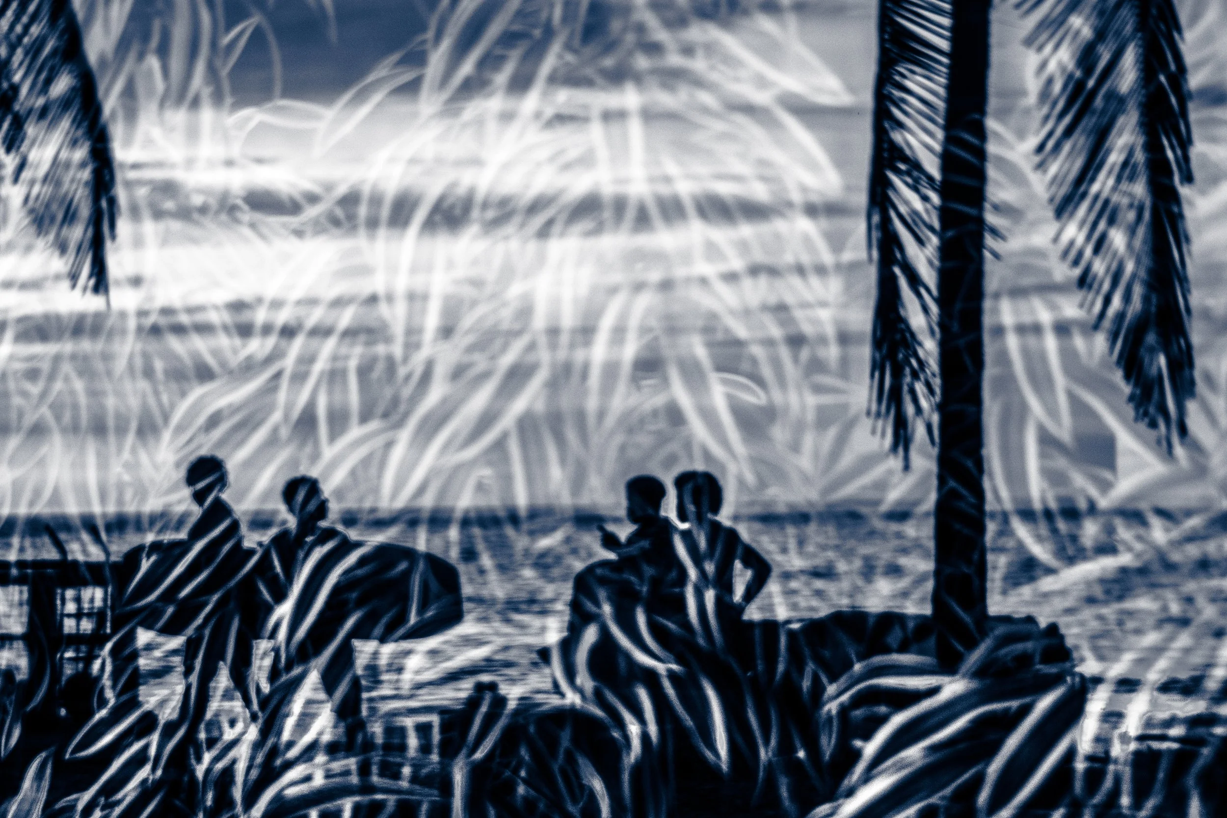
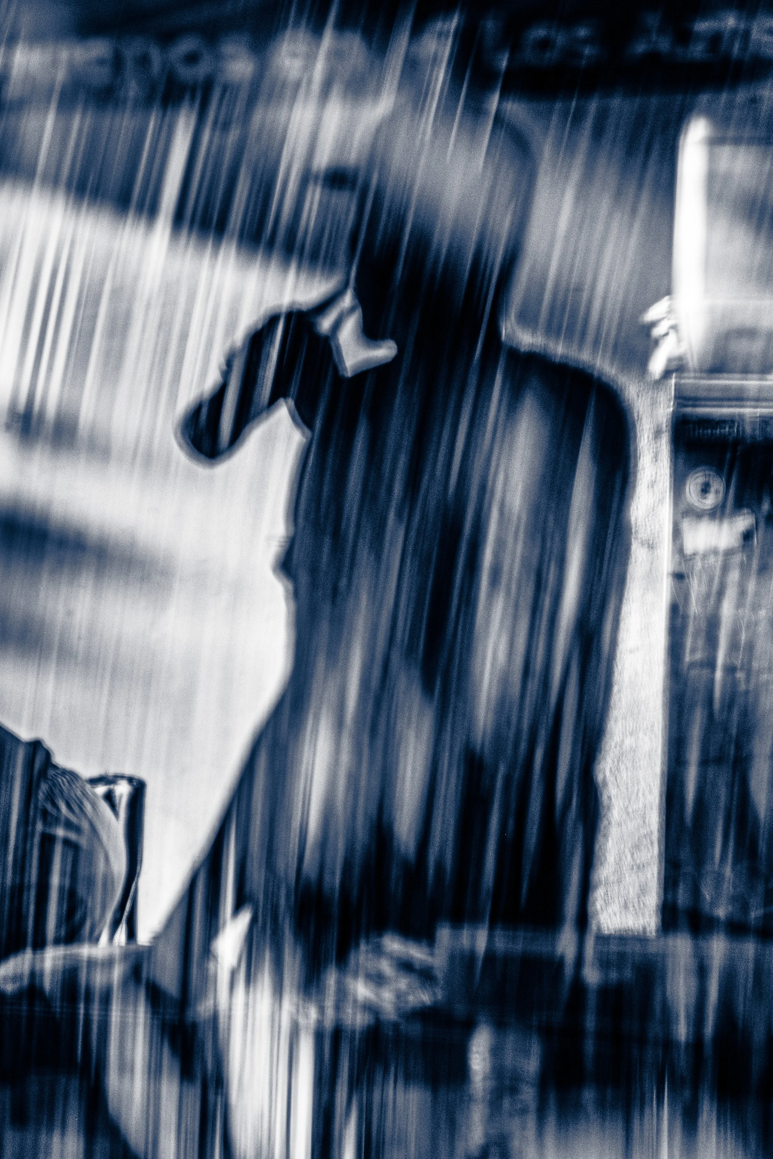
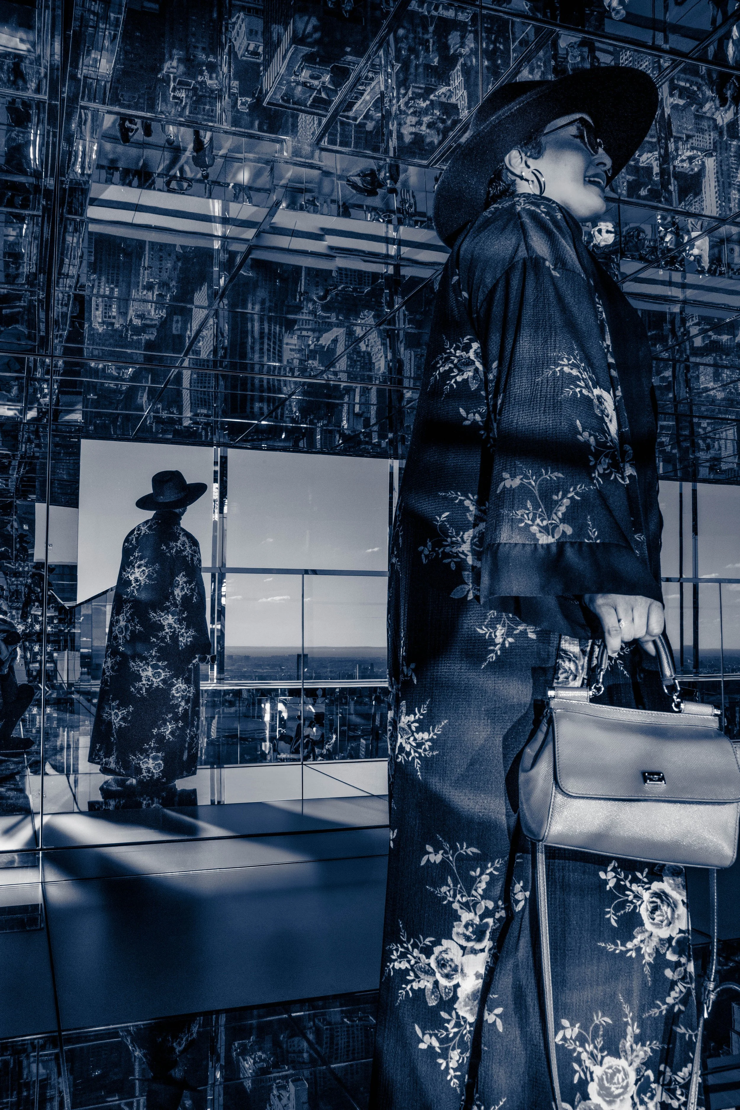
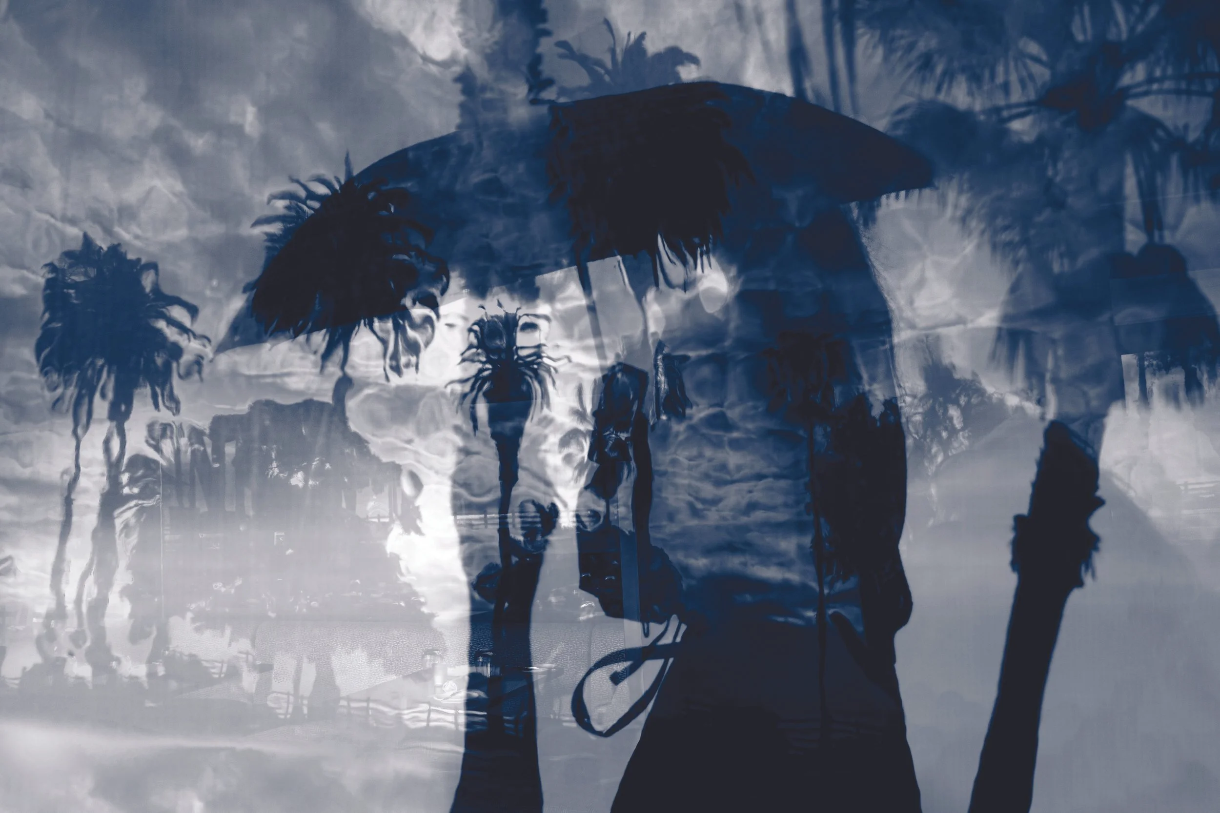
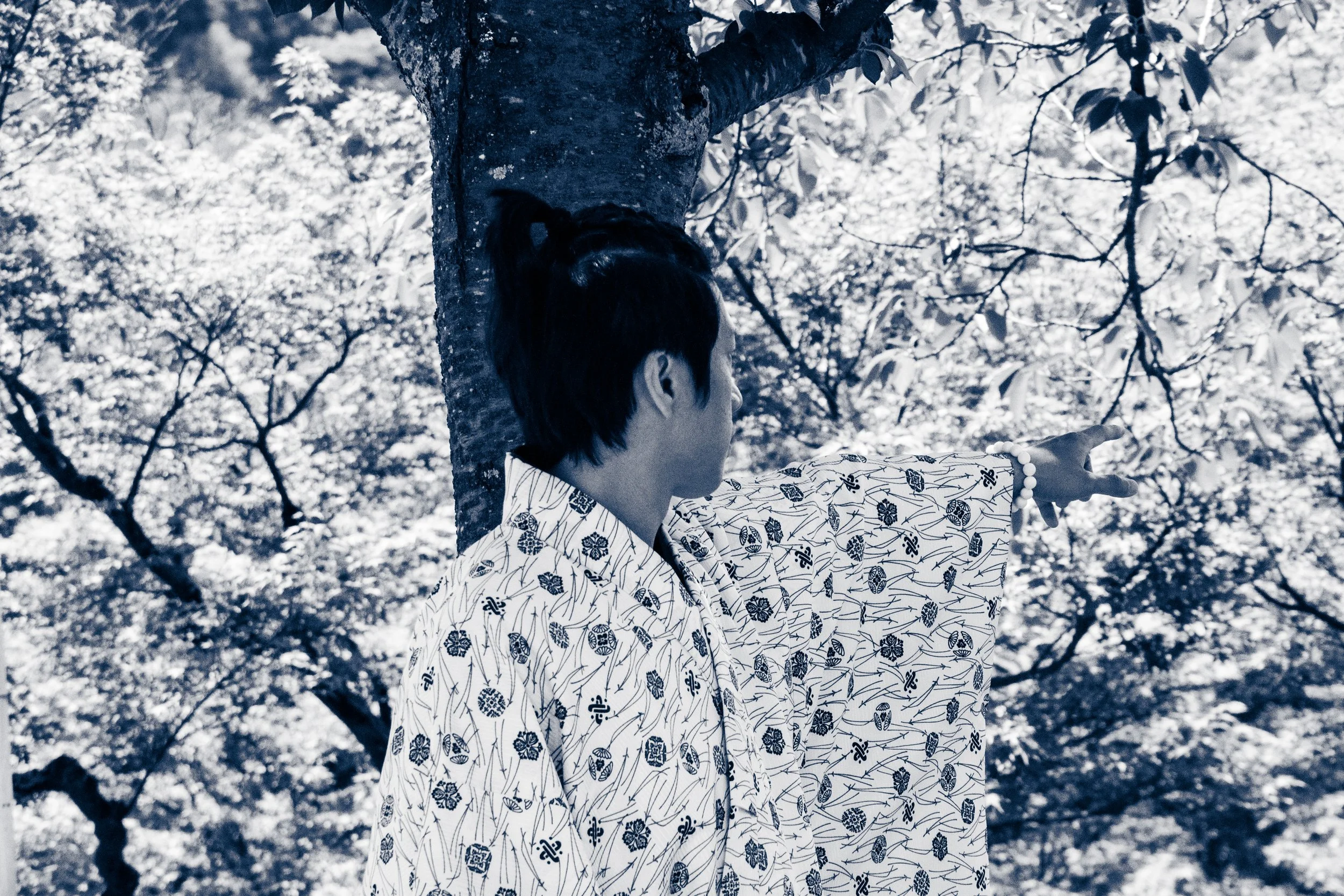
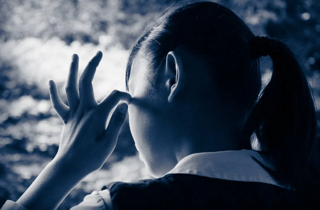
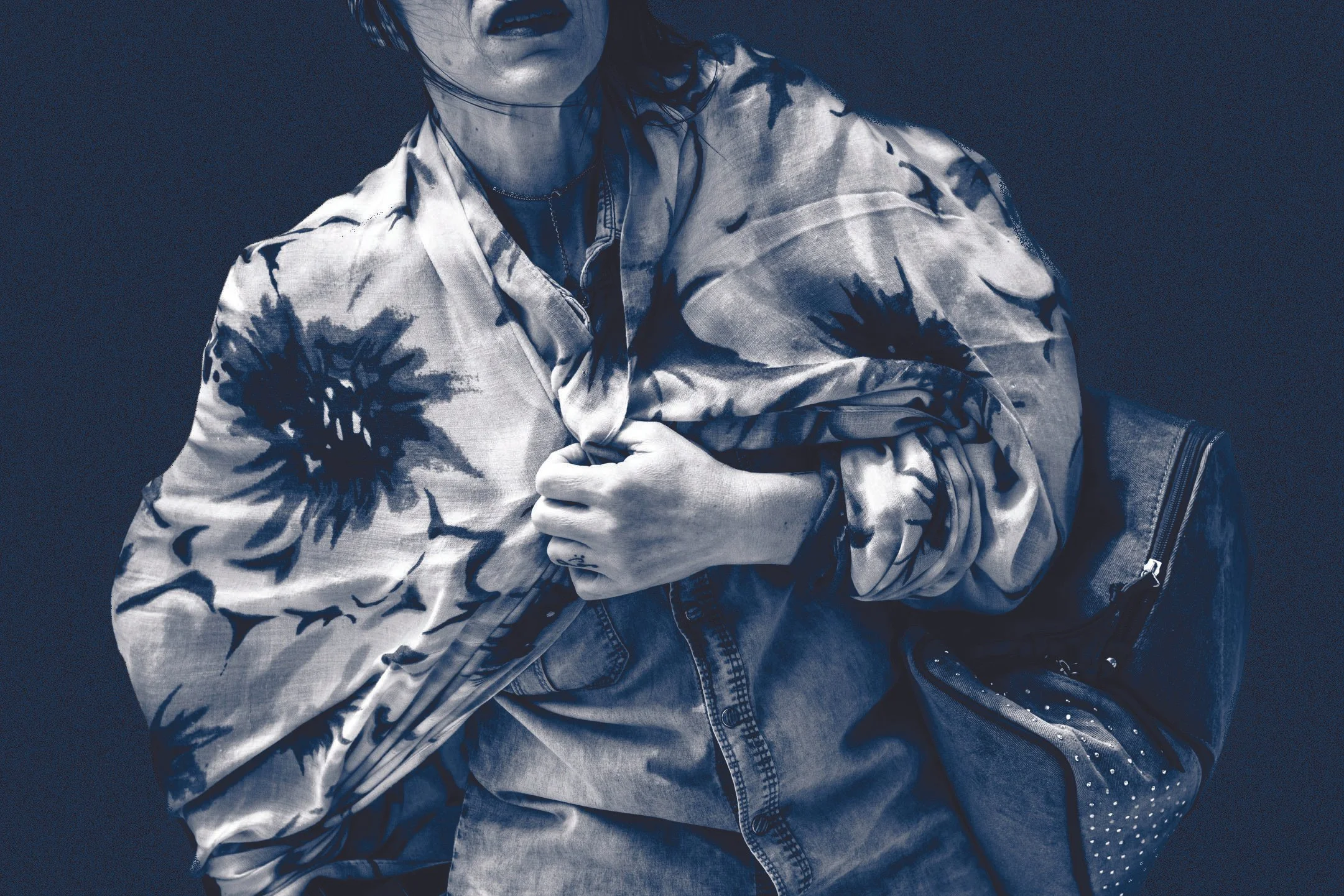
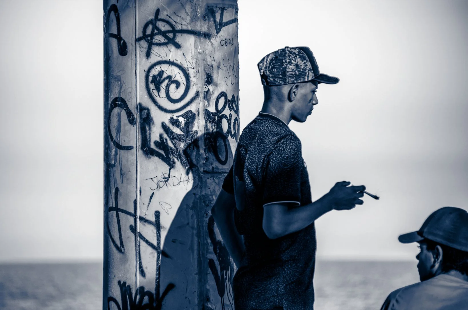
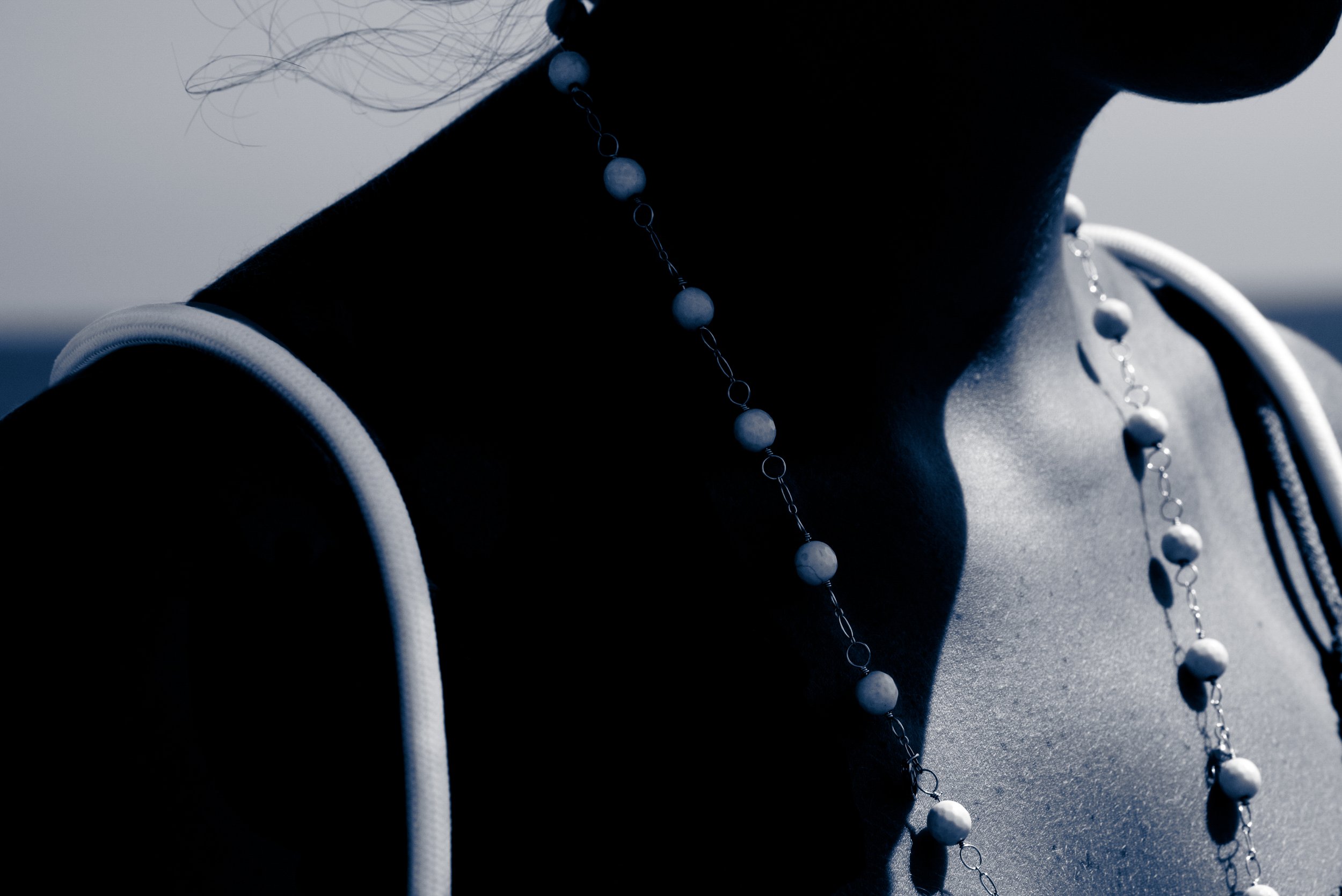
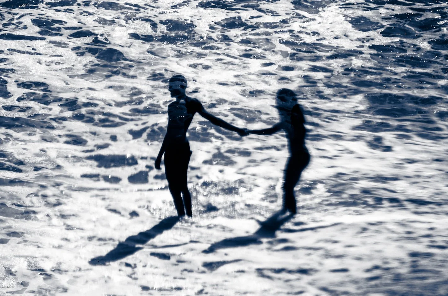
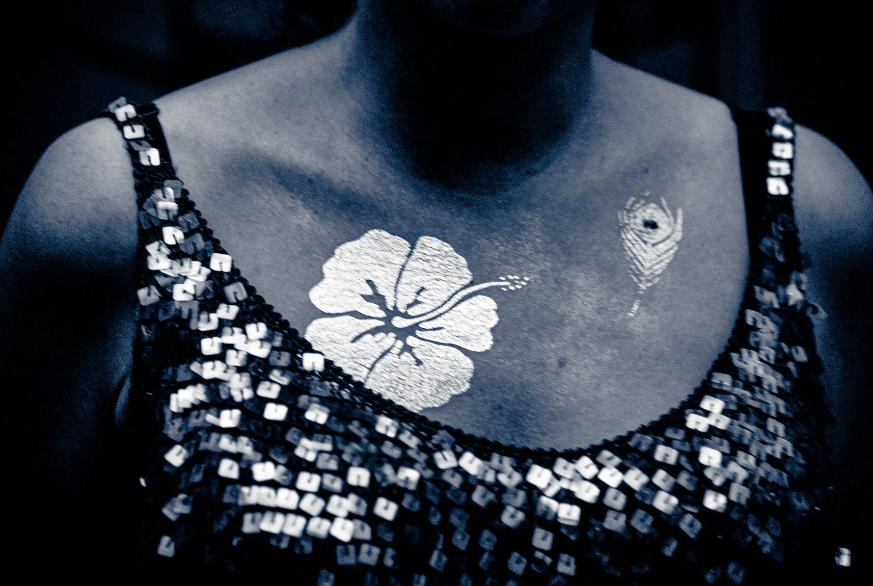
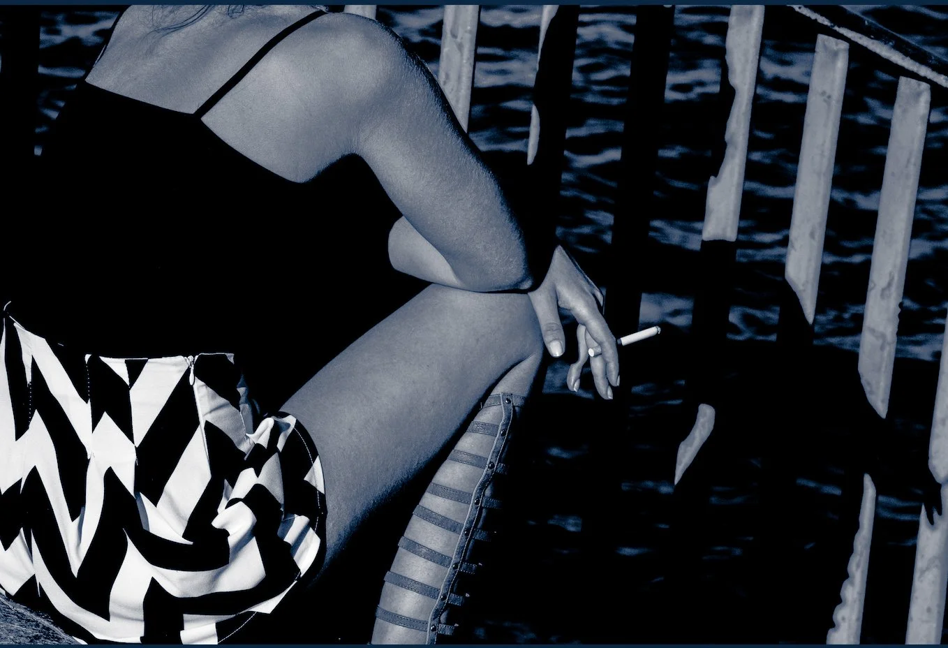
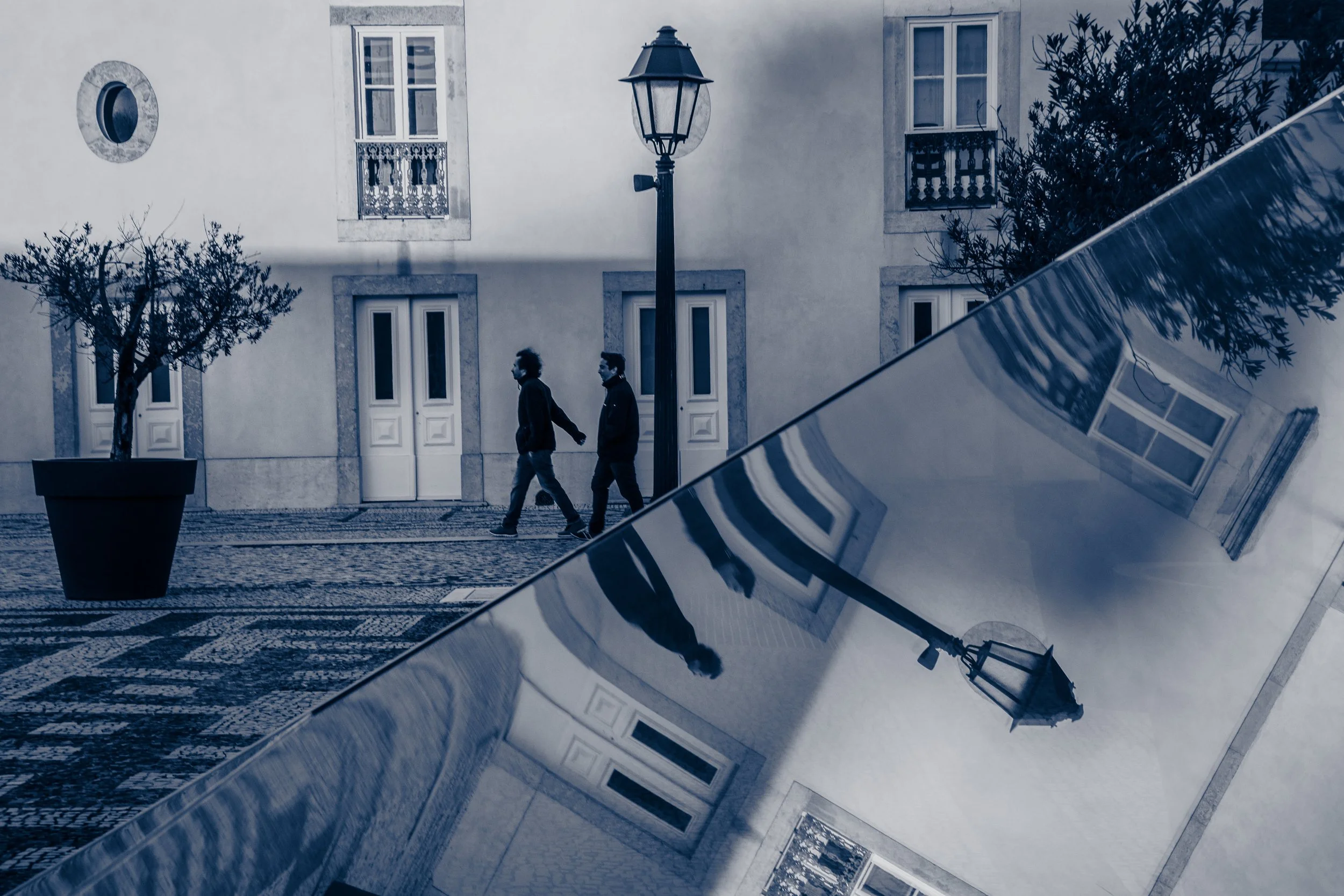
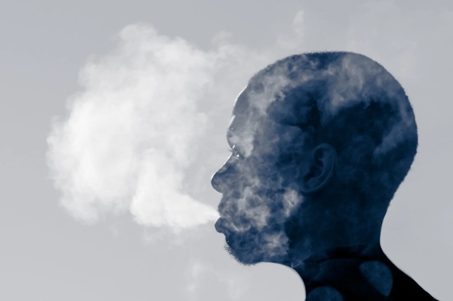
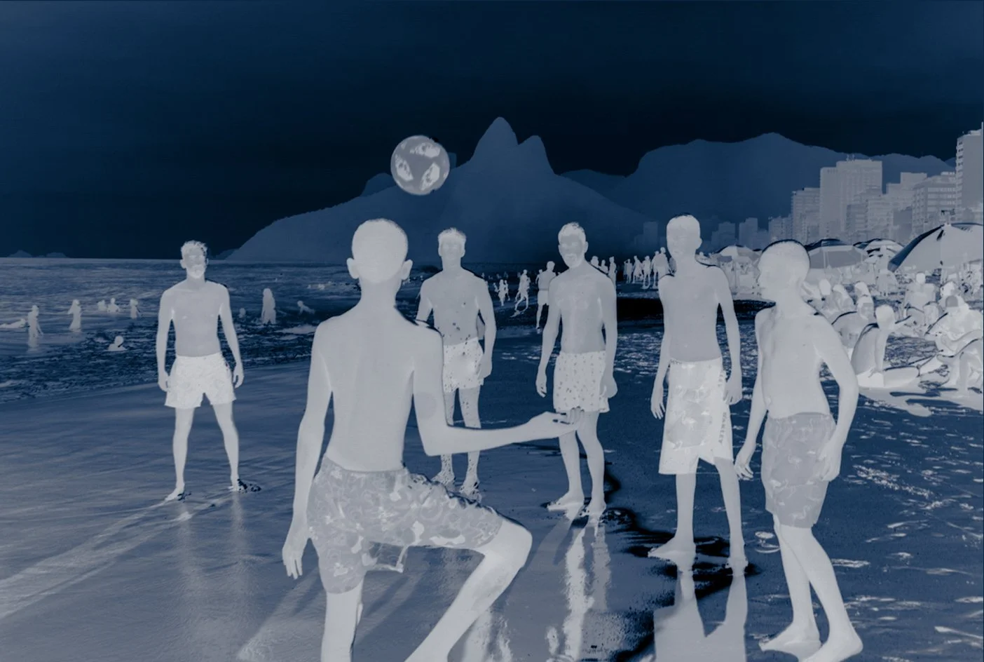
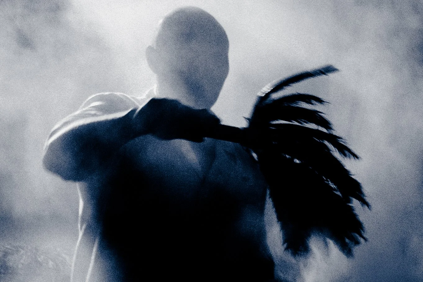
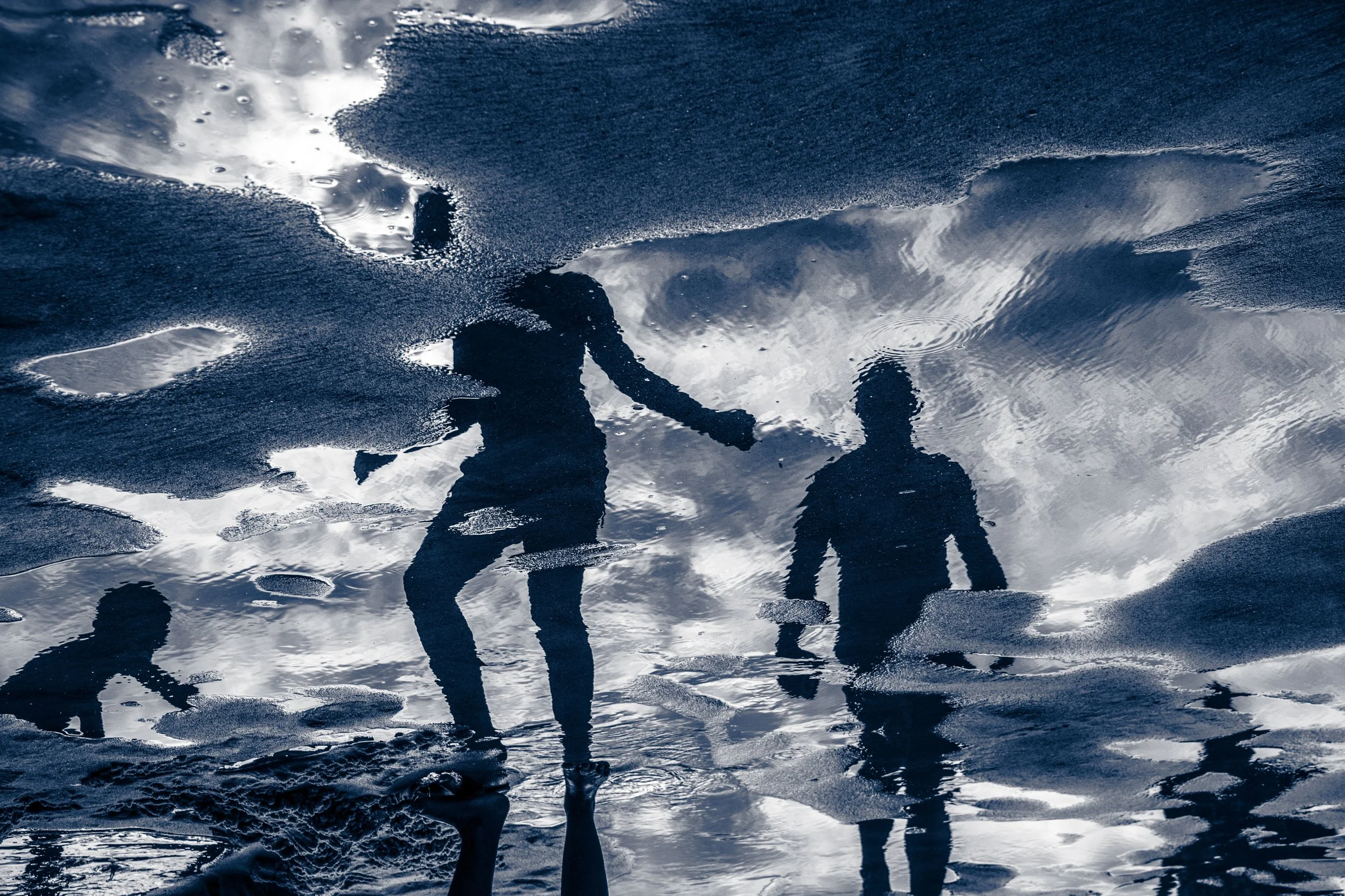
Fragments of Light, picks up where her previous works — Águas de Ouro, Scarti di Tempo, and Ten Years — left off, pushing the boundaries of street photography into new realms that appear as scenes from a dream. Printed with metallic silver ink on navy blue paper that magically transforms quiet scenes of daily life into mystical works of art, Fragments of Light envelops us in a mellifluous blend of sight, sound, and motion to explore the inherent fragility and unstable experience of perception. ( images - © Sandra Cattaneo Adorno, courtesy Robert Mann Gallery.)
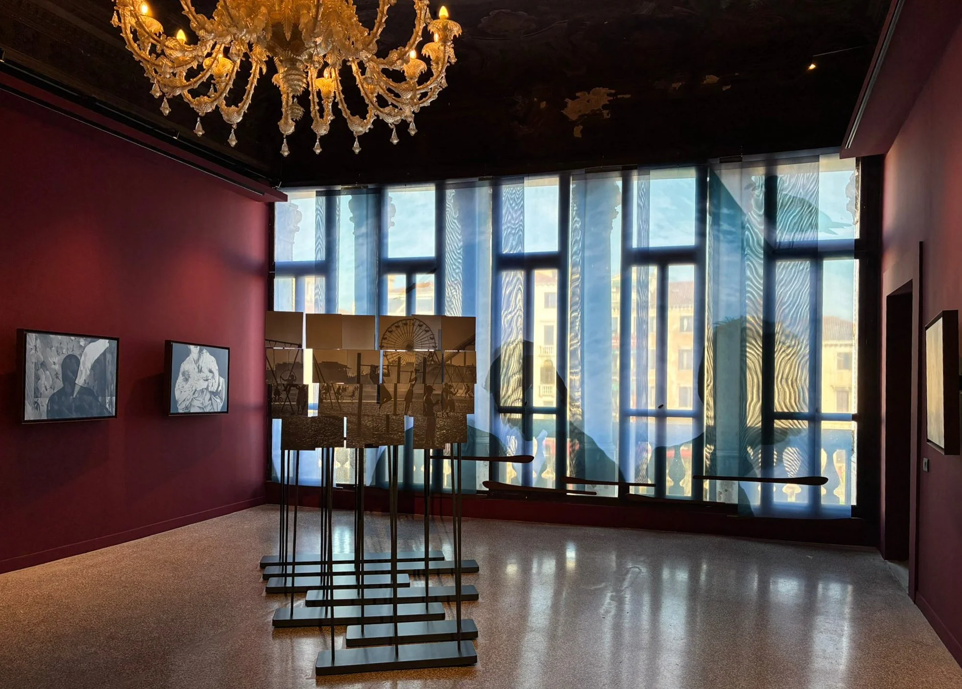
Sandra Cattaneo Adorno: Fragments of Light is on view May 9 – November 22, 2026, at Palazzo Bembo during the 8th Edition of Personal Structures: Confluences, Venice.
© Sandra Cattaneo Adorno, courtesy Robert Mann Gallery.
Project genesis: Ten Years celebrated your first decade in photography. What made you want to go in a new direction for Fragments of Light, and where did the idea for this exhibition come from?
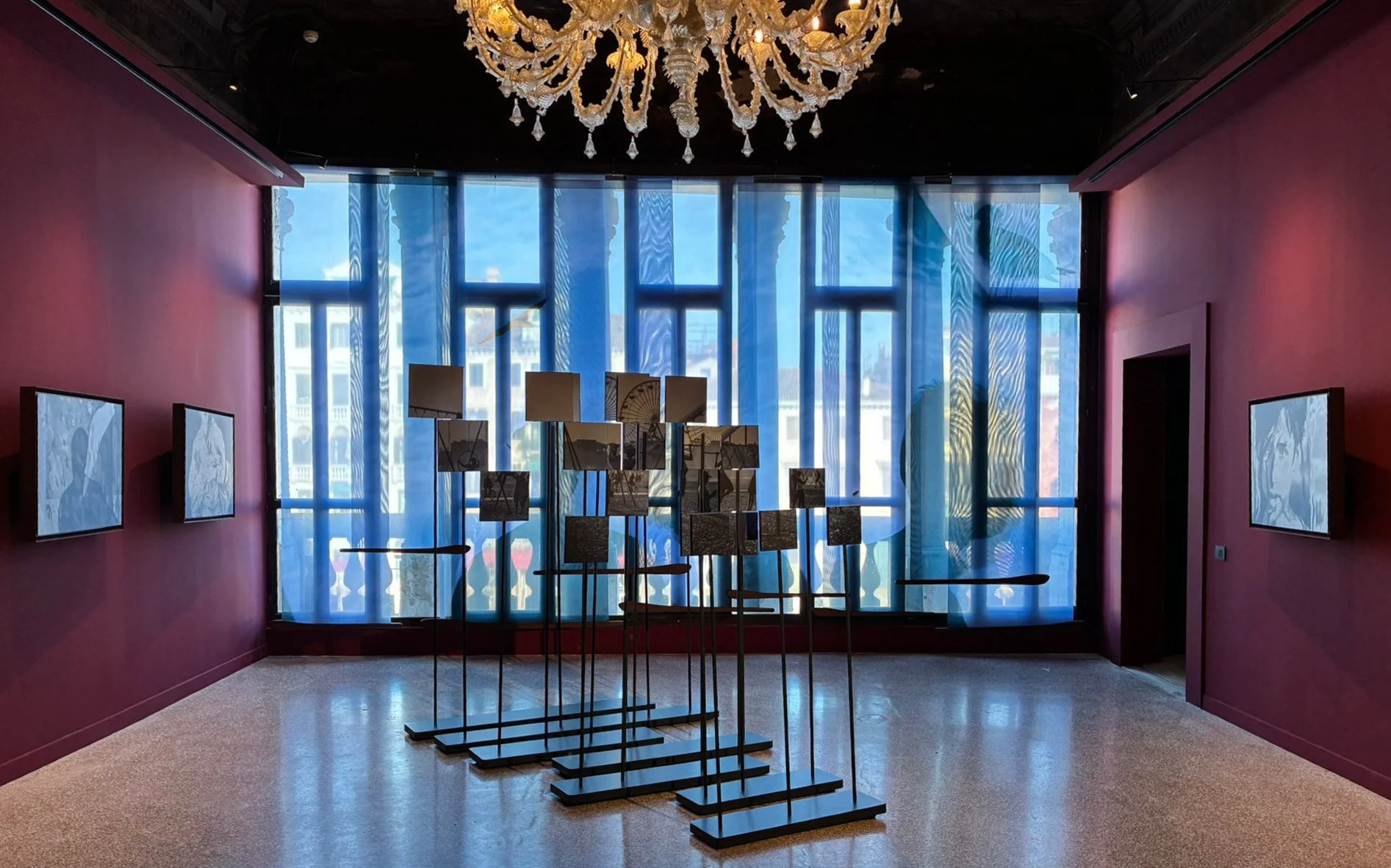
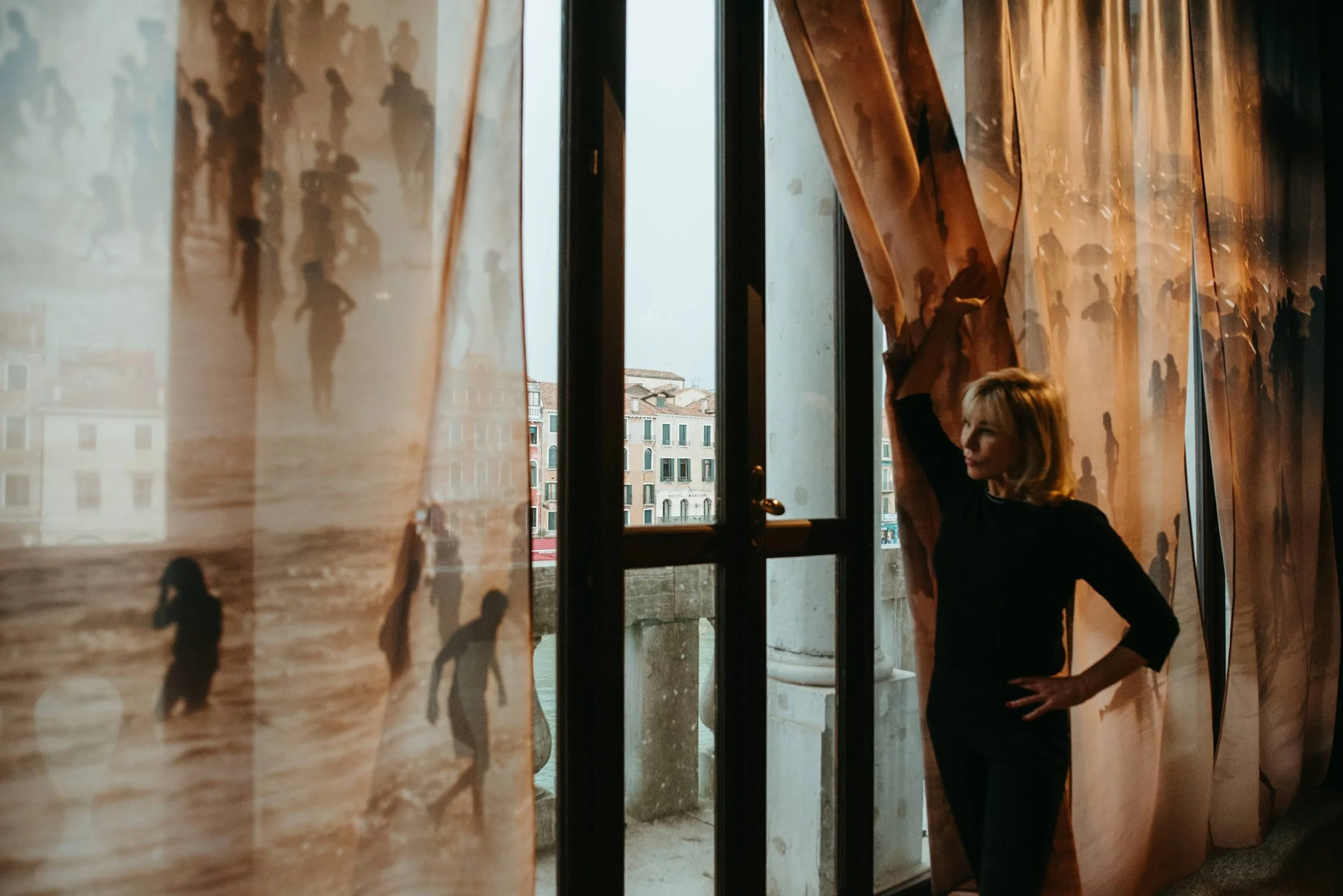
I see Fragments of Light as a continuation of the exploration that I began with Ten Years, in terms of how I can present my work for the public to actively engage with it. Mostly, I wanted to keep questioning the idea of photographs as static objects on a wall, as I wanted my images to speak to the viewers in new ways. With this exhibition, I would really like to challenge the common expectations that someone might have when they visit a photography show: I would be very happy if the people who come to see my work could experience how differently photographs communicate when they are presented on different materials and in various forms (a video projection, photomosaic installation, prints in metallic ink and also printed on curtains).
From gold to silver: In Ten Years you printed with golden ink. In Fragments of Light you chose silver. What does the shift from gold to silver mean to you creatively?
The silver metallic ink works very differently from the gold one. First of all, it reflects more light, which means that the photographs change quite dramatically according to where you are standing when you look at them. This allows me to make the viewers interact more actively with the work, because they can alter the work as they move around it. Secondly, the silver tonality is less celebratory than the golden one. With Ten Years, I wanted to express my joy at having discovered photography and at having been able to use it to explore the world around me for a decade. The silver sheen of Fragments of Light, on the contrary, is more neutral in tone, so I hope that each person might project their own emotions onto it. With this show, I would like the work to be more open to a personal and subjective interpretation.
Printing technique: The thirteen main gallery works are printed with silver metallic ink on dark blue paper. How did you experiment with this combination, and how does the dark blue paper change how the images look?
The final look was the result of various experiments to find a combination that could look monochromatic, while also offering a bit of a spin on the tradition. Black paper as background would have looked very beautiful, but the photos could have appeared more conventional and less approachable, whereas what I wanted to do was precisely to break down the barriers between the work and the viewers. The blue of the background makes the silver stand out, without creating too much contrast, opening up possibilities for its interpretation. I feel that the blue tonality accompanies and supports the silver sheen, but does not confer it a specific mood. It is important to notice that the walls of the room are dark red, a colour that makes the blue look richer.
© Sandra Cattaneo Adorno, courtesy Robert Mann Gallery.
The video projection: The exhibition opens with a kaleidoscopic montage of 55 images projected onto a silver metallic panel. How did you decide which images to include, and what did you want viewers to feel in those first few seconds?
I would like the projection to immerse the viewers, while making them aware of the fact that images are not fixed, but change and transform, resonating with us in various and sometimes unpredictable ways. For this reason, each image morphs into the next in the video. While the viewers go past the very large screen to enter the main room of the exhibition, the panel on which the work is projected dims, thus suggesting the active role of the visitors in the making of the show. I would say that the choice of the images was quite intuitive: I wanted to create a visual flow by working on the aesthetics of the photographs, playing with how lines and shapes interact, but also trying to elude expectations, so that viewers would be intrigued to discover what the next image would be.
First three-dimensional work: The photomosaic made from a single image of the Santa Monica pier is your first 3D piece. What was the biggest challenge of working in three dimensions for the first time?
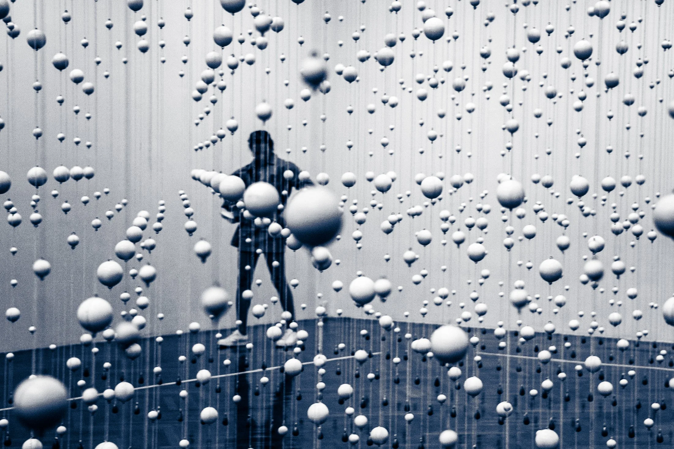
I really wanted to include a piece that could take up physical space in the room, acting a bit like a sculpture that visitors could move around. But the logistics of it were quite complicated, as I had never worked with photography in this way before. The biggest challenge was to create an object that could offer a different approach to photography without looking too gimmicky or devalue the project. In the creation of this item, the collaboration with Studio Vespier was fundamental. We worked with an artisan who was able to make an object both beautiful and functional, imbuing it with the special aura of something made by hand.
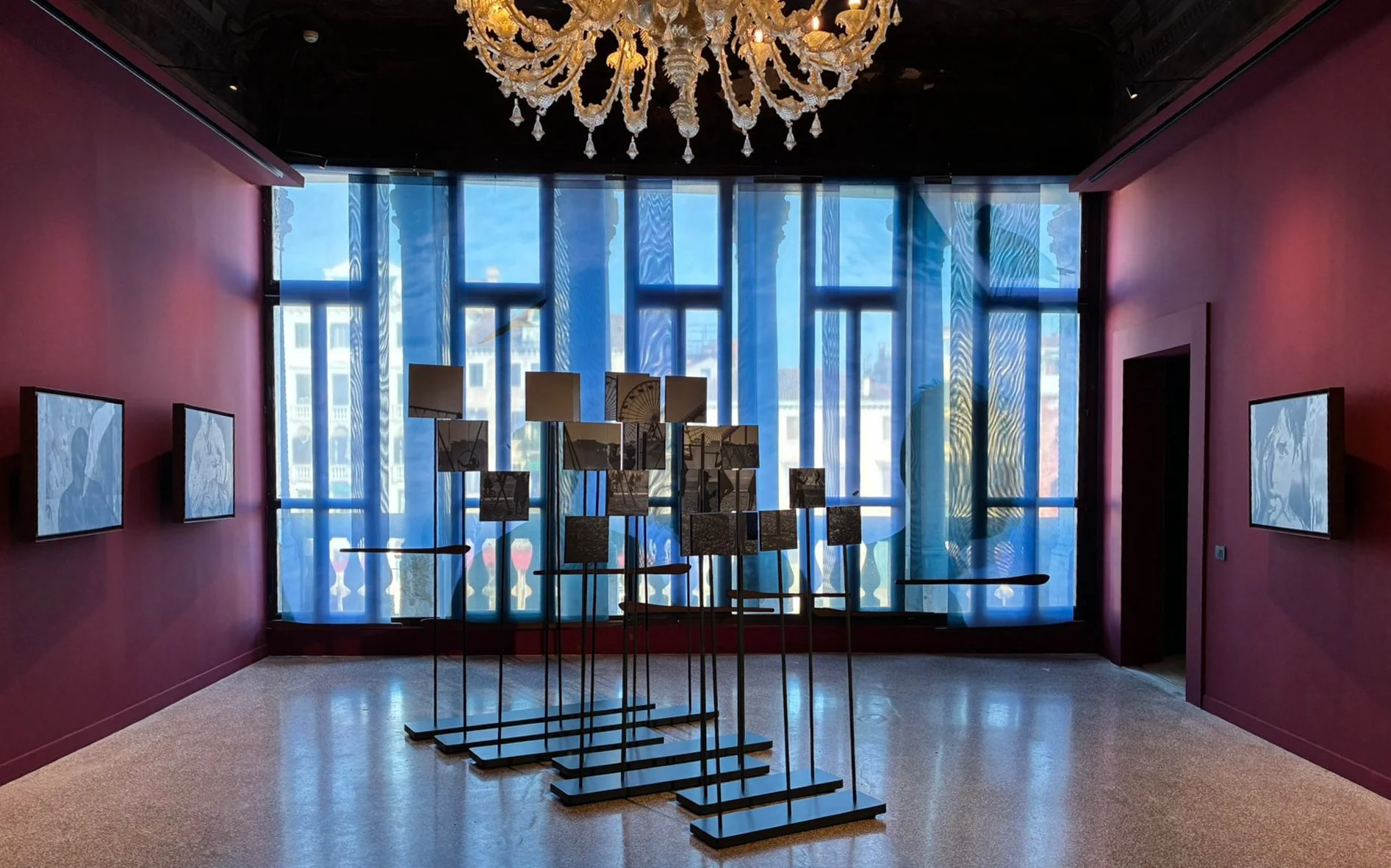

Image selection: How did you decide which photographs were strong enough to survive the translation from print to projection, mosaic, or curtain panels?
In the case of the mosaic and the curtains, the choice of the images was dictated by the materiality of the medium and practical considerations. For the mosaic, we needed to find a photograph whose composition would allow us to have interesting elements in each one of the panels, so that these could work almost as independent images before coming together in a bigger scene with the movement of the viewers. Similarly, the curtains required a subject that was compelling without seeming oppressive: we opted for large figures evenly distributed throughout the panels, with the sky, clouds and even some seagulls in the background. We hope that this will open up the experience of the visitors to the outside and connect the exhibition with the view over the Grand Canal. The choice of the images for the projection was more organic, dictated by considerations over how the photos interacted with each other more than the pictures as single frames. In general, I would say that the medium needs to enhance the way an image communicates and amplify how it can resonate with the viewers.
Testing ideas: What installation ideas did you test and reject because they felt gimmicky or distracted from the images?
We did not really get to the stage of testing ideas that felt too gimmicky, but at one stage, we experimented with printing the images as large columns. It did not work for this project, but we might use them eventually!
Choosing between transformations: When two display options changed a photograph in different ways, how did you decide which transformation deepened the work and which one distorted it?
The process of translating an image into another medium is always a bit unpredictable, and it is very difficult to envision the final result without trying different options. The materials and the size of the work can dramatically affect the final look, in ways that are sometimes surprising. Aesthetic considerations help to make a decision, but eventually I always make up my mind based on my instinct and the feelings I experience when I am in front of the physical object.
© Sandra Cattaneo Adorno, courtesy Robert Mann Gallery.
Perception as subject: The exhibition explores the fragility and instability of perception. How do you think about that idea while you are actually shooting on the street?
Since I started photographing, I began to see things differently. It had never occurred to me that I could spot such unusual and unexpected scenes on the street, but I also came to understand that we, as photographers, can create a situation that does not quite correspond to what most people would be seeing. That is why I often play with reflections in my photographs, or silhouettes, to make the people who are looking at the photos question what they are seeing. In this sense, I think that perception and vision are unstable. Moreover, the scenes I try to capture are themselves always evolving, always changing. Much of the poetry of photography rests in capturing the fragile trace of something that has already gone, never to return.
Collaboration: You worked on this exhibition with architect Danilo Vespier and art historian Andrea Verganti. How did their perspectives change decisions you would have made on your own?
I was blessed with these collaborations in many ways, as I believe that both Danilo and Andrea were able to complement my vision and enhance the possibilities of my photography. I recognise that this exhibition resulted in a much more articulated and rich experience thanks to their contribution. Danilo (along with Paolo Macchiavello, who assisted him) worked on the general design of the show, helping me with the photomosaic installation, as mentioned earlier, and also choosing the colour of the walls. Andrea and I exchanged ideas for the concept of the exhibition, and he assisted me with the prints and the general project management for the show.
© Sandra Cattaneo Adorno, courtesy Robert Mann Gallery.
Creative tensions: What did Danilo or Andrea push you to change that you resisted at first, but later realised improved the exhibition?
I would not say that they pushed me to change my ideas, but rather that we worked together from the beginning of the process and throughout it, exchanging opinions on the various aspects of the exhibition. So we informed and sometimes challenged each other's ideas and what we eventually decided to put in place was the result of this exchange. It is true that occasionally it felt a bit like a leap of faith, as in the case of the colour of the walls: when Danilo proposed dark red, I could not fully visualise what it would look like, but I trusted his judgment and I am very happy I did!
Sound and saudade: The music of João Gilberto and Stan Getz plays throughout the gallery. How did you decide that sound was the right way to bring in your Brazilian roots, and what does saudade mean for how you look at your own photographs?
I wanted to find a piece of music that could match my idea of fragments of vision to accompany the exhibition, so something jazzy was very appropriate. It was my husband who actually introduced me to this particular song, and it instantly resonated with me. There are other versions of this piece, sung with lyrics, but I opted for the instrumental one, which I find less intrusive in complementing the other works. I appreciate the fact that this song is so easily recognisable as Brazilian, although it is not necessarily an international success. Saudade is a term that might have become a bit hackneyed, but for me, it is an acknowledgement of the presence of light and shadows in life, of the belief in the beauty of being in this world despite adversity and the joy that comes with this recognition. I believe that this song rejoices in that feeling.
Looking ahead: Fragments of Light shows you moving from still photographs into projections, sound, and three-dimensional work. What do you want to explore next?
I think there is much more that I could explore in the ways in which photographs are presented and experienced. I would be thrilled to make my work resonate with the people who come to see it in new and exciting ways, so that they could experience some of the sense of wonder that is the biggest gift photography has ever made me.


More photography books and interviews?
We'd love to read your comments below, sharing your thoughts and insights on the artist's work. Looking forward to welcoming you back for our next [book spotlight]. See you then!
Lee Espinoza reminded Darren Vargas of his late grandfather. The photographer met the boxing coach in 2025, five years after his grandfather Esmael died. Photography Book Spotlight