From Minimalism to Complex Chaos in 'EDGE' by David Ricci
Welcome to this edition of [book spotlight]. Today, we uncover the layers of 'EDGE,' by David Ricci (published by Fall Line Press). We'd love to read your comments below about these insights and ideas behind the artist's work.
In 'EDGE', David Ricci compiles an extraordinary array of images that mark significant milestones in his career as a fine art photographer. The book starts with simple, clean architectural forms and evolves into rich, complex scenes filled with rhythm, color, and motion. This article delves into Ricci's creative process, exploring how his work reflects a deep engagement with the world around him and a unique interpretation of beauty amidst chaos.
Are you ready to journey to the edge of chaos and beauty? David Ricci, in his groundbreaking book 'EDGE', invites readers to explore a world where deserted landscapes and everyday scenes are transformed into extraordinary visions of aesthetic brilliance. "The book begins with two 'minimalist' architectural images," Ricci shares, delving into the evolution of his artistic process. He describes how his work "progressively orchestrated more components, nearly overloading the frame, eventually reaching a point where the images became extraordinarily complex." This progression, from simplicity to complexity, reflects Ricci's unique approach to photography, capturing moments where "order and disorder reach a taut balance."
But what drives a photographer to seek beauty in the midst of chaos? Ricci finds inspiration in the concept of the 'edge of chaos', a term he borrowed from M. Mitchell Waldrop's book "Complexity." He elaborates, "I was intrigued by this concept because it seemed somewhat analogous to the way I was constructing my photographs." Yet, Ricci's 'EDGE' is more than just an artistic exploration; it is a reflection of human existence. He hopes viewers will connect with the theme of "human presence without humans present," where deserted venues and abandoned structures tell a story of what once was and what remains. Through 'EDGE', Ricci not only challenges viewers' perceptions but also invites them to find beauty in unexpected places.
Inspiration Behind 'EDGE': What was the initial spark or moment that led to the creation of "EDGE," and what do you hope viewers will take away from engaging with this body of work?
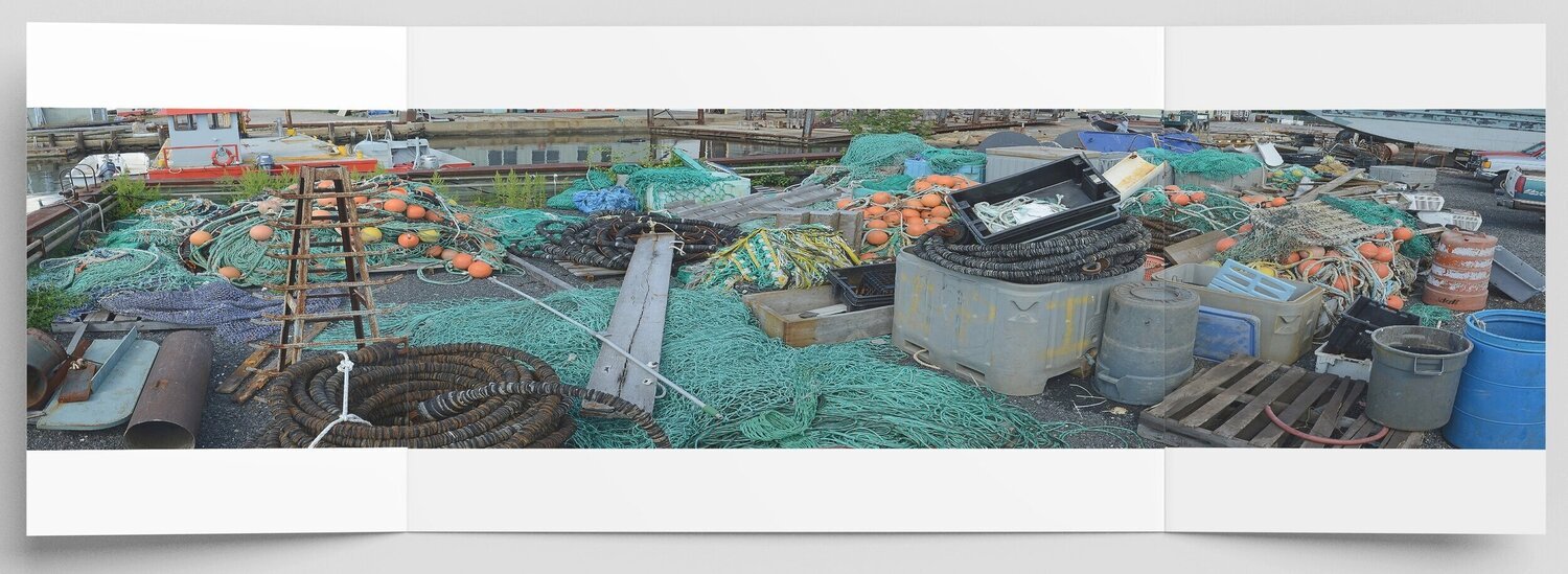
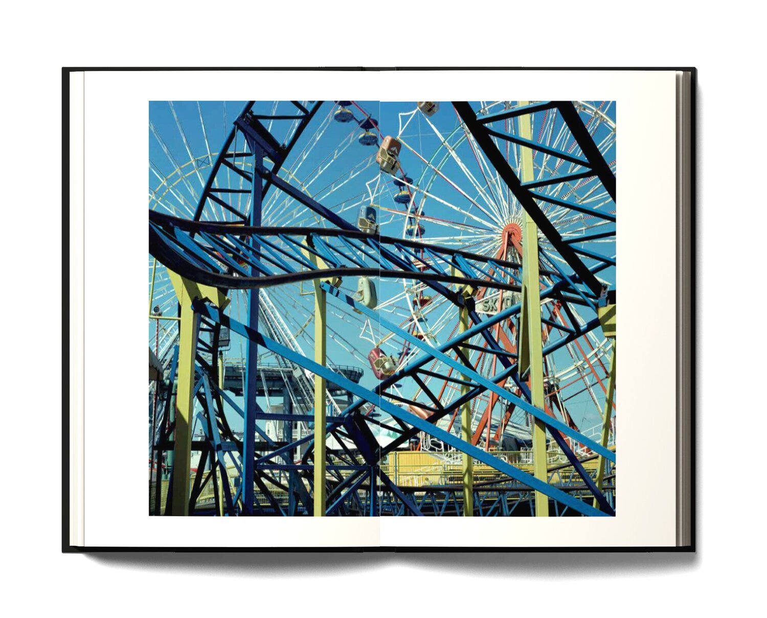
EDGE includes selections from several projects that span more than thirty years of my career as a fine art photographer, so rather than a specific moment, the ideas behind it evolved over time. The book begins with two “minimalist” architectural images, followed by an early project photographing deserted amusement parks, outdoor sports facilities, and boardwalk attractions throughout the United States. As that work progressed over several years, I gradually included a greater number of visual elements in my viewfinder, and made extensive use of motifs – repeating lines, shapes, and objects - to make intricate, layered compositions that resonate with color, gesture, and rhythm. Over time I progressively orchestrated more components, nearly overloading the frame, eventually reaching a point where the images became extraordinarily complex and held together a bit tenuously. My hope is that the viewer will connect with the progression of my personal vision in the early part of the book and how that way of looking at the world expanded in the work that follows.
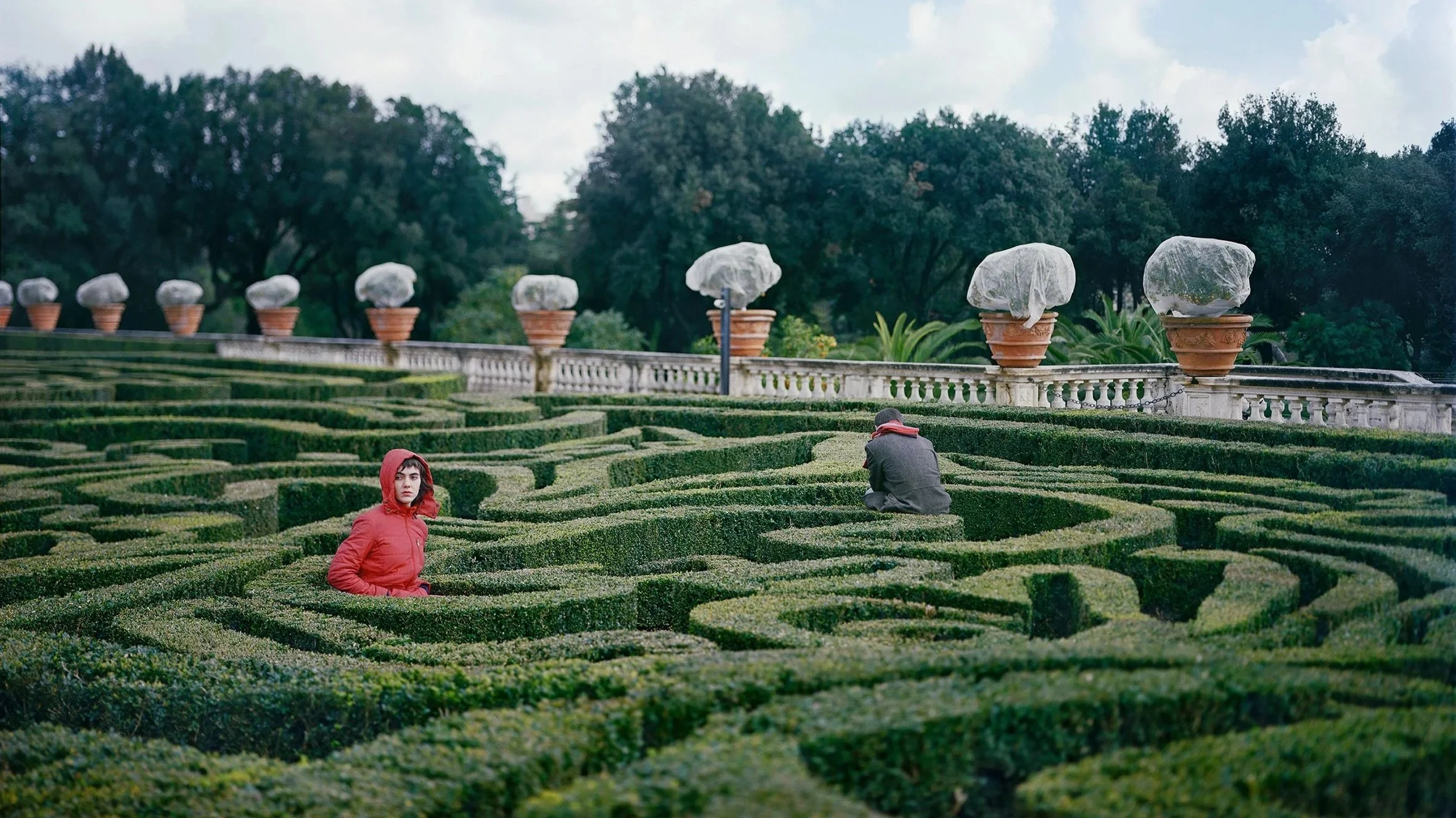
One theme that I hope is apparent is what I refer to as “human presence without humans present” – deserted venues where we expect to see crowds; the placement of equipment, tools and other objects at work sites; demolished structures that formerly were beehives of activity; discarded possessions collected in scrap metal heaps.
Also, while there is a deliberate overarching flow to the sequence, my hope is that every image also stands on its own to engage the viewer as they work their way through the book, that they spend a fair amount of time with each photograph, and they return for a second and third look.
Philosophy of Chaos and Beauty: Your work on "EDGE" explores the intersection of chaos and aesthetic brilliance. Can you elaborate on the conceptual foundation of this project?
Several years ago, I became captivated by M. Mitchell Waldrop’s book “Complexity” in which he describes an intriguing scientific phenomenon: as more and more components are added to a system it inherently becomes more complex, but at some point, the system moves beyond complexity and enters a region termed the “edge of chaos” where something unique emerges – a new entity that is both greater than the sum of its parts and essentially different from them. Beyond this stage chaos reigns. I was intrigued by this concept because it seemed somewhat analogous to the way I was constructing my photographs by including a great number of visual elements in the composition. To be clear - I never attempted to “document” the edge of chaos. That concept simply functions as a metaphor for my work.
Constructing Complex Visual Structures: Your photographs are known for their complex visual structures. Can you discuss the process behind creating these intricate compositions within "EDGE" and their significance in conveying your thematic focus?
The initial object, scene, or view that drew my attention was dependent on the subject matter and my thematic focus at the time, but in terms of composition I searched for a meaningful way to map a plethora of visual elements in three-dimensional space onto the two-dimensional plane. I used a variety of compositional strategies to do that. When shooting scenes that encompassed a considerable amount of space, I would look at objects and surfaces close to me, others a short distance away, and still others off in the distance to see if there was a correlation in terms of colors, shapes, forms, or patterns. Once I found a scene that intrigued me, I would walk around the space to get a range of perspectives and determine if I could get the composition to work. When the situation warranted it, I would bring out my camera, mount it on a tripod, and study the scene through the viewfinder, moving an inch or two left, right, forward, or back until (in my mind) the composition coalesced. Most of those photographs were taken from a similar perspective - looking straight out toward the scene in front of me with a normal or slightly wide-angle lens. So, the ground I was standing on played an important role, often occupying the bottom third or more of the picture. At times I would look through a structure (e.g., the openings in the steel frame of an amusement park ride) to incorporate objects in the photograph that were further from my viewfinder. Other situations called for an “all over” approach to composition that required finding relationships and juxtapositions in a scene with limited physical depth (scrap metal heaps, building demolitions)
I believe there is an underlying rhythmic pulse in the universe which, at certain places and times, is manifested in that enchanted space where order and disorder reach a taut balance. I try to capture those instances in my photographs.
Impact of New Topographics and New Color: How have the movements of New Topographics and New Color photography influenced your approach to capturing deserted environments and chaotic landscapes in "EDGE"?
Of the New Topographics photographers, I would say that Lewis Baltz had the most direct influence on my work – I was fascinated by the geometric formal structure of his compositions. While not aware of it at the time, in retrospect I believe Robert Adams’ magical images of scenes that included a few human figures (or none) worked their way into my subconscious when I was photographing deserted recreational sites early in my career.
Sally Eauclaire’s book “The New Color Photography” introduced me to the work of Eggleston, Shore, Meyerowitz, Groover and several others who were redefining color photography in the late 1970s and early 1980s. Stephen Shore’s book Uncommon Places had a significant impact on my way of looking at the world. In my mind, he seemed to be building on Walker Evans’ black & white work, but with more complex visual structures, repeating shapes, and the crucial added element of color – all of which appealed to my own aesthetic sensibility. Uncommon Places was the springboard for my own work, but I tried to move in a different direction by using a broad range of palettes and pushing my compositions to the edge of chaos.
Collaborative Influence on Narrative: The editing and sequencing by Peter Essick and design by Margaux Fraisse have been highlighted as crucial to "EDGE." How did this collaboration shape the narrative or visual conversation of the book?
My initial proposal to Fall Line Press included a book dummy which was separated into six sections - one for each project – that started with a title and brief text, followed by a series of images. The title and text referenced a specific area of scientific inquiry, in keeping with the overarching theme of “edge of chaos.” During the initial brainstorming sessions with Peter and Fall Line Press publisher/editor Bill Boling, they suggested that the groupings and text might be a bit confusing for many readers and could detract from the images. That made sense to me, so we took a different approach from that point forward, eventually discarding the groupings in favor of a single sequence from the beginning to the end of the book, allowing the flow of images to carry the day.
While most of the photographs in my proposal were included in EDGE, the published book has a very different look and feel from my prototype. Given the level of detail in many of the photographs we opted for a lay-flat binding that allowed us to spread several images across two pages without interruption from the gutter, and we included two gatefolds that open to 12x32 inches. EDGE did not really feel like a book until French designer Margaux Fraisse joined the team. She provided us with a couple of options for the overall design, layouts, fonts, image sizes, placement and covers. We all suggested some tweaks, some were incorporated into the design, but in the end, it was Margaux who wrapped the photographs and text into a cohesive, exquisite book.
Insights from Tim Davis's Essay: Tim Davis's essay in "EDGE" brings into focus the joys of "life on the edge." How do you feel his insights complement the visual narrative of your work?
When I first saw the title of Tim’s essay “The Photographs of a Spoonleaf Sundew” I was a bit flabbergasted. What is a sundew and what could that possibly have to do with the photographs in the book? But that cryptic title lures the reader into an insightful essay. Through his creative use of the carnivorous plant metaphor, and references to photography, poetry, film, and, yes, even a “really fun party” the reader is taken on a whirlwind, multilayered, at times humorous journey that in its own way borders on the edge of chaos – so I think it aligns well with the overarching narrative and theme of the book.
Future Directions: Having explored the themes of aesthetic brilliance and transcendent beauty in "EDGE," what are the new themes or projects you are currently exploring or plan to explore in the future? How do you anticipate your focus or methodology might evolve in these upcoming works?
After completing the photography work for EDGE I started a new project, tentatively titled Hunter/Gatherer, shooting at antique malls and fairs, curio shops, flea markets and other sites throughout the United States. The subject matter is quite broad: dolls, mannequins, religious items, Black memorabilia, figurines - and the themes range from consumerism to misogyny to racism.
Another project started several years ago has been on the back burner way too long and I intend to return to it soon. “Where the Truth Lies” examines how text impacts our interpretation of photographs. My process begins by discovering and photographing a peculiar, intriguing scene or object. Taking cues from the image, I contemplate alternate meanings for it, make a list of keywords, and enter them on Wikipedia. Then I pore over the search results and record phrases and sentences that are “candidates” as captions for the image. In some cases I use the text verbatim while in other instances I combine and edit passages to compose the final wording that is paired with one or more photographs. These image/text juxtapositions ask us to consider how we obtain meaning from photographs as they question their tenuous, fragile intimacy with the truth. The topics cover a broad range: mythology, history, war, etymology, psychology, ecology, architecture, urban legend, science, science fiction, mathematics, anthropology, agriculture and more.
Shift in Subject Matter with "Hunter/Gatherer": While "EDGE" encapsulates a certain thematic exploration, "Hunter/Gatherer" represents a shift in your work. How does this newer project build upon or diverge from the themes explored in "EDGE"?
Well, when I began the Hunter/Gatherer project my intent was to build on the “edge of chaos” style that I had developed in EDGE, but, unexpectedly, the project veered down new, surprising paths. Displays at antique fairs and flea markets are microcosms of our ultra-consumerism, and initially I was drawn to displays that speak to that: tables piled high with a hodgepodge of household goods; shelves packed with knickknacks; booths overflowing with a jumble of peculiar items. Chaos echoing the American dream mantra - I own, therefore I am.
But these marketplaces are also treasure troves of historical artifacts that offer glimpses into the past, portals to American values and biases from a different era. By incorporating human figures in my photographs - portrayed by mannequins, statues, figurines, and dolls or depicted in illustrations, photographs, and paintings – I try to illuminate prejudices and stereotypes that were prevalent decades ago while also providing a window into the current American moral and cultural climate.
To discover more about this intriguing body of work and how you can acquire your own copy, you can find and purchase the book here. (use the code EDGE30 for 30% discount)
More photography books?
We'd love to read your comments below, sharing your thoughts and insights on the artist's work. Looking forward to welcoming you back for our next [book spotlight]. See you then!


Innocent people confess to crimes they never committed. It sounds extreme, but it is a real and documented problem. Photography Book Spotlight