A Painterly Lens: The Artistic Alchemy of Teresa Freitas
Welcome to this edition of [book spotlight]. Today, we uncover the layers of 'Teresa Freitas,' by Setanta . We'd love to read your comments below about these insights and ideas behind the artist's work.
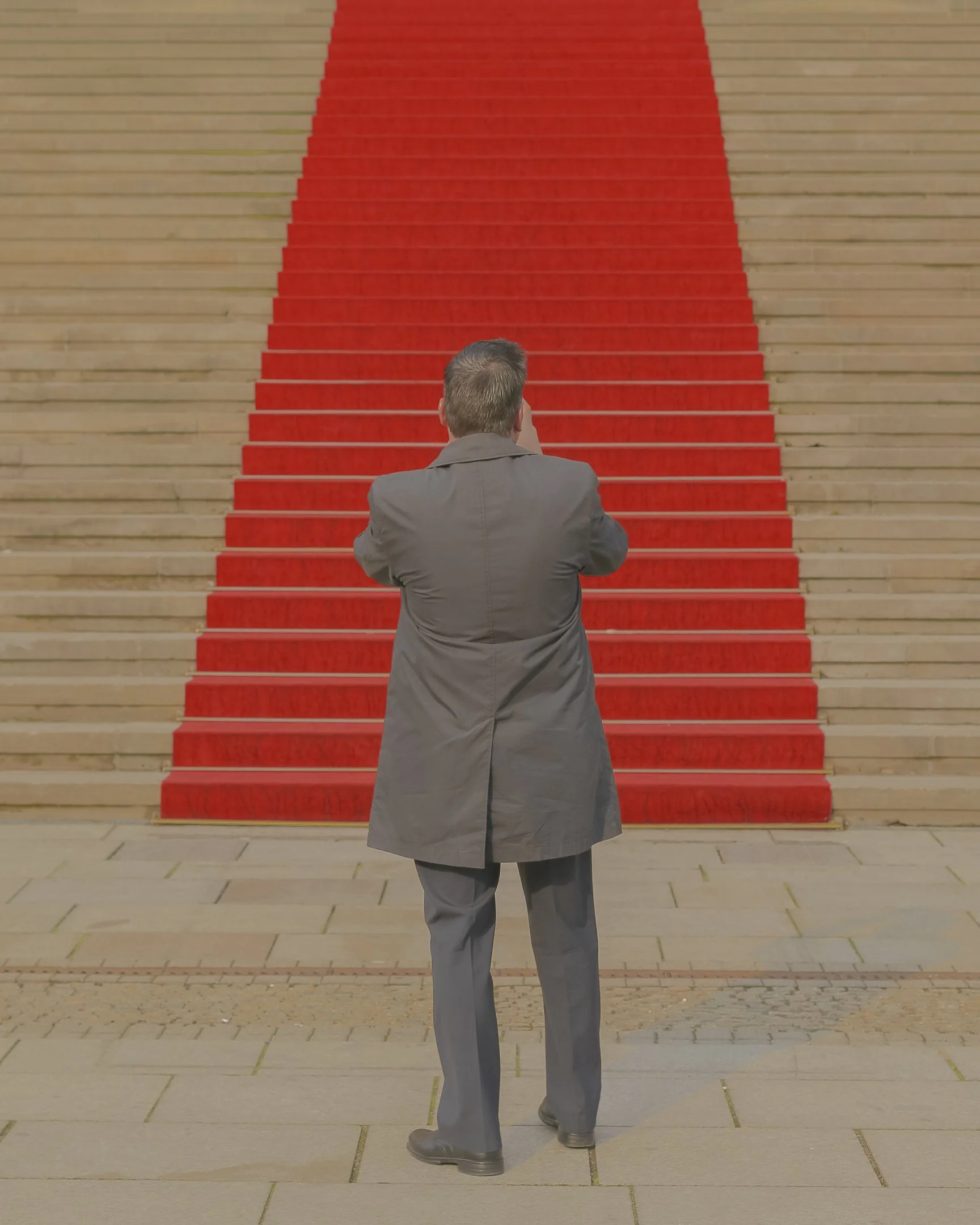
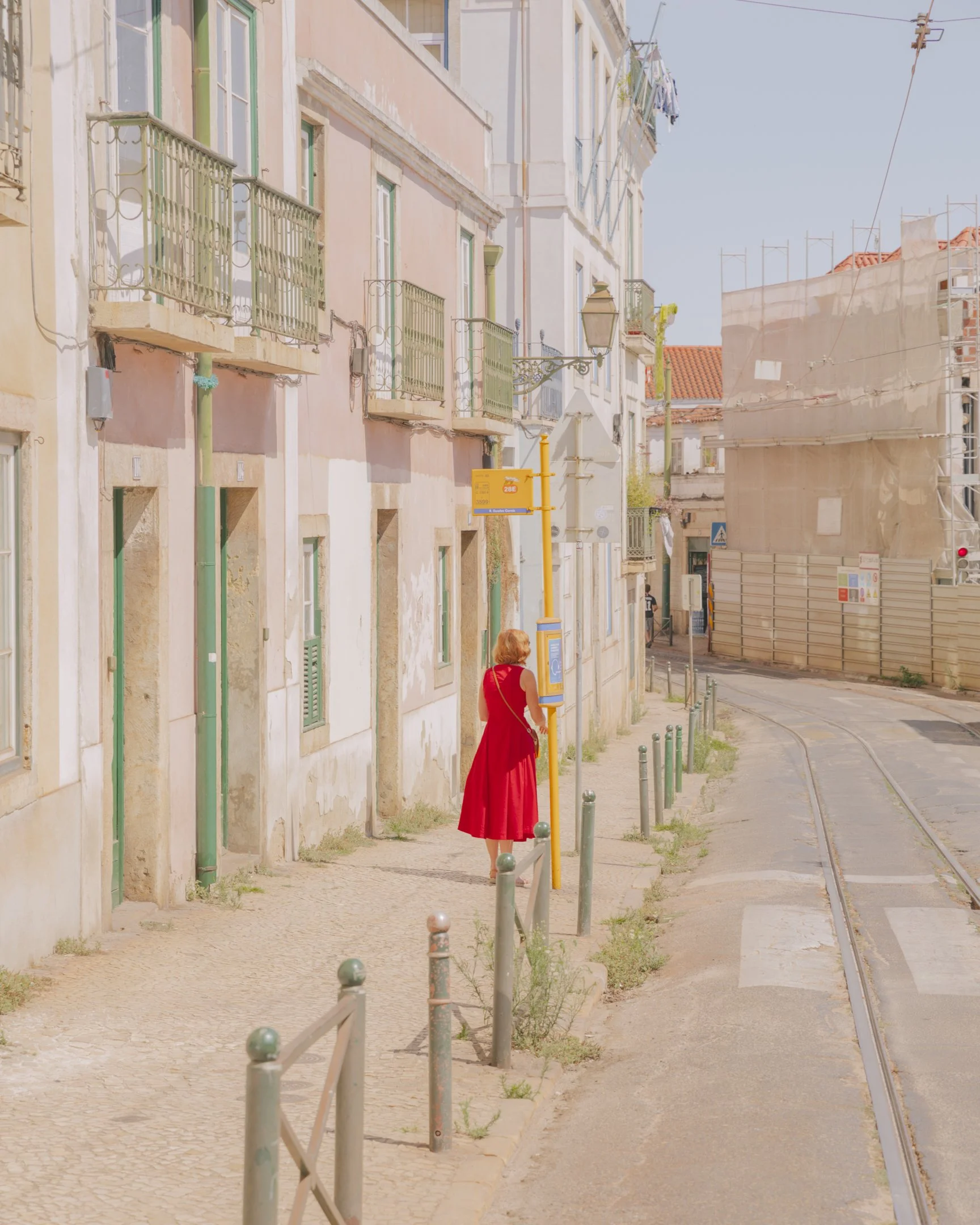
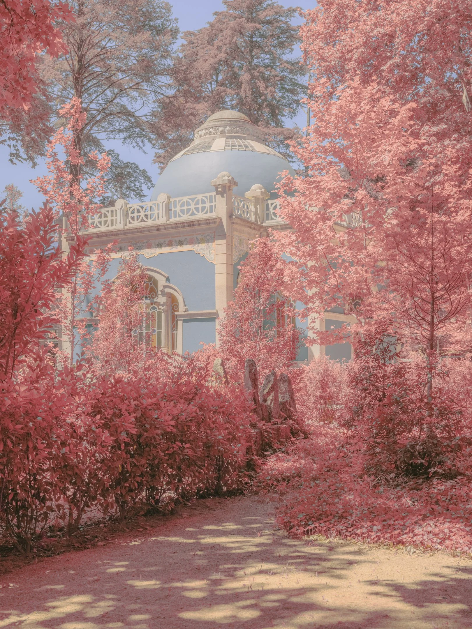
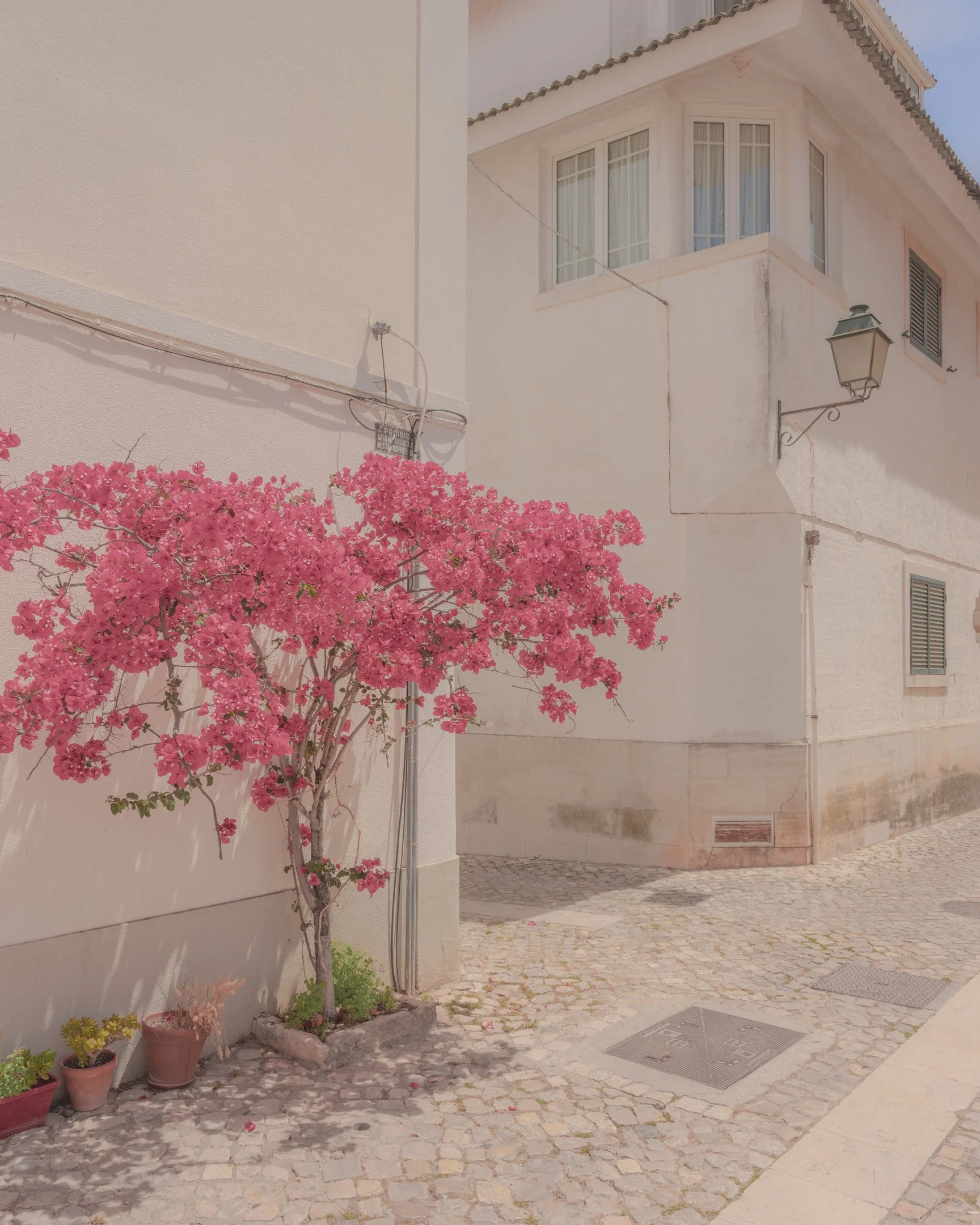
In the realms of vivid colors and ethereal landscapes, Teresa Freitas crafts a visual symphony that beckons the eye to dance between reality and the surreal. As the fourteenth feature in an ongoing Setanta’s series that showcases emerging photographers, Freitas offers an intimate glimpse into her world where colors do not merely exist but communicate, narrate, and even intrigue. Her work, a blend of meticulous composition and an intuitive grasp of color harmony, achieves a painterly quality that transforms everyday scenes into moments of pure visual pleasure. From the serene shores of her native Lisbon to the bustling streets of Seoul, where her first solo exhibition saw over 110,000 visitors in just three months, Freitas's journey is a testament to the power of color in shaping our perception of place.
This exploration of chromatic harmony is more than a personal preference; it is a philosophical stance that defines her body of work. In her recent interview, Freitas delves into the inspiration behind her book—a desire to sequence her photographs by color, creating a journey through the color spectrum that mirrors the evocative progression of a musical piece. With an approach deeply rooted in her early fascination with the 'feel-good' sensation of light, soft tones, and the expressive power of color, she aims to offer viewers not just a photograph, but a moment of reflection, a glimpse into a world where the boundaries between fiction and reality blur, guided by the subtle nuances and bold statements made by her chosen palette.
Inspiration Behind the Book/Body of Work: What inspired you to compile your photographs into this book/body of work, and what do you hope viewers take away from it?
I had always wanted to see my images in book form and take on the challenge of sequencing and editing my work. When Setanta approached me with the idea of creating a book zine, I was immediately on board, and suggested we curate it by colour, where the concept of sequencing followed the idea of going through the colour spectrum (starting with red, ending in violet, in pairs). When I buy a photo book, I want to feel inspired, and be able to take a closer, more thoughtful look into the work of a photographer. I hope that's what viewers feel, too.
Philosophy of Color: You've described color as a primary motivator in your work. Can you expand on how your relationship with color began and how it has evolved in your photography?
I believe my attraction to colour has been with me since an early age, looking at illustrations in children's books, movies (specially animation/anime) and video games. It wasn't a very conscious taste at the time, but I placed a lot of importance in the visual aspect and care of the stories I consumed. I searched for a 'feel-good' sensation, and that's what light, soft tones gave me. Eventually, I started to look at painting more attentively, and the work of colour masters like Van Gogh who explored colour contrast to the fullest. I found the work of Helen Frankanthaler, who was a member of the Colour Field painting – a movement and style of abstract painting that explored the expressive power of color and its power to envelop the viewer. I didn't immediately employ this notion into my photography, which came intuitively and unplanned, but as I delved into the possibilities of color editing and grading, I started to focus more on the impact of colour in composition. I eventually found a sweet-spot, where I felt I had been able to subtly change the second-degree reality that is a photograph, and take that idea a bit further: a shift in perception that makes the viewer question the authenticity of the scenes I'm photographing.


Composition and Color Harmony: How do you balance the elements of composition with your unique approach to color, especially in achieving a painterly quality in your images?
I've always played by instinct, even though I've learned the theory. There's nothing like actually seeing things change as you move the switches. What I do try to bring to each image is a mix of softer and bolder tones at the same time, a visual paradox that our eyes aren't used to, except in painting. This creates a colour accent, usually present in smaller details that I give more colour saturation to, whereas larger areas of the image are tinted down to become less invasive, allowing us to rest our eyes. Softer, more muted tones are usually associated with water colours. I'm also programmed to search for colour harmonies when I'm out shooting, sometimes waiting for the right timing to be able to get them in the frame. That kind of attention to colour is often a part of a painting, so that painterly quality stands out from association.
Moment of Visual Pleasure: Your intention is to provide a moment of visual pleasure through your images. Can you share an instance where this aim was particularly challenging to achieve, and how you overcame it?
I feel I often take photographs of complex scenes, but the way I edit colour makes them easier to digest. But it's particularly hard when there's a lot going on in the frame – when besides structural, architectural elements, there's also people, a strong contrast of light and shadow, movement, and different layers in the fore, mid and background. The decision of which hue to stand out, and which hues to dial down, plays a big influence. Sometimes it doesn't work at all. But when I'm stuck, the only thing I can do is move away from the image, work on different ones or take a break. Distance and time from it tends to help, as it's true for most of the process in creating something.


Ambiguity and Emblematic Quality of Color: You mention the ambiguous and emblematic quality of color in your work. How do you think this ambiguity influences the viewer's perception and interaction with your images?
I often get told that my images do one of three things: 1. question if it's a photograph, or a painting; 2. bring a positive light and peaceful tone; 3. breakdown a scene and make it about colour, rather than subject. All things I'm happy with when it comes to interpreting my work. I'm happy to leave that to the viewer.
Exploring Fiction and Reality: How do you navigate the subtleness of the relationship between fiction and reality in your photography, and what role does color play in this exploration?
Colour is the main element for the reality shift, specially thanks to the visual paradox we've talked about earlier. But I think the subject often comes into play as well, and the way I photograph. I believe there's a strong observation quality to my images, namely when there's people involved. There's an intimate distance. I want people to be a part of the image, but not be the whole image itself. There's a sense of both person and place. I also enjoy the quirkiness of human behaviour that sometimes is revealed. There's a cinematic feel to it, as if someone is a part of a story, that could apparently be fabricated, rather than a candid capture of a daily-life moment.
Teaching and Sharing Knowledge on Color: As someone who enjoys sharing knowledge about color through courses and workshops, what is one key lesson or piece of advice you always emphasize to your students?
That you have to go through bad work to get to somewhere good. As creators, we've been developing our taste for so long that sometimes it's hard when it doesn't match our abilities. There's no way around that, you have to keep creating to get closer to accomplish it. Keep working, focus on what feels good, let go of the rest.
Solo Exhibition Experience: Your first solo exhibition in Seoul attracted over 110,000 visitors. What was this experience like for you, and how has it impacted your artistic journey?
It's absolutely mind blowing when you see lines being formed to view your work. The realization that people took a moment of their day to see your images. It's an incredible feeling of support, and motivation. I'm not sure how it impacted my journey, besides knowing that I want to feel it again. I'm hoping to have more exhibitions in the future, and I've been working on it.
Future Projects and Directions: Looking forward, are there new themes or techniques in color and photography you're eager to explore in your future work?
I want to attach important narratives to new projects, and namely start developing long-term projects. I'm working on getting into the realm of post-documentary photography, that's characterised by a more intimate connection to the tangible world, and placing strong emphasis on a subjective, poetic method of crafting images and stories. While always having a dedication to the exploration of colour in photography and its expression as my artistic style, of course.
To discover more about this intriguing body of work and how you can acquire your own copy, you can find and purchase the book here.
Teresa C. Freitas, (Website, Instagram) born in 1990 in Lisbon, Portugal, is a photographer celebrated for her distinctive use of color to shape perception and mood. Her work, characterized by a blend of soothing pastels and vibrant hues, achieves a painterly quality that blurs the lines between fiction and reality. Freitas's passion for color began in childhood, drawing inspiration from various visual media and the expressive power of color in art. She has honed her craft through intuition and a deep understanding of color's impact on composition.
Freitas shares her knowledge through online courses and workshops, emphasizing color's role in photography. Her first solo exhibition in Seoul in 2022, attracting over 110,000 visitors, marked a significant achievement in her career. Based in Lisbon, she continues to explore new themes in her work, aspiring to merge important narratives with her artistic style. Freitas's journey is a testament to the emotive and narrative power of color in visual storytelling.
More photography books?


We'd love to read your comments below, sharing your thoughts and insights on the artist's work. Looking forward to welcoming you back for our next [book spotlight]. See you then!
Fallen Flowers turns women into living landscapes. In this book, Claire Harrison and Adelaide Turnbull bring women, flowers, body paint, and the British countryside into one visual world. Photography Book Spotlight